Quantitative modeling of the effect of antigen dosage on B-cell affinity distributions in maturating germinal centers
- Laboratoire de Physique de l’École Normale Supérieure, ENS, PSL University, CNRS UMR8023, Sorbonne Université, Université Paris-Diderot, Sorbonne Paris Cité, France
- Laboratory for Functional Immune Repertoire Analysis, Institute of Pharmaceutical Sciences, ETH Zurich, Switzerland
- Laboratoire Colloides et Materiaux Divises (LCMD), Chemistry, Biology and Innovation (CBI), ESPCI, PSL Research and CNRS, France
Figures
Figure 1
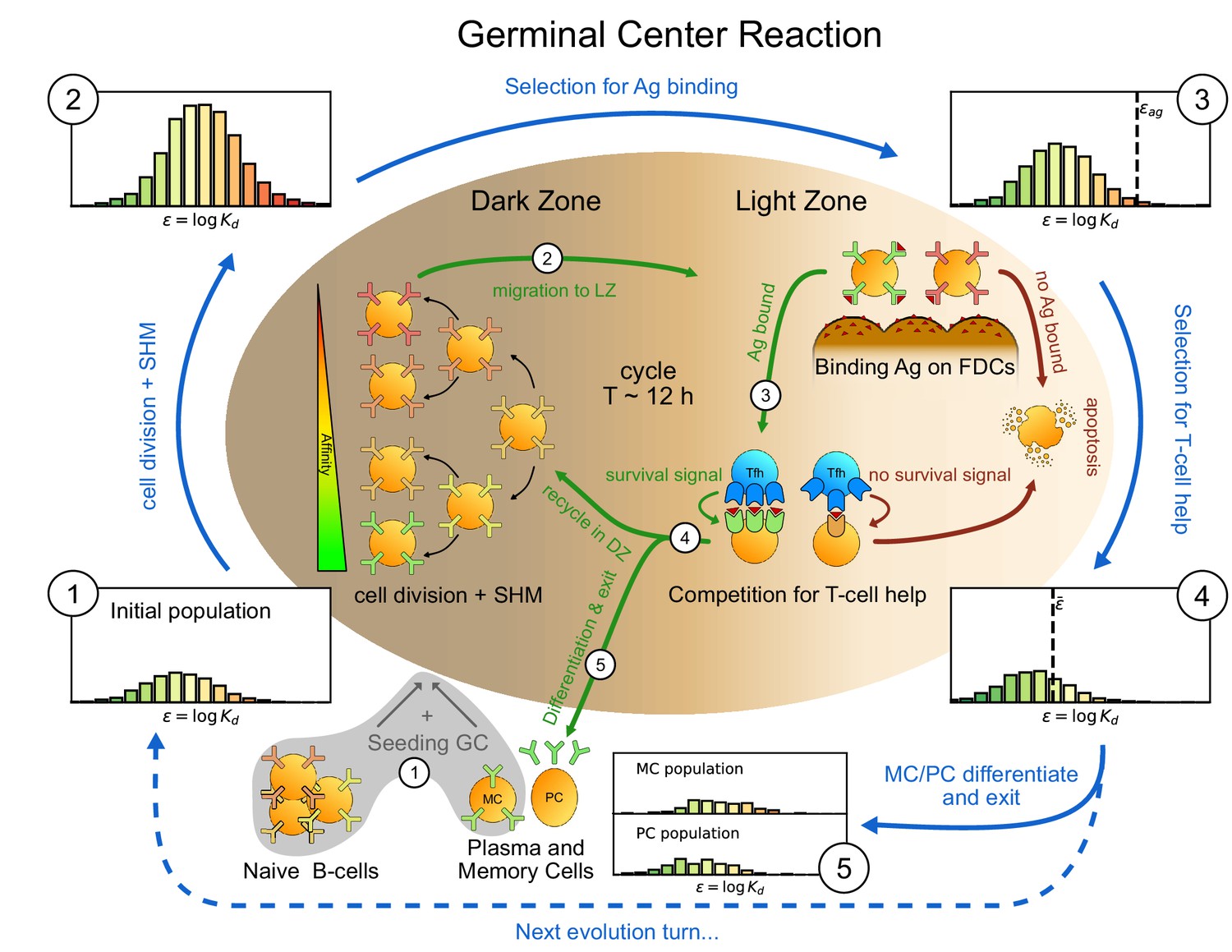
Sketch of the germinal center reaction (inner part) and effects of the main reaction steps on the distribution of the binding energies (, equivalent to the logarithm of the dissociation constant ) of the B-cell population (histograms on the outer part).
A red-to-green color-scale is used to depict the affinity of both B-cell receptors in the inner part of the scheme and in the outer binding-energy histograms. Upon Ag administration GCs start to form, seeded by cells from the naive pool having enough affinity to bind the Ag. If the Ag has already been encountered also reactivated memory cells (MC) created during previous GC reactions can take part in the seeding. At the beginning of the evolution round cells duplicate twice in the GC dark zone and, due to somatic hypermutation, have a high probability of developing a mutation affecting their affinity. Most of the mutations have deleterious effects but, rarely, a mutation can improve affinity. As a result the initial population (1) grows in size and decreases its average affinity (2). After duplication cells migrate to the light zone, where they try to bind Ag displayed on the surface of follicular dendritic cells. Failure to bind Ag eventually triggers apoptosis. The probability for a cell to successfully bind the Ag depends both on its affinity for the Ag and on the amount of Ag available. Cells with binding energy higher than a threshold value are stochastically removed (3). The Ag concentration shifts this threshold by a quantity . B-cells able to bind the Ag will then internalize it and display it on MHC-II complexes for T-cells to recognize, and then compete to receive T-cell help. We model this competition by stochastic removal of cells with binding energy above a threshold that depends on the affinity of the rest of the population (4). As before Ag concentration shifts this threshold. Moreover to account for the finite total amount of T-cell help available we also enforce a finite carrying capacity at this step. Surviving cells may then differentiate into either MC that could seed future GCs or Ab-producing plasma cells (PC). MCs and PCs are collected in the MC/PC populations (5), while the rest of non-differentiated cells will re-enter the dark zone and undergo further cycles of evolution. Eventually Ag depletion will drive the population to extinction.
Figure 2

Effect of different antigen dosages on model evolution.
(A) Schematic representation of the Antigen (Ag) dynamics. Upon injection Ag is added to the reservoir. From there it is gradually released at a rate and becomes available for B-cells to bind. Available Ag is removed through decay at a constant slow rate and consumption by the B-cells at rate , proportional to the size of the B-cell population. (B) Histogram of the B-cell populations at different times (1,2,4,8,12 weeks after Ag administration) for two simulations of the model at two different values of administered Ag dosage (1 - blue, 10 - orange). Ag Dosage is converted to Ag concentration through the inferred proportionality constant . Notice that low dosage entails a faster maturation, albeit having a shorter total duration. (C) Evolution of Ag concentration (top), number of B-cells in germinal center (middle) and average binding energy of the population (bottom) for the same two simulations as a function of time from Ag administration. Vertical grey lines corresponds to time points for which the full affinity distribution is displayed in panel (B). (D) cumulative final populations of differentiated cells at the end of evolution (memory cells - top, plasma cells - bottom) for the two simulations. Colors encode Ag dosage as in panel B and C. Simulations were performed with variant (C) and parameters given in Table 1.
Figure 3
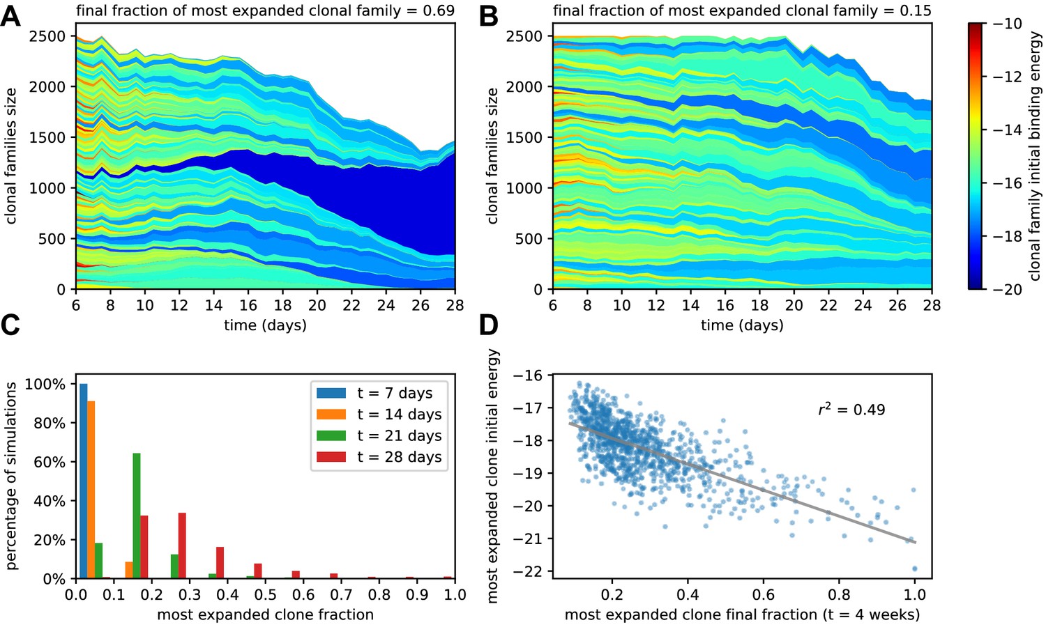
Simulated GCs present different levels of homogenization.
(A) Example of homogenizing selection in GC evolution. Population size as a function of time for each clonal family in stochastic simulations of a single GC. The GC were initiated with an injected antigen dosage of . The color of the clonal family reflects the initial binding energy of the founder clone according to the color-scale on the right. On top, we report the fraction of the final population composed by the most expanded clonal family. In this example, the progeny of a single high-affinity founder clone (dark blue) progressively takes over the GC, and at week 4 constitutes around 70% of the GC B-cell population. (B) Example of heterogeneous GC evolution. Contrary to the previous example, many clonal families coexist, without one dominant clone taking over the GC. (C) Evolution of the distribution of the most-expanded clone fraction. We perform 1000 stochastic simulations and evaluate the fraction of the population constituted by the most-expanded clone at each time (cf colors in the legend). Distributions show the percentage of simulations falling in 10 bins splitting equally the [0,1] interval according to the values of their dominant clone fractions. Notice the presence of heterogeneous and homogeneous GCs at week 4. (D) Scatter plot of final (week 4) population fraction versus initial binding energy for the most-expanded clone; the straight line shows the best linear fit (). The presence of a clone with high initial affinity favors the advent of a homogeneous GC.
Figure 4
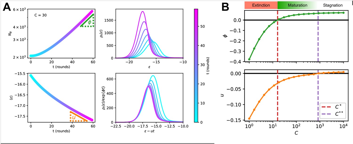
Asymptotic evolution at constant Ag concentration.
(A) Analysis of the asymptotic deterministic evolution for the large-size limit of the model, at constant available concentration . Top left: size of the population vs. number of maturation rounds, showing the exponential increase at rate . Bottom left: average binding energy of the B-cell population, decreasing linearly with speed . Top right: evolution of the binding energy distribution, normalized to the number of cells in the GC, shows a travelling-wave behavior. Different times are represented with different colors, according to the color-scale on the right. Bottom right: distributions of binding energies, shifted by the time-dependent factor and rescaled by the exponential factor . Notice the convergence to the invariant distribution . (B) Values of the growth rate (top) and maturation speed (bottom) as functions of the Ag concentration . The points at which the two quantities are zeros define the two critical concentration and (red and purple vertical dashed lines). They split the asymptotic behavior of the system at constant Ag concentration in three different regimes: extinction for (), maturation for ( and ) and finally stagnation for ( but ). Results were obtained using parameter values reported in Table 1.
Figure 5
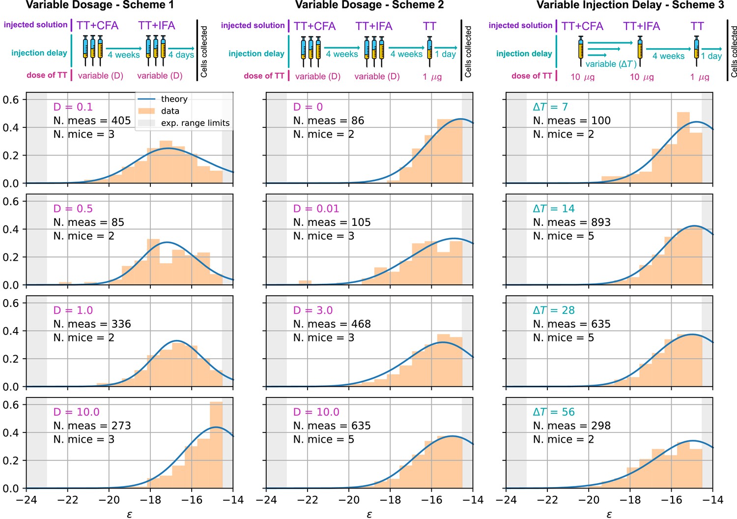
Comparison between model-predicted and experimentally measured affinity distributions of antibody-secreting cells (Ab-SCs) for different immunization protocols.
A schematic representation of the protocol used is reported on top of each column. Scheme 1 (left column) consists of two injections at the same Ag dosage , separated by a 4 weeks delay. Cells are harvested 4 days after the second injection. Scheme 2 (middle column) is the same as scheme one until the second injection. Then, after an additional 4 weeks delay, a supplementary boost injection of 1µg pure TT is administered, and cells are harvested one day later. Scheme 3 (right column) is the same as Scheme two but the TT-dosage of the first two injections is kept constant, and instead the delay between them is varied. Experimental data (orange histograms) consists in measurements of affinities of IgG-secreting cells extracted from mice spleen. The experimental sensitivity range (, or equivalently ) is delimited by the gray shaded area. Blue curves represent the expected binding energy distribution of the Ab-SCs population according to our theory under the same model conditions. For a good comparison, all the distributions are normalized so that the area under the curve is unitary for the part below the experimental sensitivity threshold. For every histogram, we indicate the number of single cell experimental measurements that make up the experimental distribution (black), the number of different mice from which the measurements were pooled (black), and the value of the varied immunization scheme parameter, corresponding to dosage (pink) in μg of TT for the first two schemes and time delay (blue) in days for the third.
Figure 6
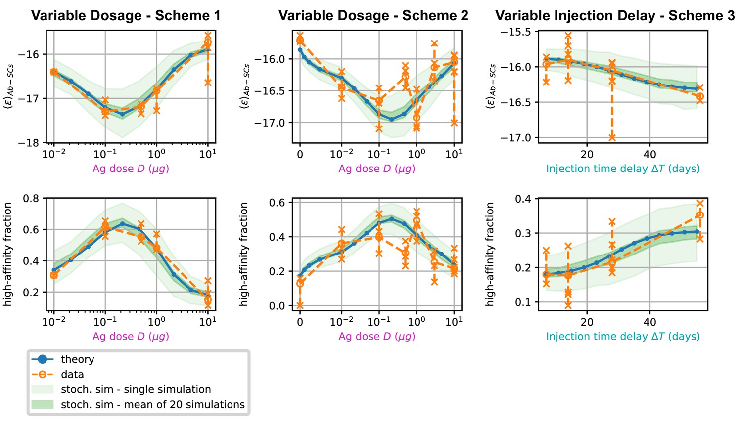
Comparison between data and model prediction for the average binding energy (top) and high affinity fraction (bottom) of the Ab-secreting cell population under the three different immunization schemes (scheme 1 - left, scheme 2 - center, scheme 3 - right).
The high-affinity fraction corresponds to the fraction of measured cells having binding affinity , or equivalently binding energy . On the x axis we report the variable quantity in the scheme, which is administered dosage for schemes 1 and 2 and delay between injection for scheme 3. Green shaded areas indicate the results of the stochastic model simulations. The light area covers one standard deviation around the average result for a single simulation, while the dark area corresponds to the standard deviation for the mean over 20 simulations. This quantifies the expected variation for populations of cells extracted from a spleen, that could potentially have been generated by many different GCs. Results are evaluated over 1000 different stochastic simulations per condition tested. The deterministic solution of the model, in blue, reproduces well the average over stochastic simulations in all the considered schemes. Data coming from experimental affinity measurement of IgG-secreting cells extracted from spleen of immunized mice are reported in orange. Orange empty dots represent averages over the data pooled from multiple mice immunized according to the same scheme, while orange crosses represent averages for measurements from a single mice. Crosses are connected with a vertical dashed line in order to convey a measure of individual variability. Notice that the number of mice per scheme considered can vary, see Figure 5 and Appendix 1—figure 7). In order to compare these data with our model, both for the stochastic simulations and the theoretical solution we take into account the experimental sensitivity range when evaluating averages.
Appendix 1—figure 1

Effect of affinity-affecting mutations, differentiation time-switch and survival probability.
(A) Plot of the affinity-affecting kernel . Only around 5% of the affinity-affecting mutations increase affinity (green part of the curve for ). (B) Probability of MC and PC differentiation as a function of time from Ag injection ( in days). (C) Probability that a B-cell survives Ag-binding selection process as a function of its binding energy , see Equation 19. On the x-axis we mark the threshold energy . (D) Probability that a B-cell survives the T-cell selection process as a function of its binding energy , see Equation 20. On the x-axis we mark the threshold binding energy , which depends on the binding energy distribution of the rest of the B-cell population, see Equation 20.
Appendix 1—figure 2

Deterministic and stochastic evoliution comparison.
(A to D) Comparison between average evolution of the system and prediction of our deterministic model. The average is performed over 1000 independent GCR simulations at injected dosage of Ag . The black dashed line corresponds to the average stochastic trajectory, the shaded blue area covers one standard deviation from the trajectory mean, and the orange lines correspond to the prediction of the deterministic model. Number of GC B-cells (A) and average energy of GC B-cells (C), MCs (B) and PCs (D) as a function of time from Ag injection. (E) Average lifetime and effective lifetime of GCs as a function of administered Ag dosage. The latter corresponds to the time at which the GC decays to 1% of its initial size. We compare the average over 1000 stochastic simulations (blue and green plots, shaded area corresponds to one standard deviation from the mean) to the theoretical prediction (orange and red lines). Due to finite-size effects, the theory in general slightly underestimates the lifetime of the GC.
Appendix 1—figure 3
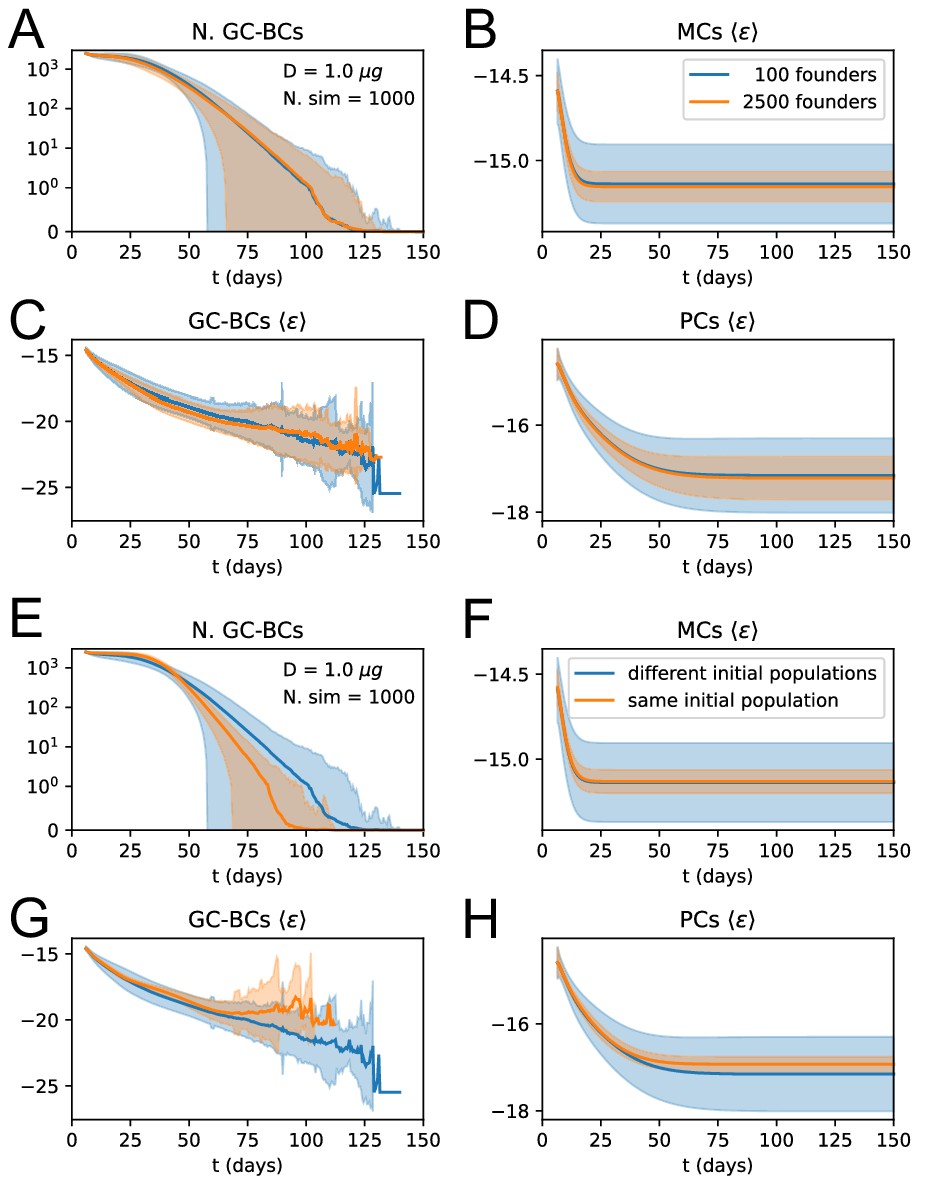
Influence of number and affinity of founder clones on evolution stochasticity.
(A to D) Effect of increasing the number of founder clones in the population. We compare 1000 stochastic simulations of the standard version of the model (blue) with a modified version in which every cell in the initial population (2500 cells total) originates from a different founder clone, and has therefore a different affinity (orange). Solid lines represent average trajectories and the shaded area covers one standard deviation from the mean. The plots represent the number of GC B-cell (A), their average binding energy (C), and the average binding energy of MC (B) and PC (D) population as a function of time from Ag injection. (E to H) Stochastic contribution of the initial founder clones population. We compare 1000 stochastic simulations of the standard version of the model (blue) with a modified version in which GCs are initialzied with the same 100 founder clones (orange). We observe that the initial choice of founder clones plays an important role in evolution and explains most of the variation observed in the outcome. Figures E to H display the same quantities as A to D.
Appendix 1—figure 4
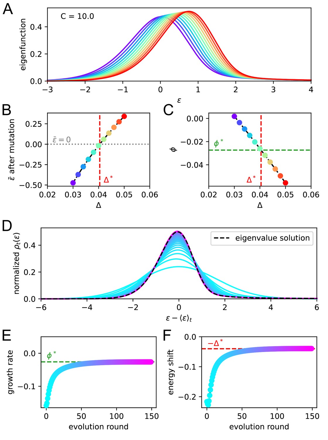
Asymptotic evolution matches the solution of the eigenvalue equation.
We check that upon repetition of the evolution operator the system converges at the eigenvalue equation solution. For a given constant Ag concentration ( in our case) we solve the eigenvalue equation for various values of the shift . In A we report the maximum eigenvalue eigenfunctions. By virtue of the Perron-Frobenius theorem these consist of only positive values. Color represent the value of the shift for the corresponding solution. In B and C, we plot the value of after mutation and of the growth rate for every solution. The consistency condition requires us to pick the eigenfunction for whom the value of after mutation is zero. This corresponds to the value represented in vertical red dashed line and the value of the growth rate in horizontal green dashed line. In panels D, E, F, we consider repeated application of the evolution operator to the binding energy distribution at constant Ag concentration . Color encodes the number of applications of this operator. In D and E, we report respectively the growth rate and shift of the mean per evolution turn, and in F the full distribution of binding energies, normalized to the population size. All the quantities converge to their theoretical expectation given by the chosen solution of the eigenvalue equation, reported as green and red dashed lines.
Appendix 1—figure 5
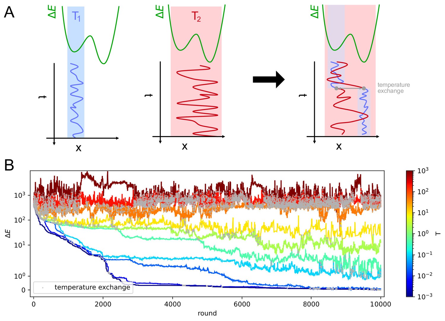
Parallel tempering helps exiting local minima in stochastic likelihood maximization.
A: intuitive representation of the advantage of Parallel Tempering. When a Monte Carlo simulation is run at low temperature () the system reaches a low-energy state but can get stuck in local energy minima. Conversely at high temperature () the system is free to explore a larger portion of the space, but is unable to localize the energy minimum. By allowing the states to exchange their temperature when favorable, the high temperature simulation can help the low temperature simulation exit from a local minimum trap and converge to the global energy minimum. B: Simulation trajectories in energy space as a function of the simulation round for inference on variant C of the model. The energy difference is defined as , where is the maximum likelihood recovered by the inference algorithm. Colors encode different temperatures according to the colorbar on the right. Grey dots mark points in which trajectories exchange temperatures. To display both large variations and values equal to zero the energy scale is logarithmic for values of and linear for energies .
Appendix 1—figure 6
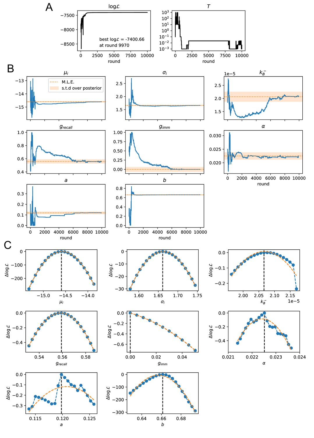
Convergence of the stochastic likelihood maximization procedure for variant C of the model (see main text).
In this variant 8 of the model parameters are inferred (, , , , , , , ). (A) Values of the log-likelihood and the temperature for the parameter set that reached peak likelihood. (B) Evolution of the parameter values during the maximization procedure for the same set (blue lines). Maximum likelihood (ML) estimates of the parameters are marked as orange dashed lines. Orange shaded area cover one standard deviation of the posterior distribution around the ML value, evaluated through a Gaussian approximation of the posterior distribution and the quadratic fit of the log-likelihood displayed in panel C. (C) Likelihood variation of the posterior distribution for a small (±5%) variation of single parameters around their ML values (vertical black dashed lines). The peaked shapes of confirm the convergence of the maximization procedure for all parameters. Orange dashed curves represent quadratic fit of , used to estimate the orange confidence interval in (B).
Appendix 1—figure 7
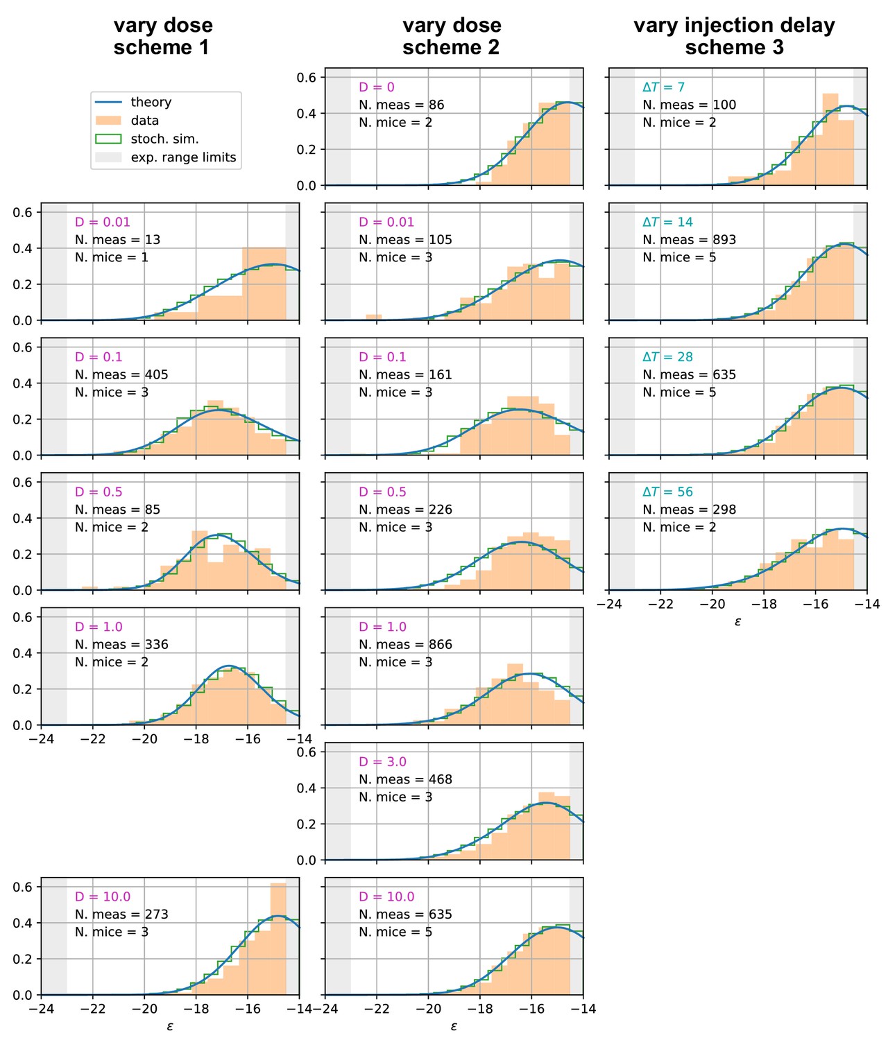
Affinity distributions, comparison between experiments and model prediction for all tested conditions.
Comparison between experimental measurements (orange histograms), stochastic model (green histograms), and theoretical solution (blue curve) for affinity distributions of antibody-secreting cells (Ab-SCs) under all the different immunization protocols (see main text for the description of the schemes). Experimental data (orange histograms) consists in measurements of affinities of IgG-secreting cells extracted from mice spleen. The number of mice and single-cell measurements is indicated for each histogram (black). The experimental sensitivity range (, or equivalently ) is delimited by the gray shaded area. Blue curves represent the expected binding energy distribution of the Ab-SCs population according to our theory under the same model conditions. For a good comparison all the distributions are normalized so that the area under the curve is unitary for the part inside the experimental sensitivity threshold. For every histogram, we indicate the value of the varied immunization scheme parameter, corresponding to dosage (pink) for the first two schemes and time delay (blue) for the third.
Appendix 1—figure 8
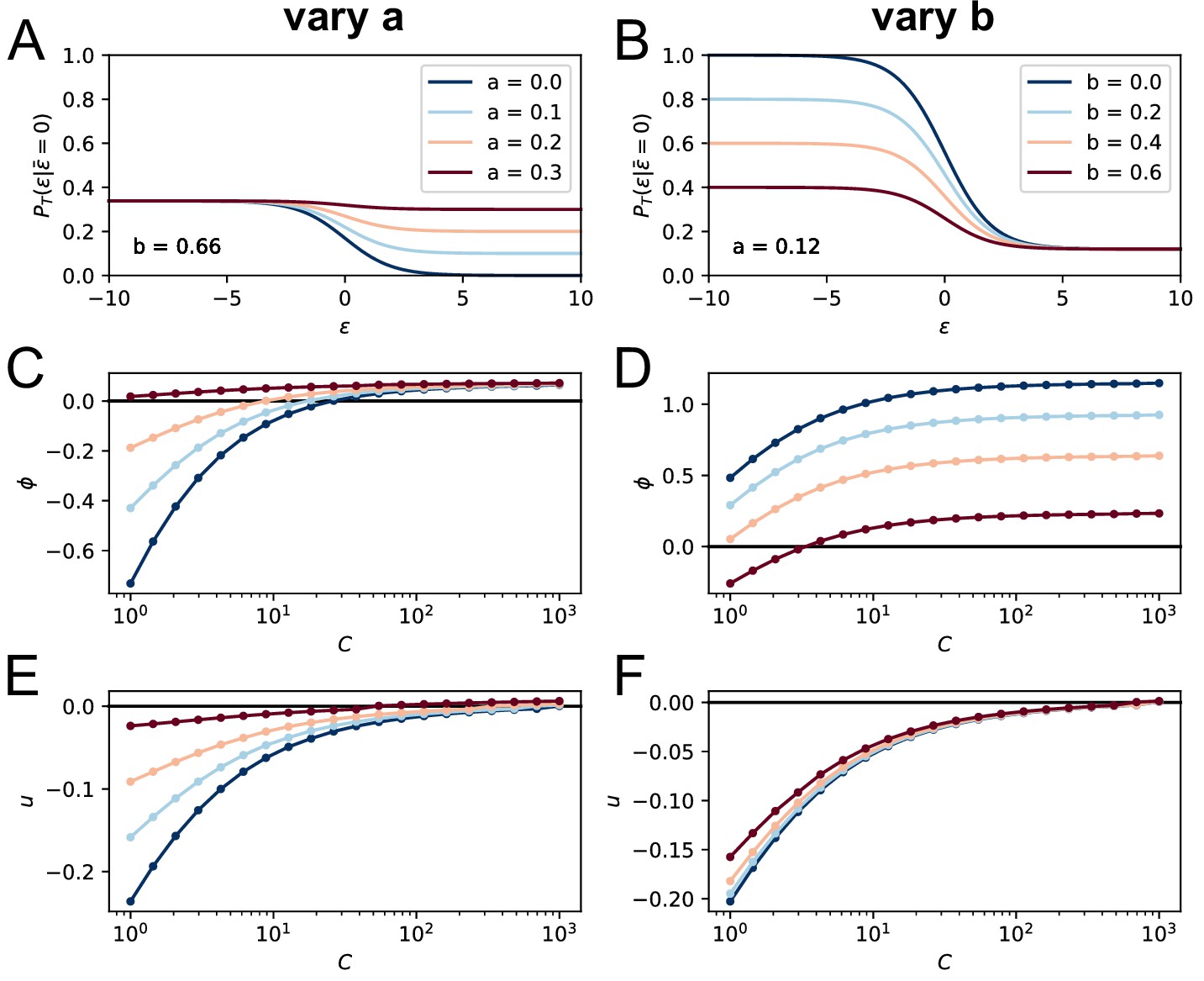
Effect of the terms , on the model asymptotic behavior.
On the top row we plot the corresponding T-cell selection survival probability (setting for simplicity and ) respectively in the case and varying from 0 to 0.3 (A) and , varying from 0 to 0.6 (B). Values of the parameters and are color-coded as showed in the legend. In C and E we show the effect of varying on the asymptotic growth rate and evolution speed (we set as before ). Notice how increasing both slows down evolution and increases the growth rate. In D and F, we report the same quantities for variation of the parameter (while ). Increasing decreases both the growth rate and the maturation speed.
Appendix 1—figure 9
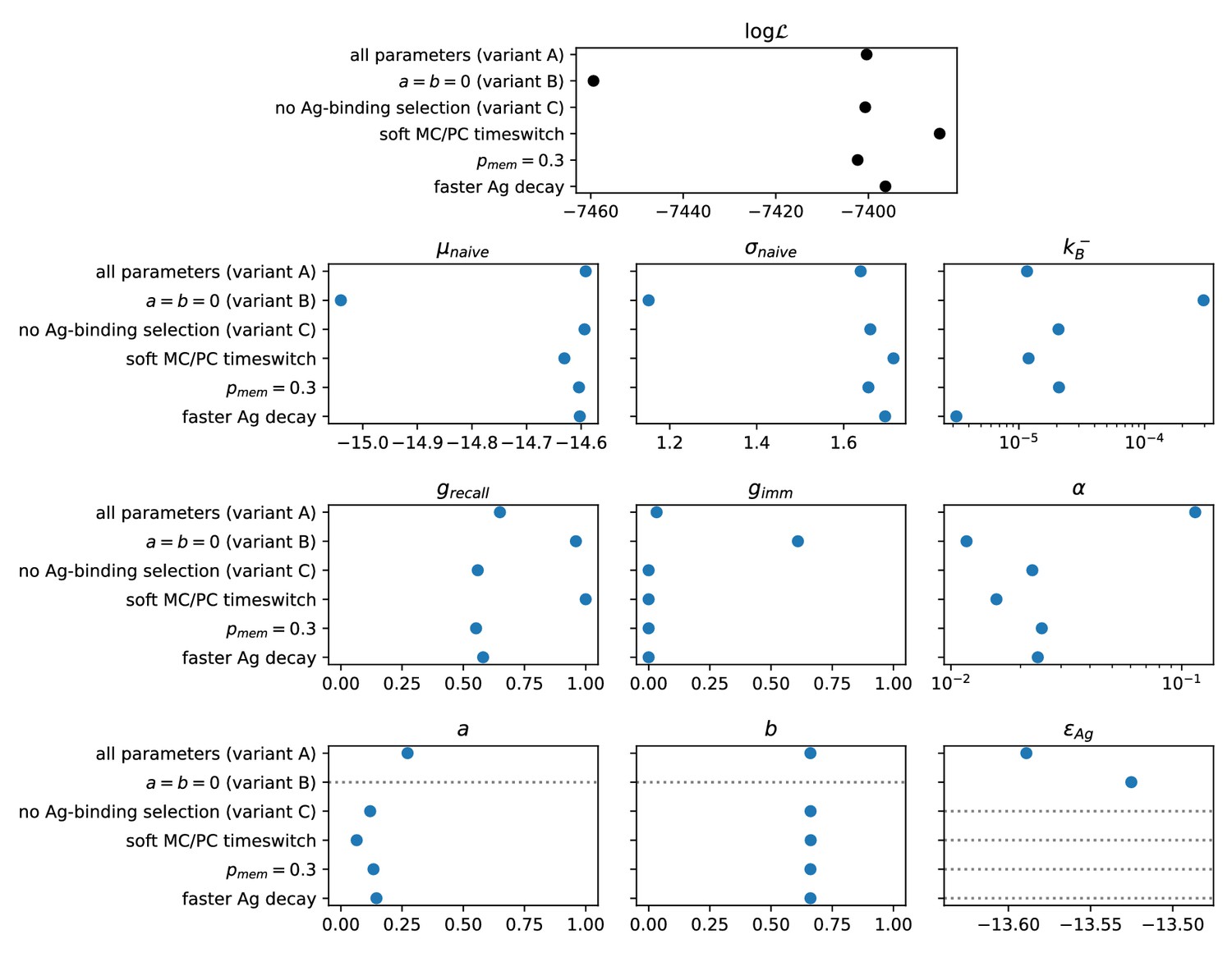
Result of the inference procedure on the five variations of the model and comparison with the standard version of the model.
The variations are described in appendix sect. 6 (Possible model variations). Top: final maximum value of the log-likelihood obtained with the inference procedure (black). Bottom: maximum-likelihood estimate of all of the inferred parameters (blue). Horizontal grey dashed lines mark parameters that are absent in the variant of the model considered.
Appendix 1—figure 10

Distribution of beneficial and deleterious mutations over 1000 stochastic germinal center simulations at injected Ag dosage .
Color represents the average number of cells that have developed the specified number of beneficial and deleterious mutations for any examined population, according to the color-scale on the right. Top: distribution of mutation numbers in the GC population taken at different times (respectively, 10, 30 or 50 days after Ag injection from left to right). Notice that not all of the populations have the same total size. Bottom: distribution of mutation numbers for the final MC and PC distributions. The average number of total mutations accumulated is 0.13 for MCs and 0.54 for PCs. This number has to be compared to the total number of residues considered ().
Appendix 1—figure 11

Generation of realistic datasets, matching the statistics of the experimental one, for inference procedure validation.
(A) Average binding energy of responders populations in the 10 artificially generated datasets (gray) for the 15 experimentally tested conditions, vs the same quantity as predicted by simulations of the deterministic model. The condition to which the measurement are referred is reported on the y-axis, in the form of the scheme used, the Ag dosage injected () and/or the time delay between injection (). (B) Distribution of generated binding energies in the 10 generated dataset (gray), compared to the distribution of binding energies predicted by the deterministic model (blue), for the condition corresponding to the injection of of Ag in scheme 2.
Tables
Table 1
List of parameters in the model and of their values.
Binding energies are expressed in units of , and times in days (d) or hours (h). The last nine parameters were inferred within selection variant (C), except , whose reported value refers to variant (A), which includes Ag-binding selection.
| Values of model parameters | |||
|---|---|---|---|
| Symbol | Value | Meaning | Source |
| 12 h | Duration of an evolution turn | Wang et al., 2015 | |
| 6 d | Time for GC formation after injection | De Silva and Klein, 2015; Jacob et al., 1993; McHeyzer-Williams et al., 1993 | |
| 2500 | GC max population size | Eisen, 2014; Tas et al., 2016 | |
| 2500 | Initial GC population size | Eisen, 2014; Tas et al., 2016 | |
| 100 | Number of GC founder clones | Tas et al., 2016; Mesin et al., 2016 | |
| 10% | Probability of differentiation | Wang et al., 2015; Meyer-Hermann et al., 2012; Oprea and Perelson, 1997 | |
| 11 d | Switch time in MC/PC differentiation | Weisel et al., 2016 | |
| 2 d | Switching timescale in MC/PC differentiation | Weisel et al., 2016 | |
| 14% | Prob. of mutation per division | Wang et al., 2015; McKean et al., 1984; Kleinstein et al., 2003 | |
| 50%, 30%, 20% | Probability of a mutation to be silent/lethal/affinity-affecting | Zhang and Shakhnovich, 2010; Wang et al., 2015; Wang, 2017 | |
| Equation 18 | Distribution of affinity-affecting mutations | Ovchinnikov et al., 2018 | |
| 0.98 /d | Ag release rate | MacLean et al., 2001 | |
| Ag decay rate | Tew and Mandel, 1979 | ||
| 0.12 | Baseline selection success probability | Max-likelihood fit | |
| 0.66 | Baseline selection failure probability | Max-likelihood fit | |
| -14.60 | Mean binding energy of seeder clones generated by naive precursors | Max-likelihood fit | |
| 1.66 | Standard deviation of the seeder clones binding energy distribution | Max-likelihood fit | |
| Ag consumption rate per B-cell | Max-likelihood fit | ||
| Concentration to dosage conversion factor | Max-likelihood fit | ||
| 0.56 | MC fraction in Ab-SC population for measurement 1 day after boost | Max-likelihood fit | |
| 0 | MC fraction in Ab-SC population for measurement 4 days after second injection | Max-likelihood fit | |
| -13.59 | Threshold Ag binding energy | Max-likelihood fit | |
Appendix 1—table 1
Average results of the inference procedure on the 10 artificially generated datasets.
For each model parameter, we report the value used to generate the data (left), and the mean (middle) and standard deviation (right) over the 10 inferred values.
| Parameter | Value used to generate data | Mean of inferred values | Std of inferred values |
|---|---|---|---|
| −14.59 | −14.76 | 0.22 | |
| 1.66 | 1.59 | 0.11 | |
| 2.07e-05 | 1.82e-05 | 0.71e-05 | |
| 0.56 | 0.55 | 0.11 | |
| 0 | 0.009 | 0.022 | |
| 0.023 | 0.032 | 0.019 | |
| 0.120 | 0.125 | 0.094 | |
| 0.661 | 0.659 | 0.008 |
Additional files
-
Source data 1
Single-cell affinity measurement sheet.
- https://cdn.elifesciences.org/articles/55678/elife-55678-data1-v2.xlsx
-
Transparent reporting form
- https://cdn.elifesciences.org/articles/55678/elife-55678-transrepform-v2.pdf
Download links
A two-part list of links to download the article, or parts of the article, in various formats.
Downloads (link to download the article as PDF)
Open citations (links to open the citations from this article in various online reference manager services)
Cite this article (links to download the citations from this article in formats compatible with various reference manager tools)
Quantitative modeling of the effect of antigen dosage on B-cell affinity distributions in maturating germinal centers
eLife 9:e55678.
https://doi.org/10.7554/eLife.55678


