Effective dynamics of nucleosome configurations at the yeast PHO5 promoter
- Department of Physics, Technical University of Munich, Germany
- Molecular Biology Division, Biomedical Center, Faculty of Medicine, Ludwig-Maximilians-Universität München, Germany
Figures
Figure 1
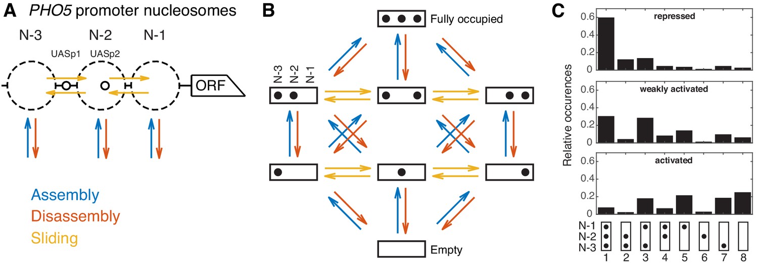
Modeling approach and promoter configuration occurrences.
(A) Simplified nucleosome dynamics at the PHO5 promoter including assembly, disassembly and sliding from a site-centric point of view. Dashed circles indicate possible nucleosome positions. Pho4-binding sites (UASp elements) are represented by small circles. (B) Configuration-specific modeling approach with eight promoter configurations and 32 reactions. Arrow color code as in panel A. (C) Measured relative occurrences of the eight promoter configurations indicated at the bottom as in panel B but rotated by 90° and for three different ‘promoter states’: the repressed wild-type, a weakly activated mutant (pho4[85-99] pho80tata) and the activated mutant (pho80), using data from Brown et al., 2013.
-
Figure 1—source data 1
Occurrences of promoter configurations measured by Brown et al., 2013.
- https://cdn.elifesciences.org/articles/58394/elife-58394-fig1-data1-v2.xlsx
Figure 2 with 8 supplements
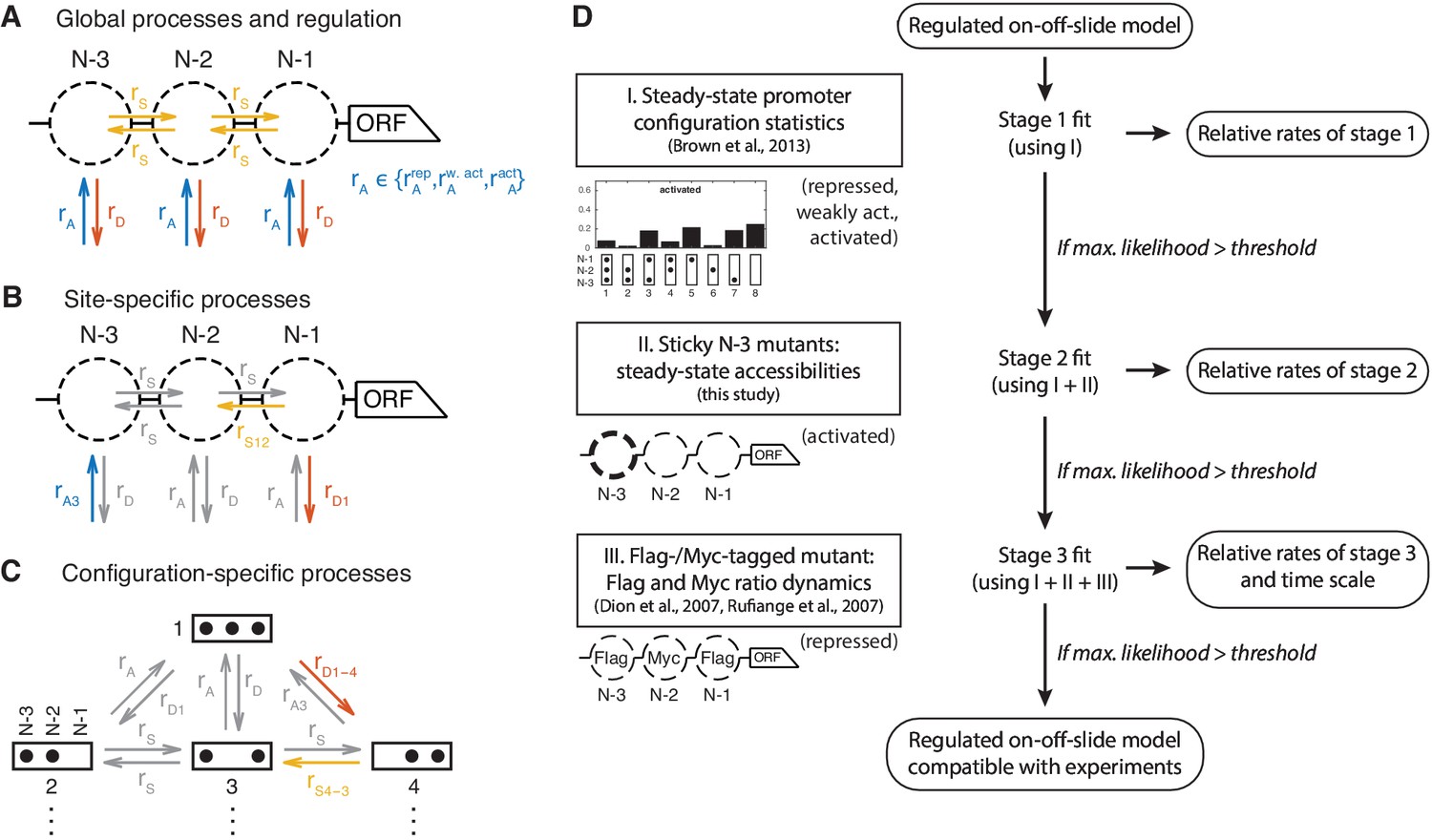
Definition and evaluation workflow of regulated on-off-slide models.
On-off-slide models consist of processes from different hierarchies: (A) Global processes for assembly, disassembly and (optional) sliding. Global processes govern all reactions of the corresponding type with the same rate , or . To fit multiple promoter states simultaneously, some processes have to be regulated, that is, have different rate values depending on the promoter state. In this example, the global assembly process is regulated. (B) Optional site-specific processes for assembly and disassembly at each position (example here with rates and ) and for sliding between each neighboring pair of positions (here ). Reactions in gray have not been overruled by more specific processes (here: site-specific processes) and consequently are still determined by the rate parameters of processes on the less specific hierarchy level (here: global processes). (C) The last hierarchy level is given by optional configuration-specific processes governing only one reaction (here with rates and ). Here, only the promoter configurations 1 to 4 are shown. (D) Each regulated on-off-slide model is fitted and evaluated successively using the experimental data on the left-hand side (promoter states during the experiment given in parentheses). Models are discarded if they do not match the maximum likelihood threshold after each stage. With each additional experimental data set, the fit results in new optimal relative rate values of the model. Only the dynamic Flag-/Myc-tagged histone measurements enable us to also fit the time scale.
Figure 2—figure supplement 1
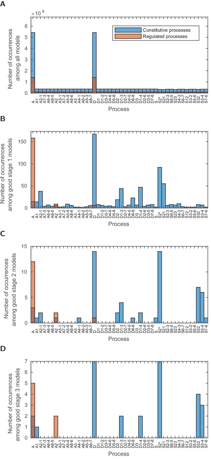
Occurrences of the different processes in the models with satisfactory likelihood at the different stages.
(A) In all 68,145 analyzed models, (B) in all 173 good models of stage 1, (C) in all 15 good models of stage 2, (D) in all seven satisfactory models after stage 3. In each plot, the y-axis limit is the number of the considered models allowing the comparison of the relative occurrences between the four cases.
Figure 2—figure supplement 2
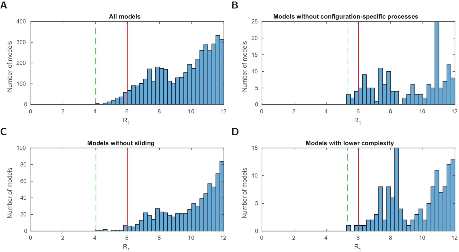
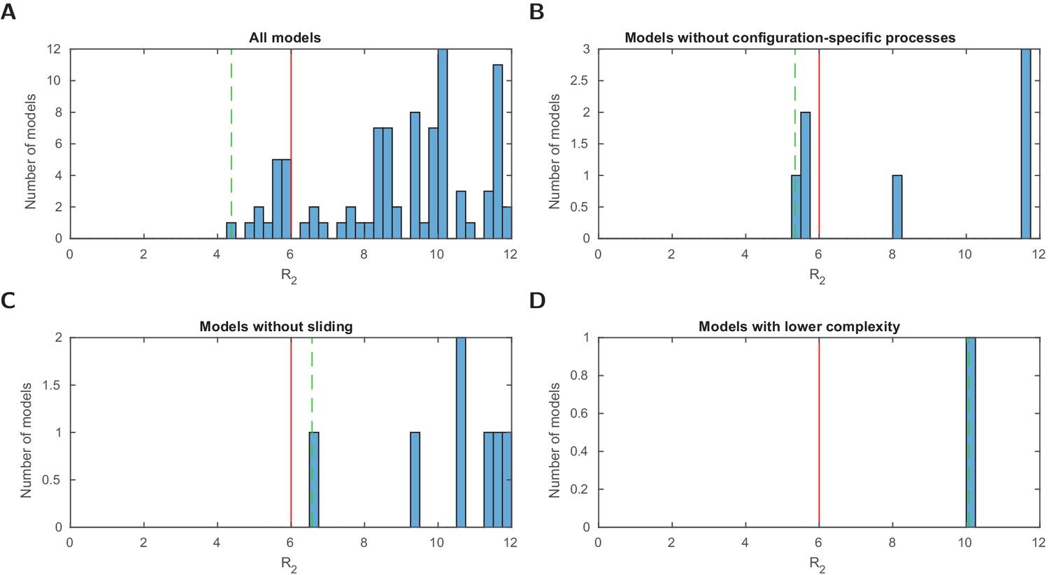
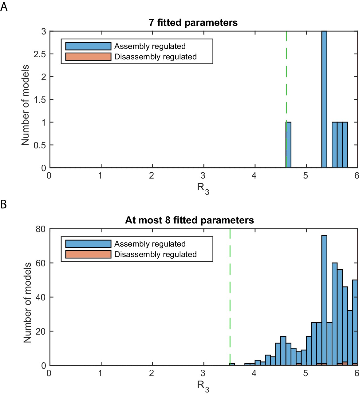
Stage 1: logarithmic likelihood ratio histograms.
Histograms of the logarithmic likelihood ratio with respect to the perfect fit likelihood in stage 1 (), that is, using the configurational data of Brown et al., 2013 only. (A-D) For all models and three model subsets. 0 on the x-axis corresponds to a perfect fit. Dashed green line: value of the best model (within the subset). Red line: threshold for a satisfactory fit of . Sliding processes are not needed to find agreement with the measured configuration statistics alone. Two models with lower complexity, that is, with one fitted parameter less, are below the threshold .
Figure 2—figure supplement 3
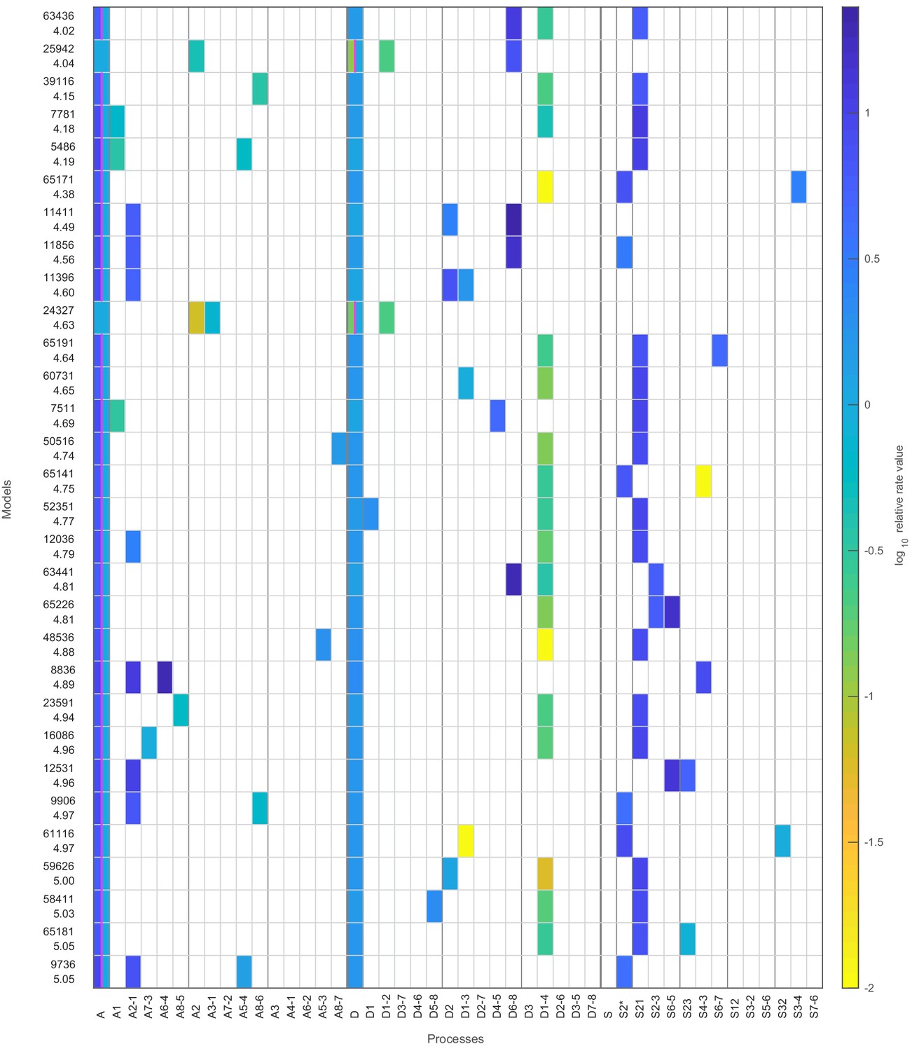
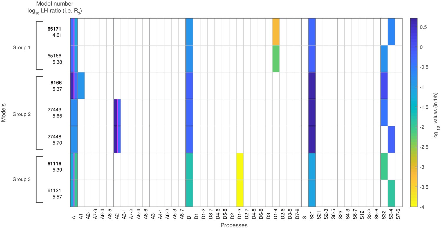
Stage 1: top 30 models with likelihood above the threshold.
The top 30 models with likelihood above the threshold after the first stage. The colored boxes in each row show the model processes and their rate values. White boxes denote the absence of a process in a model. Regulated processes are separated into two differently colored boxes for repressed (left half) and activated (right half) promoter state. Weakly activated rate values are not shown here. On the left side are the model number and the log10 ratio of the best possible likelihood and the model likelihood, .
Figure 2—figure supplement 4
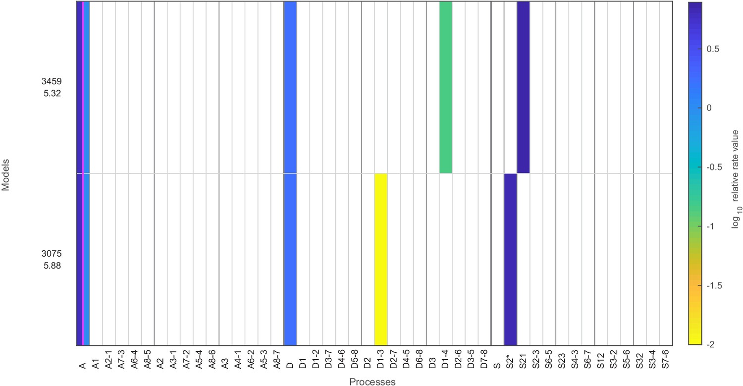
Stage 1: models with likelihood above the threshold and only six fitted parameters.
Same as in Figure 2—figure supplement 3, but showing satisfactory stage 1 regulated on-off-slide models with complexity reduced by one, that is, models with up to only six fitted parameters.
Figure 2—figure supplement 5
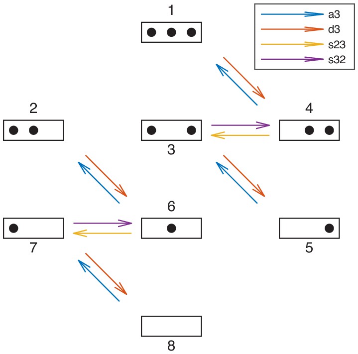
Reactions involving the sticky N-3 position.
Reactions involving the N-3 position. 'a3’, 'd3’, 's23’, and 's32’ denote sets of reactions. For each model the reaction rates are governed by the model’s processes as in stage 1. Simultaneously, to test models for the agreement with the sticky N-3 mutation experiments, the model’s reaction rates of assembly at N-3 (a3), disassembly at N-3 (d3), sliding from N-2 to N-3 (s23) and sliding from N-3 to N-2 (s32), each obtain a prefactor whose values are found by maximizing the combined likelihood of the configurational data and the sticky N-3 mutant accessibility fold-changes (see Materials and methods).
Figure 2—figure supplement 6
Stage 2: logarithmic likelihood ratio histograms.
Histograms of the logarithmic likelihood ratio with respect to the perfect fit likelihood in stage 2, , that is, using the configurational data of Brown et al., 2013 and the sticky N-3 accessibility data (Table 1). (A-D) For all models and three model subsets. 0 on the x-axis corresponds to a perfect fit. Dashed green line: value of the best model (within the subset). Red line: threshold for a ‘good’ fit of .
Figure 2—figure supplement 7
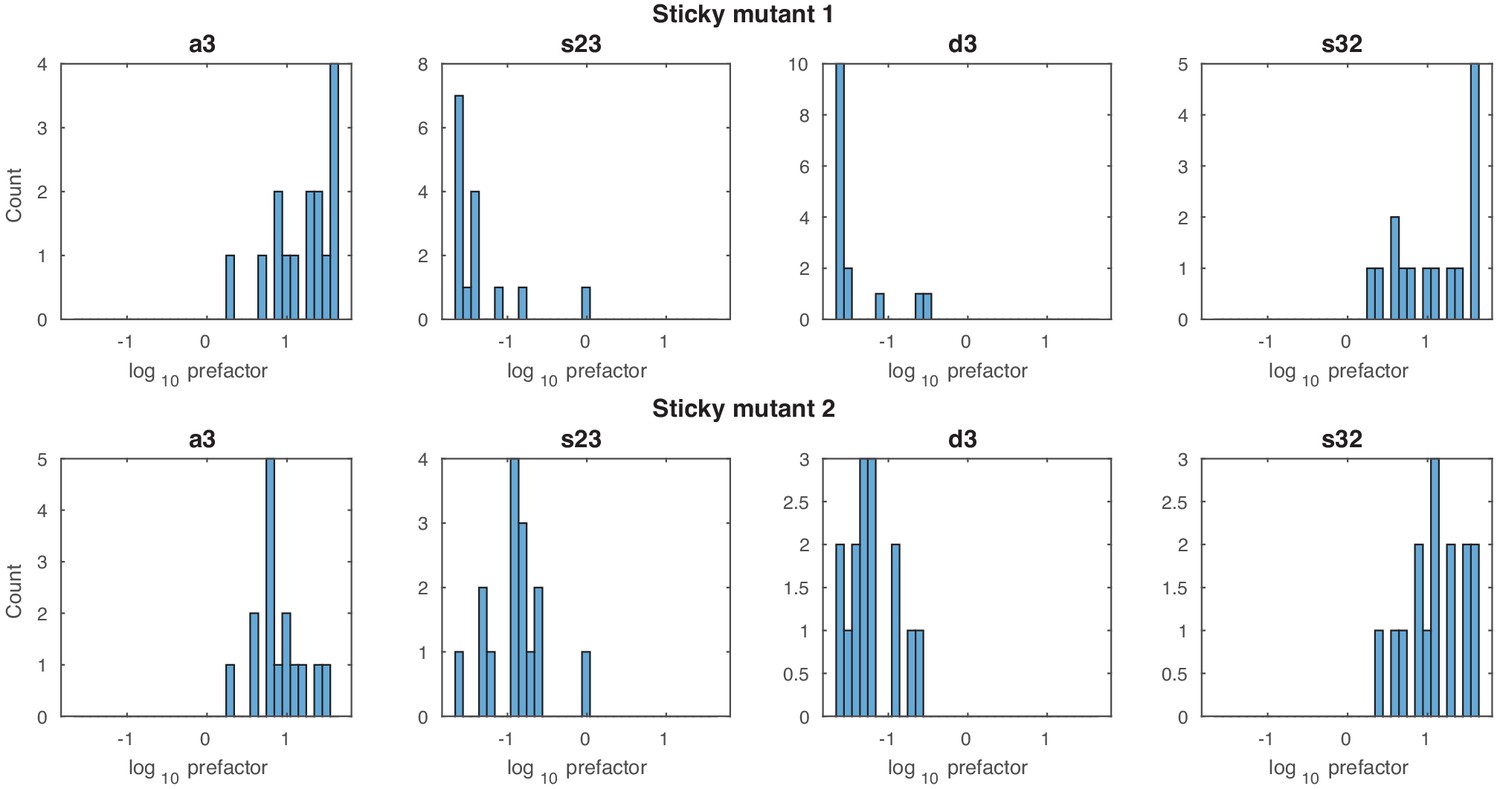
Stage 2: prefactor histograms.
Histograms of the four prefactor values for the reaction sets a3, s23, d3 and s32 for both sticky mutants and all 15 models with maximum likelihood above the threshold in stage 2.
Figure 2—figure supplement 8
Stage 2: models with likelihood above the threshold.
Same as in Figure 2—figure supplement 4, but showing the regulated on-off-slide models with likelihood above the threshold with up to seven parameters after stage 2, with the stage 2 log10 likelihood ratios, , written below the model numbers.
Figure 3 with 3 supplements

Best regulated on-off-slide model compatible with all the experimental data sets in stage 3.
All fits were done simultaneously (see Materials and methods). (A) Regulated on-off-slide model with the regulated process A (global assembly, thick arrows) and the constitutive processes D (global disassembly), D1-4 (disassembly from configuration 1 to 4, overrules D), S2* (sliding away from N-2) and S3-4 (sliding from configuration 3 to 4). (B, C, D) Combined fits to the steady-state promoter nucleosome configuration occurrences in repressed, weakly activated, and activated state. Only a change in the rate of the regulated global assembly process accounts for differences in the three distributions. The other processes (D, D1-4, S2*, and S3-4) are constitutive and their rates do not change. The model fits in stage 1 (ignoring all other data) and stage 2 (ignoring Flag-/Myc-tagged histone exchange data) are only slightly better (data not shown). (E) Fit to the sticky N-3 RE accessibility data of two mutants in the activated state (error bars with standard deviation of rescaled RE accessibility). Only reaction rates involving the N-3 were allowed to divert from the previously fitted parameter values. (F) Fit to the Rufiange et al., 2007 data of Flag amounts at N-1 over N-2 after 2 h of Flag expression (shifted by 0.25 h lag time determined in Dion et al., 2007). The error bar corresponds to the standard deviation of two measurements. (G) Fit to the Dion et al., 2007 data of Flag over Myc amounts at N-1 at four time points after Flag expression (shifted by 0.25 h lag time). y-axis points are normalized by their mean to account for a sloppy fitted parameter in the treatment of the data in Dion et al., 2007. Error bars are estimated experimental standard deviations used in the fit.
Figure 3—figure supplement 1
Stage 3: Flag amount ratios of tested models.
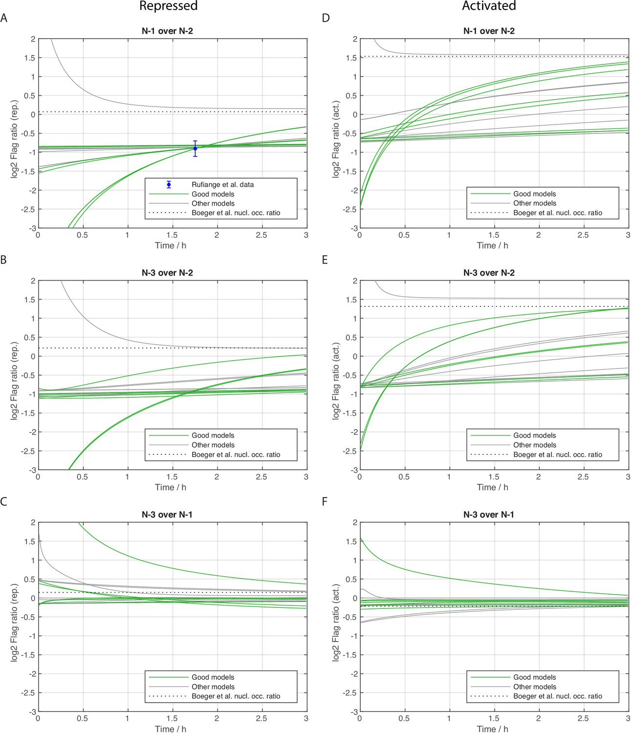
Dynamics of Flag amount ratios after Flag expression (shifted by 0.25 h lag time) of different sites for repressed (left column) and activated state (right column), calculated for all models with satisfactory likelihood after stage 2. Green lines represent the satisfactory models of stage 3. The dashed lines show the steady state ratio that eventually all models should reach closely. (A) Ratio of N-1 over N-2 in repressed state with available experimental data. The three groups of green lines match the three model groups of the main text and Figure 4: almost constant lines (group 3), slightly rising lines (group 1), and quickly rising lines (group 2). (B) As panel A but for the ratio of N-3 over N-2 and without experimental data. (C) As panel B, but N-3 over N-1. (D, E, F) All three ratios now for the activated promoter state.
Figure 3—figure supplement 2
Stage 3: Flag over Myc amount ratios of tested models.
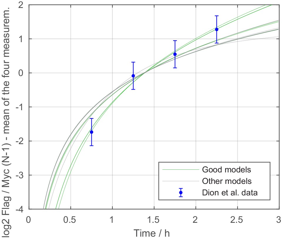
Dynamics of the normalized Flag over Myc amount ratio (shifted by 0.25 h lag time) at N-1 position, calculated for all models with satisfactory likelihood after stage 2. Green lines represent the satisfactory models of stage 3.
Figure 3—figure supplement 3
Stage 3: logarithmic likelihood ratio histograms.
Histograms of the logarithmic likelihood ratio with respect to the perfect fit likelihood in stage 3, . 0 on the x-axis corresponds to a perfect fit. (A) The seven satisfactory models with , all of them with one regulated assembly process. Dashed green line: value of the best model. (B) Final results for the same analysis initially also including all models with one additional fitted parameter, a total of 837,435 models, to check for the occurrence of differently regulated models. Of the now 508 satisfactory models, 501 also have a regulated assembly process and only 7 a regulated disassembly process.
Figure 4 with 1 supplement
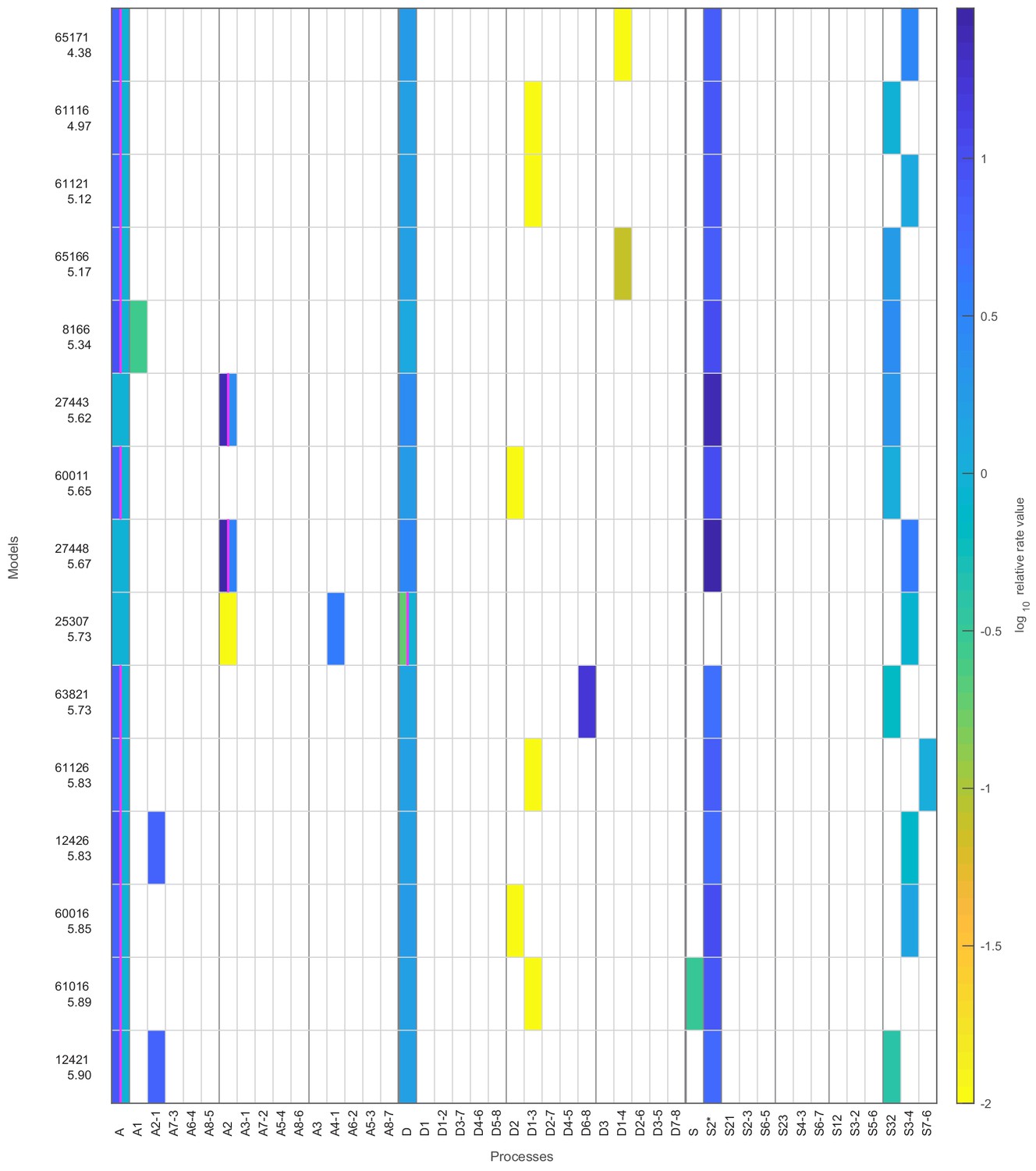
The seven models that agree with all four data sets after stage 3.
The colored boxes in each row show the model processes and their rate values. White boxes denote the absence of a process in a model. Regulated processes are separated into two differently colored boxes for repressed (left half) and activated (right half) promoter state. Weakly activated rate values are not shown here. On the left side are the model number and the log10 ratio of the best possible likelihood and the model likelihood, . The models are grouped with respect to similarities in the site-centric net fluxes (Figure 5—figure supplement 5). The groups’ representatives are printed in bold with net fluxes compared in Figure 5.
-
Figure 4—source data 1
Fitted parameter values of constitutive processes and time scale with error estimates.
- https://cdn.elifesciences.org/articles/58394/elife-58394-fig4-data1-v2.xlsx
-
Figure 4—source data 2
Fitted parameter values of regulated processes with error estimates.
- https://cdn.elifesciences.org/articles/58394/elife-58394-fig4-data2-v2.xlsx
Figure 4—figure supplement 1
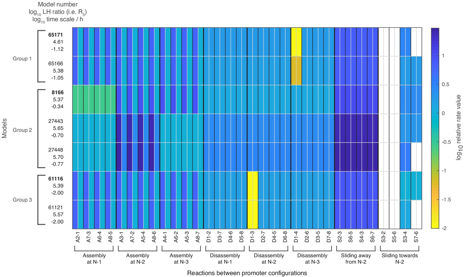
Relative rate values for all 32 reactions of the seven satisfactory models.
Rate values for each of the 32 reactions when using the processes and their rate values of each model as shown in Figure 4. The colored boxes show the relative rate values with respect to the global assembly process rate in activated state. White fields correspond to a reaction rate of zero. For a given reaction, the left half shows the repressed value, the right half the activated value. Weakly activated rate values are not shown. The left column shows for each model: the model number, the log10 likelihood ratio and the log10 time scale parameter value.
Figure 5 with 7 supplements
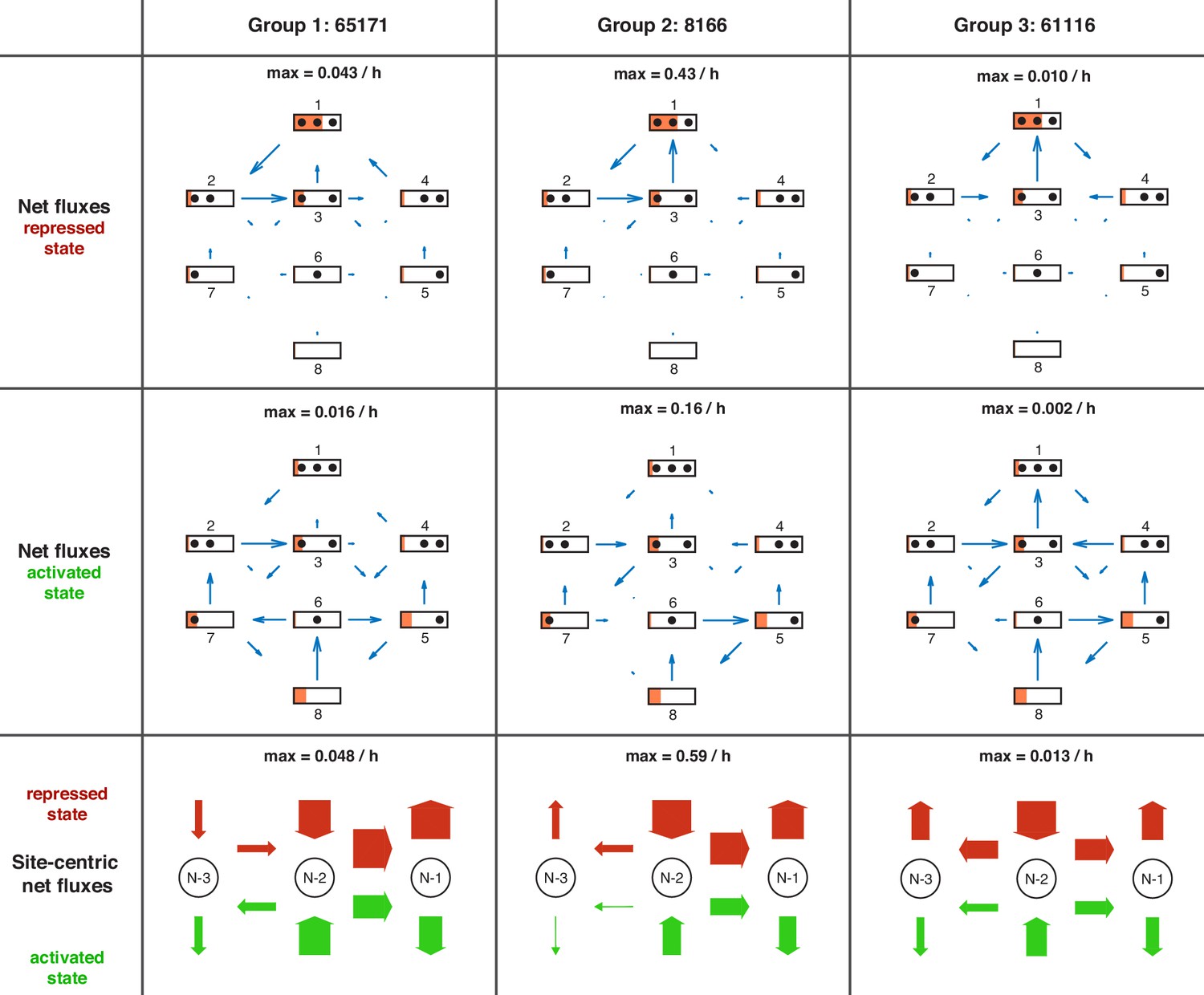
Overview of net fluxes and site-centric net fluxes for the three group representatives.
First two rows: net fluxes in repressed and activated promoter state (arrows) with configuration probabilities as orange horizontal bars (a filled promoter rectangle corresponds to probability 1). Arrow length indicates the relative flux amount within a flux network with the maximum stated above. Third row: site-centric net fluxes in repressed (red) and activated (green) state, obtained by summing all assembly/disassembly net fluxes at each site and sliding net fluxes between N-1 and N-2 as well as N-2 and N-3. Here, the arrow thickness indicates the amount of flux with the maximum stated above.
Figure 5—figure supplement 1
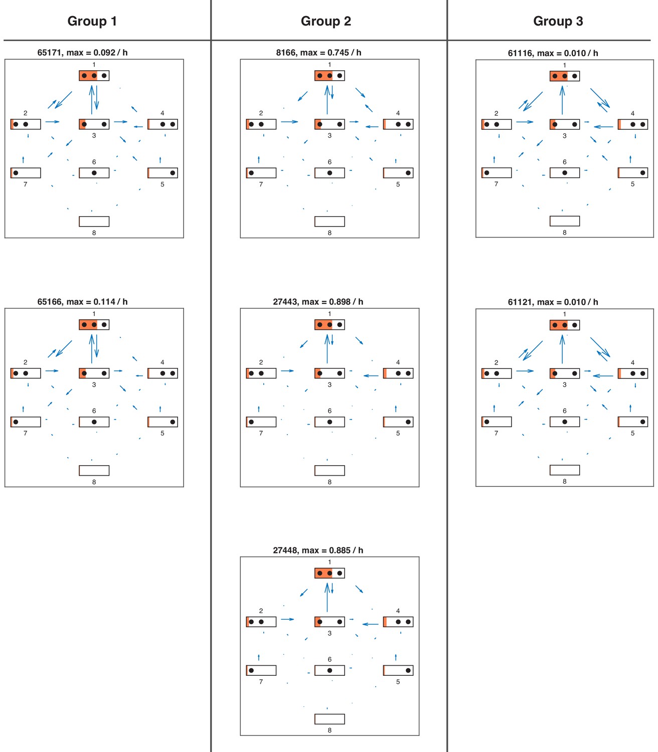
Directional fluxes in repressed promoter state of all satisfactory models.
Directional fluxes in repressed promoter state for each satisfactory model in stage 3. The length of the flux arrows indicates the amount of net flux with respect to the maximum value for each model stated above. The orange filling of each state symbol shows the steady state probabilities. The models are grouped with respect to similarities in the site-centric net fluxes (Figure 5—figure supplement 5).
Figure 5—figure supplement 2
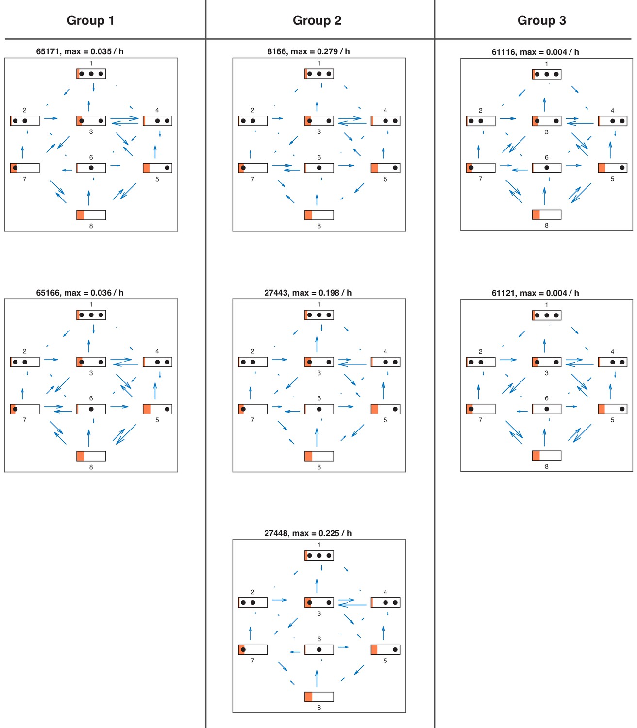
Directional fluxes in activated promoter state of all satisfactory models.
Directional fluxes in activated promoter state for each satisfactory model in stage 3.
Figure 5—figure supplement 3
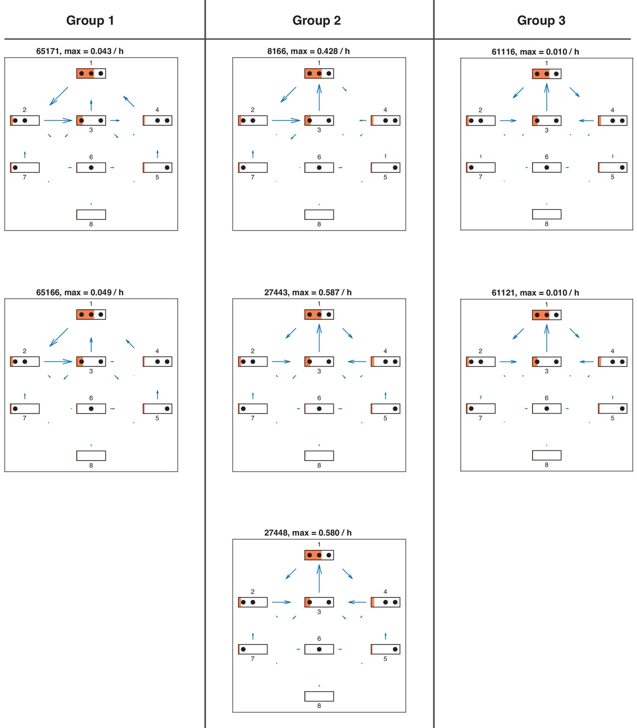
Net fluxes in repressed promoter state of all satisfactory models.
Net fluxes in repressed promoter state for each satisfactory model in stage 3. The length of the flux arrows indicates the amount of net flux with respect to the maximum value for each model stated above. The orange filling of each state symbol shows the steady state probabilities. The models are grouped with respect to similarities in the site-centric net fluxes (Figure 5—figure supplement 5).
Figure 5—figure supplement 4
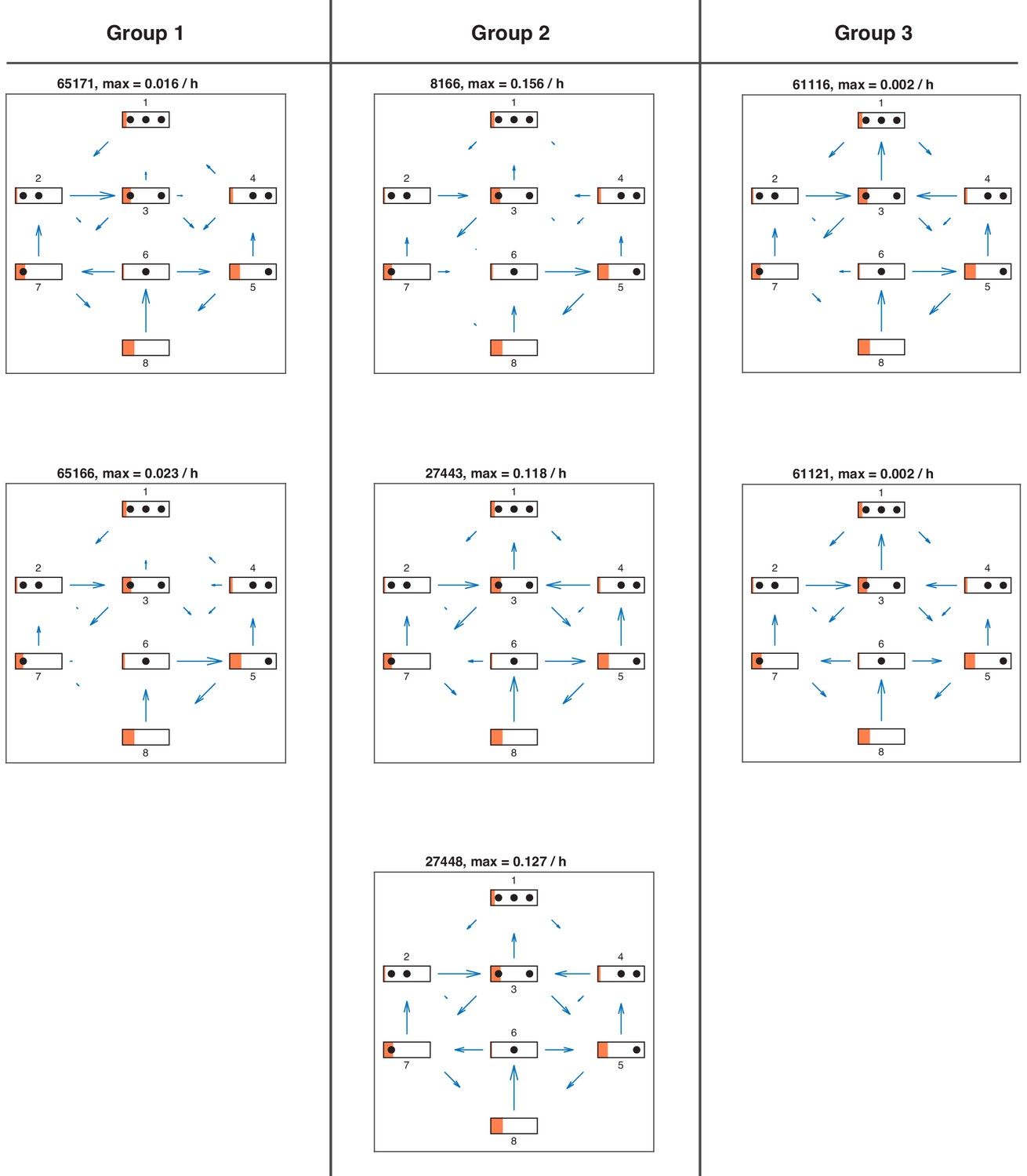
Net fluxes in activated promoter state for each satisfactory model in stage 3.
Figure 5—figure supplement 5
Site-centric net fluxes of all satisfactory models.
Site-centric net fluxes in active (green) and repressed (red) promoter state for each satisfactory model in stage 3. Obtained by summing all assembly/disassembly net fluxes at each site and sliding net fluxes between N-1 and N-2 as well as N-2 and N-3. The arrow thickness indicates the amount of flux with the maximum value stated above. The models are grouped with respect to similarities in the site-centric net fluxes (also see main text).
Figure 5—figure supplement 6
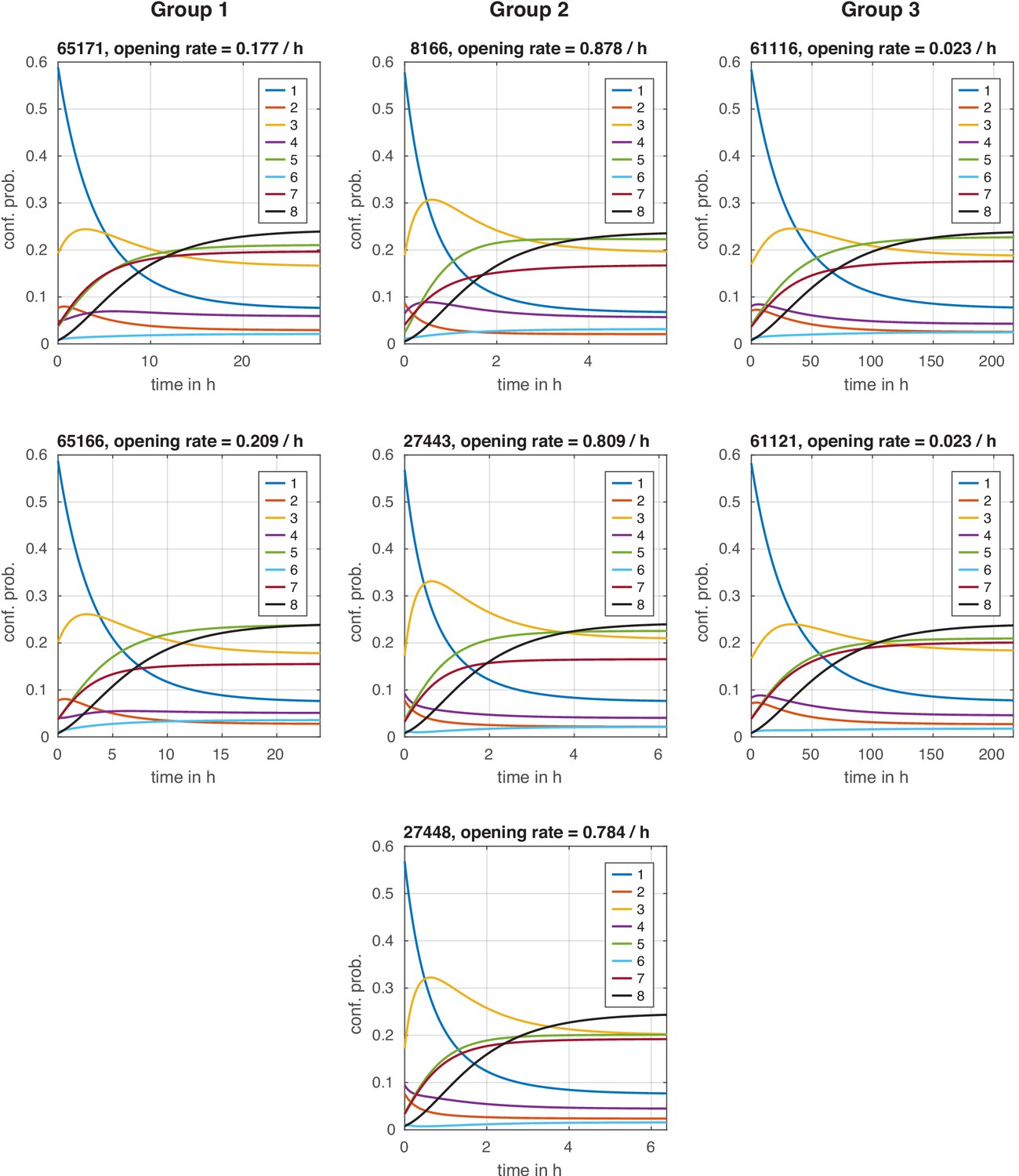
Configuration distribution dynamics during chromatin opening with instantaneous signal.
Configuration distribution dynamics during chromatin opening with instantaneous signal. For each model, the distribution starts in the repressed steady state and is then evolved with the transition rate matrix of the activated state, simulating an instantaneous regulation. The effective chromatin opening rate is the slowest negative eigenvalue of this transition rate matrix (see Materials and methods).
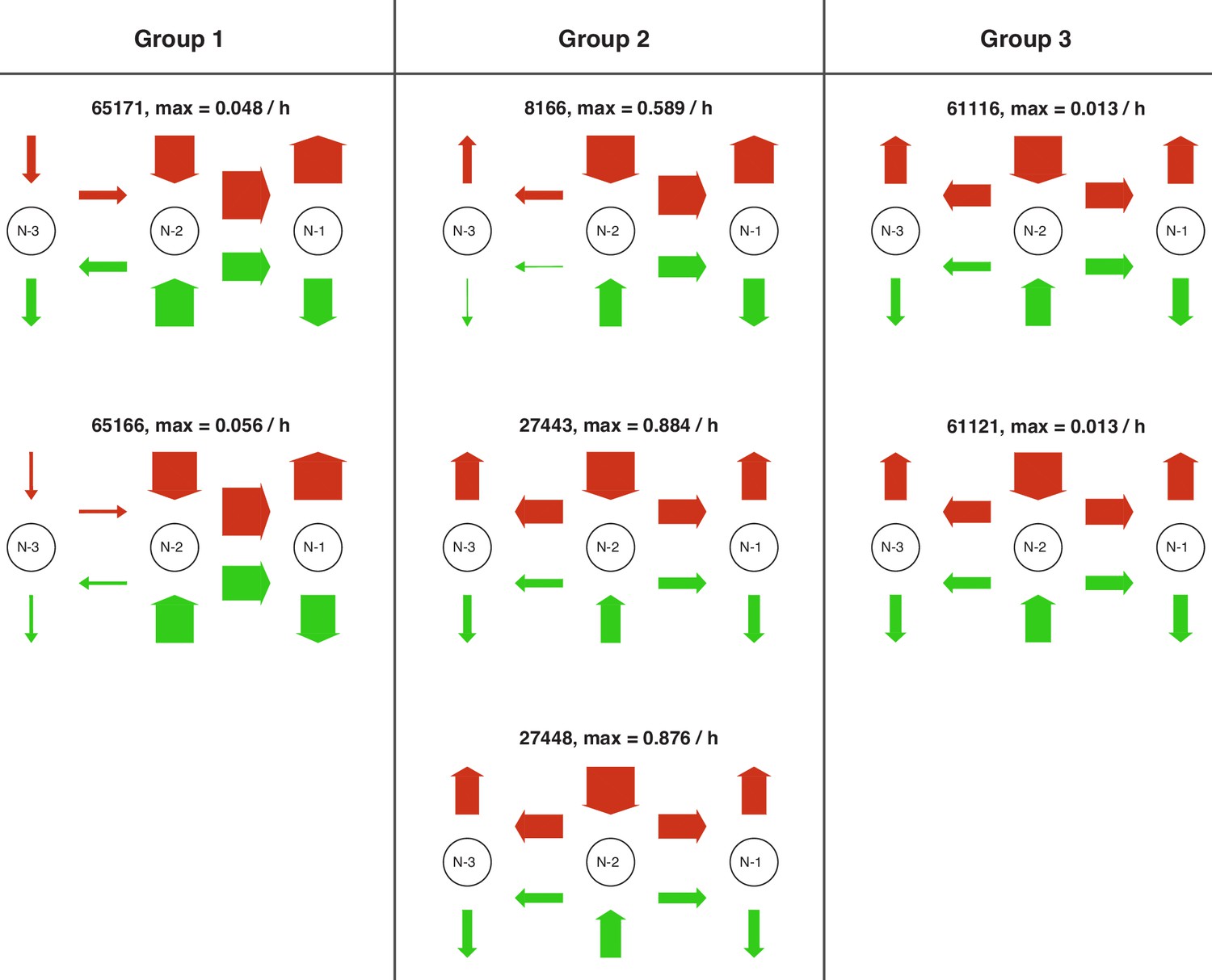
Figure 5—figure supplement 7
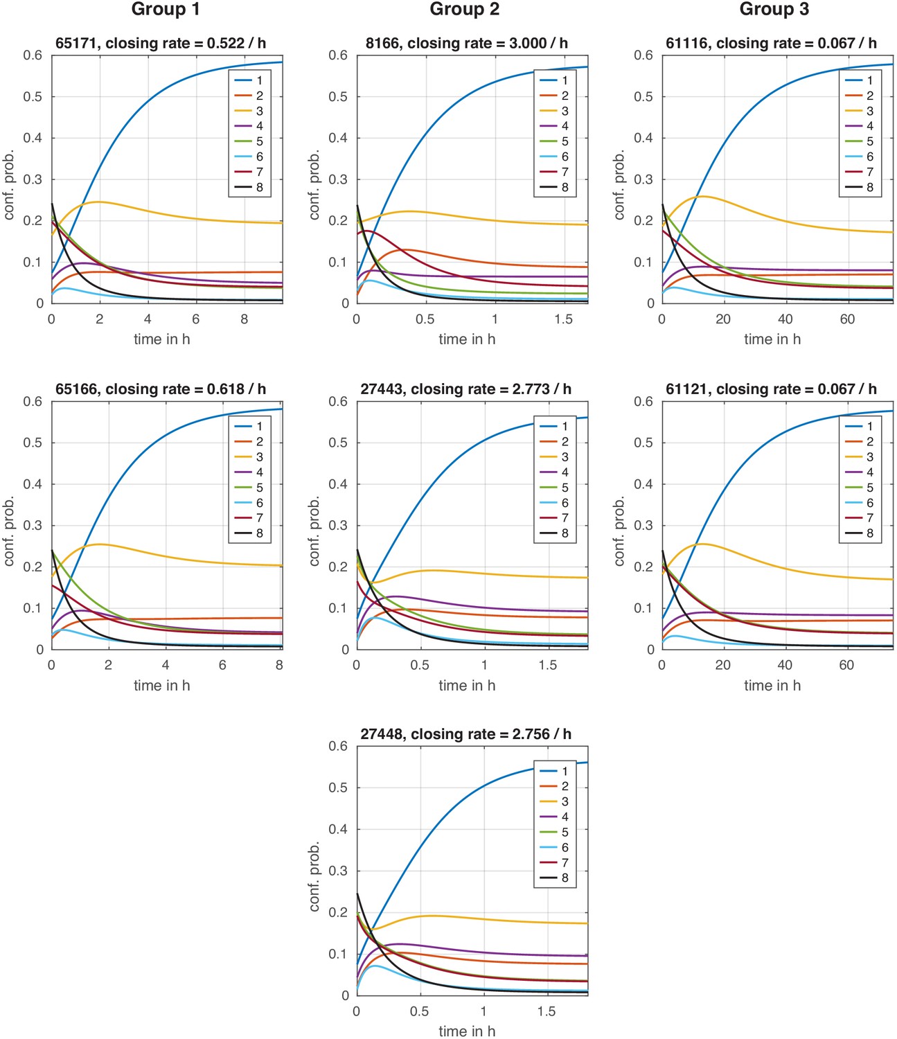
Configuration distribution dynamics during chromatin closing with instantaneous signal.
Configuration distribution dynamics during chromatin closing with instantaneous signal. For each model, the distribution starts in the activated steady state and is then evolved with the transition rate matrix of the repressed state, simulating an instantaneous regulation. The effective chromatin closing rate is the slowest negative eigenvalue of this transition rate matrix (see Materials and methods).
Tables
Table 1
Restriction enzyme (RE) accessibility of N-2 and N-3 sites in phosphate starved cells measured in this study and corresponding accessibility values of Brown et al., 2013 (RE accessibility with mean ± standard deviation of two independent biological replicates and the fold-change standard deviation calculated using standard error propagation).
The sticky N-3 mutants feature manipulated DNA sequences at the N-3 site, which decrease the RE accessibility at the N-3 site compared to the wild-type. In our study, this sticky N-3 also decreases the accessibility of the N-2 site. In stage 2, we tested which regulated on-off-slide models with compatible configuration distribution in stage 1 can at the same time reproduce the accessibility fold-changes at sites N-2 and N-3 for both sticky N-3 mutants.
| Wild type | Sticky N-3 mutant 1 | Sticky N-3 mutant 2 | |||
|---|---|---|---|---|---|
| accessibility | accessibility | wt fold-change | accessibility | wt fold-change | |
| N-2 RE (ClaI) | |||||
| N-2 Brown et al. | 82% | ||||
| N-3 RE (HhaI) | |||||
| N-3 Brown et al. | 55% | ||||
-
Table 1—source data 1
RE accessibility of independent biological replicates in phosphate starved cells.
- https://cdn.elifesciences.org/articles/58394/elife-58394-table1-data1-v2.xlsx
Additional files
Download links
A two-part list of links to download the article, or parts of the article, in various formats.
Downloads (link to download the article as PDF)
Open citations (links to open the citations from this article in various online reference manager services)
Cite this article (links to download the citations from this article in formats compatible with various reference manager tools)
Effective dynamics of nucleosome configurations at the yeast PHO5 promoter
eLife 10:e58394.
https://doi.org/10.7554/eLife.58394


