An integrative model of cardiometabolic traits identifies two types of metabolic syndrome
Figures
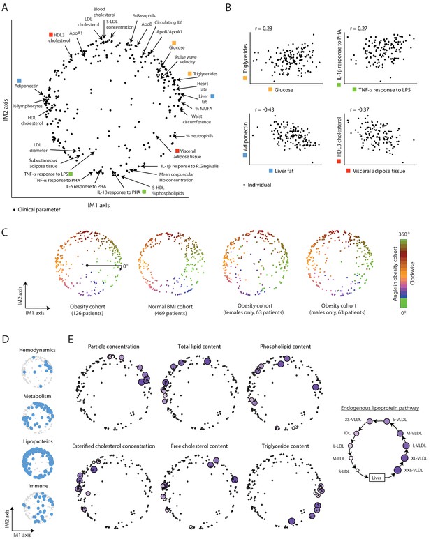
A continuous map of clinical and physiological parameters in healthy humans.
(A) The map of parameters: a map of similarities among clinical and physiological parameters. A principle component analysis (PCA) plot based on dimension reduction in which each clinical and physiological parameter is a dot embedded in a space of two principle components. The principle components are referred to as the IM1 and IM2 axes. Selected pairs of parameters (color coded) are detailed in B. Data are from individuals in the obesity cohort. (B) The organization of the map: representative examples. Presented are measured levels of four pairs of clinical parameters (color coded as in A). Each individual is represented by a dot. The plots represent the positive correlation between proximal parameters on the map (top) and negative correlation between parameters in opposite sides of the map (bottom). (C) Robustness of the parameter map in different healthy subpopulations. Shown are four maps that were constructed independently using the obesity cohort, normal BMI cohort, only females in the obesity cohort, and only males in the obesity cohort (ordered from left to right). All four panels have the same color coding based on the angle of the parameter in the map of the obesity cohort (clockwise color coding starting from right). (D) Distribution of biological categories in the map. Shown are the positions of immune, metabolic, hemodynamic, and lipoprotein parameters in the map. (E) Lipoprotein data supports the continuous nature of the map. Right: illustration of the known endogenous lipoprotein pathway. The data from the obesity cohort consist of several different measures within each of the 10 lipoprotein subfractions. Left: Each subpanel shows the map from A with highlighting the 10 parameters corresponding to one measure that was evaluated in each of the 10 lipoprotein subfractions (colored by subfractions, as illustrated on the left). Five of the six measures show gradual anticlockwise changes in positions that are in agreement with the known process of maturation along the endogenous pathway.
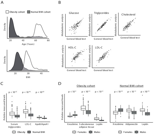
Validity of clinical parameters.
(A) Characteristics of the obesity and normal BMI cohorts. Distributions of age (top) and BMI (bottom) in the obesity cohort (white) and normal BMI cohort (gray). (B) Scatter plot comparing, for each individual in the obesity cohort (a dot), the measurements in a general blood test (x axis) to the measurements of the same clinical parameters in metabolomic profiling (y axis). Scatter plots are shown for all five parameters that were measured in both tests. (C and D) Associations with obesity (C) and gender (D). In C, shown are the distributions of (relative) measured levels in the obesity cohort (white) and the normal BMI cohort (gray). In D, shown are the distributions of relative measured levels in females (white) and males (gray) in the obesity cohort (left) and in the normal BMI cohort (right). All associations are in agreement with prior knowledge; the p-values (reported on top) were calculated using conventional association test that accounts for age, gender, and BMI; each box represents 0.25–0.75 percentiles; whiskers show 95% confidence interval; horizontal lines represent the median.
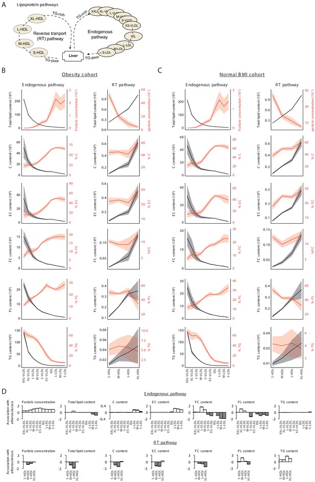
Analysis of lipoproteins.
(A) Illustration of two main lipoprotein pathways for which lipoprotein fractions were measured in the obesity and normal BMI cohorts. In particular, lipoproteins consist of 10 subfractions over the very-low-density lipoprotein (VLDL) to low-density lipoprotein (LDL) ‘endogenous’ pathway and four subfractions over the high-density lipoprotein (HDL) ‘reverse transport’ (RT) pathway. (B and C) Measured levels with confidence bands (± standard deviation) for the endogenous (left panels) and RT (right panels) pathways using data from (B) the obesity cohort or (C) the normal BMI cohort. Lipid types include total cholesterol (C), esterified cholesterol (EC), free cholesterol (FC), phospholipids (PL), and triglycerides (TG). The percentages of these lipids were calculated as lipid content divided by the total lipids content for the same subfraction (Materials and methods). Results are consistent with previously observed dynamics along the major pathways (Wasan et al., 2008): For the RT pathway, there is a dynamic increase in lipid content and cholesterol measures as previously described; along the endogenous pathway, the content of all lipids typically decreased, but since the most drastic content loss occurs in triglycerides, the percentage of triglycerides decreased, whereas the percentage of all other lipids increased. (D) Plot of signed log p-values of the association with atherosclerosis (y axis) over different lipoprotein subfractions (x axis) along the endogenous (top) and reverse transport (bottom) pathways. Positive and negative directions of associations are in white and gray respectively. The p-values for the associations were calculated by comparing between the atherosclerosis to controls using conventional association test that accounts for age, gender, and BMI. The results confirm the canonical atherosclerosis risk factors (Wasan et al., 2008; Nordestgaard et al., 2010): Atherosclerosis is negatively associated with the total cholesterol content carried by HDL subfractions and is positively associated with the total cholesterol content transported by LDL subfractions, with triglycerides transported by HDLs, and with the circulating particle concentration of LDL, intermediate density lipoprotein (IDL), and VLDL particles. Of note, the plots indicate a switch in the association of free cholesterol and phospholipid content with atherosclerosis during the dynamic endogenous pathway, suggesting that the remodeling of the surface membrane of particles, consisting of both free cholesterol and phospholipids, is dysregulated in atherosclerosis.
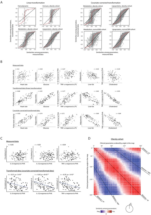
Relations among clinical parameters.
(A) Amplification of signals through the linear lipoprotein-based transformation. For each pair of clinical parameters (a dot), the scatter plots compare the pairwise similarity when using transformed data (y axis) versus the pairwise similarity when using the measured data (x axis), using the linear transformation (left) and the covariate-corrected transformation (right). Pairwise similarities were assessed using Pearson correlation. Scatter plots are shown for different categories of clinical parameters and for different cohorts (indicated on top). Trendlines are in red. (B) Examples of improved similarities between clinical parameters when using data transformation. Presented are values of representative pairs of clinical parameters. Examples are shown in the obesity cohort – using either measured data (top), linear transformation of the data (middle) and covariate-corrected transformation (bottom). The plots demonstrate the amplification of correlations among parameters. For example, clinical parameters that are associated with atherosclerosis, such as triglycerides, glucose, heart rate, and pulse wave velocity, have high Pearson correlations between their transformed levels (>79%), with much weaker, albeit still significant, correlations between their measured levels (<30%); similarly, the anti-correlation between liver fat and adiponectin, two known antagonistic factors (Buechler et al., 2011), is also increased from 43% to 85% using this transformation. (C) Revealing novel relations. Presented are values of representative pairs of clinical parameters. Examples are shown in the obesity cohort – using either measured data (top) and transformed data (bottom; using covariate-corrected transformation). The plots demonstrate specific cases in which the transformation reveals correlations that were undetectable through the original measured values. For example, the concentration of circulating IL-6 (y axis) and the ex vivo secretion of IL-6, IL-1β, and TNF-α from PBMCs in response to PHA stimulation (x axis) have strong negative Pearson correlations between their transformed levels (>31%, p<10−5), with insignificant correlations between their measured levels (2–5%, p>0.05). (D) Correlations among clinical parameters in the obesity cohort. Shown is a heatmap with Pearson correlations for each pair of clinical parameters, based on data in the obesity cohort. Blue to red indicate negative and positive correlations; white indicates weak or no correlation among parameters. The order of clinical parameters (same order in rows and columns) is by the angle of each parameter in the obesity map (as in Figure 1A), from 0° to 360°. Each diagonal line indicates a constant angular distance between the two parameters in the obesity map. The heatmap highlights the positive correlations among proximal parameters (angular distance around 0°) and negative correlations among parameters in opposite sides of the map (angular distance around 180°). All correlation values are detailed in Supplementary file 2B.
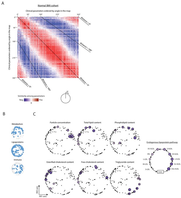
Organization of clinical and physiological parameters in the normal BMI map.
(A) Correlations among clinical parameters in the normal-BMI cohort. Presentation is as in Figure 1—figure supplement 3D but for the normal BMI cohort. (B) Positions of the main biological categories (excluding hemodynamic parameters that are not available in the normal-BMI cohort). Presentation is as in Figure 1D but for a map that was constructed using data from the normal BMI cohort. (C) Positions of lipoproteins. Presentation is as in Figure 1E but for a map that was constructed using data from the normal BMI cohort.
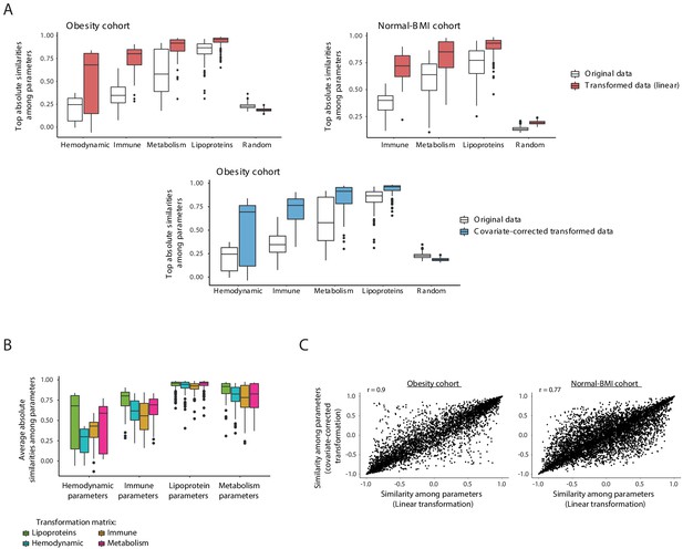
Data transformation.
(A) Improved similarities between clinical parameters when using the lipoprotein-based transformation. Box plots of averaged pairwise similarities of each clinical parameter to its five most similar clinical parameters. Different categories of clinical parameters are shown. Similarities were assessed as absolute Pearson correlation using either the measured data (without transformation; white) or the data after the lipoprotein-based transformation (linear transformation – pink; covariate-corrected transformation – blue). Cohort data is indicated on top. Using the original measurements (without transformation), pairwise similarities of each parameter to its five most similar parameters were often poor; these similarities were substantially higher when using the transformed representation of the data. (B) Box plots showing the averaged pairwise similarities of each clinical parameter to its five most similar clinical parameters (y axis). Plots are shown within different categories of clinical parameters (x axis). Transformed profiles were calculated with four different transformation matrices (color coded): the immune, hematodynamic, lipoprotein, and metabolic data matrices. Lipoproteins outperformed the alternative transformation matrices within each category of clinical parameters, and thus were used as the default transformation matrix throughout this study. (C) For each pair of clinical parameters (dots), the scatter plots compare the pairwise similarities obtained when using the linear transformation (x axis) to the pairwise similarities obtained when using the covariate-corrected transformation (y axis). Similarities were assessed using Pearson correlation. Scatter plots are shown for the obesity cohort (left) and normal BMI cohort (right).
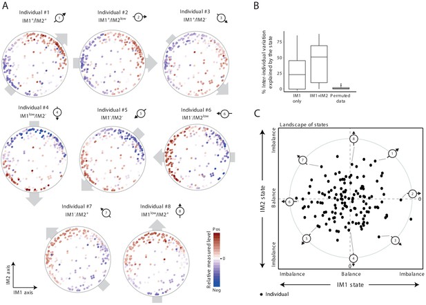
The whole-body state consists of two key components – the IM1 and IM2 states.
(A) Representative patterns of co-regulation over the map of parameters. Shown are measured levels of eight individuals along the map of parameters. Each map (subpanel) is shown with color coding of measured levels from one specific individual: blue/red scale for low/high (relative) measured levels (no data transformation; data were not smoothed). The observed gradient-like patterns of measured levels over the map, indicated with gray arrows, allow reduction of data for each individual into two scores – the ‘IM1-state’ and ‘IM2-state’ scores – which together specify the ‘whole-body state’ of each individual. Original individual identifiers were renumbered as #1–8. For each individual, the signs of the two scores are indicated on top (IM– and IM+ for negative and positive scores, IMlow for zero and nearly zero scores). (B) Box plots of percentage of inter-individual variance that is explained by IM1 state only (left), IM1 and IM2 states (middle) and using permuted data (right). (C) The landscape of states. Scatter plot of inferred IM1-state scores (x axis) and IM2-state scores (y axis) for all individuals in the obesity cohort. The coordinate of each individual (a dot) is a representation of its whole-body state. Indicated individuals (#1–8) are detailed in A.
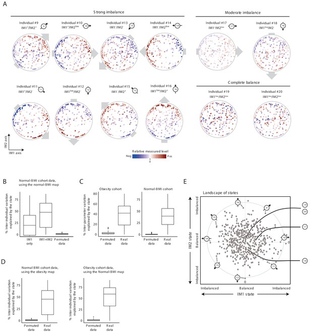
Characterization of the whole-body state in the normal BMI cohort.
Unless stated otherwise, the plots present results for the normal BMI cohort. (A) Measured levels along the map of parameters for selected individuals. Original individual identifiers were renumbered as #9–20. Each map (subpanel) is shown with color coding of relative measured levels from one specific individual (blue/red scale for low/high values; no transformation and data were not smoothed). Shown are individuals with an observed gradient (also termed an ‘imbalanced state’) over the map of parameters – either a strong gradient (a strong imbalance; individuals #9–16) or a moderate gradient (a moderate imbalance; individuals #17 and #18); individuals #19 and #20 have no gradient (a ‘balanced state’). Plots are presented as in Figure 2A. (B) Box plots of percentages of inter-individual variance explained by the state (left to right: IM1 only, IM1 and IM2 states, and IM1/IM2 states using permuted data), calculated for each clinical parameter. Results are based on a parameter map that was constructed using the normal-BMI cohort. (C) Box plots of percentages of inter-parameter variance explained by the state (both IM1 and IM2 states), calculated for each individual from the obesity (left) and normal-BMI (right) cohorts, using real and permuted data. (D) Box plots of percentages of inter-individual variance explained by the state (both IM1 and IM2 states), calculated for each of the clinical parameters using real and permuted data. Left: Inter-individual variation in the normal BMI cohort, based on a parameter map that was constructed using the obesity cohort. Right: Inter-individual variation in the obesity cohort, based on a parameter map that was constructed using the normal BMI cohort. (E) The landscape of states. Scatter plot of inferred IM1-state (x axis) and IM2-state (y axis) scores for all individuals in the normal-BMI cohort. The coordinate of each individual (a dot) is a representation of its state. Indicated individuals (#9–20) are detailed in A.
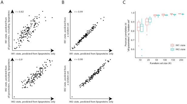
The IM1-state and IM2-state scores are consistently reproduced with subsets of clinical parameters.
(A) Scores that were generated using only the lipoprotein (LP) parameters (x axis) or using all clinical parameters except from the lipoprotein parameters (y axis) are shown across individuals (dots) from the obesity cohort for the IM1-state (upper graph) and IM2-state (lower graph) scores. (B) Scores that were generated using all 168 lipoprotein parameters (x axis) or using a randomly sampled set of 168 parameters (sampled from all clinical parameters; y axis) shown across individuals (dots) from the obesity cohort for the IM1-state (upper graph) and IM2-state (lower graph) scores. (C) Pearson correlations between the ‘all-parameters’ scores (that is, scores that were generated using all clinical parameters) and a ‘random set’ scores (that is, scores that were generated using a randomly-sampled set of parameters) versus size of the randomly sampled set of parameters. Results are shown for both the IM1-state and IM2-state scores (color coded) for the obesity cohort.
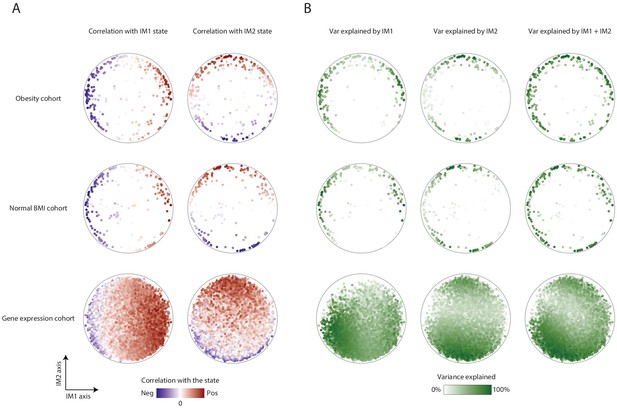
Association of parameters with the IM1 and IM2 states.
(A) Parameter-state correlations. Each parameter (dot) in the map is colored based on its correlation with the IM1 state (left) and IM2 state (right). Results are presented for the map of clinical parameters of the obesity cohort (top), the map of clinical parameters of the normal BMI cohort (middle), and the extended map of gene transcripts of the normal-BMI cohort (bottom). Negative and positive Pearson correlation scores are in blue and red, respectively. (B) Variance explained by the IM1 and IM2 states. Each parameter (dot) in the map is colored by the percentage of its variance that is explained by the IM1 state (left), IM2 state (middle), or both (right). Results are presented for the map of clinical parameters of the obesity cohort (top), the map of clinical parameters of the normal-BMI cohort (middle), and the extended map of gene transcripts of the normal-BMI cohort (bottom). Color coding ranges between 0% of explained variation (white) to 100% of explained variation (green).
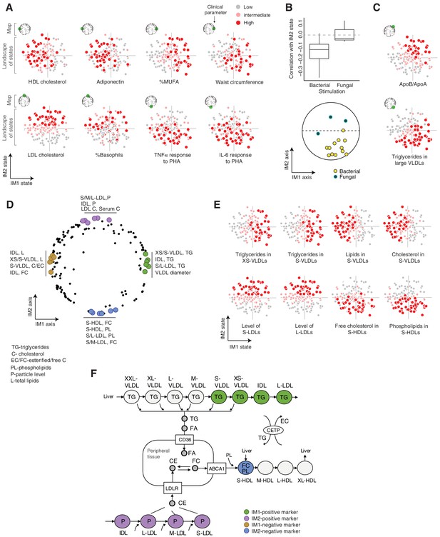
Biological characterization of the whole-body state.
(A and C) Examples of state-specific parameters. For each parameter (a subpanel), shown is the landscape of states (x and y axes are the IM1- and IM2-state scores, respectively), where each individual (a dot) is colored with its measured level of the parameter (gray to red coloring with cutoffs at the 40th/70th percentile). For each parameter, its position within the map is indicated in green (top-left map illustration in each subpanel). A, IM1- and IM2-specific markers (q < 0.05). C, markers of composite IM1/IM2 states. (B) Cytokine response of PBMCs is associated with the IM2 state. Top: Distribution of correlations between the IM2 state and the pro-inflammatory response to bacterial (left) and fungal (right) stimulations. Bottom: The position of pro-inflammatory response parameters within the map. Presented are parameters of pro-inflammatory response (TNF-α, IL-6, and IL-1β ) to bacterial (PHA, LPS, Staphylococcus aureus, and Porphyromonas gingivalis) and fungal (Candida albicans) stimulations. (D) Top IM1- and IM2-specific markers, presented by their positions in the map. Highlighted are four groups of six parameters (color coded), a group for each side of each axis. (E) Representative examples of top markers, presented as in A. (F) Marker genes in the context of cellular influx and efflux of lipids. Illustration was compiled from known lipoprotein processes. Markers are color coded as in D. Abbreviations: TG – triglycerides, C – cholesterol, FC – free cholesterol, EC – esterified cholesterol, PL – phospholipids, L – total lipid content, P – particle level.
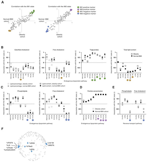
Top markers for the whole-body state.
(A) Top IM1-specific and IM2-specific markers. The scatter plots present correlations (Pearson’s r) of measured parameters with the IM1 (left) and IM2 (middle) states, calculated using the obesity data (x axis) and normal BMI data (y axis) for each clinical parameter (a dot). Highlighted are four groups of top markers (color coded), six markers for each side of each axis. The map positions of these markers are in Figure 3D. (B–E) Top markers, presented in the context of lipoprotein pathways. Correlation (Pearson’s r; y axis) between a measure and a state (subpanels, indicated on top) across different lipoprotein subfractions (x axis). The x axis is ordered in accordance with the endogenous pathway (B–D) and the reverse transport pathway (E) (see pathways in Figure 1—figure supplement 2A). Correlations were calculated using different cohorts and different lipid measures (color coded). Colored circles indicate the top markers from A. (F) Presented are the positions of all parameters (gray) and parameters of fatty acid percentages (blue) in serum. The percentage of fats in liver is also highlighted. The plot supports the notion that the composition of fatty acids is associated with the IM1 state.
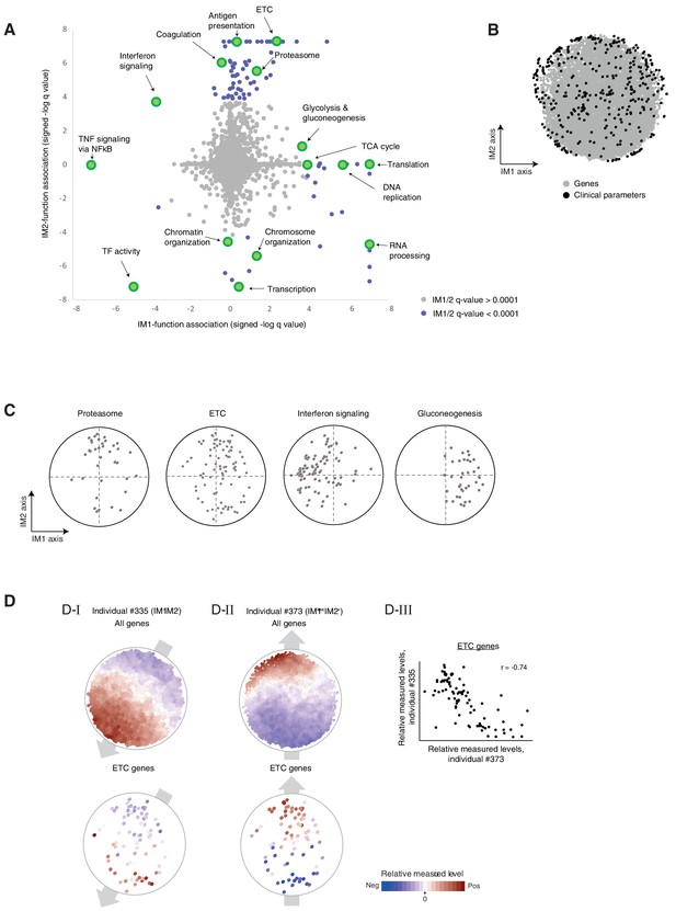
Associations of biological functions with the state.
(A) Associations of biological functions with the state. A scatter plot of signed log q-values for the measure of association of functional annotations with the IM1 state (x axis) and the IM2 state (y axis). Positive/negative value indicative up/downregulation in the IM1-positive (or IM2-positive) state. Each biological function (gene set) is a dot. Exemplified gene sets are highlighted. All q-values are detailed in Supplementary file 2D. (B) The extended map. The original map of parameters (black dots) extended with additional gene expression parameters (gray dots). Data and map are from the normal BMI cohort. (C) Position of cellular functions over the map. Each panel presents the positions of genes from a given gene set (black dots) over the map. (D). (D–I, D–II) Measured levels (color coded) of two individuals (individual #335, D-I; individual #373, D–II) with nearly opposite directions of the state (IM1-negative/IM2-negative and IM1-low/IM2-positive individuals; #335 and #373, respectively). Color coded maps are shown either for all genes (top) or only for the ETC genes (bottom). These two individuals demonstrate that the prototypical gradients of measured levels over the map are not limited to clinical and physiological parameters but are also observed at the transcriptional level. The notion of IM1/2 states, which was originally observed in clinical parameters, is therefore relevant to transcriptional circuits. (C-III) A scatter plot for the expression of ETC genes in individual #335 versus expression of ETC genes in individual #373, highlighting opposite transcriptional states of the ETC geneset. The plot demonstrates that expression levels within the group of ETC genes quantitatively anticorrelate between individuals with opposing states, providing additional indication that the global IM1/2 state is also observed at the level of specific pathways.
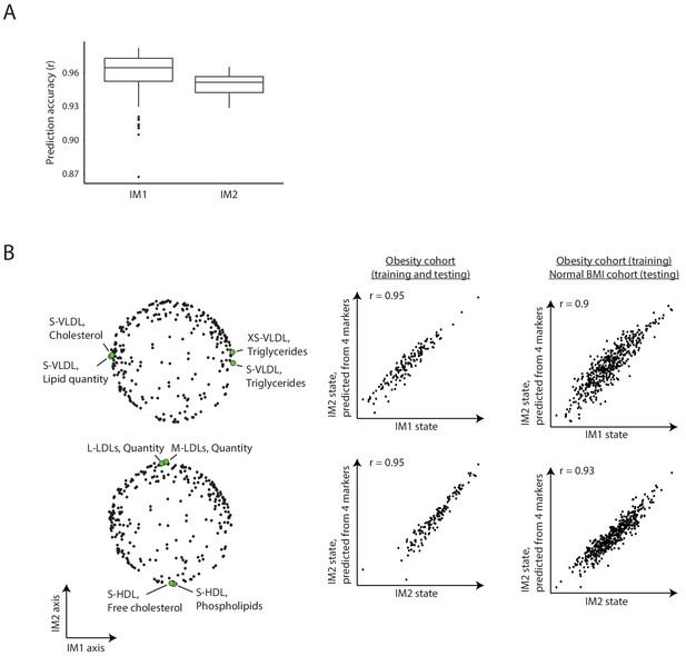
Estimating the whole-body state from reduced parameter sets.
(A) Analysis of alternative four-parameter sets for the calculation of states. Box plots for the prediction accuracy of calculating the IM1 state from four-parameter sets from the top IM1 markers (left) for the prediction accuracy of calculating the IM2 state from four-parameter sets from the top IM2 markers (right). In each case, the analysis was repeated 100 times with different sampling of the four-parameter sets. (B) Representative example. Left: a particular four-parameter set. Middle/right: comparison between the states that were calculated using all parameters (x axis) or using these four-parameter sets (y axis). Presented are the results of testing across the obesity cohort (middle) or the normal BMI cohort (right). In both cases, training was performed using individuals from the obesity cohort. Results are shown for the IM1 state (top) and IM2 state (bottom). The specific parameters of this example are detailed in Figure 3E.
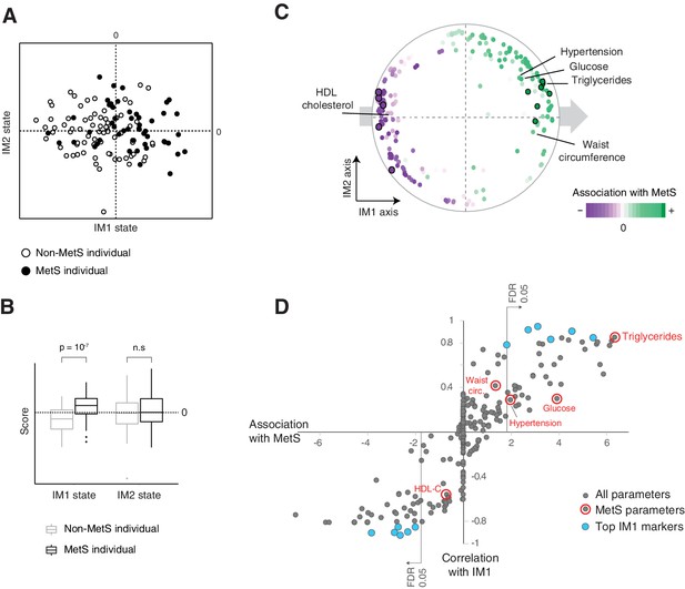
The IM1 state is a continuous representation of metabolic syndrome (MetS).
(A) The landscape of parameters, color-coded by MetS classification. (B) Box plots of IM1/IM2 states, comparing between MetS and non-MetS individuals. (C) Association of each clinical and physiological parameter with MetS, shown as color coding along the map of parameters. Each parameter (dot) in the map is colored based on its association with MetS (signed −log p-value of association scores, with negative/positive scores in purple/green and outer black circle in top associated parameters; no smoothing). Shown are association scores that account for age and body mass index. The five MetS criteria are highlighted. (D) Comparisons between the association of each clinical parameter with MetS (x axis, calculated as in C) and the association of each clinical parameter with the IM1-state score (Pearson’s r; y axis). MetS criteria are highlighted in red. Top IM1-state markers are highlighted in blue. Abbreviations: TG – triglycerides, C – cholesterol, FC – free cholesterol, L – total lipid content, circ. – circumference. MetS classification is based on the National Cholesterol Education Program (NCEP) ATP-III criteria. Results are shown for the obesity cohort.
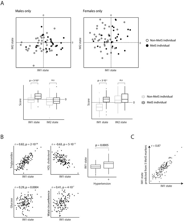
Relationships between metabolic syndrome (MetS) and the whole-body state model.
(A) Comparisons of IM1/IM2-state scores in MetS (black) and non-MetS (white) individuals represented as a scatter plot (top) and a box plot (bottom). Plots are for males (left) and females (right). There is a higher prevalence of MetS patients with positive IM1-state scores compared to controls. (B) Comparisons of the IM1-state scores (x axis) to the measured levels of parameters (y axis) across individuals from the obesity cohort. Plots are for the five conventional MetS parameters. (C) Performance of the conventional MetS markers. Comparison between the IM1 states that were calculated using all parameters (x axis) or using a set of five MetS parameters (state prediction using a linear regression model; y axis) across individuals from the obesity cohort (dots). The five parameters are indicated in Figure 4C.
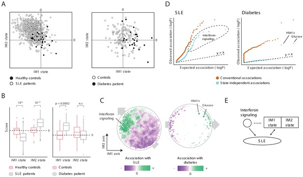
Characterization of the IM2 state as a novel immunometabolic syndrome (‘non-classical metabolic syndrome’).
The analysis is based on independent disease data sets of systemic lupus erythematosus (SLE; left) and diabetes (right) compared to control subjects. (A and B) Disease-specific associations with the whole-body state. The comparison is presented using the landscape of states (A) and as box plots (B), demonstrating bias of each disease toward a certain combination IM1/IM2 states, and emphasizing the utility of IM2 as a novel risk factor of disease. (C) Association of each clinical and physiological parameter with disease along the map of parameters. Each parameter (dot) in the map is colored based on its association with disease (signed −log p-value of association scores, with negative/positive scores in purple/green). Shown are conventional association scores that account for age, gender, and body mass index (BMI). (D) Relations between disease, the state, and specific clinical parameters. A quantile–quantile plot for all tests of association between disease and clinical parameters using conventional association tests (accounting for age, gender, and BMI; orange) and using association tests that account also for the state (light blue). Each plot shows ranked observed associations versus expected associations by an empirical null model; the dashed line (slope = 1) is shown for reference. In both SLE and diabetes, most associations are cancelled out when accounting for variation in states, highlighting a small number of factors that are associated independently of the state. (E) Schematic illustration of the inferred relations between SLE, interferon signaling, and the whole-body state.
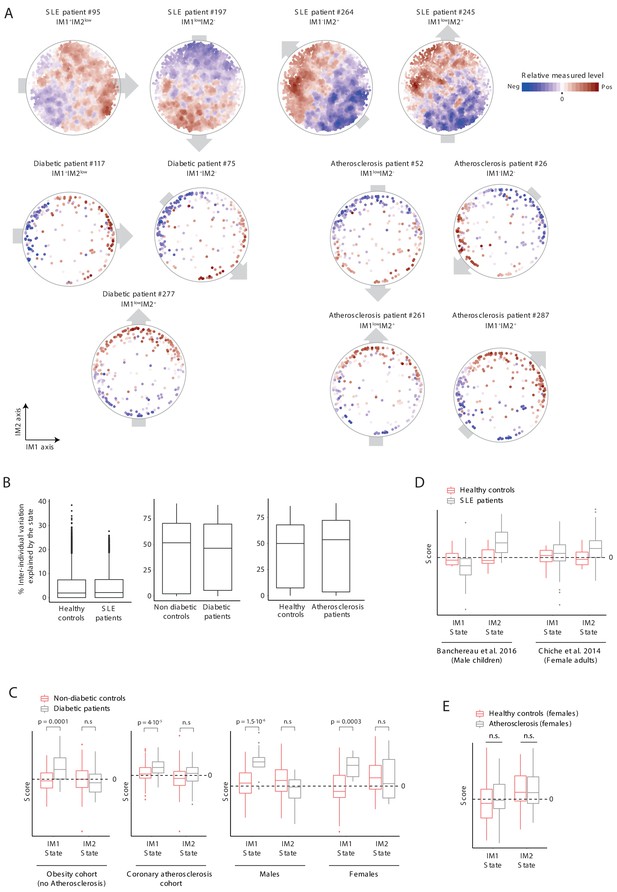
Analysis of states in disease patients.
(A) Measured levels of patients along the map of parameters. Exemplified are four systemic lupus erythematosus (SLE) patients, three diabetic patients, and four atherosclerosis patients. The map of parameters for these selected individuals are shown with color coding in blue/red scale for negative/positive values; relative measured levels were not transformed. Only gene expression values in SLE were smoothed. The observed personal global trends over the map (indicated with gray arrows) are similar to those observed in healthy individuals (Figure 2A and Figure 2—figure supplement 1A), allowing reduction of data for each patient into a ‘whole-body state’. (B) Box plots of percentage of inter-individual variance that is explained by the state, for each of clinical parameters from the SLE, diabetes, and atherosclerosis groups and their matching healthy groups. (C) Comparison of states in diabetes (gray) and controls (pink) presented as box plots, showing a higher prevalence of diabetes patients with positive IM1-state scores compared to controls. Results are shown for three data sets: diabetes in healthy obese patients (both females and males, left), diabetes in atherosclerosis patients from the carotid-atherosclerosis cohort (both females and males, middle), and diabetes in atherosclerosis obese patients (separate for females and males, right). The observed trends are in agreement with the results in Figure 5. (D) Comparison of states in SLE (gray) and controls (pink). Results are shown for two data sets (male children data set and adult female data set, left and right, respectively). (E) Testing the link between atherosclerosis and the IM1/IM2 state in females. The comparison is presented using box plots, demonstrating the lack of bias of atherosclerosis in females toward a certain state.
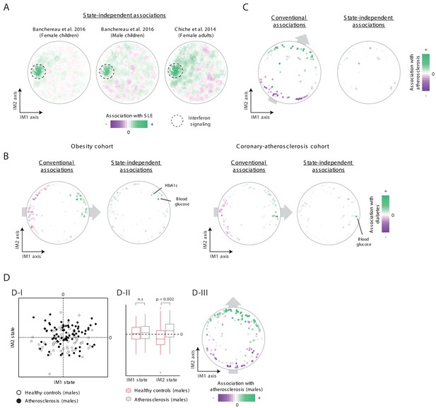
Additional analysis of states in disease patients.
(A) State-independent associations with systemic lupus erythematosus (SLE). Plots are presented as in Figure 5C, for a data set of female children (left), male children (middle), and for a data set of adult females (right). (B) Conventional and state-independent associations with diabetes. Plots are presented as in Figure 5C, using the obesity cohort (left) and the coronary-atherosclerosis cohort (right). The Hb1Ac parameter was not measured in the coronary-atherosclerosis cohort. (C) Association of each clinical parameter with atherosclerosis in the 300-OB cohort using an independent parameter map. The plot is shown as in Figure 6D, but the map of parameters is taken from the normal BMI cohort. In particular, the color coding (i.e., association with atherosclerosis) were calculated for the 300-OB cohort, as in Figure 6D; however, the positions of parameters in the map were calculated using the normal-BMI map. The positions of parameters were used for the calculation of the IM1/IM2-state scores and for the subsequent calculation of state-independent associations. (D) Association with atherosclerosis in older adults, obese men. Diabetes patients were excluded from the analysis. Association is demonstrated using the landscape of states (D-I), box plots (D-II), and the map of parameters (D-III), as in Figure 6B–D, respectively. The plots highlight the strong association between the IM2-positive state and atherosclerosis in older adults, obese men.
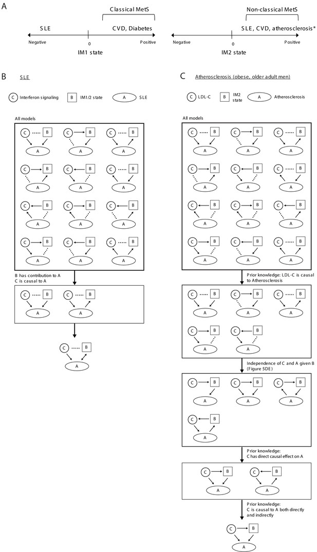
Relations between disease, specific causal factors, and the whole-body state.
(A) Illustration of relations between disease and the IM1/IM2 states. *Atherosclerosis in obese older adult men. (B) Analysis of systemic lupus erythematosus (SLE). We explored three components: interferon/antiviral signaling, IM1/2 states and disease. Overall, there is a large number of possible models (top). Given that both the state and interferon signaling contribute to the explained variation in disease, there are only two relevant models (middle); in these models, both interferon signaling and the state are linked to disease but the direction is unknown (bottom). (C) Analysis of atherosclerosis in obese older adult men. We explored three components: LDL cholesterol, atherosclerosis, and the IM2 state. Overall there is a large number of possible models (top). Given the prior knowledge that LDL cholesterol is causal to atherosclerosis (Borén et al., 2020), there are only five relevant models (middle). Furthermore, given that atherosclerosis and LDL cholesterol are associated (conventional association p<0.03) but are independent when accounting for the state (state-independent association p>0.2), and given that LDL cholesterol is causal to atherosclerosis both directly and indirectly (Borén et al., 2020), there is only one relevant model – in which LDL cholesterol affects atherosclerosis indirectly through the state, in addition to a direct effect (bottom).
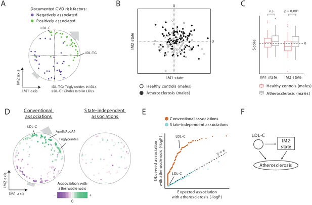
A novel signature for atherosclerosis based on non-classical metabolic syndrome.
(A) Association of the whole-body state with CVD. The map is shown with color coding of parameters by their documented (previously reported) positive or negative association with CVD. Parameters without known associations are not shown. References for these documented associations are listed in Supplementary file 2F. The observed trend over the IM1 and IM2 axes implies that both positive IM1 and positive IM2 states are associated with CVD. (B–E) Association with atherosclerosis in older adults, obese men, demonstrated using the landscape of state (B), box plots (C), the map of parameters (D), and a Q–Q plot (E) (shown as in Figure 5A–D, respectively). The plots indicate that the IM2-positive state is associated with atherosclerosis in older adult obese men. (F) Schematic illustration for the inferred relations between the IM2-state, low-density lipoprotein(LDL) cholesterol, and atherosclerosis, in obese older adult men.
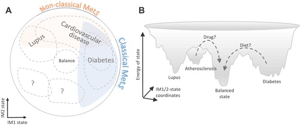
Implications of the whole-body state for disease research.
Shown are two schematic representations for the landscape of states, highlighting a potential future utility of these states in diagnosis and treatment. (A) Distribution of disease risk over the landscape of states. Indicated are regions in the landscape that have a higher disease risk (gray outline). The conventional (‘classical’) metabolic syndrome (MetS) and the newly defined ‘non-classical MetS’ are indicated as blue and orange regions, respectively. The landscape highlights the utility of classical/non-classical MetS scores as risk factors for common, complex disease. (B) Energy landscape of the whole-body state. Each state in the landscape is associated with a certain level of energy. Possible sites of disease risk are also indicated. The energy landscape highlights our hypothesis that transitions from one state to another state are blocked by energetic boundaries. Thus, transitions from a disease-associated state to a low-risk state may therefore require a certain activation energy, such as changes in lifestyle and drug treatments (dashed lines).
Additional files
-
Supplementary file 1
Individuals and clinical parameters.
(A) Individuals in the 300-OB cohort. For each individual (column 1), the table reports the gender, age, and body mass index (BMI) (columns 2–4), the presence of diabetes mellitus (column 5), and carotid atherosclerosis (column 6). Indications for atherosclerosis (maximum plaque thickness, maximum stenosis, and number of plaques) are in columns 7–9, respectively. The healthy controls (no atherosclerosis and no diabetes) are referred to as the healthy ‘obesity cohort’. (B) Individuals in the normal BMI cohort. The table reports the index of individuals included in the normal BMI cohort (column 1). Gender, age, and BMI of each individual are reported in columns 2–4, respectively. (C) Clinical parameters. The table reports the list of parameters measured in the 300-OB cohort and/or the normal-BMI cohort that were included in this study (the obesity cohort is part of the 300-OB cohort). For each parameter (column 1), indicated is the physiological system (column 2) and whether the parameter was measured in the 300-OB cohort (column 3) and normal-BMI cohort (column 4). (D) Immune capacity and lipoprotein parameters used in this study. The table provides a summary for the immune capacity and lipoprotein parameters in the 300-OB cohort and/or the normal-BMI cohort. Each of these parameters is listed with more details in (C).
- https://cdn.elifesciences.org/articles/61710/elife-61710-supp1-v2.xlsx
-
Supplementary file 2
Analysis of biological functions and disease, performed in the context of the map and the whole-body state.
(A) The parameters. For each parameter (column 1), columns 2 and 3 report the position of parameter in the map, as calculated using the obesity cohort data (IM1 and IM2 axes, respectively), and columns 4 and 5 report the position of parameter in the map as calculated using the normal BMI cohort data (IM1 and IM2 axes, respectively). Columns 6 and 7 report the Pearson’s correlations (r) between each parameter and the state, as calculated using the obesity cohort data (IM1 and IM2 states, respectively), and columns 8 and 9 provide the correlation (r) between each parameter and the state, as calculated using the normal-BMI cohort data (IM1 and IM2 states, respectively). (B) Pearson correlations between each pair of parameters. Parameters are ordered as in Figure 1—figure supplement 3D. Correlations were calculated using the covariate-corrected transformed data of the obesity cohort. (C) Top state-specific markers. Reported are top identified markers (columns 1 and 2) together with their correlation with the IM1 state (columns 3 and 5) and IM2 state (columns 4 and 6) in the obesity cohort (columns 3 and 4) and normal-BMI cohort (columns 5 and 6). Column 7 reports the association with metabolic syndrome (MetS). (D) Associations of functional categories with the whole-body state. For each functional annotation (columns 1 and 2), the table reports the significance of association with the IM1 and IM2 states (columns 3 and 4, respectively). Reported are (signed) q-values of a function-state association test. Positive/negative values are indicative of up/downregulation of IM1-positive (or IM2-positive) individuals. Included are significant functional annotations based on the extended map from Figure 3—figure supplement 2B. (E) Comparisons between health and disease groups in this study. For each comparison (column 1), reported is the parameter map used as a reference (columns 2 and 3), and the compared healthy and disease groups (columns 4–8). (F) The parameter map and associations with atherosclerosis and CVD. For each parameter (column 1), column 2 reports the conventional scores of association with atherosclerosis, and column 3 reports the state-independent association with atherosclerosis (–log p-values, with positive values indicative of higher values in atherosclerosis subjects compared to those without and negative values indicative of lower values in the atherosclerosis subjects). Previous findings about CVD risk factors are reported in columns 4 and 5. Reported are CVD risk factors in at least one age/BMI/gender/ethnicity group and excluding controversial factors. (G) State-independent associations with systemic lupus erythematosus (SLE). Reported are genes that are significantly associated with SLE independently of the state and their state-independent association scores (–log q-value). Association scores are signed according to the direction of associations; for instance, 76 genes are positively associated and 12 genes are negatively associated with SLE in female children. Results are reported for the analysis of three data sets (E). Known interferon signaling genes are highlighted in bold. *For SLE in males, due to the small number of individuals in this cohort, reported are –log p-values.
- https://cdn.elifesciences.org/articles/61710/elife-61710-supp2-v2.xlsx
-
Transparent reporting form
- https://cdn.elifesciences.org/articles/61710/elife-61710-transrepform-v2.docx


