Fast and flexible estimation of effective migration surfaces
- Department of Human Genetics, University of Chicago, United States
- Department of Statistics, University of California, Berkeley, United States
- Department of Statistics, University of Chicago, United States
- Department of Ecology and Evolution, University of Chicago, United States
Figures
Figure 1
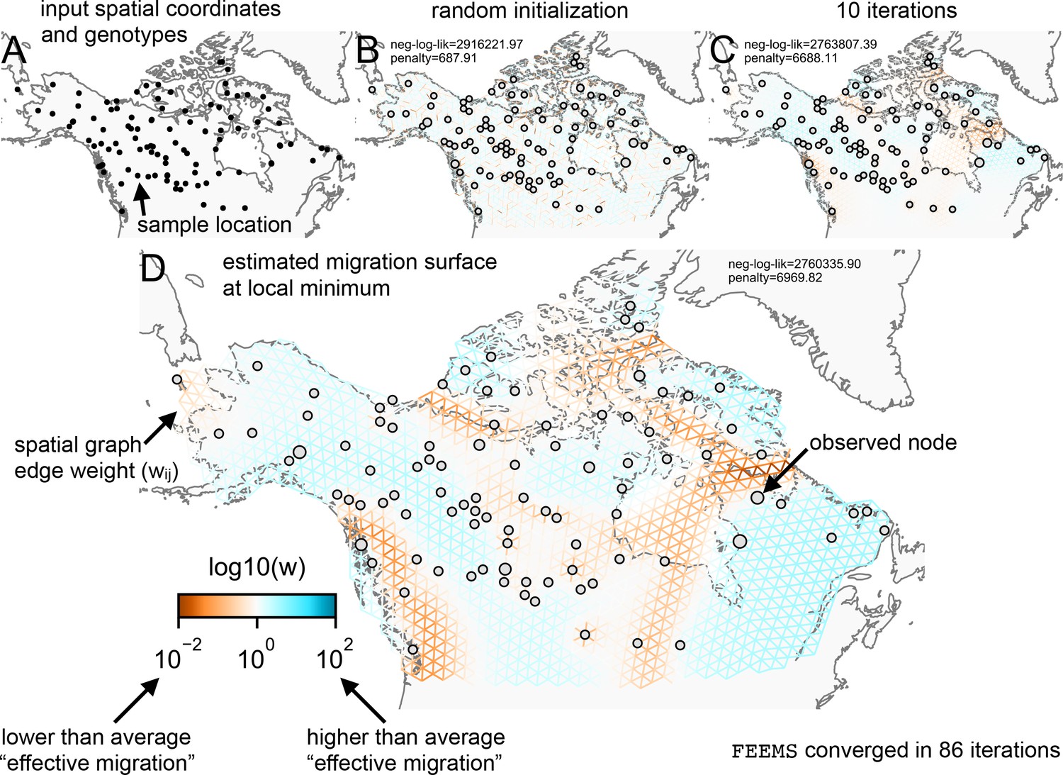
Schematic of the FEEMS model: The full panel shows a schematic of going from the raw data (spatial coordinates and genotypes) through optimization of the edge weights, representing effective migration, to convergence of FEEMS to a local optima.
(A) Map of sample coordinates (black points) from a dataset of gray wolves from North America (Schweizer et al., 2016). The input to FEEMS are latitude and longitude coordinates as well as genotype data for each sample. (B) The spatial graph edge weights after random initialization uniformly over the graph to begin the optimization algorithm. (C) The edge weights after 10 iterations of running FEEMS, when the algorithm has not converged yet. (D) The final output of FEEMS after the algorithm has fully converged. The output is annotated with important features of the visualization.
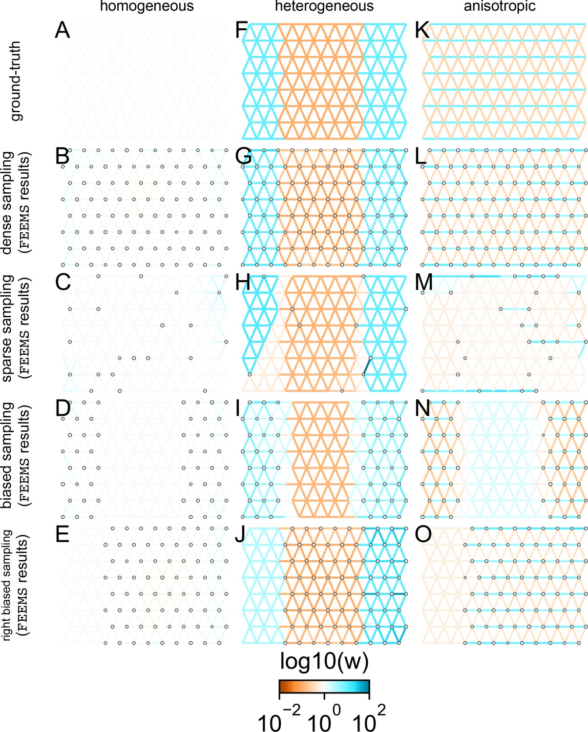
Figure 2
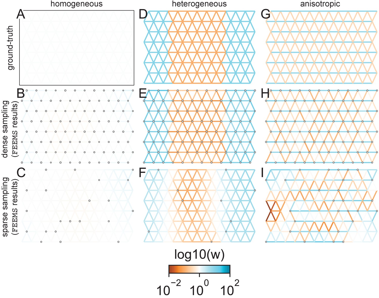
FEEMS fit to coalescent simulations: We run FEEMS on coalescent simulations, varying the migration history (columns) and sampling design (rows).
In each simulation, we used leave-one-out cross-validation (at the level of sampled nodes) to select the smoothness parameter λ. The first column (A–C) shows the ground-truth and fit of FEEMS to coalescent simulations with a homogeneous migration history that is, a single migration parameter for all edge weights. Note that the ground-truth simulation figures (A,D,G) display coalescent migration rates, not fitted effective migration rates output by FEEMS. The second column (D–F) shows the ground truth and fit of FEEMS to simulations with a heterogeneous migration history that is, reduced gene-flow, with 10-fold lower migration, in the center of the habitat. The third column (G–I) shows the ground truth and fit of FEEMS to an anisotropic migration history with edge weights facing east-west having five fold higher migration than north-south. The second row (B,E,H) shows a sampling design with no missing observations on the graph. The final row (C,F,I) shows a sampling design with 80% of nodes missing at random.
Figure 3

The fit of FEEMS to the North American gray wolf dataset for different choices of the smoothing regularization parameter λ: (A) , (B) , (C) , and (D) .
As expected, when λ decreases from large to small (A–D), the fitted graph becomes less smooth and eventually over-fits to the data, revealing a patchy surface in (D), whereas earlier in the regularization path FEEMS fits a homogeneous surface with all edge weights having nearly the same fitted value, as in (A). (E) shows the mean square error between predicted and held-out allele frequencies output by running leave-one-out cross-validation to select the smoothness parameter λ. The cross-validation error is minimized over a pre-selected grid at an intermediate value of as shown in (B).
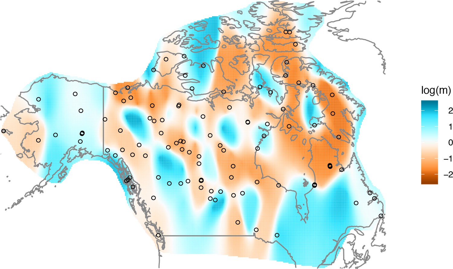
Figure 4
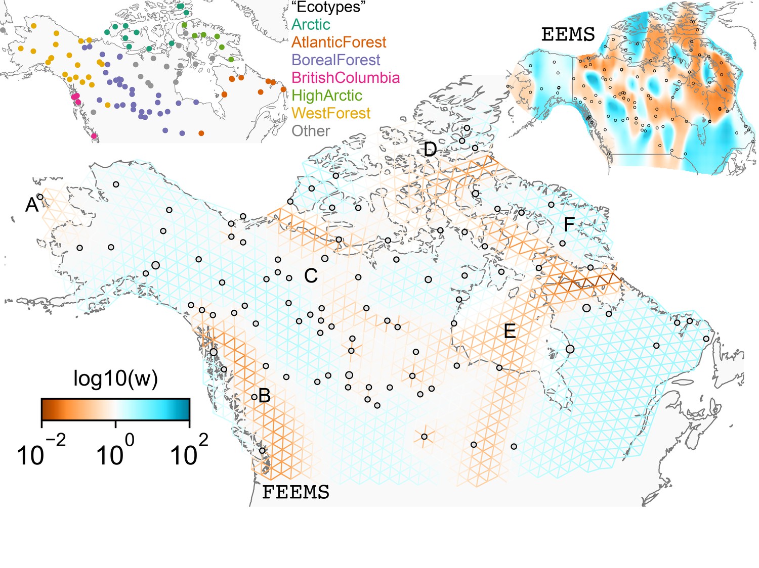
FEEMS applied to a population genetic dataset of North American gray wolves: We show the fit of FEEMS applied to a previously published dataset of North American gray wolves.
Leave-one-out cross-validation (at the level of sampled nodes) was used to select the smoothness parameter . We show the fitted parameters in log-scale with lower effective migration shown in orange and higher effective migration shown in blue. The bold text letters highlights a number of known geographic features that could have plausibly influenced wolf migration over time: (A) St. Lawrence Island, (B) Coastal mountain ranges in British Columbia, (C) The boundary of Boreal Forest and Tundra eco-regions in the Shield Taiga, (D) Queen Elizabeth Islands, (E) Hudson Bay, and (F) Baffin Island. We also display two insets to help interpret the results and compare them to EEMS. In the top left inset we show a map of sample coordinates colored by an ecotype label provided by Schweizer et al., 2016. These labels were devised using a combination of genetic and ecological information for 94 ‘un-admixed’ gray wolf samples, and the remaining samples were labeled ‘Other’. We can see these ecotype labels align well with the visualization output provided by FEEMS. In the right inset, we display a visualization of the posterior mean effective migration rates from EEMS.
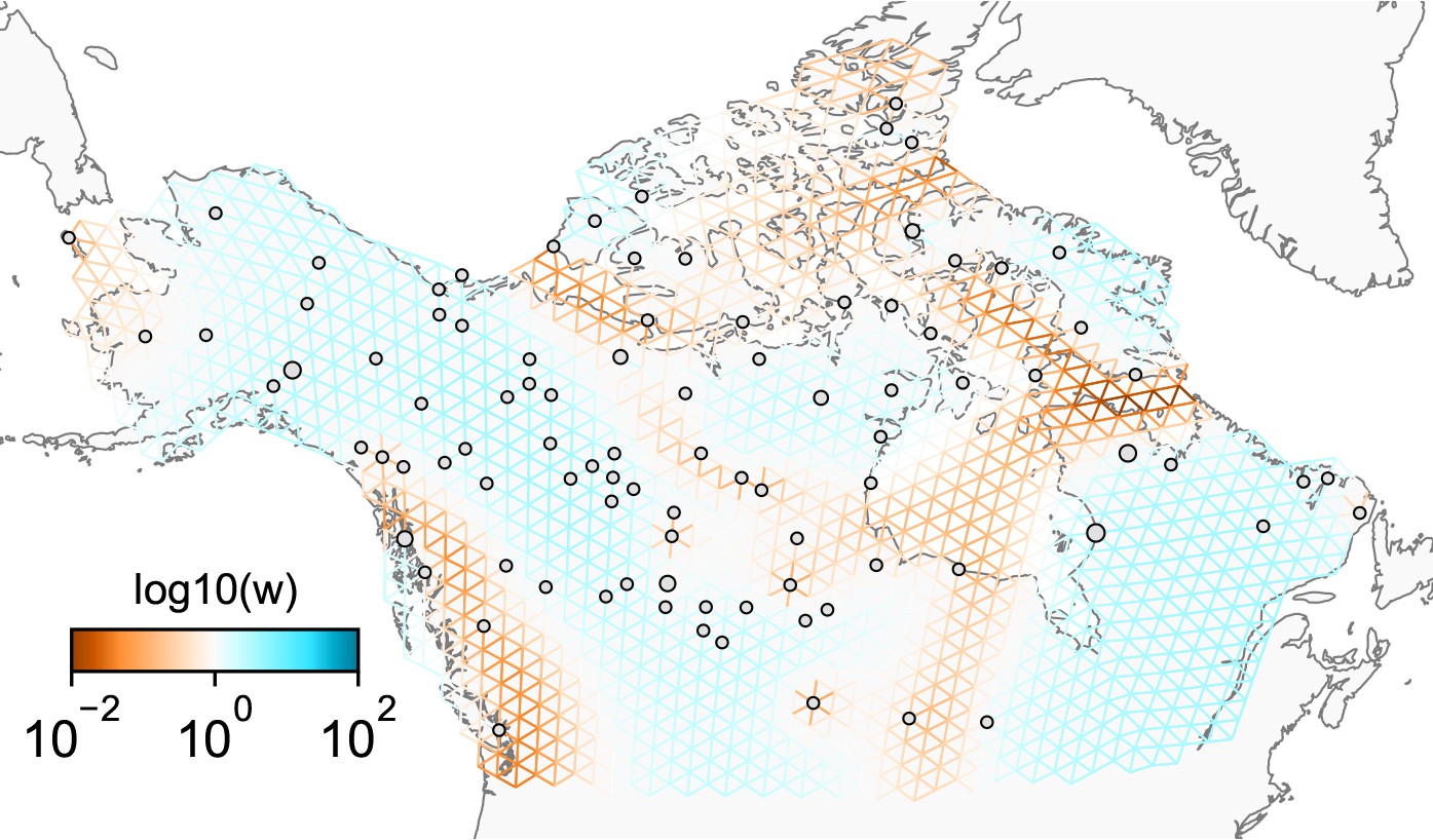
Appendix 1—figure 1
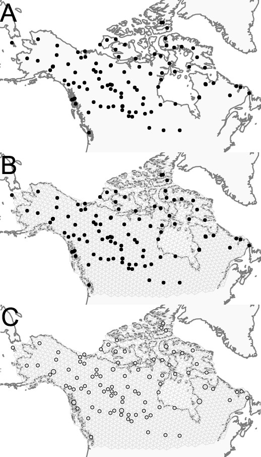
Visualization of grid construction and node assignment: (A) Map of sample coordinates (black points) from a dataset of gray wolves from North America.
The input to FEEMS are latitude and longitude coordinates as well as genotype data for each sample. (B) Map of sample coordinates with an example dense spatial grid. The nodes of the grid represent sub-populations and the edges represent local gene-flow between adjacent sub-populations. (C) Individuals are assigned to nearby nodes (sub-populations) and summary statistics (e.g. allele frequencies) are computed for each observed location.
Appendix 1—figure 2
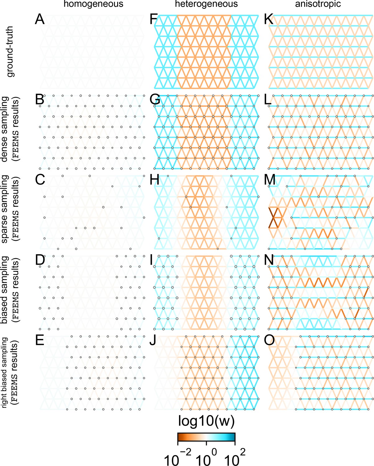
Application of FEEMS to an extended set of coalescent simulations: We display an extended set of coalescent simulations with multiple migration scenarios and sampling designs.
The sample sizes across the grid are represented by the size of the gray dots at each node. The migration rates are obtained by solving FEEMS objective function Equation 9 where the the smoothness parameter λ was selected using leave-one-out cross-validation. (A, F, K) display the ground truth of the underlying migration rates. (B, G, L) shows simulations where there is no missing data on the graph. (C, H, M) shows simulations with sparse observations and nodes missing at random. (D, I, N) shows simulations of biased sampling where there are no samples from the center of the simulated habitat. (E, J, O) shows simulations of biased sampling where there are only samples on the right side of the habitat.
Appendix 1—figure 3
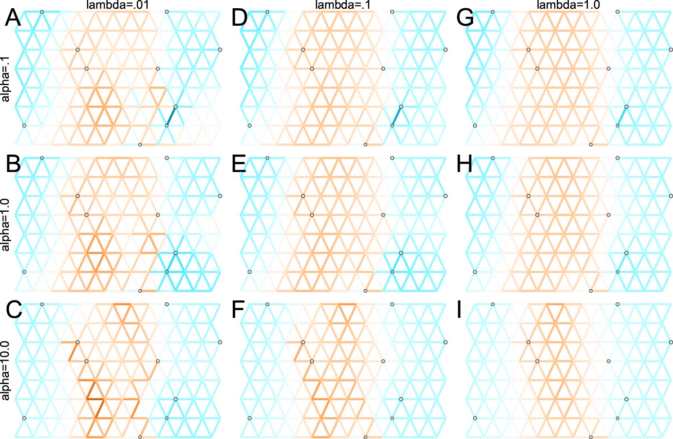
Application of FEEMS to a heterogeneous migration scenario with a ‘missing at random’ sampling design: We run FEEMS on coalescent simulation with a non-homogeneous process while varying hyperparameters λ (rows) and α (columns).
We randomly sample individuals for 20% of nodes. When λ grows, the fitted graph becomes overall smoother, whereas α effectively controls the degree of similarity among low migration rates.
Appendix 1—figure 4
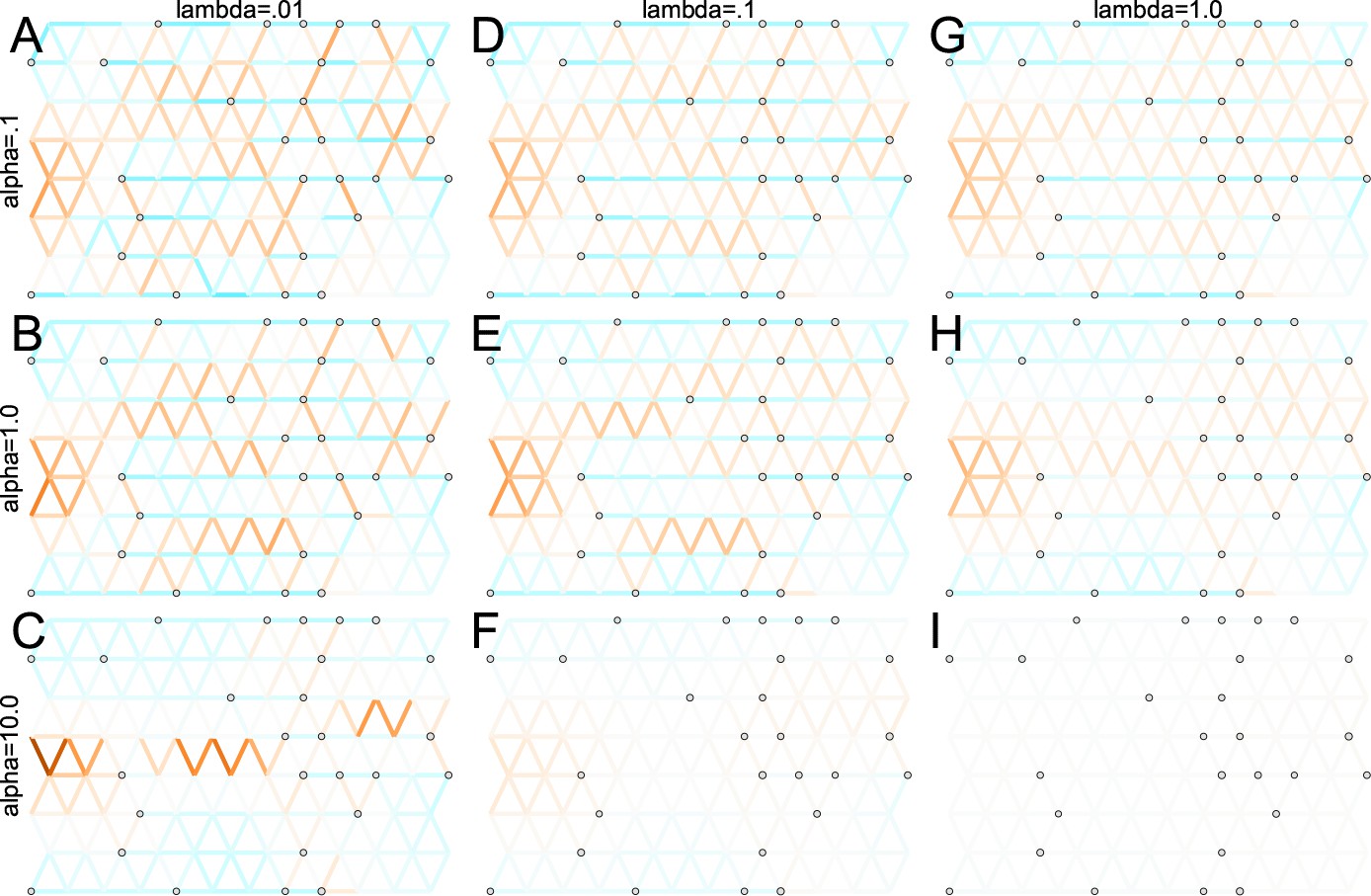
Application of FEEMS to an anisotropic migration scenario with a ‘missing at random’ sampling design: We run FEEMS on coalescent simulation with an anisotropic process while varying hyperparameters λ (rows) and α (columns).
We randomly sample individuals for 20% of nodes. When λ grows, the fitted graph becomes overall smoother, whereas α effectively controls the degree of similarity among low migration rates.
Appendix 1—figure 5
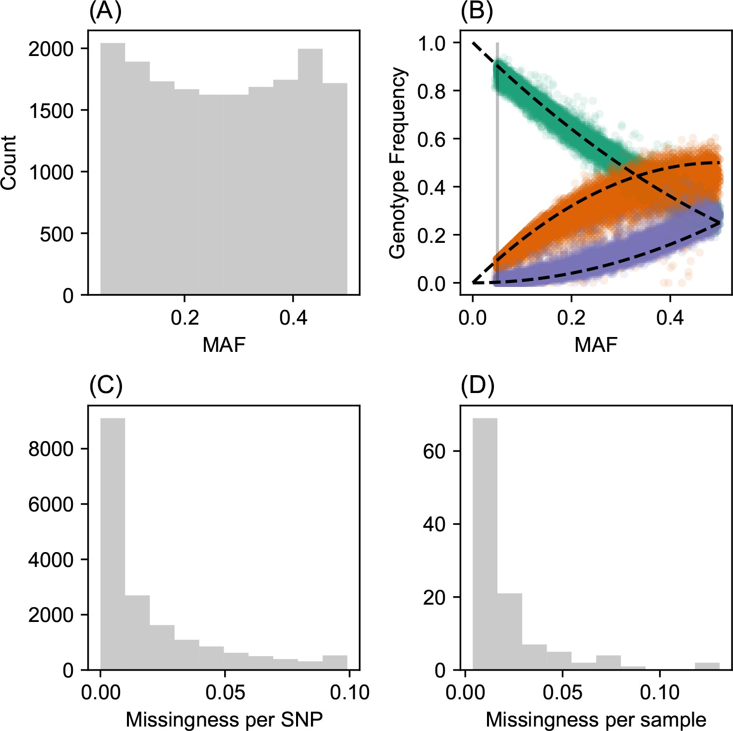
SNP and individual quality control.
(A) displays a visualization of the sample site frequency spectrum. Specifically, we display a histogram of minor allele frequencies across all SNPs. We see a relatively uniform histogram which reflects the ascertainment of common SNPs on the array that was designed to genotype gray wolf samples. (B) visualization of allele frequencies plotted against genotype frequencies. Each point represents a different SNP and the colors represent the three possible genotype values. The black dashed lines display the expectation as predicted from a simple binomial sampling model i.e., Hardy-Weinberg equilibrium. (C) displays a histogram of the missingness fraction per SNP. We observe the missingness tends to be relatively low for each SNP. (D) displays a histogram of the missingness fraction per sample. Generally, the missingness tends to be low for each sample.
Appendix 1—figure 6
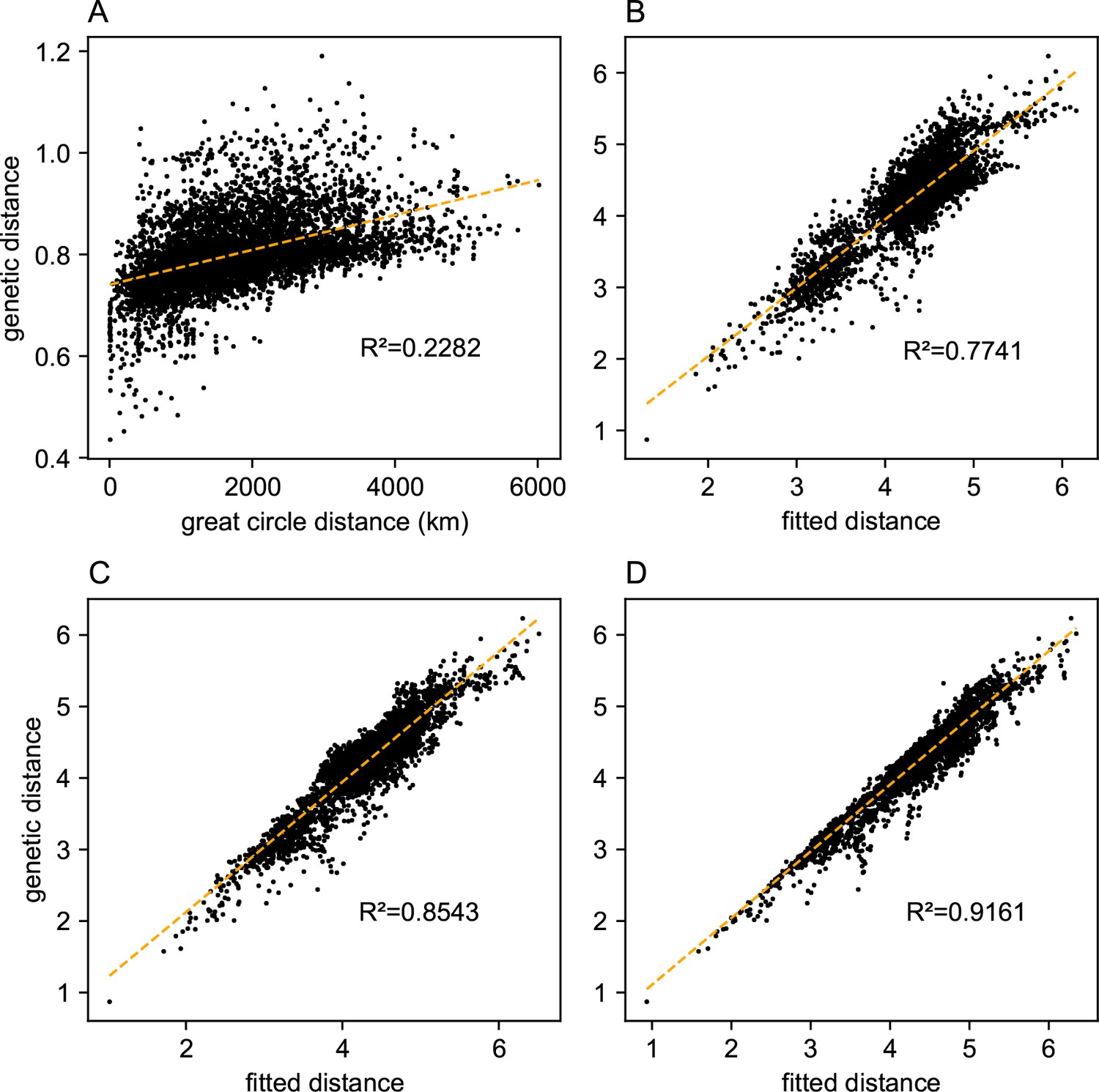
Comparing predictions of observed genetic distances: We display different predictions of observed genetic distances using geographic distance or the fitted genetic distance output by FEEMS.
(A) The x-axis displays the geographic distance between two individuals, as measured by the great circle distance (haversine distance). The y-axis displays the squared Euclidean distance between two individuals averaged over all SNPs. (B–D) The x-axis displays the fitted genetic distance as predicted by the FEEMS model and y-axis displays the squared Euclidean distance between two sub-populations averaged over all SNPs. For (B–D), we display the fit of λ getting subsequently smaller, (the same values of λ used in Figure 3A,B,C), and as expected the fit appears better because we tolerate more complex surfaces and we are not evaluating the fit on out-of-sample data.
Appendix 1—figure 7
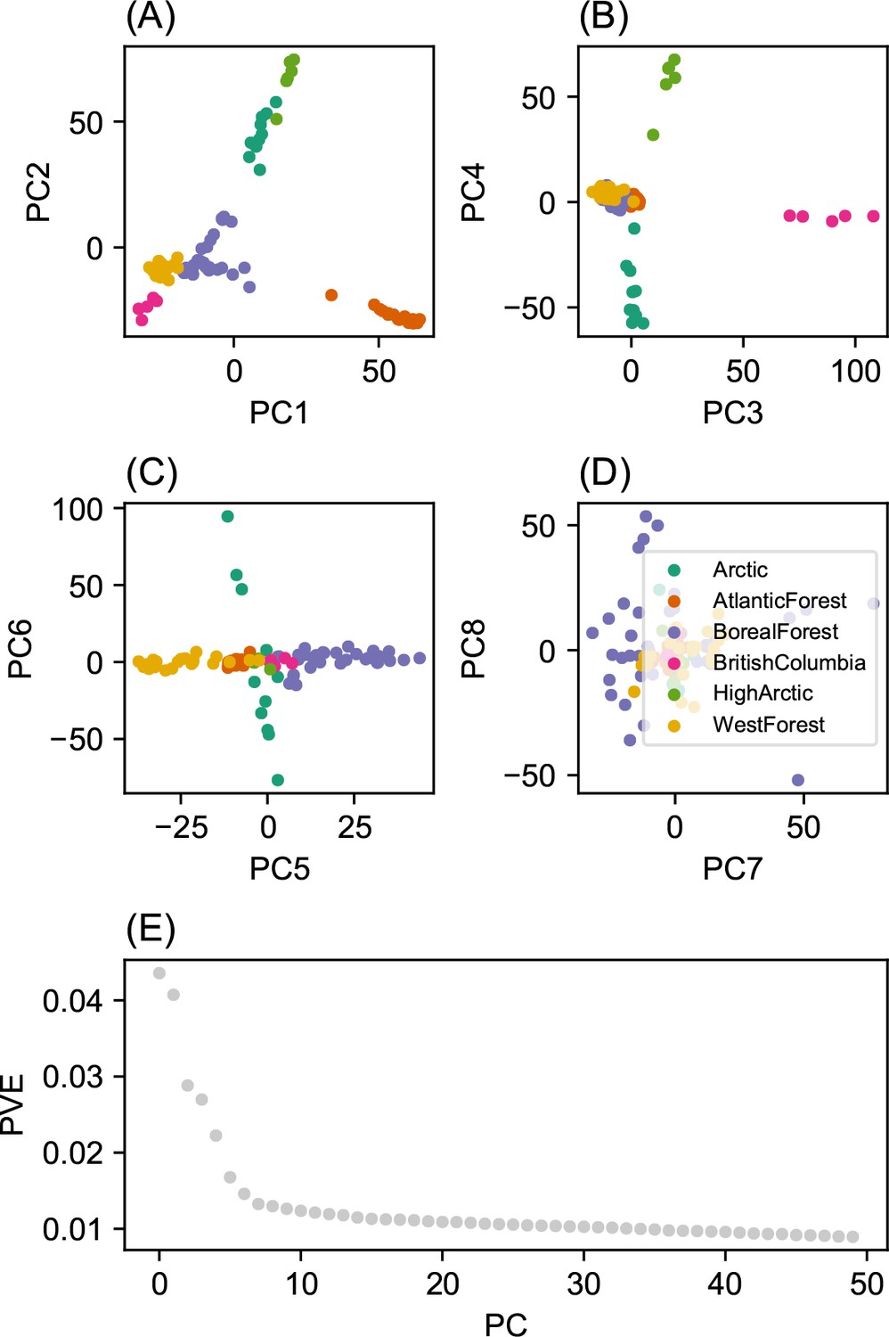
Summary of top axes of genotypic variation: We display a visual summary of Principal Components Analysis (PCA) applied to the normalized genotype matrix from the North American gray wolf dataset.
(A–D) displays PC bi-plots of the top seven PCs plotted against each other. The colors represent predefined ecotypes defined in Schweizer et al., 2016. We can see that the top PCs delineate these predefined ecotypes. (E) shows a ‘scree’ plot with the proportion of variance explained for each of the top 50 PCs. As expected by genetic data (Patterson et al., 2006), the eigenvalues of the genotype matrix tend to be spread over many PCs.
Appendix 1—figure 8

Relationship between top axes of genetic variation and latitude: In each sub-panel, we plot the PC value against latitude for each sample in gray the wolf dataset.
We see many of the top PCs are significantly correlated with latitude as tested by linear regression.
Appendix 1—figure 9
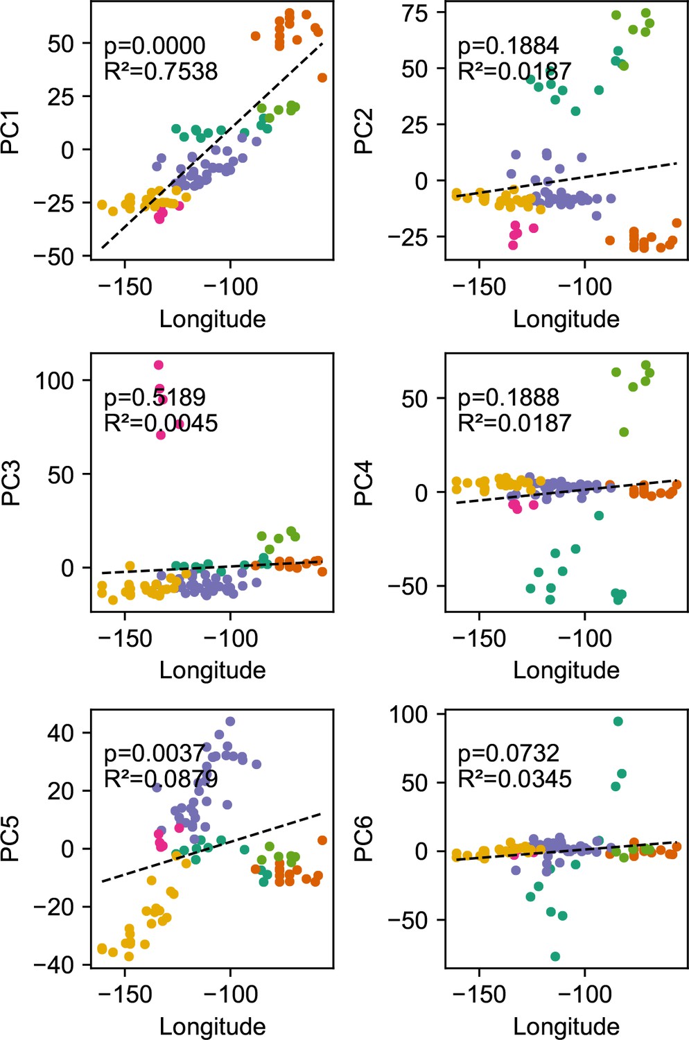
Relationship between top axes of genetic variation and longitude: In each sub-panel, we plot the PC value against longitude for each sample in the gray wolf dataset.
We see many of the top PCs are significantly correlated with longitude as tested by linear regression.
Appendix 1—figure 10
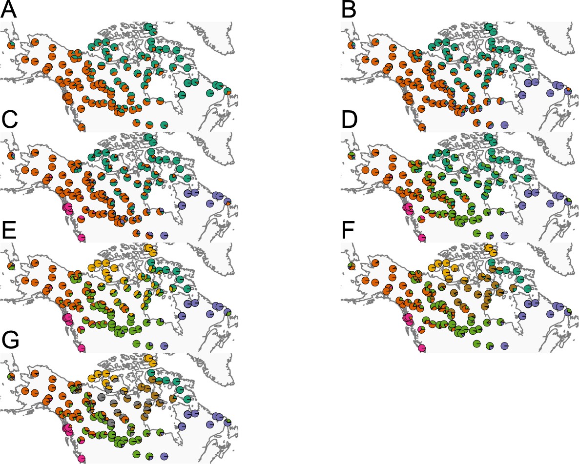
Summary of ADMIXTURE results: (A–G) Visualization of ADMIXTURE results for to .
We display admixture fractions for each sample as colored slices of the pie chart on the map. For each , we ran five replicate runs of ADMIXTURE and in this visualization, we display the solution that achieves the highest likelihood amongst the replicates. The ADMIXTURE results qualitatively reveal a spatial signal in the data as admixture fractions tend to be spatially clustered.
Appendix 1—figure 11
Application of EEMS to the North American gray wolf dataset: We display a visualization of EEMS applied to the North American gray wolf dataset.
The more orange colors represent lower than average effective migration on the log-scale and the more blue colors represent higher than average effective migration on the log-scale. The results of EEMS are qualitatively similar to FEEMS when lower regularization penalties are applied.
Appendix 1—figure 12
Application of FEEMS on the North American gray wolf dataset with an exact likelihood model: We display the fit of FEEMS based on the formulation Equation (21) to the North American gray wolf dataset.
This fit corresponds to a setting of tuning parameters at and . Additionally, we set the lower bound of the edge weights to , to ensure that the diagonal elements of does not become too small—this has an implicit effect on , preventing it from blowing up at unobserved nodes. The more orange colors represent lower than average effective migration on the log-scale and the more blue colors represent higher than average effective migration on the log-scale. Visually, the result is comparable to that of the FEEMS fit (Figure 4) based on the approximate formulation (Optimization).
Appendix 1—figure 13
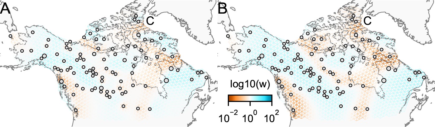
Application of FEEMS on the North American gray wolf dataset with joint estimation of the residual variances and graph’s edge weights: We show visualizations of fits of FEEMS to the North American gray wolf dataset when the residual variances and edge weights of the graph are jointly estimated.
Both fits correspond to a setting of tuning parameters at and . (A) displays the estimated effective migration surfaces where every deme shares a single residual parameter σ. (B) displays the estimated effective migration surfaces where each node has its own residual parameter . Both approaches yield similar results to the procedure that prefixes σ from the homogeneous isolation by distance model (Figure 4). The node-specific residual parameters may allow for more flexible graphs to be fitted, and we can further observe reduced effective migration around C (Queen Elizabeth Islands) in (B).
Appendix 1—figure 14
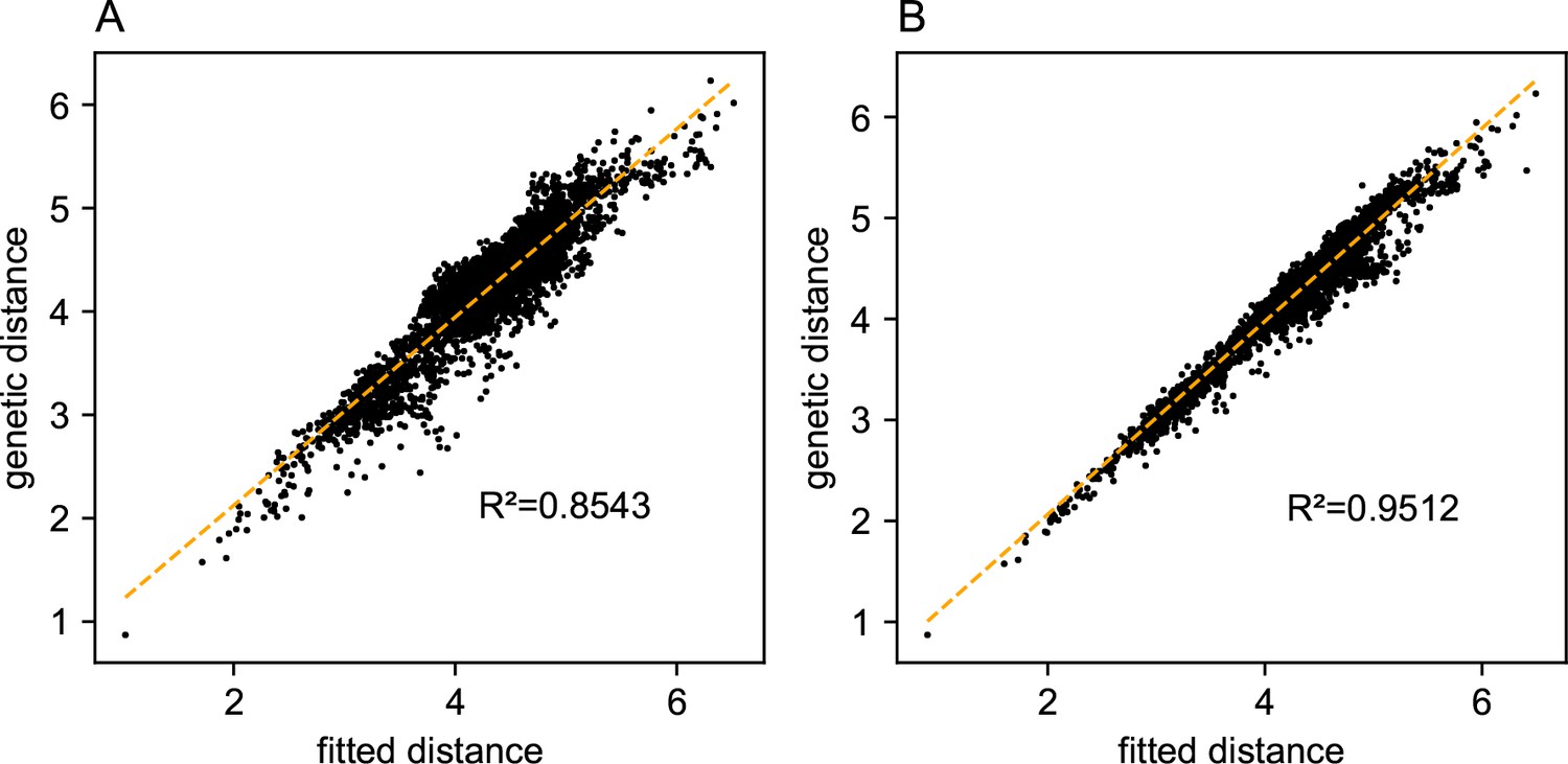
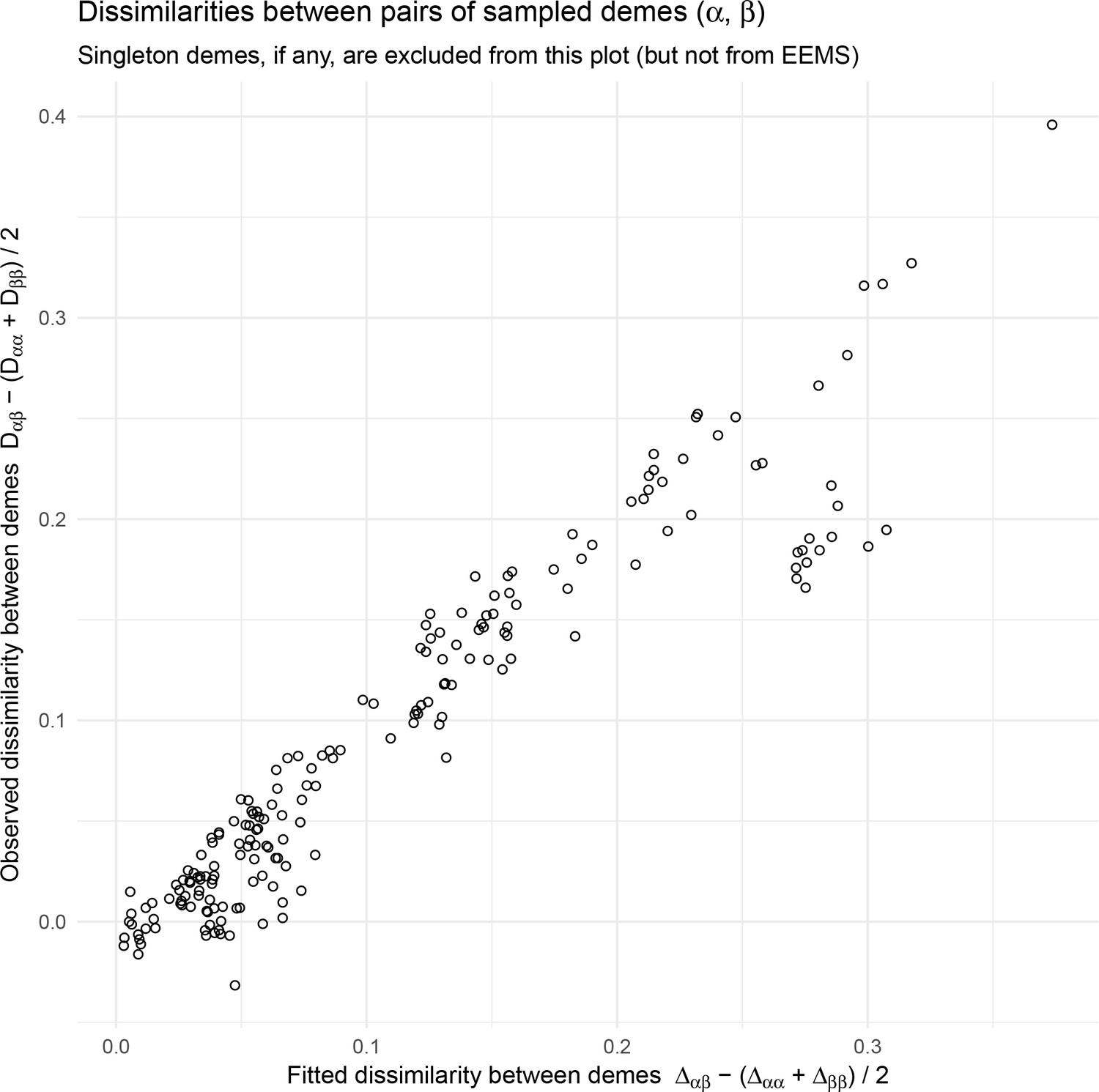
Relationship between fitted versus observed genetic dissimilarities on the North American gray wolf dataset: We display scatter plots of fitted genetic distance versus observed genetic distance from FEEMS fits on the gray wolf dataset.
(A) Corresponds to the result shown in Figure 4. (B) Corresponds to the result shown in Appendix 1—figure 13B. The x-axis displays the fitted genetic distance as predicted by the FEEMS model and y-axis displays the squared Euclidean distance between two sub-populations averaged over all SNPs. The simple linear regression fit is shown in orange dashed lines and is given.
Appendix 1—figure 15
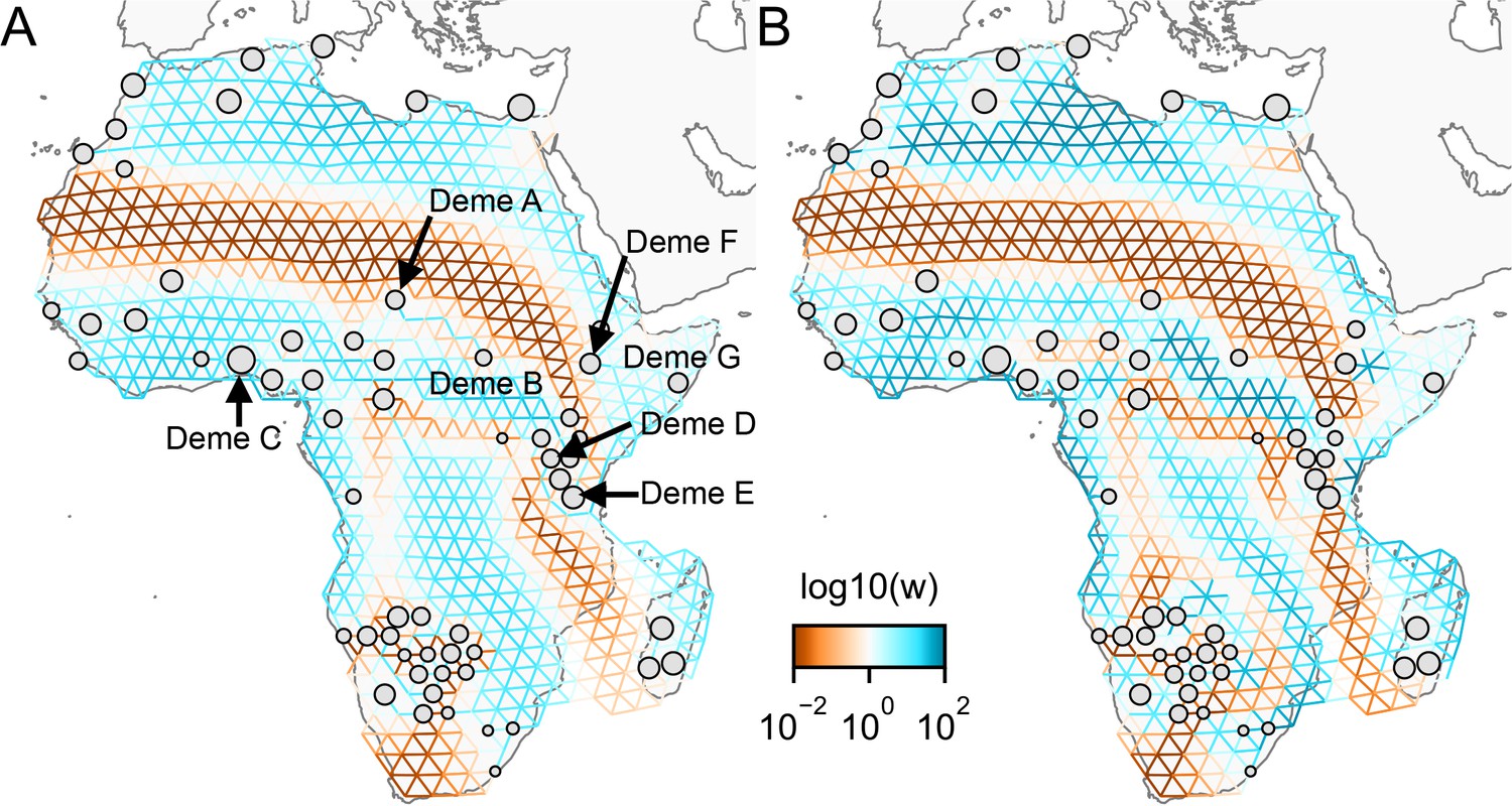
Application of FEEMS to a dataset of human genetic variation from Africa with different parameterization: We display visualizations of FEEMS to a dataset of human genetic variation from Africa with different parameterization of the graph’s edge weights.
See Peter et al., 2020 for the description of the dataset. (A) displays the recovered graph under the edge parameterization. (B) displays the recovered graph under the node parameterization. Both parameterization have their own regularization parameters λ and α, but these parameters are not on the same scale. We set and for the node parameterization which is seen to yield similar results to those in Peter et al., 2020. For the edge parameterization, we set and so that the resulting graph reveals similar geographic structure to the node parameterization. We also set the lower bound . From the plots, it is worth noting two important distinctions: (1) We see the migration surfaces shown in (B) recover sharper edge features while the migration surfaces in (A) are overall smoother. This is attributed to the fact that node parameterization has its own additional regularization effect on the edge weights, and in order to achieve similar degree of regularization strength for the edge parameterization, it needs a higher regularization parameters, which results in more blurring edges than the node parameterization. (2) When measuring correlation of the estimated allele frequencies among nodes, we find that Deme B is the node with the second highest correlation to Deme A, whereas Deme C (and nearby demes) is not as much correlated to Deme A compared to Deme B. Panel (A) reflects this feature by exhibiting a corridor between Deme A and Deme B and reduced gene-flow beneath that corridor. This reduced gene-flow disappears in (B), even if the regularization parameters are varied over a range of values. Additionally, Deme D is most highly correlated to Deme E, F, and G, and this is implicated by a long-range corridor connecting those demes appearing in Panel (A) while not shown in (B). These results suggest that the form of the node parameterization is perhaps too strong and in this case limits the model’s ability to capture desirable geographic features that are subtle to detect.
Appendix 1—figure 16
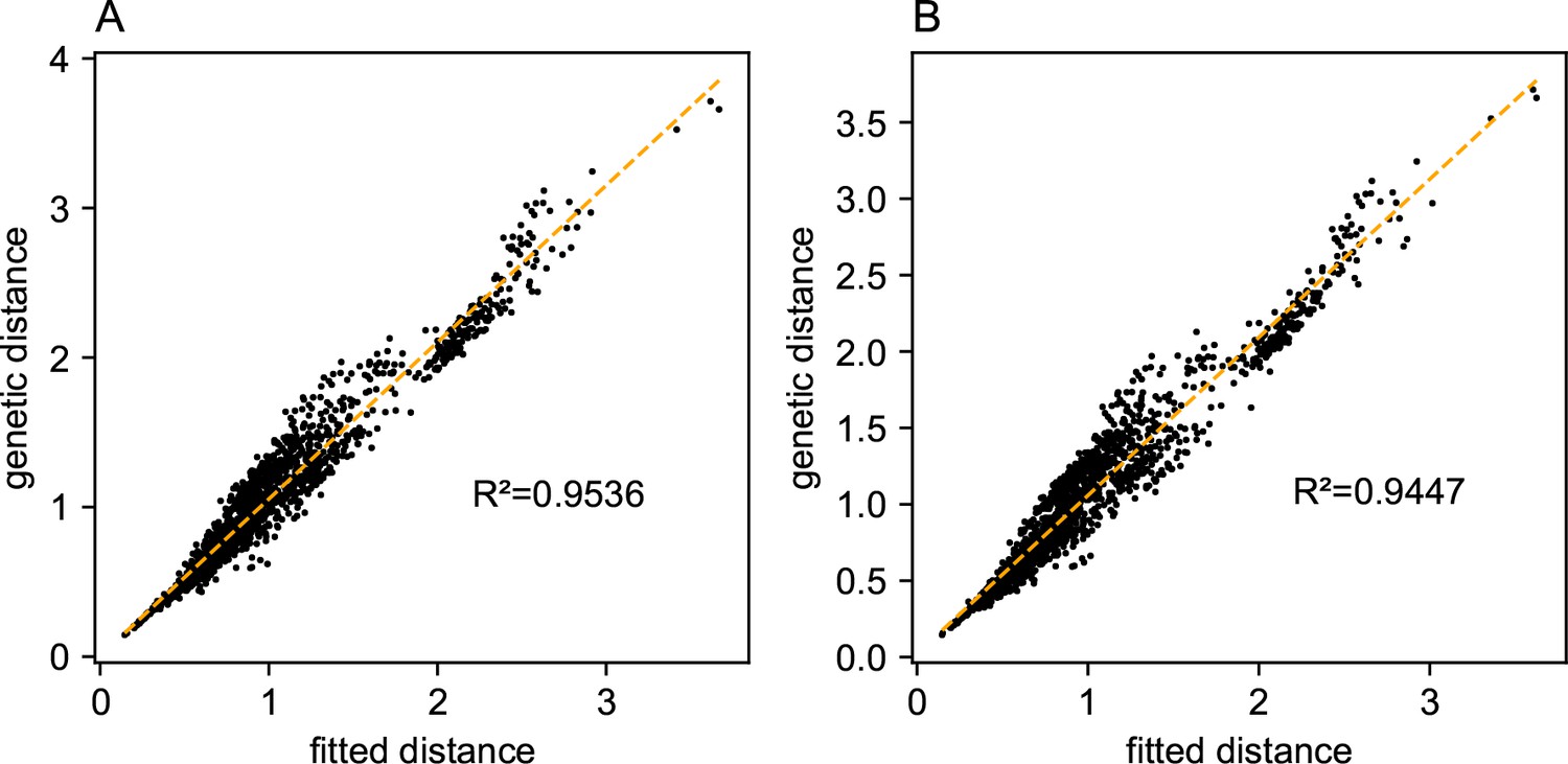
Relationship between fitted versus observed genetic dissimilarities on a dataset of human genetic variation from Africa: We display scatter plots of fitted genetic distance versus observed genetic distance from FEEMS fits on the African dataset.
(A) Corresponds to the result shown in Appendix 1—figure 15A. (B) Corresponds to the result shown in Appendix 1—figure 15B. The x-axis displays the fitted genetic distance as predicted by the FEEMS model and y-axis displays the squared Euclidean distance between two sub-populations averaged over all SNPs. The simple linear regression fit is shown in orange dashed lines and is given.
Appendix 1—figure 17
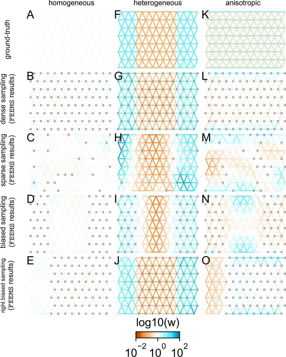
Application of FEEMS based on node parameterization to an extended set of coalescent simulations: We display an extended set of coalescent simulations with the same migration scenarios and sampling designs as Appendix 1—figure 2.
The sample sizes across the grid are represented by the size of the gray dots at each node. The migration rates are obtained by solving the FEEMS objective function (Optimization) with node parameterization where the regularization parameters are specified at and . (A, F, K) display the ground truth of the underlying migration rates. (B, G, L) shows simulations where there is no missing data on the graph. (C, H, M) shows simulations with sparse observations and nodes missing at random. (D, I, N) shows simulations of biased sampling where there are no samples from the center of the simulated habitat. (E, J, O) shows simulations of biased sampling where there are only samples on the right side of the habitat.
Appendix 1—figure 18
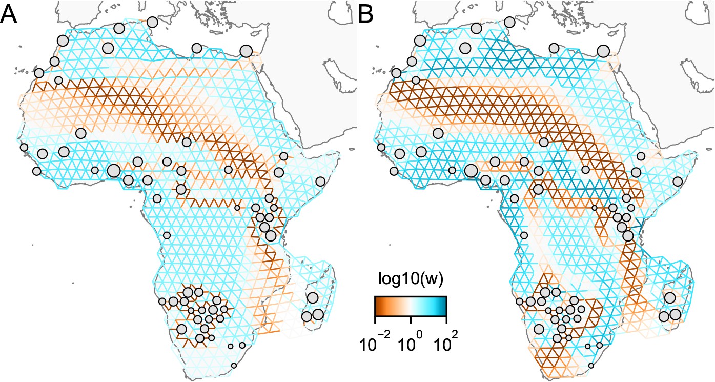
Application of -norm-based FEEMS to a dataset of human genetic variation from Africa: We display visualizations of FEEMS to a dataset of human genetic variation from Africa with the -based penalty function.
See Peter et al., 2020 for the description of the dataset. (A) displays the recovered graph under the edge parameterization with norm based penalty where the regularization parameters are specified at and . (B) displays the recovered graph under the node parameterization with norm-based penalty where the regularization parameters are specified at and . To minimize the objective Equation (23), linearized ADMM is applied with 20,000 number of iterations. The lower bound is set to be for both parameterizations. Note that due to the high degrees of missingness, the estimated effective migration surfaces using solely -based penalty exhibit many likely artifacts (e.g. high migration edges forming long paths, seen in panel A) unless an additional regularization is added to encourage global smoothness of the edge weights, such as a combination of norm penalty function and node parameterization as shown in (B).
Appendix 1—figure 19
Application of -norm-based FEEMS to an extended set of coalescent simulations: We display an extended set of coalescent simulations with the same migration scenarios and sampling designs as Appendix 1—figure 2.
The sample sizes across the grid are represented by the size of the gray dots at each node. The migration rates are obtained by solving norm based FEEMS objective Equation (23) where the regularization parameters are specified at and . (A, F, K) display the ground truth of the underlying migration rates. (B, G, L) shows simulations where there is no missing data on the graph. (C, H, M) shows simulations with sparse observations and nodes missing at random. (D, I, N) shows simulations of biased sampling where there are no samples from the center of the simulated habitat. (E, J, O) shows simulations of biased sampling where there are only samples on the right side of the habitat.
Appendix 1—figure 20
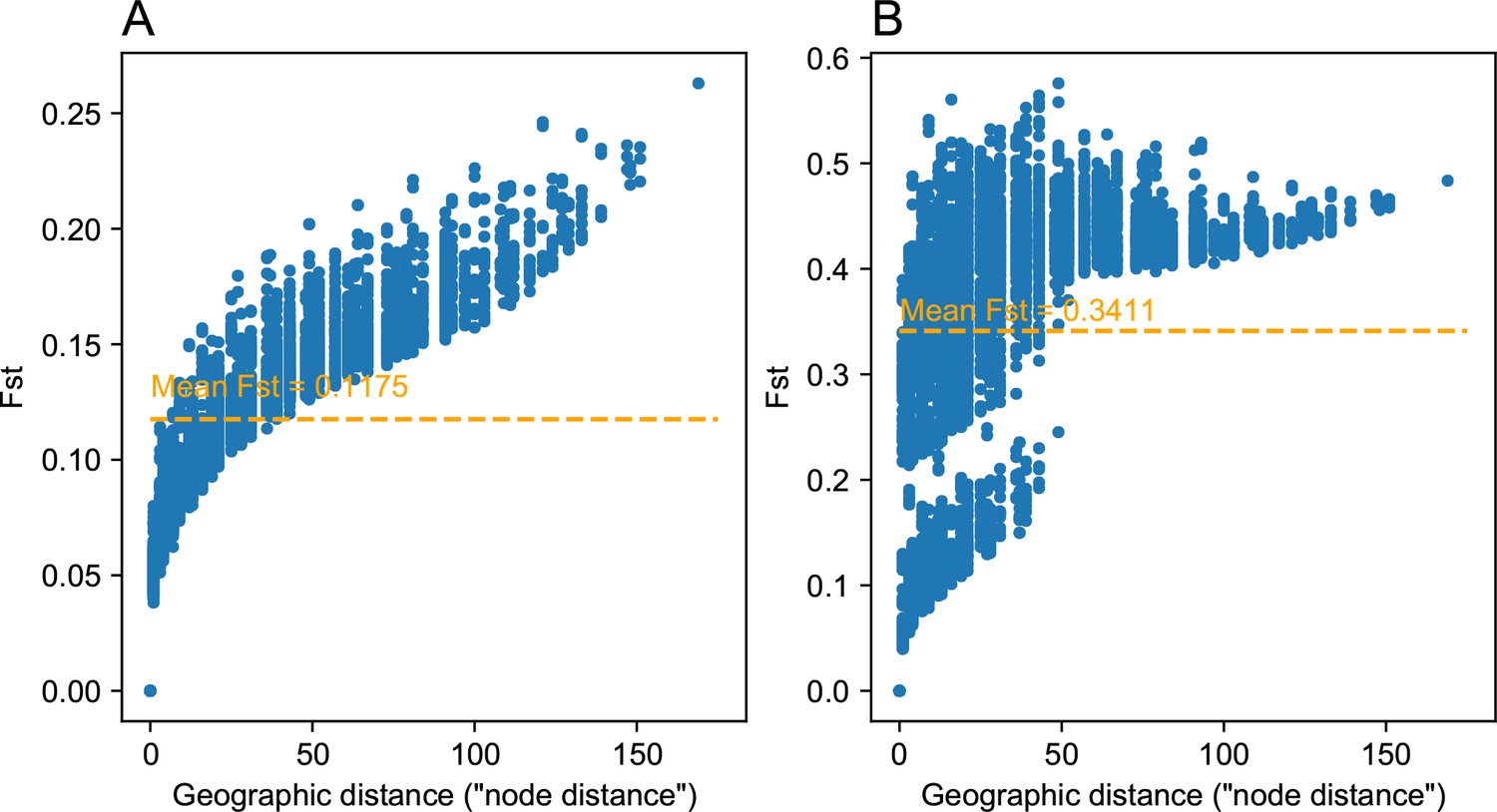
Comparing pairwise between strong and weak heterogeneous migration coalescent simulations: We visualize of the relationship between geographic distance and estimated pairwise (genetic distance) between nodes on the spatial grid for a weak heterogeneous migration simulation (A) and a strong heterogeneous migration (B).
As expected the average is lower for the weak migration setting, and we observe a clear clustering like effect in the data for the strong heterogeneous migration simulation. This strong clustering effect can be attributed to pairwise comparisons of nodes across the region of reduced gene flow. Distances between nodes were set to one in the simulation, and so the units of geographic distance here are in units of the inter-node distance.
Appendix 1—figure 21
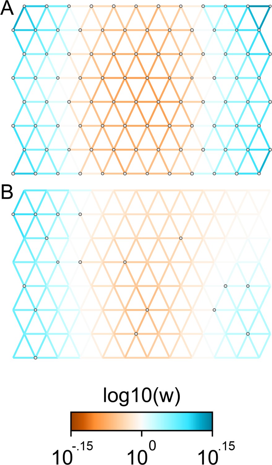
Applications of FEEMS to weak migration coalescent simulations: We visualize the FEEMS fit to coalescent simulations with weak heterogeneous migration.
The coalescent migration rate in the center of the habitat is set to be 25% lower than the left or right regions. Note that the color-scale limits are set to and , respectively. The top panel shows the fit when all the nodes of the spatial graph are observed, whereas the bottom panel shows the fit when a sparse subset of nodes are observed. We see that FEEMS can still detect a signal of heterogeneity by displaying reduced gene-flow in the center of the habitat in the top panel. When we observe only a few nodes, in this weak migration setting, the FEEMS visualization looks overly smooth.
Appendix 1—figure 22
EEMS fitted versus observed genetic dissimilarities from the North American gray wolf dataset: We visualize fitted versus observed genetic dissimilarities corresponding to the EEMS visualization run on the North American gray wolf dataset in Figure 4.
EEMS was run on a sparse grid with 307 nodes due to long run-times on the dense grid. Generally there is good concordance between the fitted and observed dissimilarities except for a small set of points whose fitted genetic dissimilarity over-estimates the observed dissimilarity, implying a relatively poorly fit for these points. Note, we do not see these poorly fit points in visualizations of the fitted versus observed distances when using FEEMS (see Appendix 1—figure 6).
Tables
Table 1
Runtimes for FEEMS and EEMS on the North American gray wolf dataset.
We show a table of runtimes for FEEMS and EEMS for two different grid densities, a sparse grid with 307 nodes and a dense grid with 1207 nodes. The second row shows the FEEMS run-times for applying leave-one-out cross-validation to select λ. The third row shows the run-times when applying FEEMS at the best λ value selected using cross-validation. FEEMS is orders of magnitude faster than EEMS, even when using cross-validation to select λ. Runtimes are based on computation using Intel Xeon E5-2680v4 2.4 GHz CPUs with 5 Gb RAM reserved using the University of Chicago Midway2 cluster.
| Method | Sparse grid (run-time) | Dense grid (run-time) |
|---|---|---|
| EEMS | 27.43 hr | N/A |
| FEEMS (Cross-validation) | 10 min 32 s | 1.03 hr |
| FEEMS (Best λ) | 1.23 s | 4.08 s |
Additional files
Download links
A two-part list of links to download the article, or parts of the article, in various formats.
Downloads (link to download the article as PDF)
Open citations (links to open the citations from this article in various online reference manager services)
Cite this article (links to download the citations from this article in formats compatible with various reference manager tools)
Fast and flexible estimation of effective migration surfaces
eLife 10:e61927.
https://doi.org/10.7554/eLife.61927


