ImmunoCluster provides a computational framework for the nonspecialist to profile high-dimensional cytometry data
Figures
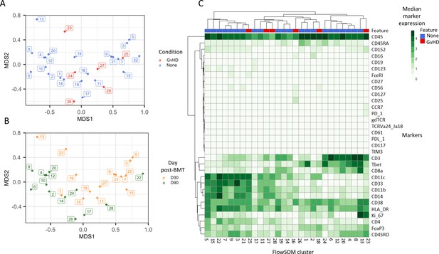
Initial exploration of liquid mass cytometry data from patients with leukemia who received bone marrow transplants (BMTs).
(A, B) Multidimensional scaling of data; median marker expression data from each sample were used to create plots, annotated with condition (graft versus host disease or none) (A), and time after BMT treatment (B). (C) Heatmap showing the median marker expression for each patient.
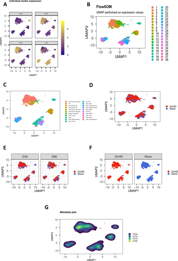
Customizable figure outputs.
(A) Expression of four selected lineage markers projected onto UMAP plot. (B) UMAP annotated with FlowSOM clusters. (C) UMAP annotated with cell types. (D) UMAP plot colored by graft versus host disease (GvHD) and none. (E) UMAP plots colored by GvHD and none and split by timepoint (30 and 90 days after bone marrow transplant treatment). (F) UMAP plots colored and split by GvHD and none. (G) Visualize the density of cells within cell islands of dimensionality reduced data.
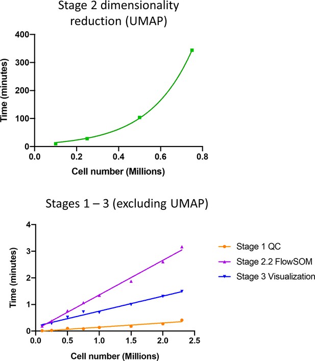
ImmunoCluster typical pipeline runtime.
2.3 M cell liquid mass cytometry graft versus host disease dataset (with UMAP downsampling to 500k cells) on a 2.9 GHz Intel Core i7 MacBook pro with 16 GB RAM. QC: quality control.
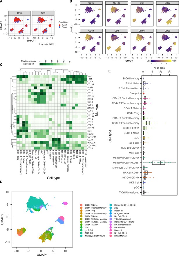
Dimensionality reduced liquid mass cytometry CyTOF data and marker expression.
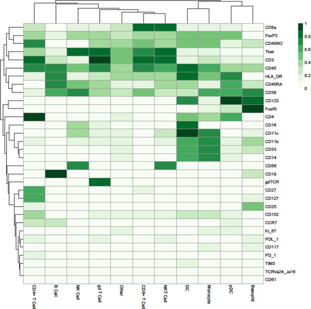
(A) UMAP plots colored by graft versus host disease and none and split by timepoint (30 and 90 days after bone marrow transplant treatment). (B) Expression of eight selected lineage markers projected onto UMAP plot. Identifying cell types and abundance of clusters. (C) Heatmap showing median marker expression across all identified cell types. (D) UMAP annotated with cell types. (E) Distribution of immune cell frequencies and abundance (%) of each cell type across all samples measured.
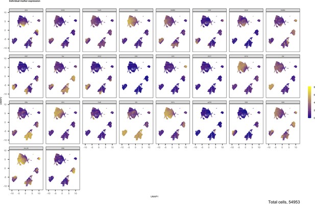
Expression of all markers measured projected onto cell islands produced by UMAP.
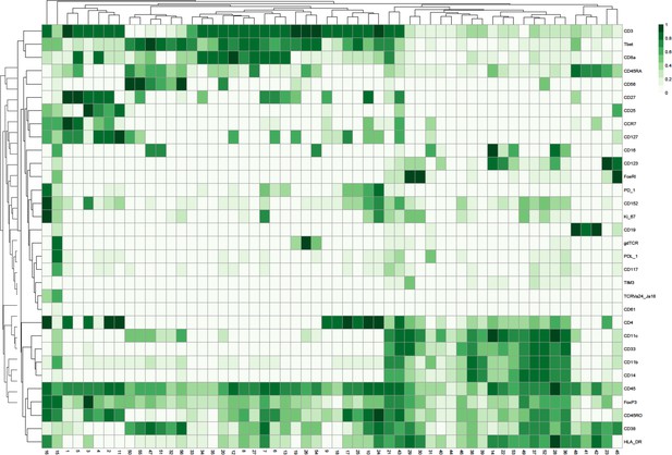
Heatmap showing the marker expression of 56 FlowSOM clusters.
This heatmap was used to identify the cell type of each cluster.
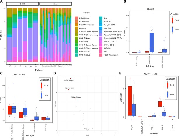
Liquid mass cytometry (LMC) CyTOF data cluster and cell-type abundances.
(A) Percentage of each cell type shown for each patient numbered across the bottom of the plot. (B, C) Box plots portray interquartile range (IQR) with the horizontal line representing the median percentage of cell types in both graft versus host disease (GvHD) and none patients for B-cell and CD4+ T-cell populations, respectively. (D) Differential abundance analysis; volcano plot showing the significantly differentially expressed cell abundances (false discovery rate p<0.05) between GvHD and none (GvHD logFC+ve and none logFC-ve). (E) Comparison of checkpoint-related molecules (PD-1 and TIM3), receptors (PD-L1), proliferative (Ki-67), and iNK T-cells (TCRVa24-Ja18) marker expression between GvHD and none patients in the CD8+ T-cell cluster.
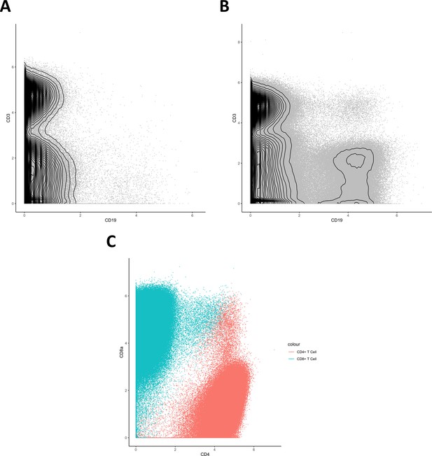
Biaxial plots.
(A, B) Biaxial contour plots showing distribution of CD3+ and CD19+ cells in graft versus host disease (A) and none (B). (C) Biaxial dot plot showing distribution of CD4+ and CD8α+ cells in the identified CD8+ T cell and CD4+ T cell clusters.
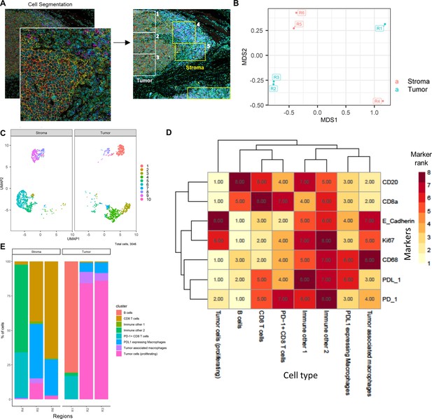
HNSCC imaging mass cytometry (IMC) data.
Immunophenotyping the tumor microenvironment with IMC data using ImmunoCluster. (A) IMC image showing an example of five channels: PD-L1 (green), CD4 (yellow), E-cadherin (red), CD20 (magenta), and CD8α (blue). Images with the segmented cell borders are highlighted. The tumor and stroma areas are clear to the eye, and three regions were selected from each as shown (regions 1–6). (B) Multidimensional scaling plot of stroma and tumor regions. (C) Dimensionality reduced data (UMAP algorithm applied) annotated with FlowSOM clusters and split by region type. (D) Rank heatmap: ranked expression (1–8, where 8 is high) of seven markers (CD20, CD8α, E-cadherin, Ki-67, PD-L1, CD68, and PD-1) and identified cell type. (E) Proportion of cell types for each tissue region.
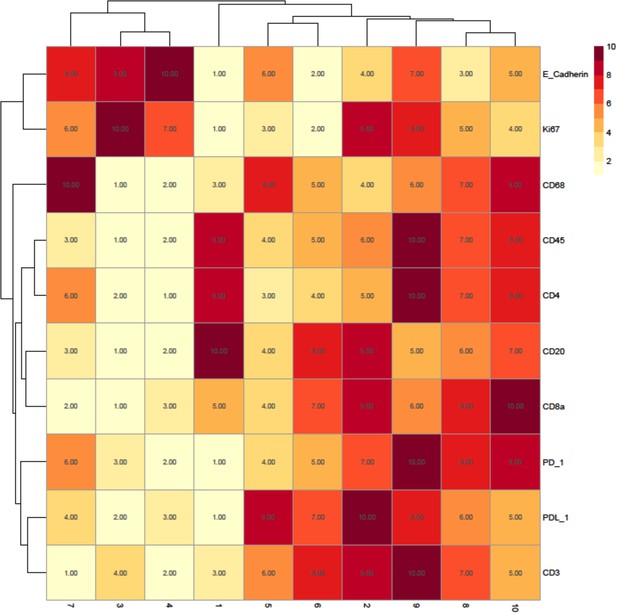
Rank heatmap for the head and neck squamous cell carcinoma patient imaging mass cytometry data.
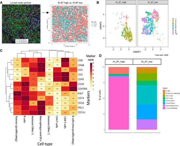
Diffuse large B-cell lymphoma imaging mass cytometry (IMC) data.
Immunophenotyping the lymph node microenvironment with IMC data using ImmunoCluster. (A) IMC image showing an example of four channels: DNA (red), CD20 (green), CD8α (dark blue), and CD45RA (light blue). The image was split by high and low Ki-67 expression to identify highly proliferative cells (tumor). (B) Dimensionality reduced data (UMAP algorithm applied) annotated with FlowSOM clusters and split by Ki-67 high or low. (C) Rank heatmap: ranked expression (1–8, where 8 is high) of 12 markers (CD8, CD68, CD4, CD3, CD45, CD20, CD45RA, Ki-67, CD74, CD16, PD-L1, and CD11c) and identified cell type. (D) Proportion of cell types for Ki-67 high and Ki-67 low cell populations.
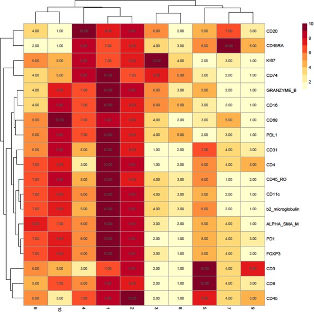
Rank heatmap for the diffuse large B-cell lymphoma patient imaging mass cytometry data.
Clusters 1 and 2 were not used for downstream analysis as they were deemed to represent minor populations of cells that were nonspecifically binding the antibodies as they ranked highly for all markers (including lineage markers) of interest.
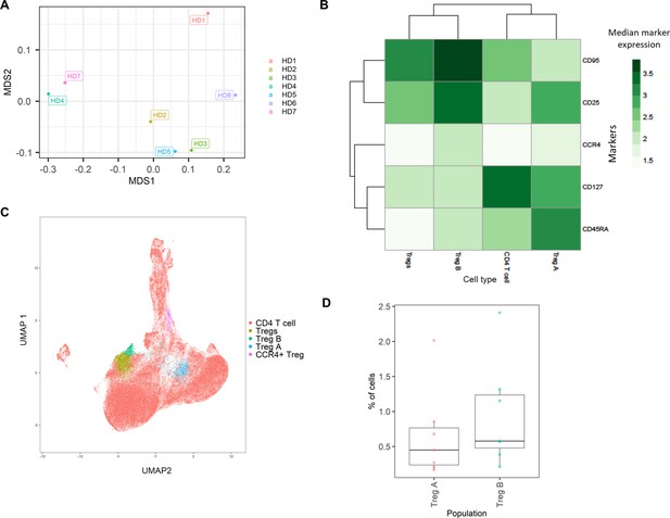
Healthy donor bone marrow flow cytometry data: identification of rare CD4+ T-cell immune cell subsets.
(A) Multidimensional scaling plot of each healthy donor (1–7). (B) Heatmap showing marker expression across clusters of identified cell types. (C) Dimensionality reduced data (UMAP algorithm applied) annotated with cell type. (D) Proportion of Treg A and B from total cells from healthy donors.
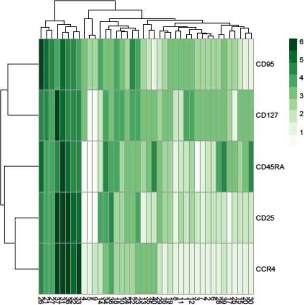
Heatmap showing the marker expression of 40 FlowSOM clusters.
This heatmap was used to identify the cell type of each cluster.
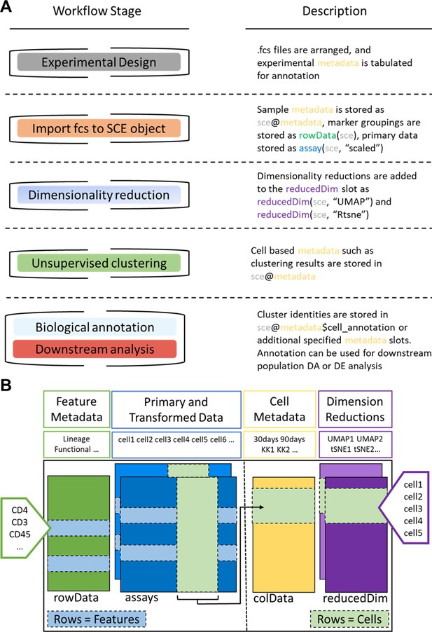
ImmunoCluster workflow stages and SingleCellExperiment structure.
(A) Schematic outlining the typical cytometry workflow and its interactions with the SingleCellExperiement ImmunoCluster object. (B) SingleCellExperiment structure in ImmunoCluster. The SingleCellExperiment class is a data container, storing multiple layers of data to create the SingleCellExperiment object, which holds all relevant data for an experiment. Feature metadata: imported by the user in the form of a panel_metadata file, which is a table containing all markers measured, each annotated with either lineage or functional information for downstream analysis. Primary and transformed data: the imported expression data is stored in an assay; additionally, the scaled data (arcsinh transformed) is also stored in an assay, meaning both can be easily accessed. Cell metadata: the first metadata added to this element of the structure will be a sample_metadata file imported by the user, containing any relevant metadata for the experiment, that is, days after treatment and graft versus host disease or none. Throughout the ImmunoCluster tool, more layers of metadata are added to cell metadata, that is, cell cluster identification (FlowSOM and Phenograph). Dimension reductions: dimensionality reduction coordinates, such as UMAP and tSNE, are stored and can be easily accessed throughout the ImmunoCluster tool for downstream analyses.
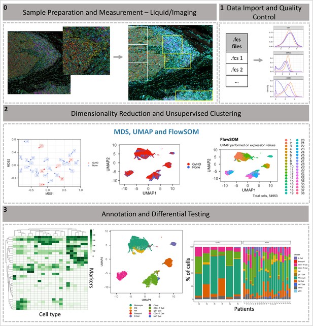
ImmunoCluster workflow overview.
(0) Samples are stained/treated and measured, for imaging mass cytometry the tissue is segmented, and regions selected for further downstream analysis. After measurement, the raw data is normalized, concatenated, (combining flow cytometry standard files from the same samples, which may have been split due to large sample volume or technical issues) and gated, before importing into ImmunoCluster. (1) Quality control of data is carried out before analysis. (2) Data is reduced to two dimensions using either UMAP or tSNE algorithm, and data are clustered using the FlowSOM or Phenograph algorithms (these algorithms were selected as they are both high-performing unsupervised clustering algorithms; an in-depth comparison has previously been described by Weber and Robinson, 2016). (3) Data is visualized, and metadata, clusters, and cell-type labels are used to explore differences between samples/conditions. *A detailed step-by-step guide for using the ImmunoCluster tool is available: https://github.com/kordastilab/ImmunoCluster.
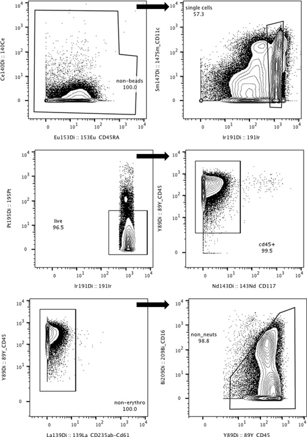
Gating strategy for mass cytometry data in FlowJo.
Calibration beads, doublets, dead cells, non-CD45+ cells, erythrocytes (CD235αβ/CD61+), and neutrophils (CD16+) were removed.
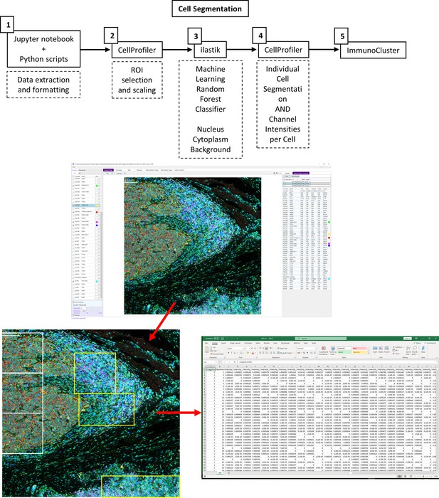
Imaging mass cytometry (IMC) data preprocessing workflow.
(1) The imctools Python package (Schulz et al., 2018) was used to convert raw IMC files (.mcd, .txt) into intermediatory .tiff files, which were used as input files for the following tools. (2) .tiff files were imported into CellProfiler for regions of interest (ROI) selection for classifier training. (3) IIastik was used for pixel classification, pixels were identified as nuclear, cytoplasmic, or background, and these class probabilities were exported as RGB (red, green, blue) .tiff images. (4) The iIastik RGB probabilities and the original images were imported into CellProfiler for single-cell segmentation, mask generation, and marker quantification.
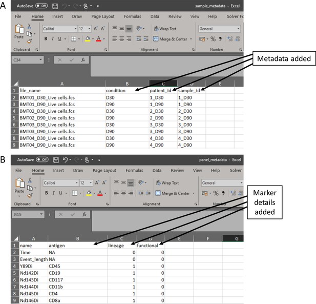
Metadata files created in the experimental design stage.
(A) Sample metadata file containing all metadata the researcher would like to explore throughout the data analysis stage. (B) Panel metadata file allows the researcher to rename parameters and select the markers that will be used for the dimensionality reduction of the data.
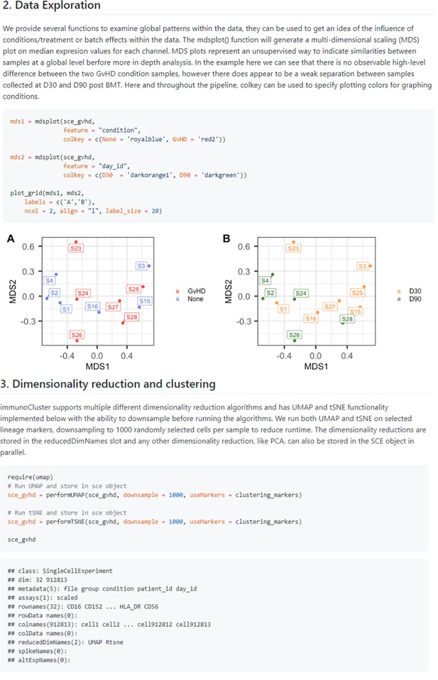
Dimensionality reduction.
Examples taken from the GitHub page (https://github.com/kordastilab/ImmunoCluster) highlighting the three different types of dimensionality reduction algorithms available for the users. Multidimensional scaling is part of the initial data exploration step followed by UMAP and tSNE dimensionality reduction in stage 2 of the ImmunoCluster framework.
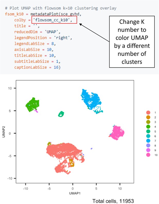
Selecting K clusters for visualization and downstream analysis.
The ImmunoCluster tool saves all K clusters selected for the FlowSOM algorithm (e.g., 1–60 K clusters); therefore, researchers can view different numbers of K clusters for downstream analysis by changing the Flowsom_cc_K number (highlighted above).
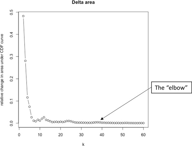
Elbow plot criterion to help determine optimal number of clusters for K-means clustering (FlowSOM).
The figure shows K clusters 2–60, for each value of K the sum of squared errors were plotted, and the aim was to detect the ‘elbow’, which is the point where the variance stops decreasing sharply and the line flattens on the plot, representing the optimal value of K.
Additional files
-
Supplementary file 1
Reference panel of anti-human antibodies for mass cytometry used by Hartmann et al., 2019.
- https://cdn.elifesciences.org/articles/62915/elife-62915-supp1-v2.docx
-
Supplementary file 2
Reference panel of anti-human antibodies for the head and neck cancer (HNSCC) imaging mass cytometry experiment.
- https://cdn.elifesciences.org/articles/62915/elife-62915-supp2-v2.docx
-
Supplementary file 3
Reference panel of anti-human antibodies for the diffuse large B-cell lymphoma (DLBCL) imaging mass cytometry experiment.
- https://cdn.elifesciences.org/articles/62915/elife-62915-supp3-v2.docx
-
Supplementary file 4
Diffcyt computational framework output for differential discovery analysis for identified cell clusters in the Hartmann et al., 2019 in LMC data.
- https://cdn.elifesciences.org/articles/62915/elife-62915-supp4-v2.docx
-
Transparent reporting form
- https://cdn.elifesciences.org/articles/62915/elife-62915-transrepform-v2.docx


