Functional dynamic genetic effects on gene regulation are specific to particular cell types and environmental conditions
- Center for Molecular Medicine and Genetics, Wayne State University, United States
- Department of Human Genetics, University of Chicago, United States
- Department of Medicine, University of Chicago, United States
- Department of Computer Science, UCLA, United States
- Department of Human Genetics, UCLA, United States
- Department of Computational Medicine, UCLA, United States
- Department of Biostatistics, University of Michigan, United States
- Center for Individualized and Genomic Medicine Research, Henry Ford Hospital, United States
- Department of Obstetrics and Gynecology, Wayne State University, United States
Figures
Figure 1 with 8 supplements
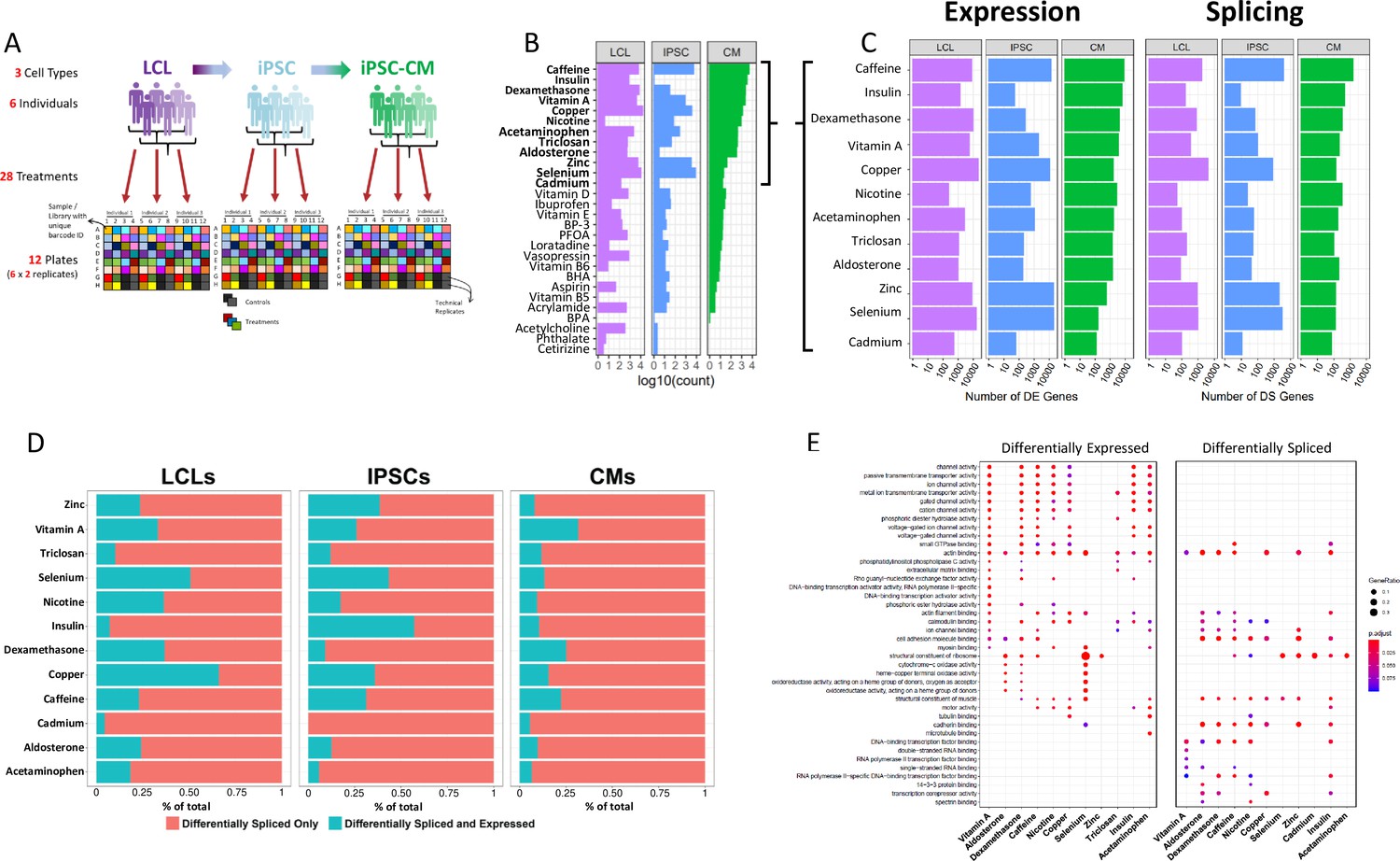
Gene expression and splicing changes in response to environmental perturbation (A) Study Design.
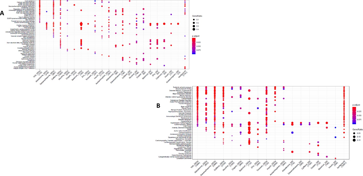
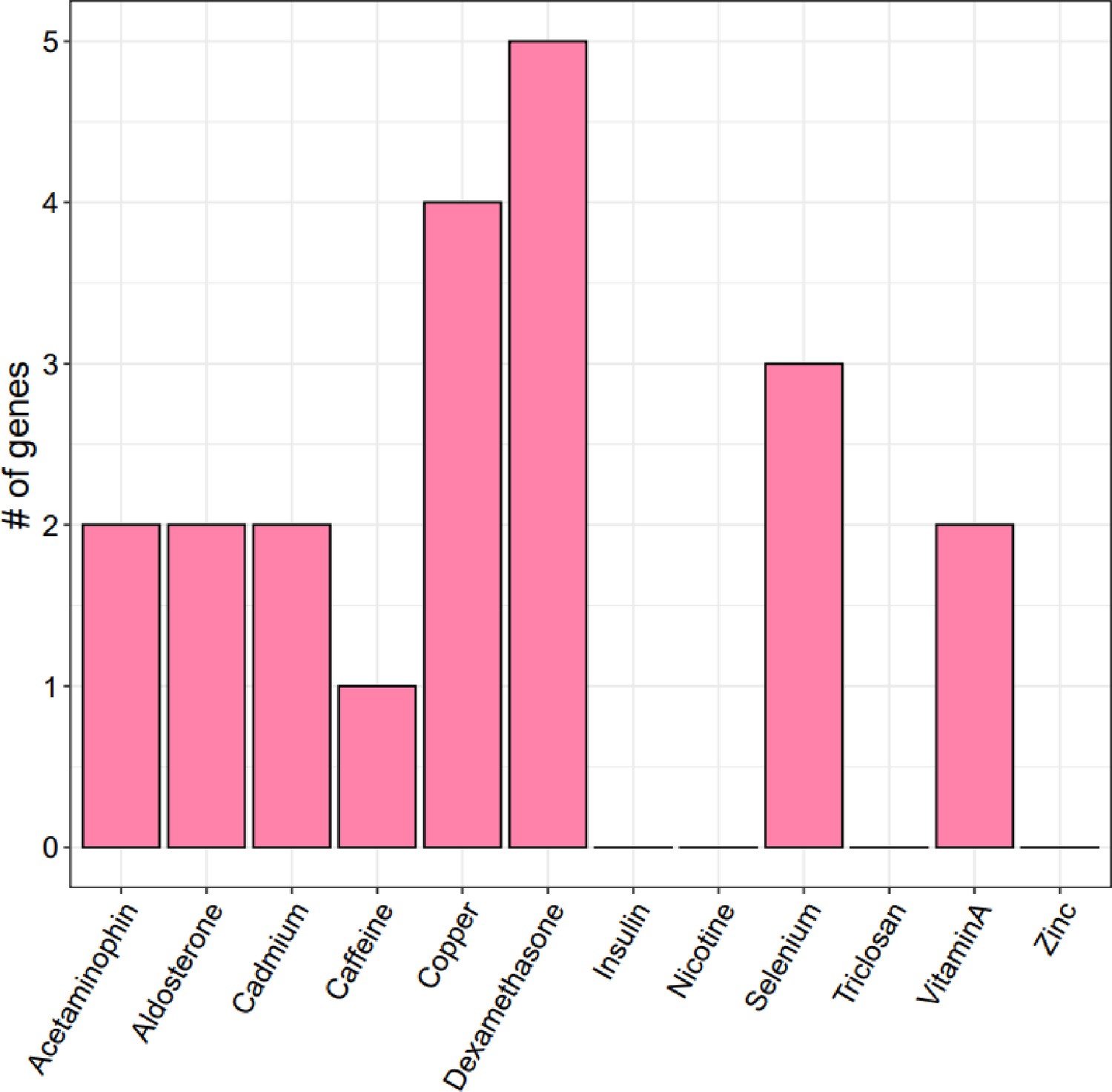
We reprogramed LCLs from six donors into IPSCs, which were further differentiated into CMs. We treated all cell lines with 28 treatments and two vehicle controls, performing RNA-seq 6 hr after treatment. Three individuals per cell line were treated on one plate, and each plate was performed in duplicate, for a total of 12 plates. (B) Shallow Sequencing. Number of differentially expressed genes (DEGs) per treatment in each cell type from the shallow sequencing. Treatments in bold were selected for deep sequencing. (C) Deep Sequencing. Number of DEGs and differentially spliced genes (DSGs) per treatment in each cell type from the deep sequencing step. (D) Normalized stacked barplot of the number of genes that are only differentially spliced and those that are both differentially spliced and differentially expressed, for each treatment and cell type. (E) Dotplot generated by ClusterProfiler depicting the top enriched GO terms of CM DEGs and DSGs across environments.
Figure 1—figure supplement 1
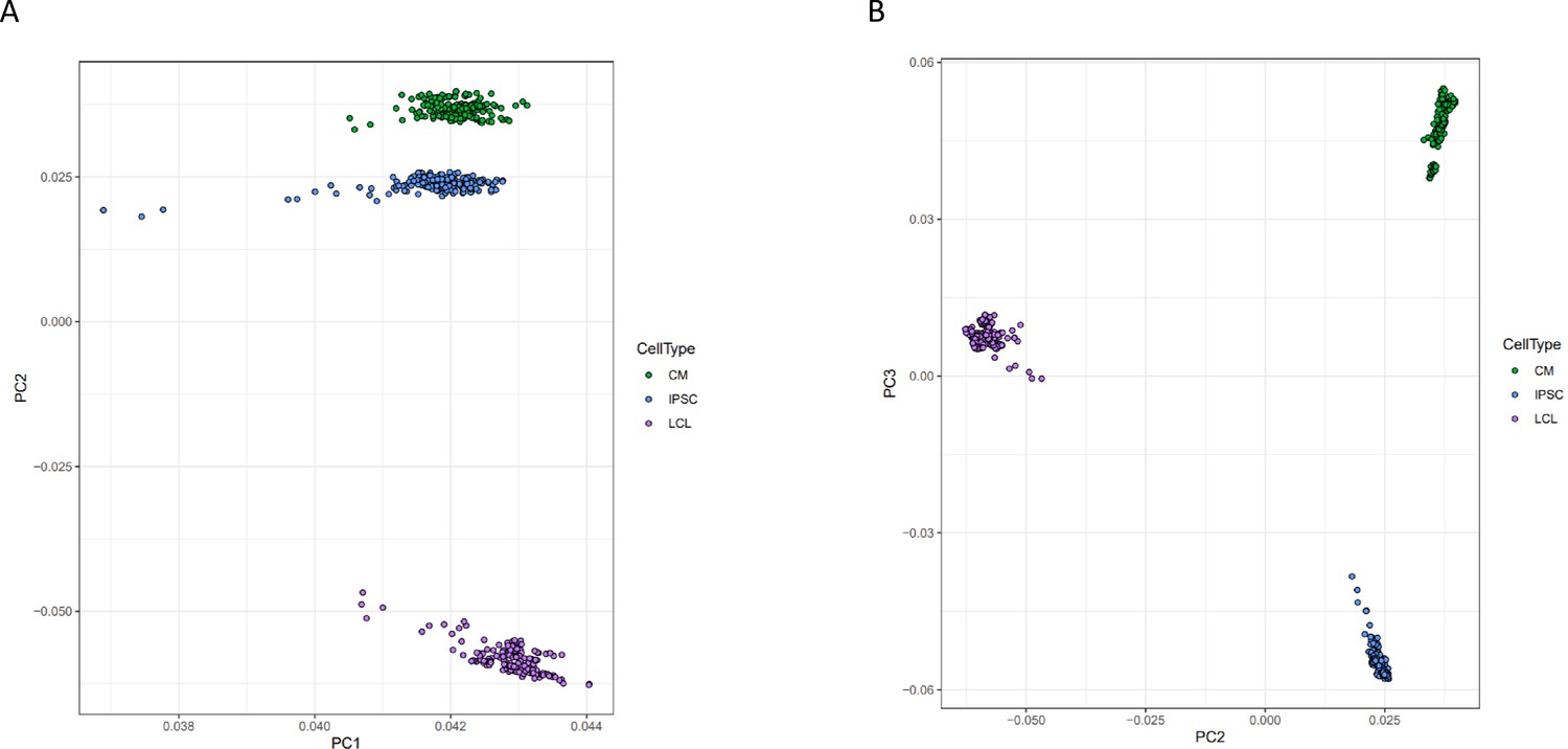
Principal component analysis of gene expression.
Principal components analysis was performed on normalized gene expression reads. Each point represents a deep-sequenced library, colored by cell type, for A PC1 vs PC2 and B PC2 vs PC3.
Figure 1—figure supplement 2
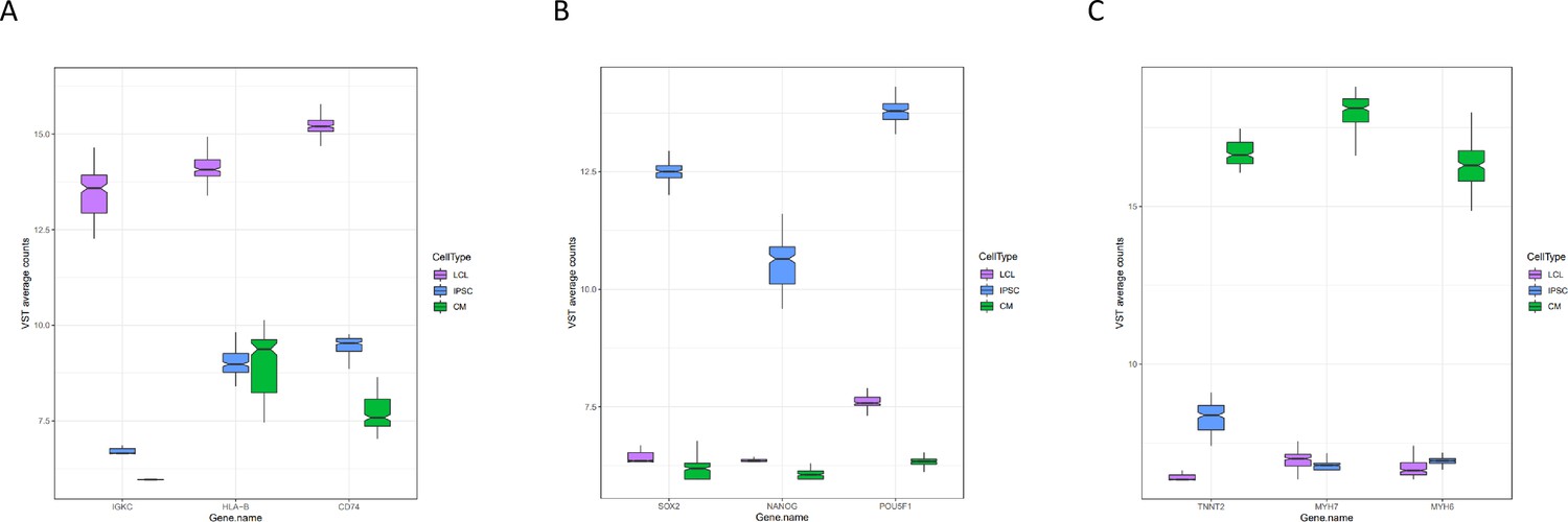
Expression of marker genes.
Normalized expression of three marker genes for each cell type from all deep-sequenced libraries are plotted by cell type.
Figure 1—figure supplement 3

Direction of differential splicing.
Forest plot of the proportion of differential splicing events which result in intron retention as opposed to intron excision. An asterisk indicates a significance at FDR <10%.
Figure 1—figure supplement 4
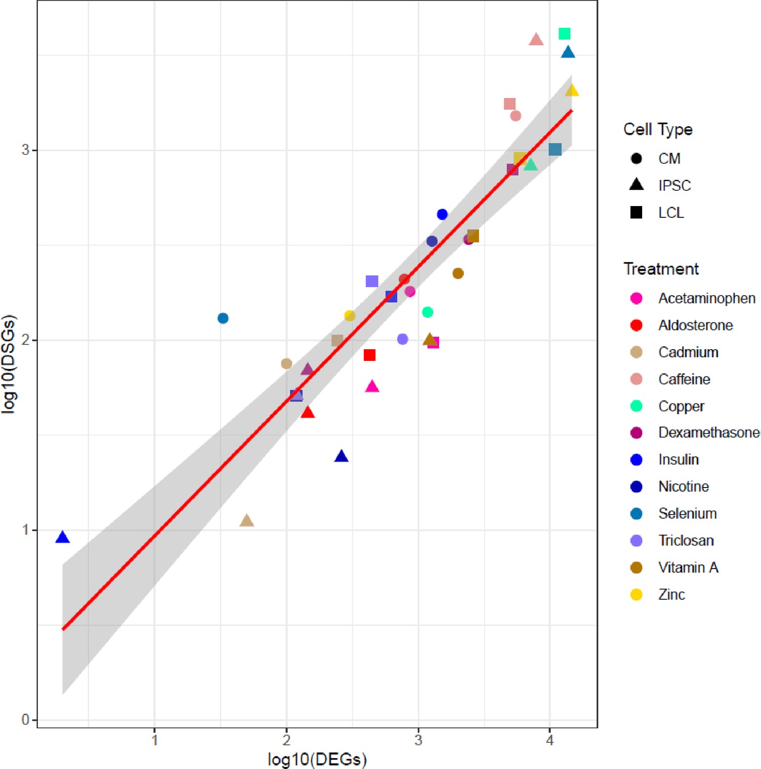
Correlation between number of DEGs and DSGs.
Scatterplot between the number of differentially expressed (DEGs) and differentially spliced (DSGs) genes. Each dot represents a unique cell type-environment, with shape and color representing cell type and treatment, respectively.
Figure 1—figure supplement 5
Enrichment of DSGs in DEGs.
Enrichment odds ratios and 95% confidence intervals have been log-transformed.
Figure 1—figure supplement 6
GO and KEGG enrichment dotplot for IPSCs.
Dotplot generated by ClusterProfiler depicting the top enriched GO (A) and KEGG (B) terms of CM DEGs and DSGs across environments, as well as within a background list composed by all tested genes.
Figure 1—figure supplement 7
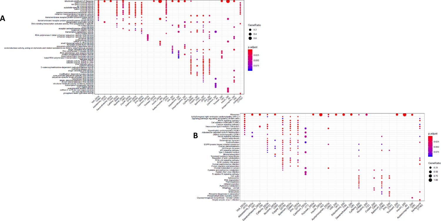
GO and KEGG enrichment dotplot for LCLs Dotplot generated by ClusterProfiler depicting the top enriched GO (A) and KEGG (B) terms of CM DEGs and DSGs across environments, as well as within a background list composed by all tested genes.
Figure 1—figure supplement 8
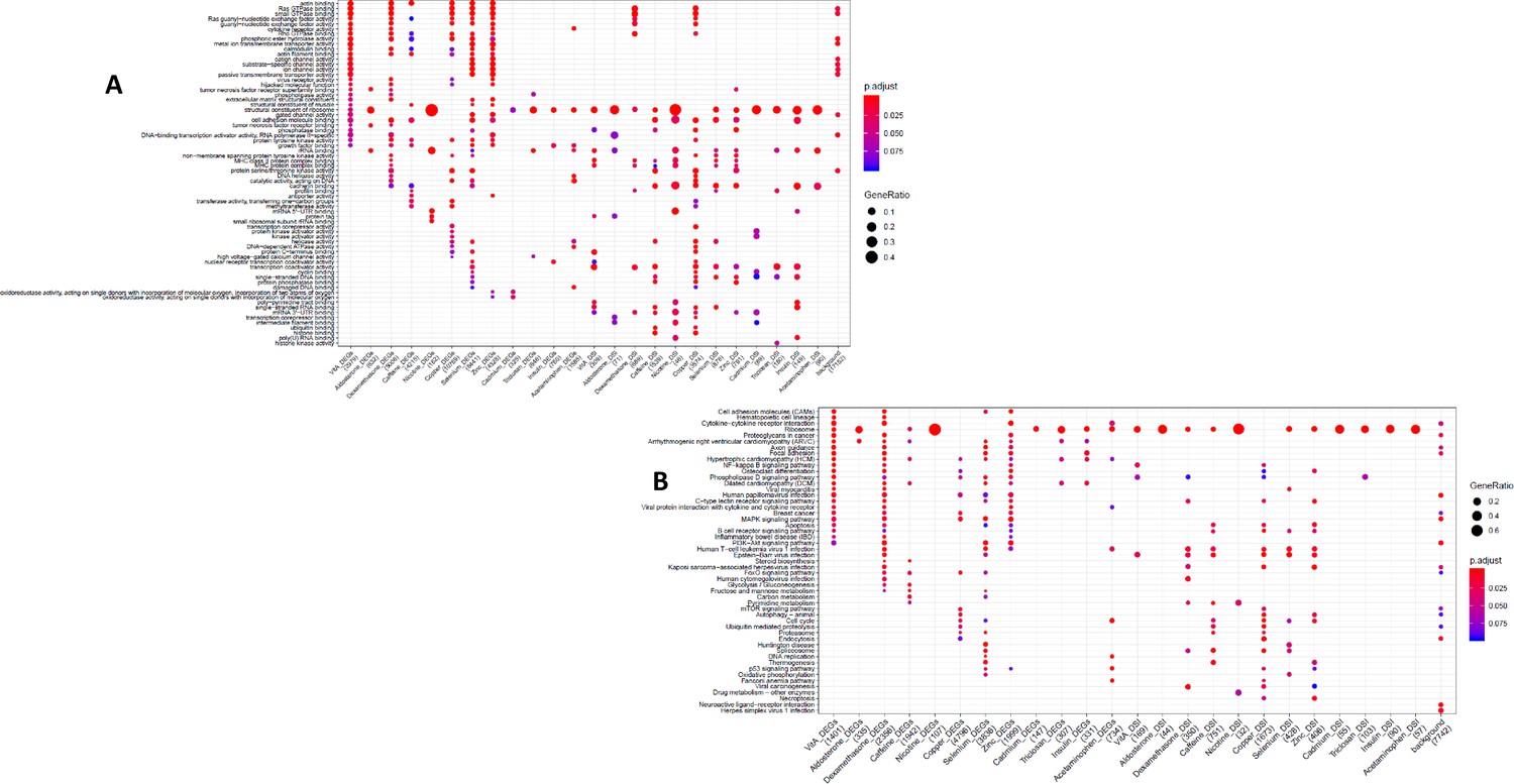
KEGG and DGN enrichment dotplot for CMs Dotplot generated by ClusterProfiler depicting the top enriched KEGG (A) and DGN (B) terms of CM DEGs and DSGs across environments, as well as within a background list composed by all tested genes.
Figure 2 with 2 supplements
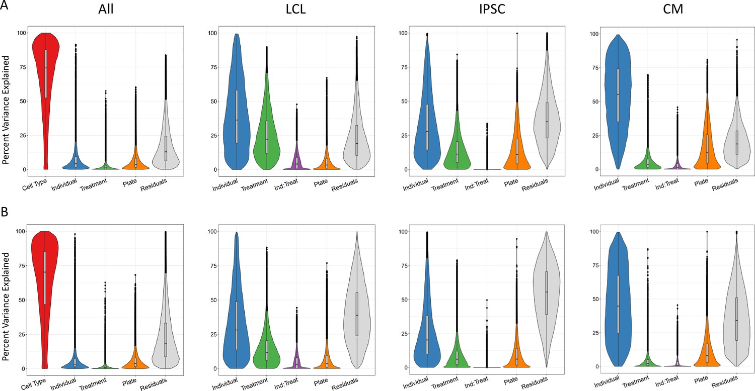
Sources of variation in gene expression and splicing.
Variance for gene expression (A) and splicing (B) was partitioned into categories (horizontal axis).
Figure 2—figure supplement 1
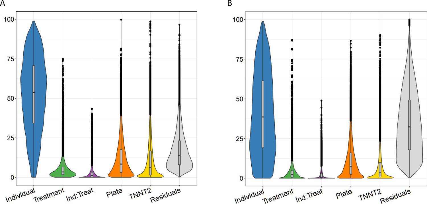
Variance partitioning of gene expression and splicing in CMs with TNNT2 expression.
Sources of variation in gene expression (A) and splicing (B) in CMs as in Figure 2, but with an additional category for TNNT2 expression.
Figure 2—figure supplement 2
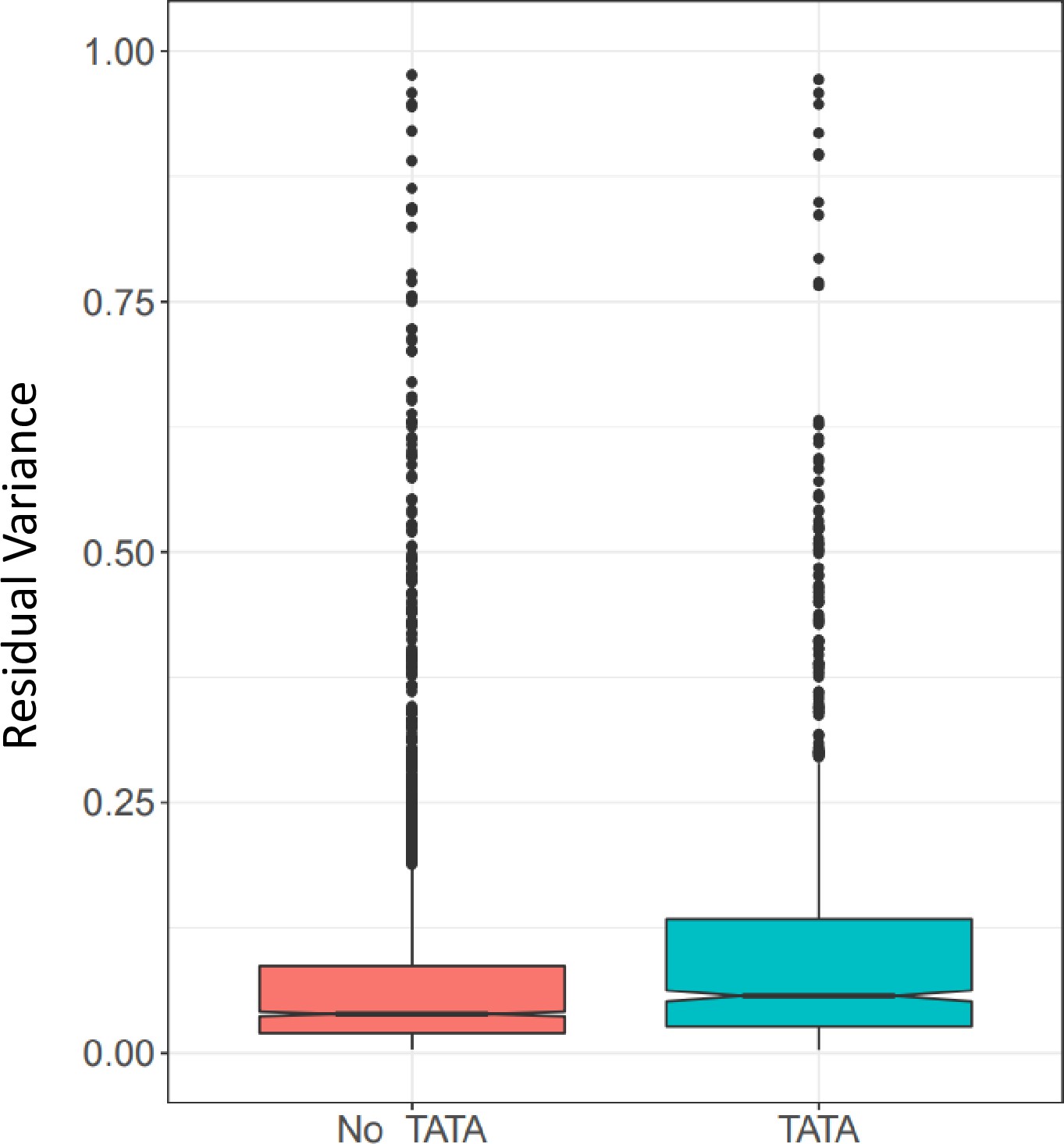
Gene expression residual variance by presence or absence of TATA box.
Figure 3 with 3 supplements
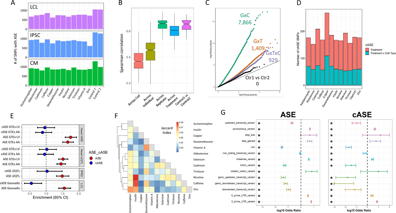
ASE and cASE (A) Number of SNPs with ASE in each treatment and cell type from QuASAR.
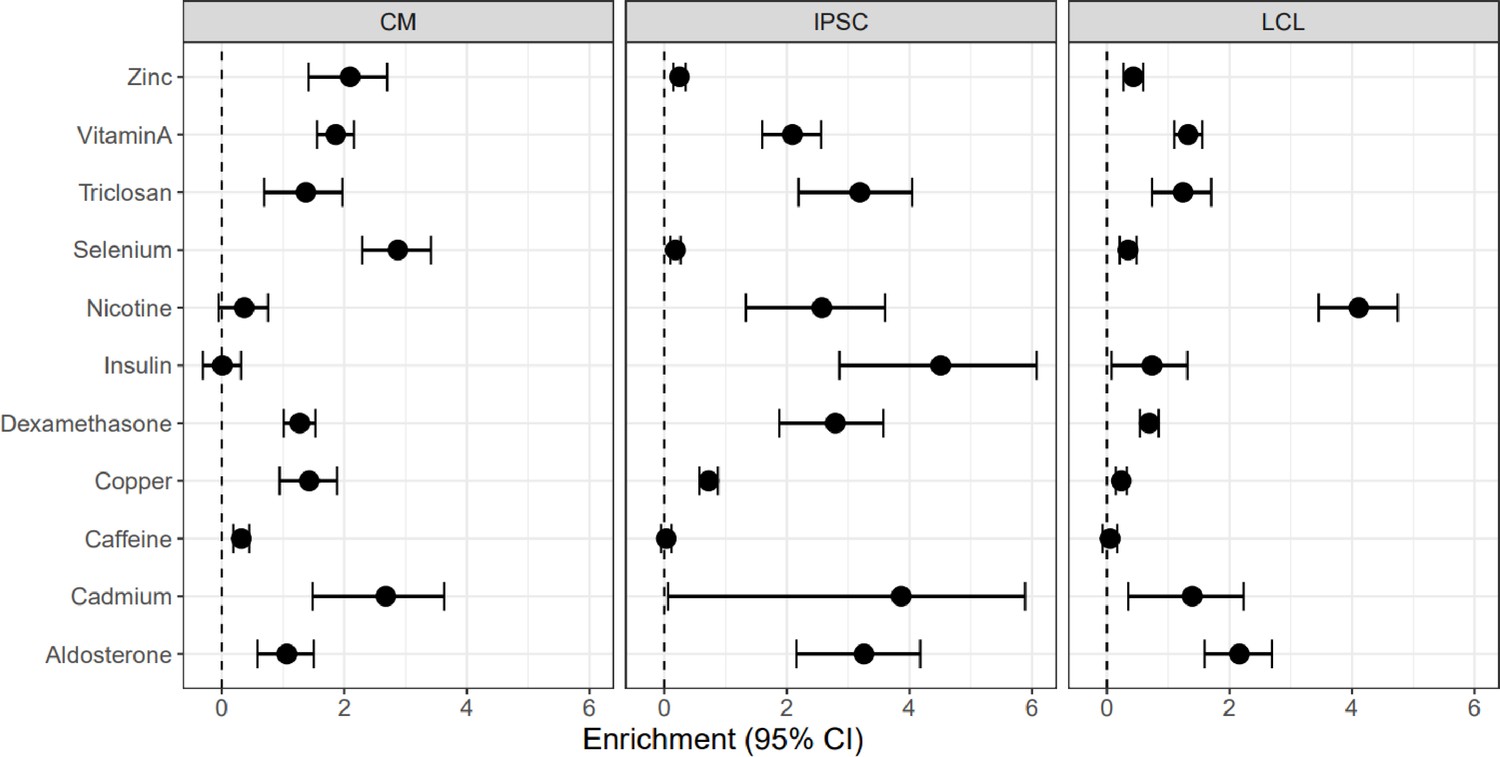
(B) Spearman correlations between libraries across variables. The notches describe the 95% confidence interval of the median. ‘Across cell’ indicates comparisons between libraries which are from the same individual and treatment, but different cell types. ‘Across individual’ indicates comparisons between libraries from the same cell type, treatment, and replicate (i.e. plate), but different individuals. ‘Across replicate’ indicates comparisons between libraries from the same cell type, treatment, and individual, but different replicates (i.e. plate). ‘Across treatment’ indicates comparisons between libraries which are from the same cell type, individual, and replicate (i.e. plate), but different treatments. ‘Control1 vs Control2’ indicates comparisons between the two vehicle controls from the same individual and replicate (i.e. plate). (C) QQ-plot depicting interaction -values for SNPs tested for cASE. G×C indicates SNPs tested for GenexCell type effects, G×T indicates SNPs tested for Gene × treatment effects, G×C×T indicates genes tested for Gene × cell type × treatment effects. Ctr1 vs Ctr2 indicates the coefficient in the model that accounts for the vehicle control used for each treatment. (D) Number of treatment G×E. Gene × treatment and gene × treatment × cell type cASE is reported for each treatment, irrespective of the cell type in which it was identified. (E) Enrichment of genes with ASE and treatment cASE in eGenes from large ASE/eQTL mapping studies: (1,2) CMs in GTEx heart tissues ASE/eQTL (left ventricle, LV and atrial appendage, AA), (3) IPSCs in i2QTL, (4) LCLs in Geuvadis. Odds ratios and 95% confidence intervals are plotted (Fisher’s test). (F) Gene-by-treatment cASE shared between treatments. For each treatment pair, we calculate the proportion of shared cASE over the union of cASE identified in each of the two treatments (Jaccard Index). (G) Forest plot depicting the significant (FDR <10%) enrichment and depletion of ASE and cASE SNPs with respect to all SNPs tested for different genomic annotations.
Figure 3—figure supplement 1

Enrichment of cASE in DSGs and DEGs cASE is matched by treatment to DSGs and DEGs.
Figure 3—figure supplement 2
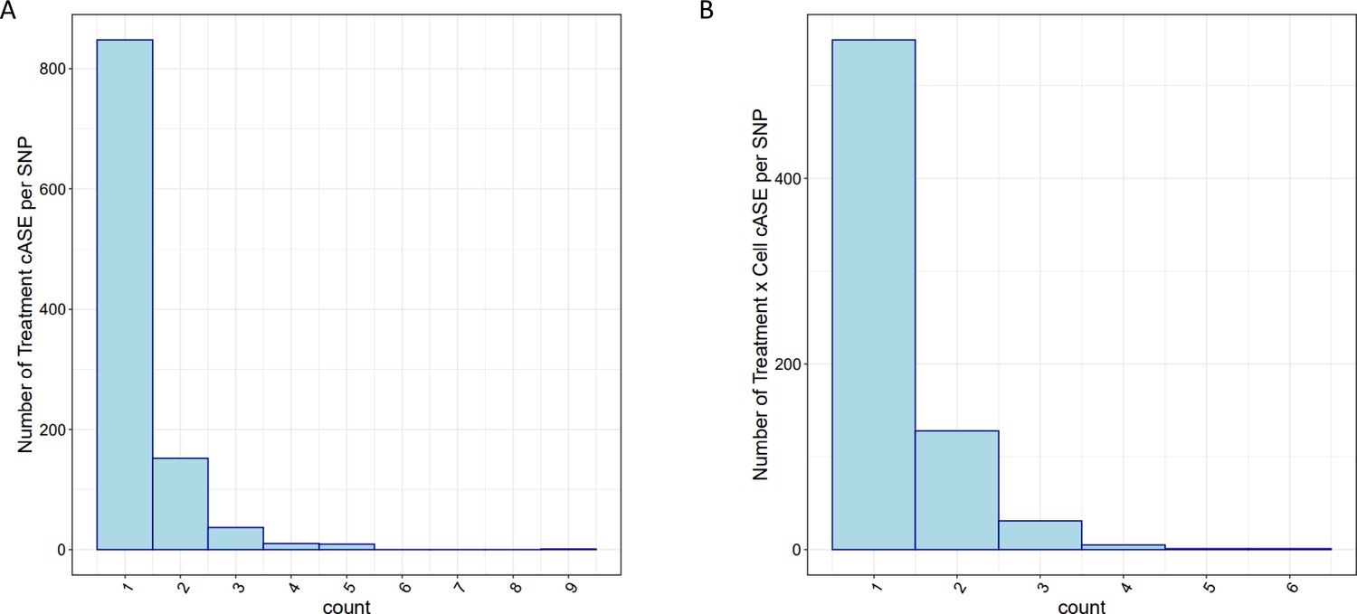
cASE per SNP.
For SNPs with significant cASE, barplots depict the number of (A) treatment cASE and (B) treatment by cell type cASE per SNP.
Figure 3—figure supplement 3
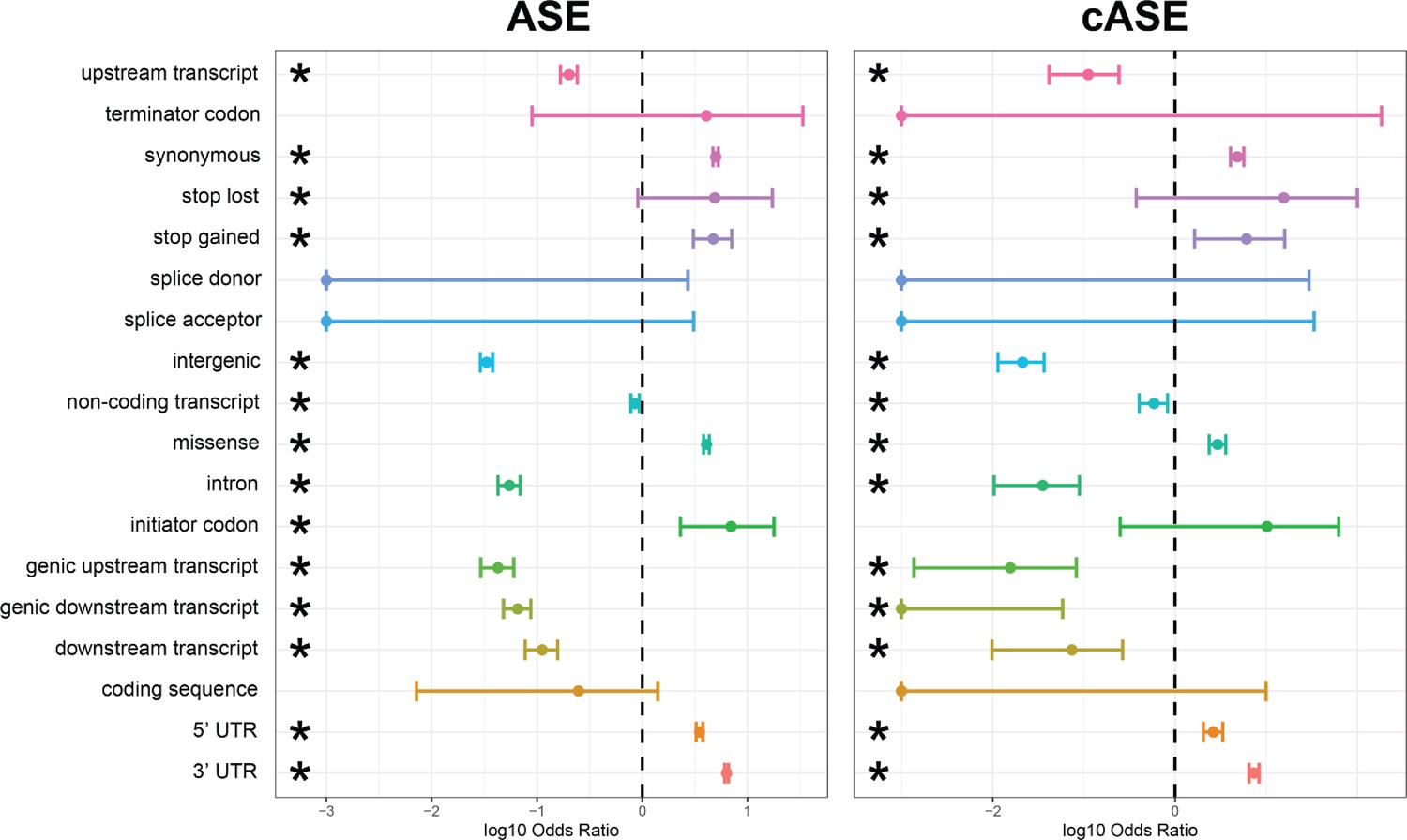
Enrichment and depletion of ASE/cASE SNPs within different genomic regions.
Full forest plot from Figure 3 with all genomic categories which were tested for an enrichment and depletion of ASE and cASE SNPs with respect to all SNPs tested.
Figure 4 with 2 supplements
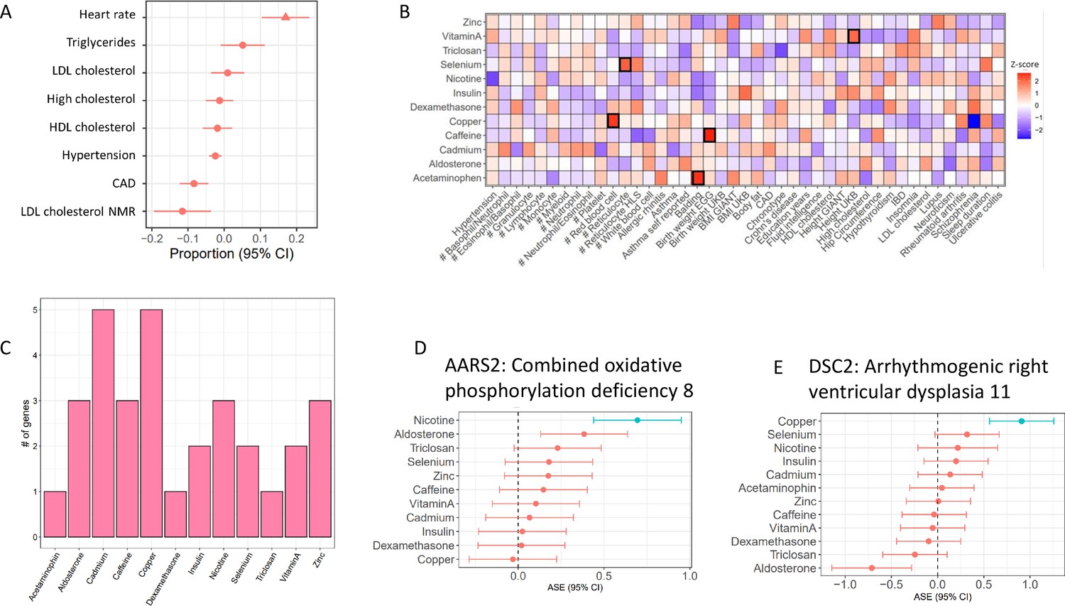
Treatment cASE genes in TWAS (A) CM cASE overlap for genes associated with complex traits in TWAS.
For each trait, the forest plot shows the proportion of cASE genes overlapping TWAS genes, relative to the average proportion calculated across all traits. Overlap with genes associated with heart rate was significantly greater than other traits (p=0.01, FDR=0.08). (B) Overlap of gene-by-treatment cASE from all cell types with genes associated with complex traits in TWAS. The color of the box represents the Z-score of the one sample proportion test comparing the proportion of cASE-TWAS overlap for a treatment to the average cASE-TWAS overlap across treatments. (C) Gene-by-treatment cASE overlap with CARDIoGRAM TWAS. (D,E) Forest plots depicting change in allelic imbalance in CMs due to treatments for AARS2 and DSC2, two genes implicated in Medelian disease. Lines in blue indicate significant treatment cASE.
Figure 4—figure supplement 1
Overlap between atrial fibrillation GWAS prioritized genes and treatment cASE.
Number of treatment cASE genes which overlap with 151 genes prioritized from an atrial fibrillation GWAS.
Figure 4—figure supplement 2
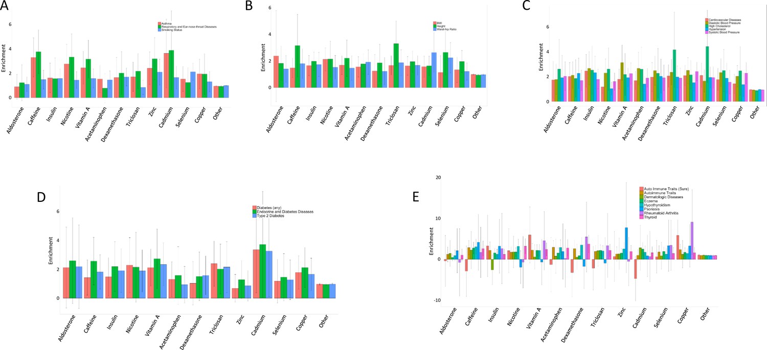
Enrichment of treatment cASE annotations in 22 GWAS.
Enrichment and 95% confidence intervals for treatment cASE annotations in A respiratory diseases, B body size traits, C cardiovascular traits, D endocrine diseases, and E autoimmune diseases.
Figure 5 with 2 supplements
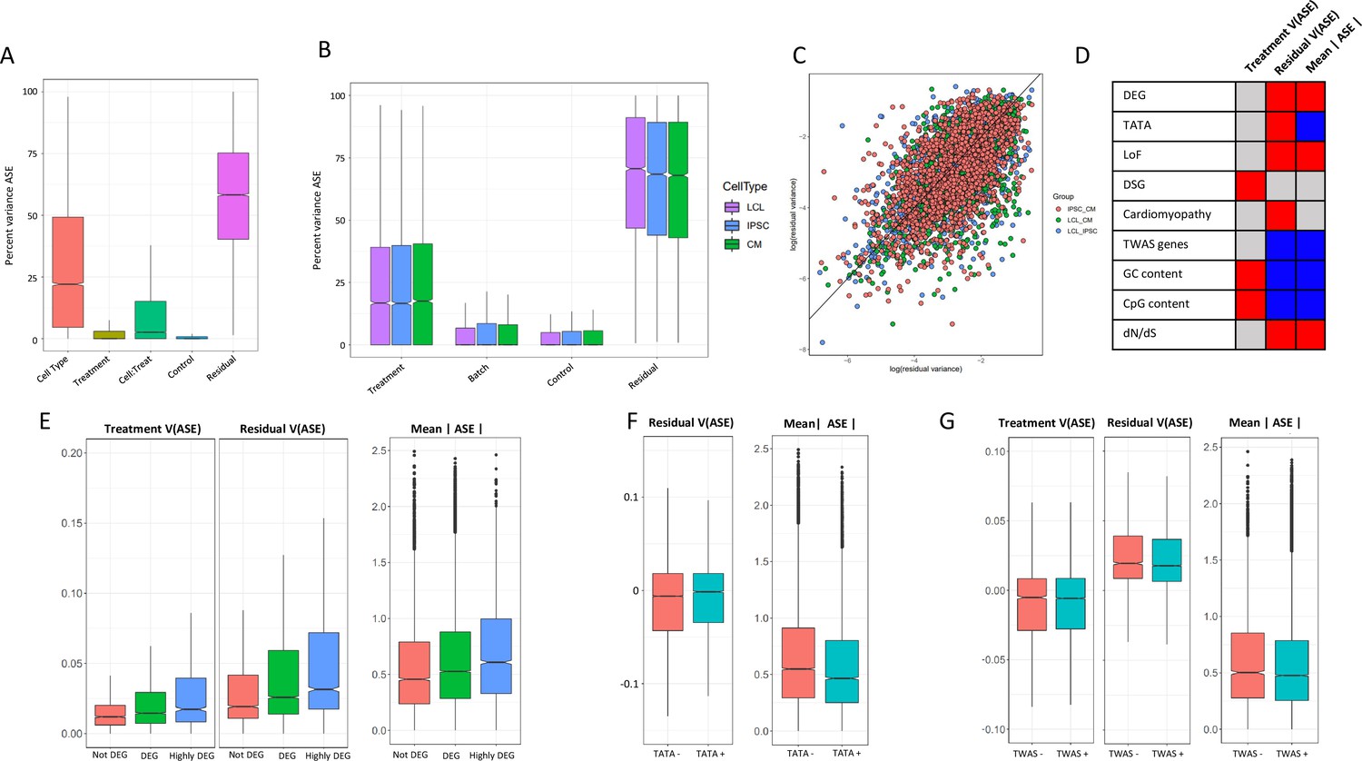
ASE residual variance (A) Variance partitioning of ASE across all cell types.
(B) Variance partitioning of ASE within each cell type separately. (C) ASE residual variance across cell types. For SNPs with ASE variance measured in more than one cell type in the cell-type-specific model, we have plotted the residual variance in each pair of cell types. (D) Relationships between eight gene annotations and treatment ASE variance, residual ASE variance, and mean absolute ASE. Red indicates that the annotation is positively correlated to ASE variance or absolute ASE, while blue indicates a negative correlation. Gray indicates no significant relationship. (E) Treatment variance, residual variance, and mean absolute ASE by DEG. We have separated genes into three categories: (1) Not DEG: Not differentially expressed in response to any treatment. (2) DEG: Differentially expressed with log2 fold change > 0.25 in at least one treatment but not greater than 0.75 in any treatment. (3) Highly DEG: Differentially expressed with log2 fold change > 0.75 in at least one treatment. Each gene can only be in one category. (F) Residual ASE variance and mean absolute ASE for genes with or without a TATA box in the promoter. (G) Treatment variance, residual variance, and mean absolute ASE for genes significant or not significant by TWAS.
Figure 5—figure supplement 1
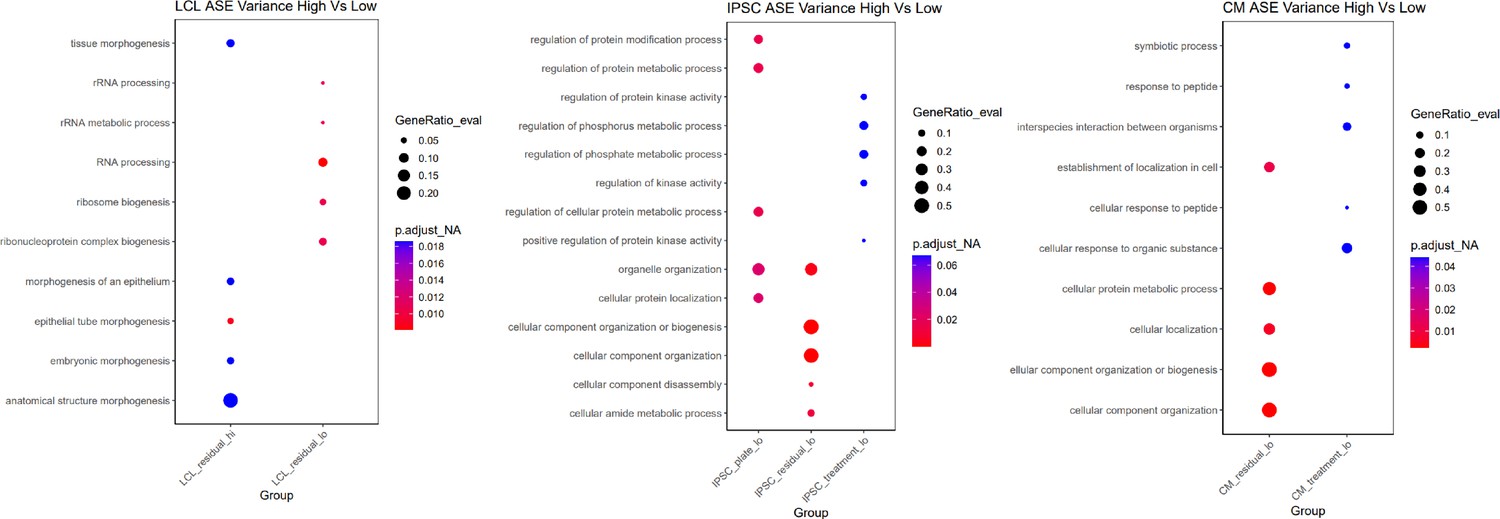
Gene ontology for ASE variance.
For each cell type, the five most significant GO terms are plotted for each group.
Figure 5—figure supplement 2
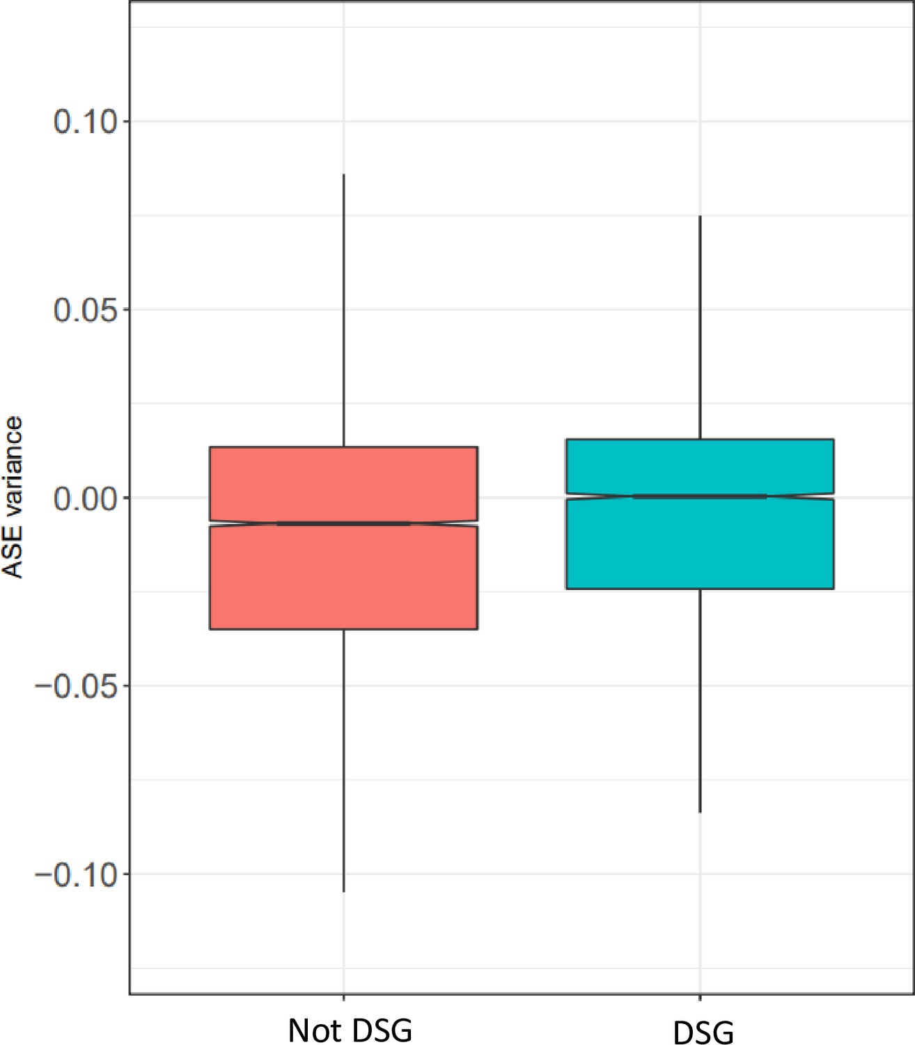
Treatment variance of DSGs.
Treatment variance of ASE based on whether the gene is differentially spliced in response to any condition.
Tables
Key resources table
| Reagent type (species) or resource | Designation | Source or reference | Identifiers | Additional information |
|---|---|---|---|---|
| Cell line (H. sapiens, Female) | GM18858 | Coriell | ||
| Cell line (H. sapiens, Female) | GM18855 | Coriell | ||
| Cell line (H. sapiens, Female) | GM18505 | Coriell | ||
| Cell line (H. sapiens, Female) | GM18912 | Coriell | ||
| Cell line (H. sapiens, Female) | GM18520 | Coriell | ||
| Cell line (H. sapiens, Female) | GM19209 | Coriell | ||
| Cell line (H. sapiens, Female) | 18858_IPSC | Banovich2018 | ||
| Cell line (H. sapiens, Female) | 18855_IPSC | Banovich2018 | ||
| Cell line (H. sapiens, Female) | 18505_IPSC | Banovich2018 | ||
| Cell line (H. sapiens, Female) | 18912_IPSC | Banovich2018 | ||
| Cell line (H. sapiens, Female) | 18520_IPSC | Banovich2018 | ||
| Cell line (H. sapiens, Female) | 19209_IPSC | Banovich2018 |
Additional files
-
Supplementary file 1
Supplementary Tables.
- https://cdn.elifesciences.org/articles/67077/elife-67077-supp1-v2.tex
-
Transparent reporting form
- https://cdn.elifesciences.org/articles/67077/elife-67077-transrepform1-v2.docx
Download links
A two-part list of links to download the article, or parts of the article, in various formats.
Downloads (link to download the article as PDF)
Open citations (links to open the citations from this article in various online reference manager services)
Cite this article (links to download the citations from this article in formats compatible with various reference manager tools)
Functional dynamic genetic effects on gene regulation are specific to particular cell types and environmental conditions
eLife 10:e67077.
https://doi.org/10.7554/eLife.67077


