Superspreaders drive the largest outbreaks of hospital onset COVID-19 infections
- MRC Biostatistics Unit, University of Cambridge, East Forvie Building, Forvie Site, Robinson Way, United Kingdom
- Institut für Biologische Physik, Universität zu Köln, Germany
- Department of Applied Mathematics and Theoretical Physics, Centre for Mathematical Sciences, United States
- University of Cambridge, Department of Medicine, Cambridge Biomedical Campus, United Kingdom
- Cambridge University Hospitals NHS Foundation Trust, Cambridge Biomedical Campus, United Kingdom
- Public Health England Clinical Microbiology and Public Health Laboratory, Cambridge Biomedical Campus, United Kingdom
- Public Health England Field Epidemiology Unit, Cambridge Institute of Public Health, Forvie Site, Cambridge Biomedical Campus, United Kingdom
- University of Cambridge, Department of Pathology, Division of Virology, Cambridge Biomedical Campus, United Kingdom
- Cambridge Institute for Therapeutic Immunology and Infectious Disease, Jeffrey Cheah Biomedical Centre, United Kingdom
- Wellcome Sanger Institute, Wellcome Trust Genome Campus, United Kingdom
- MRC Epidemiology Unit, University of Cambridge, Level 3 Institute of Metabolic Science, United Kingdom
- University of Cambridge, School of Clinical Medicine, Cambridge Biomedical Campus, United Kingdom
- Public Health England, National Infection Service, United Kingdom
Figures
Figure 1
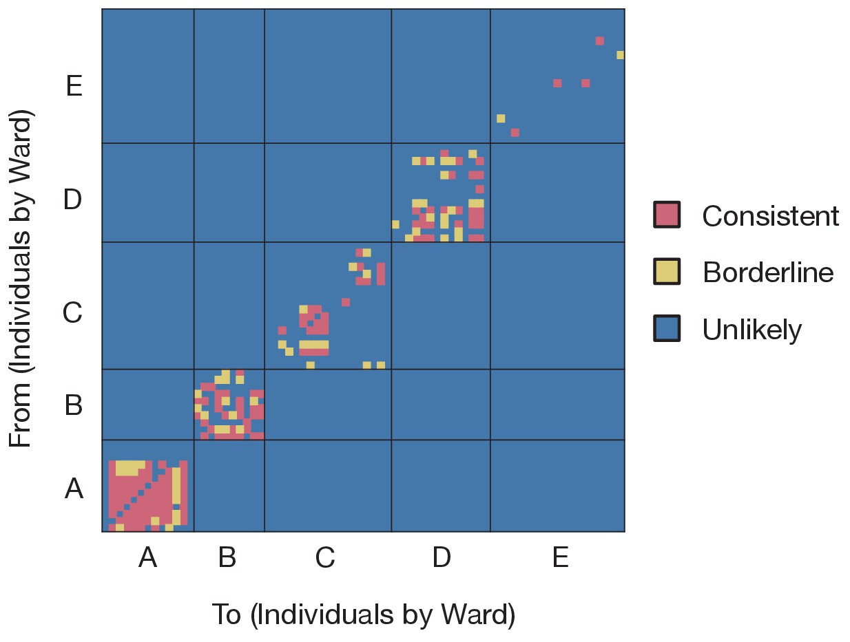
Preliminary analysis of the data with A2B-Covid.
Squares indicate the extent to which an individual-to-individual transmission event is consistent with the data collected, when considered on a pairwise level. Our analysis highlighted multiple potential transmission events occurring within each ward, but transmission between individuals on different wards was uniformly assessed as unlikely. Further analyses of the data considered wards as independent and isolated locations.
-
Figure 1—source data 1
Assessment of pairwise transmission events.
- https://cdn.elifesciences.org/articles/67308/elife-67308-fig1-data1-v2.xlsx
Figure 2 with 2 supplements
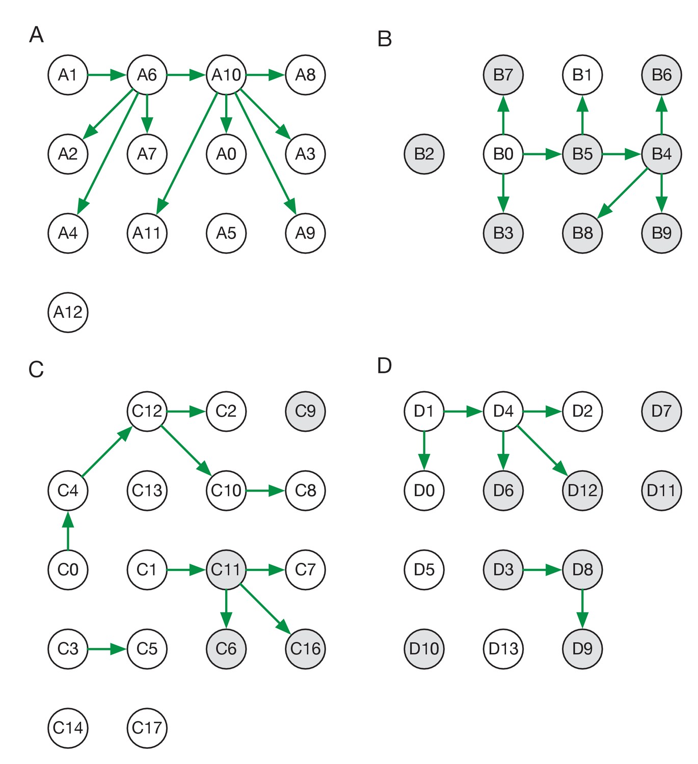
Maximum likelihood transmission networks for wards A to D.
Circles represent individuals and arrows show transmission events. White circles represent patients while grey circles represent health care workers. Individuals for which no transmission events were inferred are represented as isolated circles.
Figure 2—figure supplement 1

Maximum likelihood sources of patient and HCW infections.
Statistics were calculated across maximum likelihood network reconstructions. The great majority of patient infections were inferred to arise from other patients, while HCWs were infected roughly equally by patients and other HCWs.
Figure 2—figure supplement 2
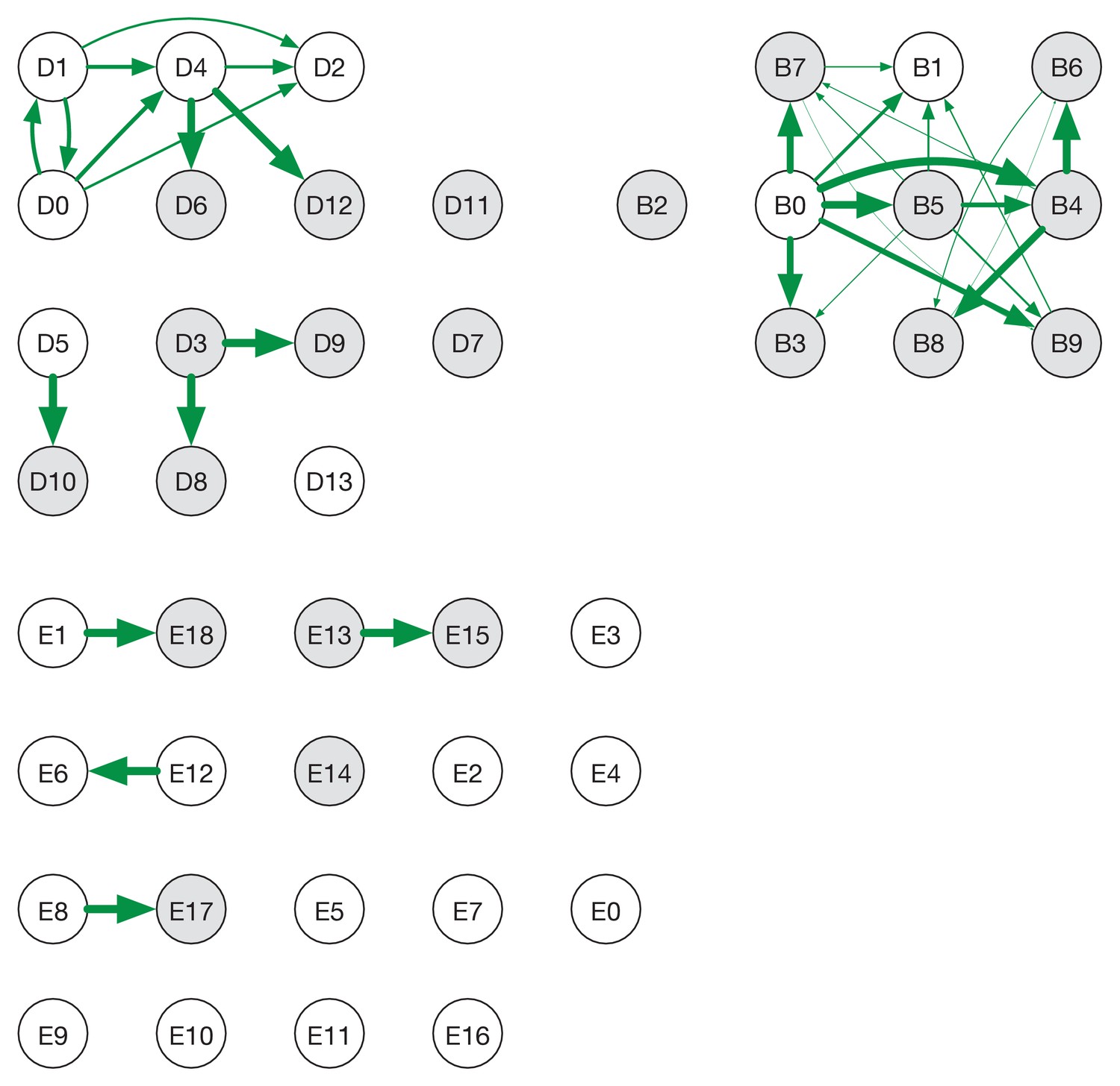
Ensemble transmission networks for wards A to D.
Data were compiled over sets of plausible reconstructions, weighted by likelihood. The width of each arrow is proportional to the probability that a specific transmission event occurred. Arrows are shown for events with a 4% or greater probability of having occurred. Red and blue lines indicate mutually incompatible events; D3 could have infected D5 or D8, but the data precluded both of these occurring in the same reconstruction.
-
Figure 2—figure supplement 2—source data 1
Posterior probabilities of transmission between individuals on each ward.
- https://cdn.elifesciences.org/articles/67308/elife-67308-fig2-figsupp2-data1-v2.xlsx
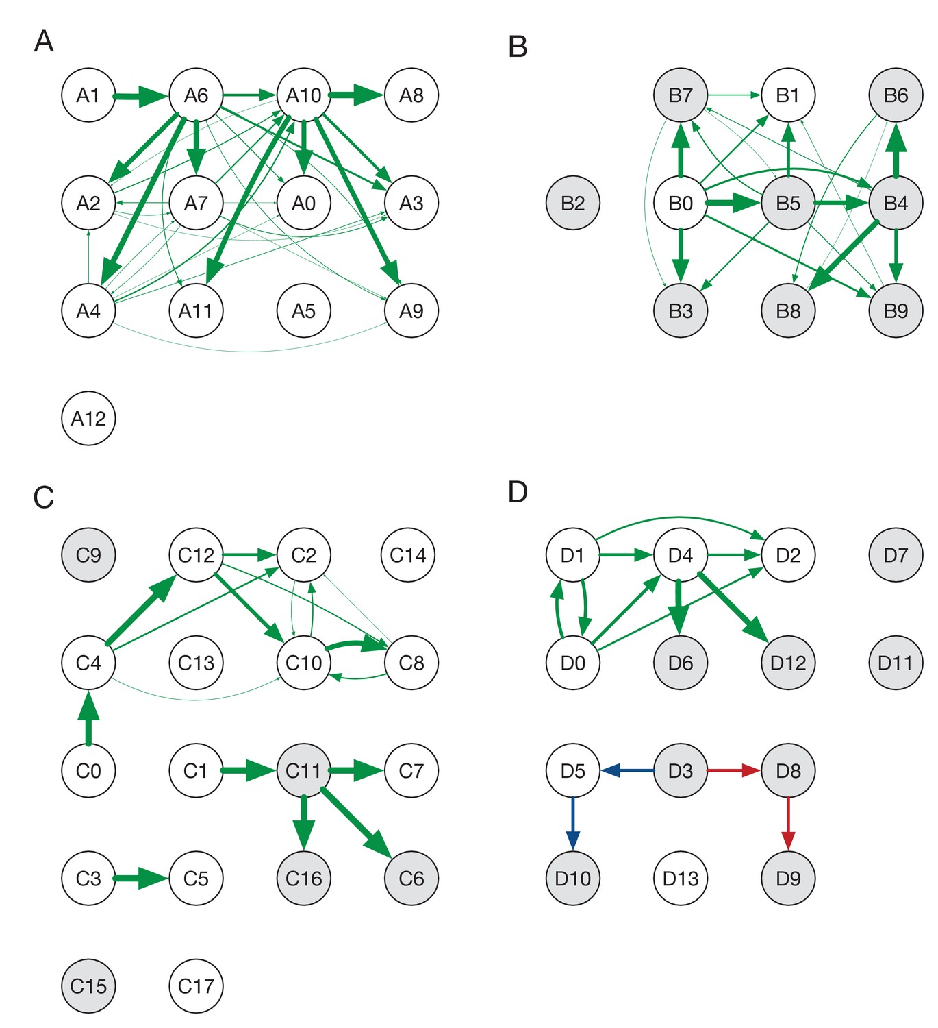
Figure 3
Maximum likelihood transmission network for ward E.
Circles represent individuals and arrows show transmission events. White circles represent patients while grey circles represent health care workers. Individuals for which no transmission events were inferred are represented as isolated circles.
Figure 4 with 5 supplements
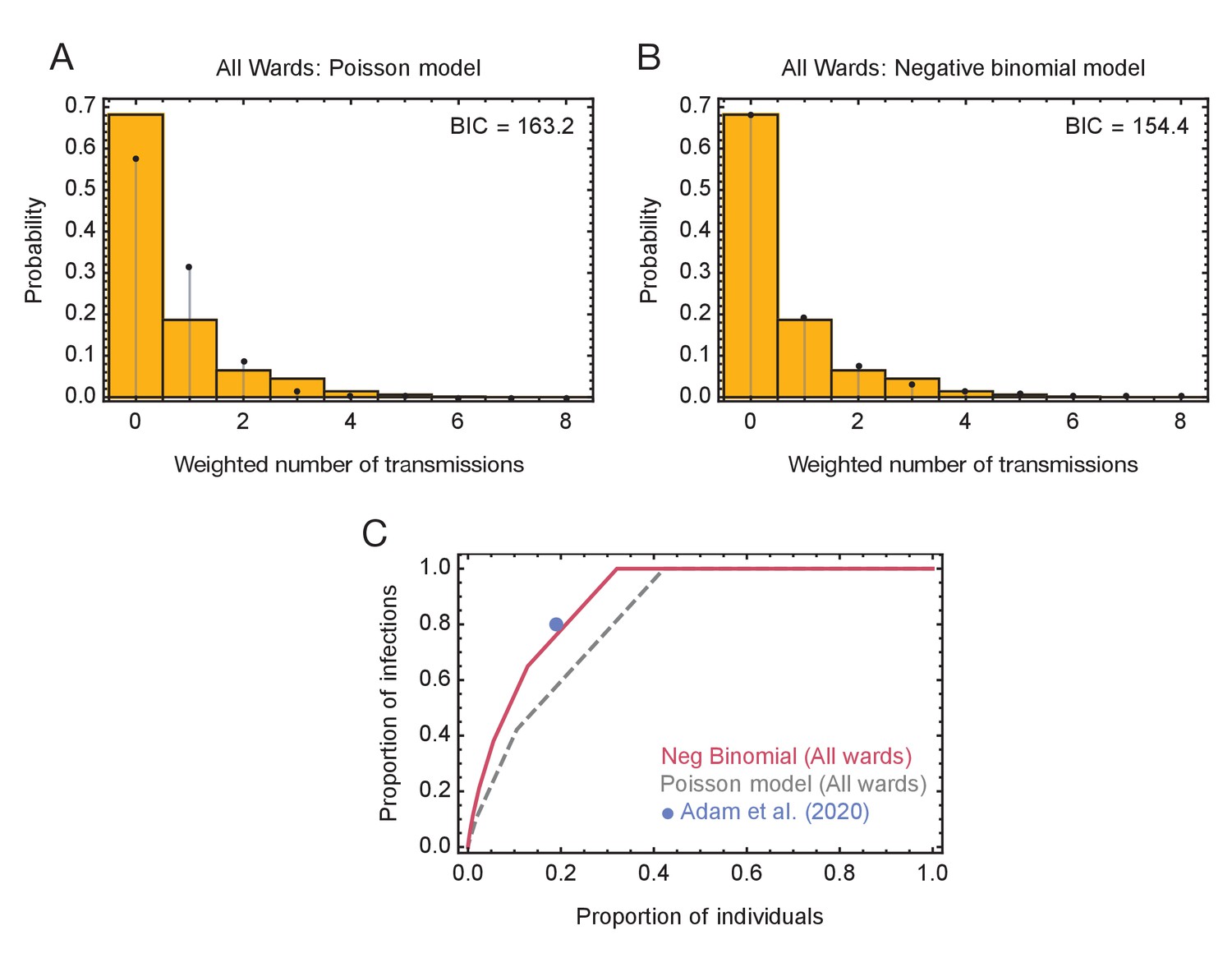
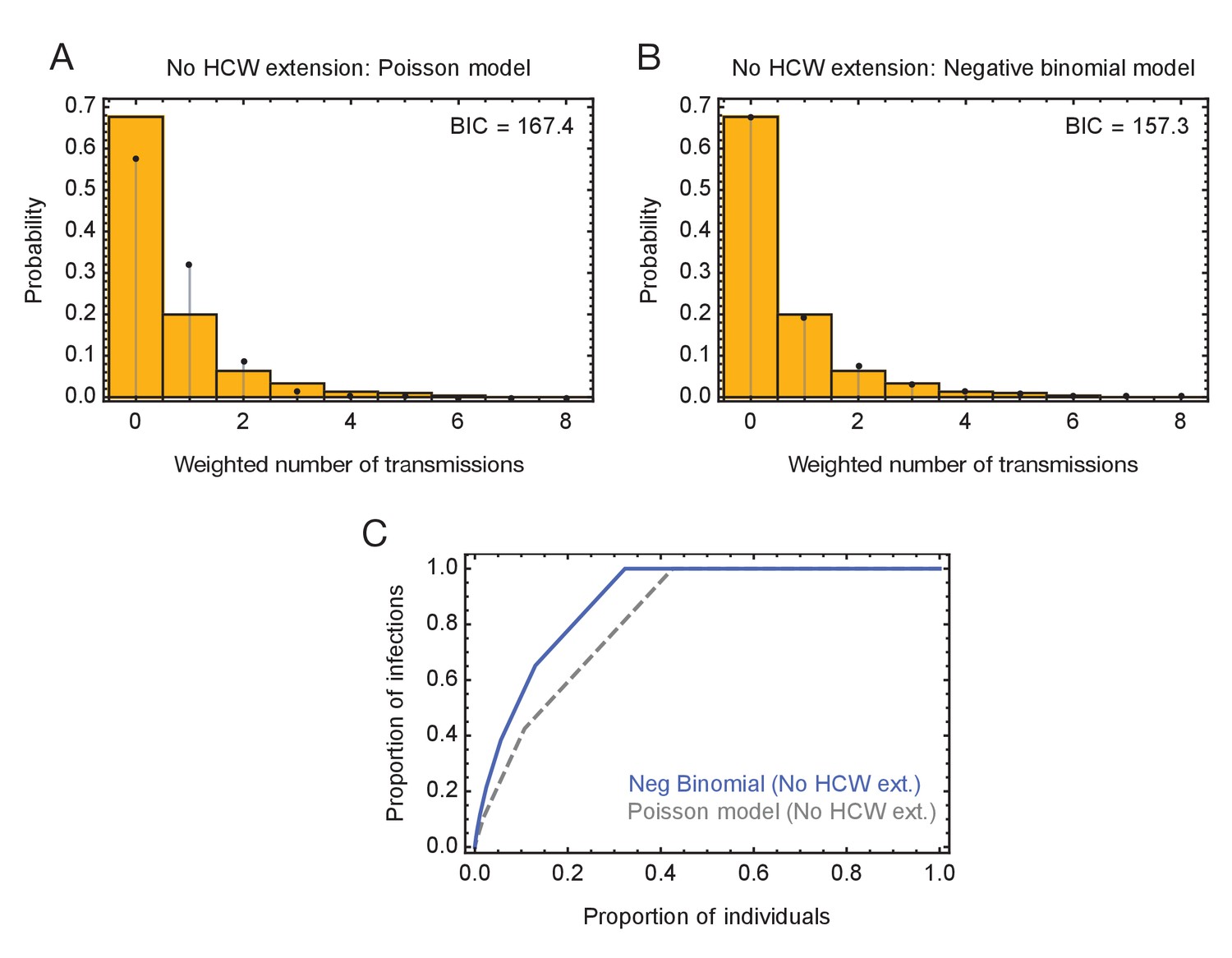
Models of viral transmission.
(A) Fit of the output of the Poisson model (black dots) to the ensemble data (yellow bars). The weighted number of transmissions per individual reflects the uncertainty in the network reconstruction across the ensemble. (B) Fit of the output of the negative binomial model (black dots) to the ensemble data (yellow bars). (C) Proportions of individuals causing different proportions of infections. A negative binomial model (red line) fitted to all ward data produces a result similar to that of Adam et al., 2020 (blue dot), with 20% of individuals being responsible for 80% of infections. A Poisson model fitted to the same data (dashed grey line) has 20% of individuals being responsible for 60% of infections.
-
Figure 4—source data 1
Distributions of number of individuals infected by each individual and fits to these data using Poisson and Negative Binomial models.
- https://cdn.elifesciences.org/articles/67308/elife-67308-fig4-data1-v2.xlsx
Figure 4—figure supplement 1

Modelling of viral transmission on the green wards.
(A) Fit of the output of a Poisson model (black dots) to the ensemble data (yellow bars). The weighted number of transmissions per individual reflects the uncertainty in the network reconstruction across the ensemble. (B) Fit of the output of the negative binomial model (black dots) to the ensemble data (yellow bars). (C) Proportions of individuals causing different proportions of infections. A negative binomial model (green line) fitted to data from the green wards suggests that 20% of individuals were responsible for 75% of infections. A Poisson model fitted to the same data (dashed gray line) has 20% of individuals being responsible for 58% of infections.
-
Figure 4—figure supplement 1—source data 1
Distributions of number of individuals on green wards infected by each individual and fits to these data using Poisson and Negative Binomial models.
- https://cdn.elifesciences.org/articles/67308/elife-67308-fig4-figsupp1-data1-v2.xlsx
Figure 4—figure supplement 2
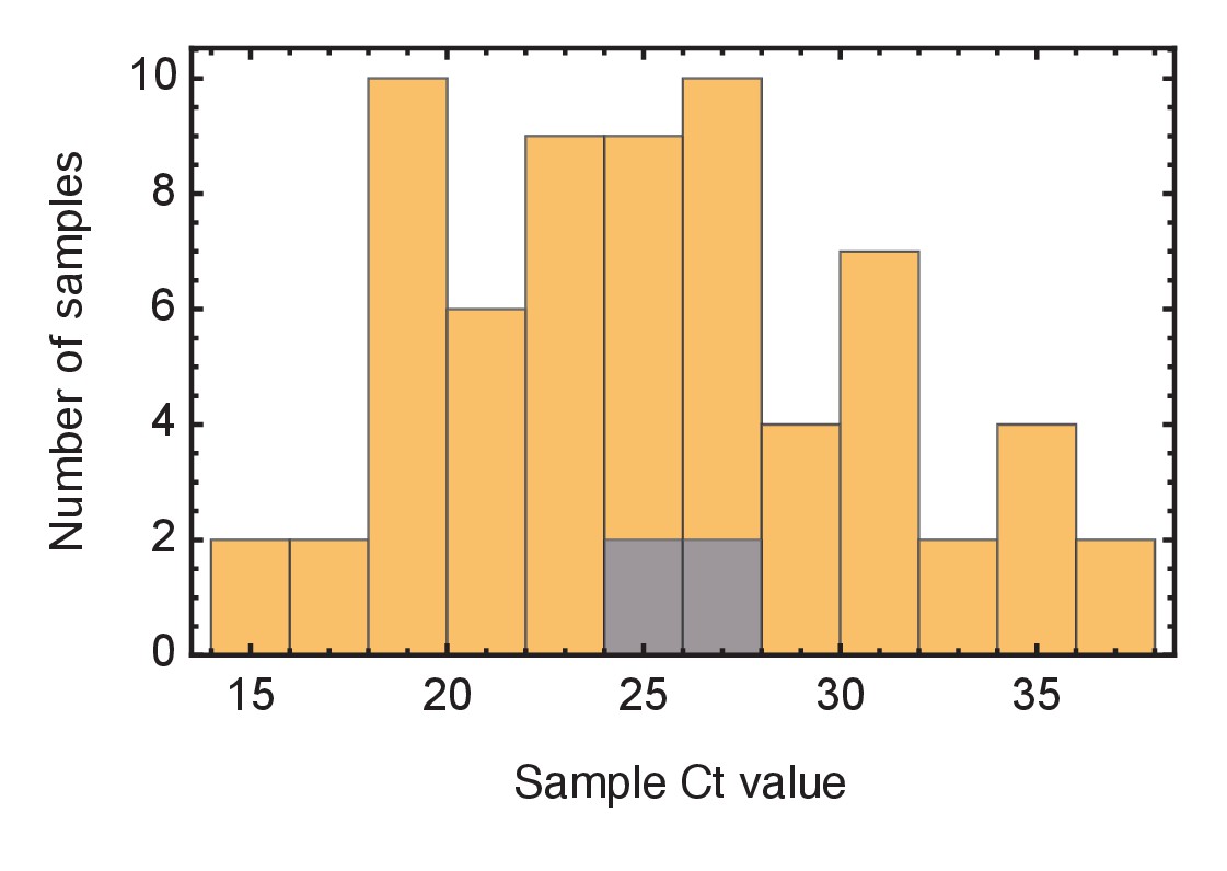
Ct values of viral samples.
Distributions of known Ct values collected from all samples from the wards studied (yellow) and from individuals identified as superspreaders (grey). Samples from superspreaders were not statistically different from those from the population as a whole. Ct values were not available for all samples.
Figure 4—figure supplement 3
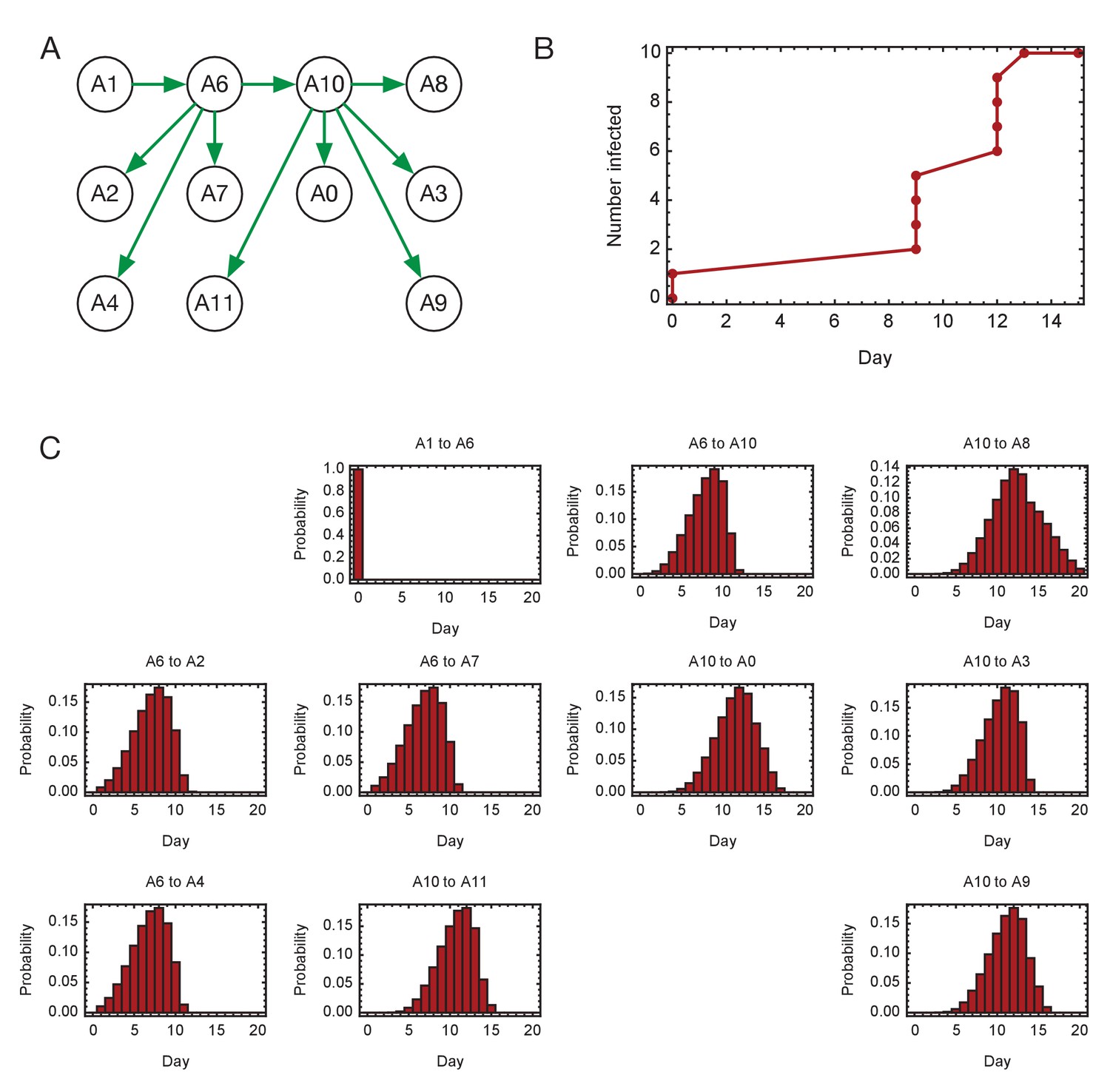
Inferred timings of transmission events in ward A.
(A) Maximum likelihood network of transmission events. (B) Maximum likelihood spread of infection given this network. (C) Distributions of the times at when transmission occurred were calculated relative to the time of the first transmission event, in this case from A1 to A6. Timings account for infection dynamics and the locations of individuals during the course of the outbreak.
-
Figure 4—figure supplement 3—source data 1
Distributions of timings of transmission events on ward A.
- https://cdn.elifesciences.org/articles/67308/elife-67308-fig4-figsupp3-data1-v2.xlsx
Figure 4—figure supplement 4
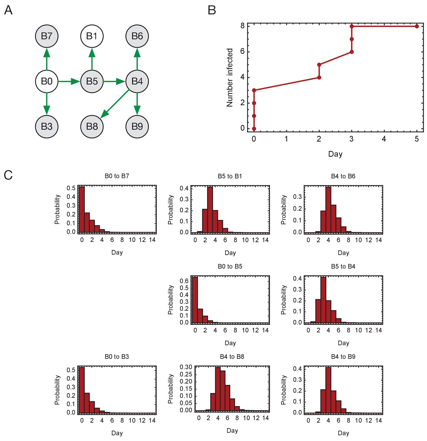
Inferred timings of transmission events in ward A.
(A) Maximum likelihood network of transmission events. (B) Maximum likelihood spread of infection given this network. Timings are shown relative to the first transmission event. Infection of the first individual (B0) is not included. (C) Distributions of the times at when transmission occurred were calculated relative to the time of the first transmission event. Timings account for infection dynamics and the locations of individuals during the course of the outbreak.
-
Figure 4—figure supplement 4—source data 1
Distributions of timings of transmission events on ward B.
- https://cdn.elifesciences.org/articles/67308/elife-67308-fig4-figsupp4-data1-v2.xlsx
Figure 4—figure supplement 5
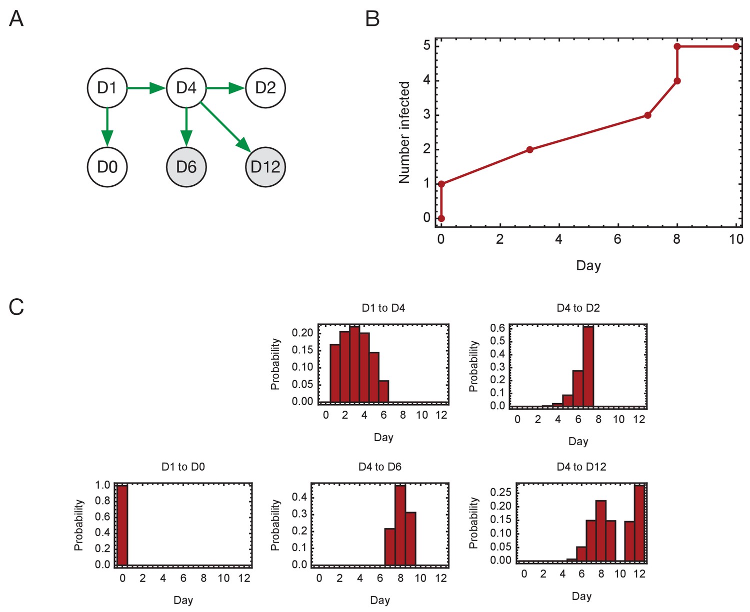
Inferred timings of transmission events in ward D.
(A) Maximum likelihood network of transmission events. (B) Maximum likelihood spread of infection given this network. Timings are shown relative to the first transmission event. Infection of the first individual (D1) is not included. (C) Distributions of the times at when transmission occurred were calculated relative to the time of the first transmission event. Timings account for infection dynamics and the locations of individuals during the course of the outbreak.
-
Figure 4—figure supplement 5—source data 1
Distributions of timings of transmission events on ward D.
- https://cdn.elifesciences.org/articles/67308/elife-67308-fig4-figsupp5-data1-v2.xlsx
Figure 5 with 5 supplements

Overview of events on different wards.
Blue squares show days on which individuals became symptomatic, while green squares show inferred days of individuals becoming symptomatic when these dates were unknown or not applicable. Red circles show days on which samples were collected from individuals for genome sequencing. Dates within each ward are normalised so that the first event on any ward is day zero. We note that not all collected samples led to genome sequences of sufficient quality to be useful in this study.
Figure 5—figure supplement 1
Ensemble transmission networks for wards B, D, and E generated without extending the times at which HCWs were present beyond the direct observations made.
Data were compiled over sets of plausible reconstructions, weighted by likelihood. The width of each arrow is proportional to the probability that a specific transmission event occurred. Arrows are shown for events with a 4% or greater probability of having occurred. Ensembles for wards A and C were not sufficiently changed by removing the extension for the change to be visible within our plotting framework.
-
Figure 5—figure supplement 1—source data 1
Posterior probabilities of transmission between individuals on each ward inferred under a model in which no padding for HCW locations was included.
Data are shown only for wards in which the inference was different from the original.
- https://cdn.elifesciences.org/articles/67308/elife-67308-fig5-figsupp1-data1-v2.xlsx
Figure 5—figure supplement 2
Modelling of viral transmission in the absence of an extension to HCW locations.
(A) Fit of the output of a Poisson model (black dots) to the ensemble data (yellow bars). (B) Fit of the output of the negative binomial model (black dots) to the ensemble data (yellow bars). (C) Proportions of individuals causing different proportions of infections. A negative binomial model (blue line) fitted to data from the green wards suggests that 21% of individuals were responsible for 80% of infections.
-
Figure 5—figure supplement 2—source data 1
Distributions of number of individuals on all wards infected by each individual, as inferred under a model in which no padding for HCW locations was included, alongside fits to these data using Poisson and Negative Binomial models.
- https://cdn.elifesciences.org/articles/67308/elife-67308-fig5-figsupp2-data1-v2.xlsx
Figure 5—figure supplement 3
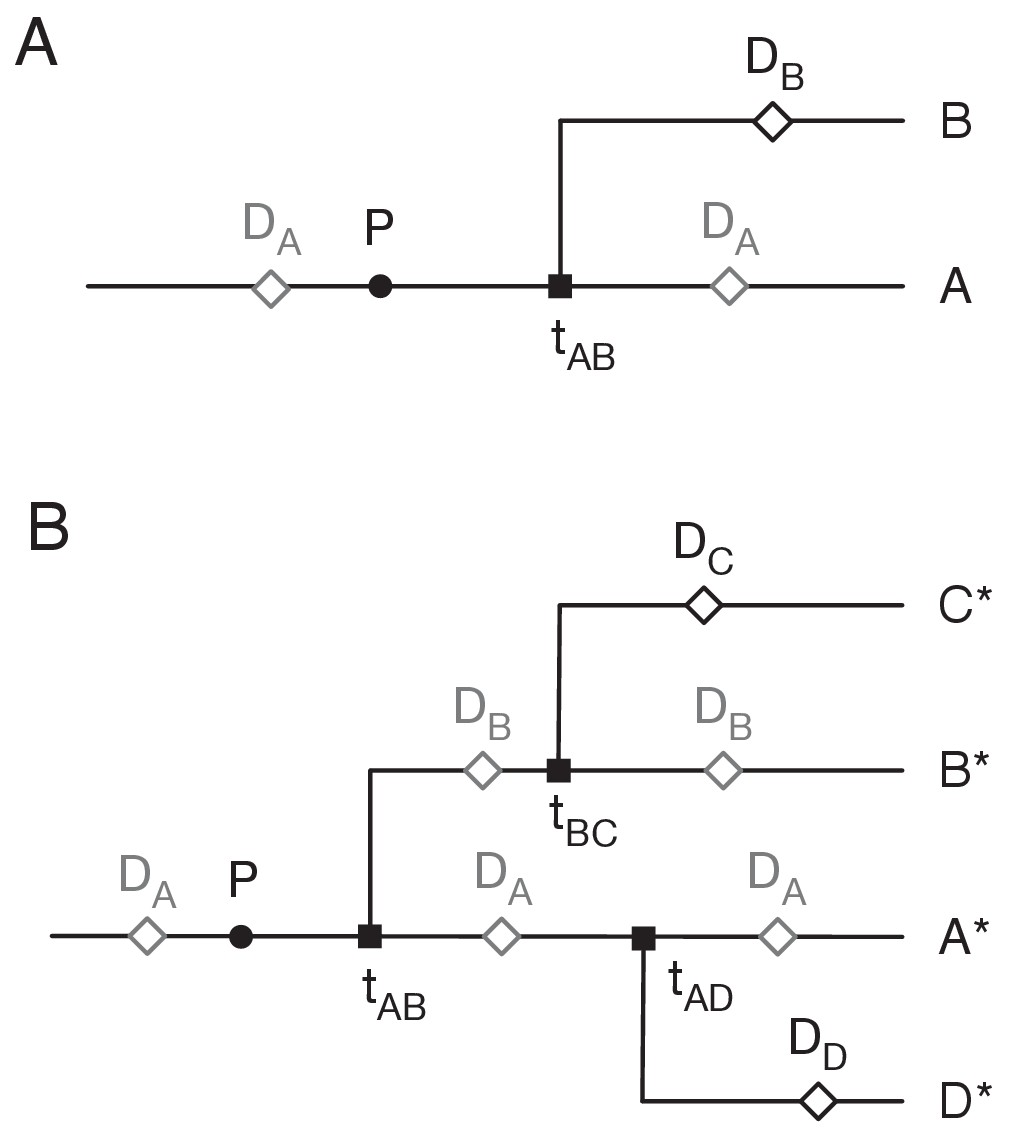
Assigning mutations to the transmission tree.
(A) Case of the last transmission event. Transmission occurs from A to B at time tAB. Viral sequence data is collected from A at time DA and from B at time DB. Grey markers show points which may be located in multiple places on the tree. (B) General case of transmission from A to B. The notation A* denotes a lineage that includes the individual A plus potentially further individuals downstream to whom A transmits the virus.
Figure 5—figure supplement 4
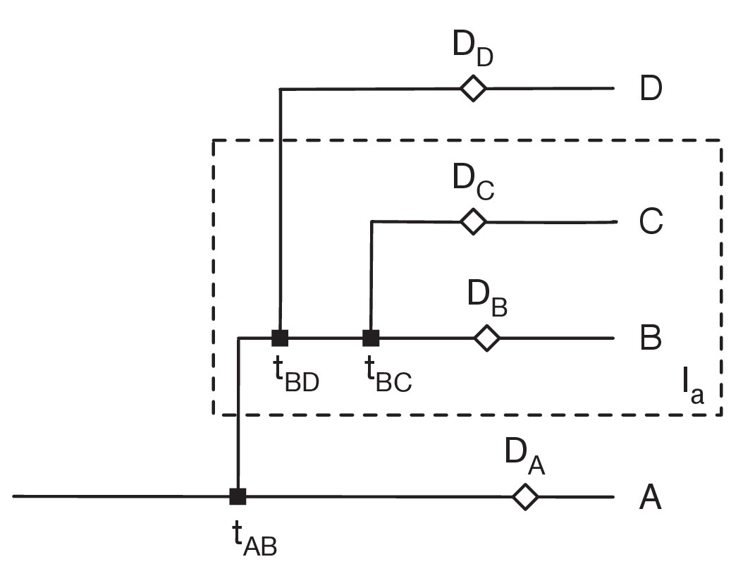
Restrictions placed on the network by sequence variants.
Here sequences collected from the individuals B and C (i.e. in the set Ia) have the variant a, but no other sequences have this variant. Data from individual i was collected at time Di. We assume that variants can be gained only once, and that variants never revert. Then 1: There can be only one transmission into the set Ia. Suppose that A, who is not in Ia, transmits to B, who is in Ia. Then the gain of the variant must occur between the earlier of tAB and DA and the latter of DB and tBC. 2: B can transmit to D not in Ia, but no other individual in Ia can transmit out of Ia. Transmission from B can occur before the gain of the variant, but transmission from any other C in Ia would involve the reversion of the variant. 3. All transmissions from B to D not in Ia must occur before all transmissions from B to C in Ia.
Figure 5—figure supplement 5
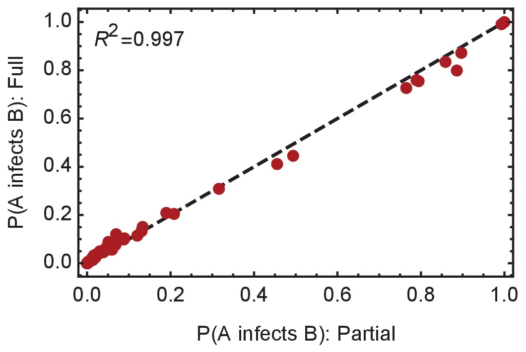
Convergence of the statistical ensemble of networks for ward A.
Comparisons of the number of infections per individual and the probabilities of specific edges being found in the transmission network for a ‘partial’ set of networks and for a more complete, ‘full’ set of networks. The full set contains approximately 30% more networks than the partial set, adding in likelihoods calculated for networks within three steps of the maximum likelihood network. Statistics calculated over the two sets are extremely similar, suggesting convergence to the true statistical ensemble.
-
Figure 5—figure supplement 5—source data 1
Probabilities of transmission events between individuals inferred from data describing ward A calculated across partial and fuller sets of networks.
The values reported here show convergence in the model with the addition of further networks.
- https://cdn.elifesciences.org/articles/67308/elife-67308-fig5-figsupp5-data1-v2.xlsx
Tables
Table 1
Case numbers in the five major ward clusters.
‘Total cases before network analysis’ were derived by adding patients with potential hospital-acquired COVID-19 infections and HCW cases from each ward. The five wards with the largest combined number of HAI and HCW cases within the study period were analysed, with anonymised ward names A to E. ‘Ward type’ refers to whether wards were ‘green’ (intended for patients negative for COVID-19), or ‘red’ (intended for COVID-19 patients). The breakdown of HAI and HCW cases for each of the included wards is shown in columns ‘HAI cases before network analysis’ and ‘HCW cases before network analysis’, respectively. The ‘network analysis’ at this stage identified additional patients that could have been involved in transmission with the HAI patients on the basis of co-location on the same or other wards within a plausible timeframe for SARS-CoV-2 transmission (described in Materials and methods). This yielded the final cases analysed for each ward cluster using the transmission reconstruction model. The final column shows the number of cases from each ward cluster for which genomic data were available. In total, there were 98 cases with genomic data and 129 SARS-CoV-2 genomes analysed in the study (the larger number of genomes than cases is because of multiple samples per patient that underwent SARS-CoV-2 sequencing). Three patients were included in two ward clusters each (which is why the total of the ‘Cases after network analysis with genomic data’ column is 101). HAI = hospital-acquired infection (definition in Methods); HCW = healthcare worker.
| Ward name | Ward type | Total cases before network analysis | HAI cases before network analysis | HCW cases before network analysis | Cases after network analysis | Cases after network analysis with genomic data |
|---|---|---|---|---|---|---|
| A | Green | 14 | 12 | 2 | 16 | 15 |
| B | Green | 11 | 2 | 9 | 15 | 12 |
| C | Green | 12 | 5 | 7 | 20 | 19 |
| D | Green | 14 | 4 | 10 | 16 | 16 |
| E | Red | 13 | 3 | 10 | 47 | 39 |
Additional files
-
Supplementary file 1
GISAID sequence identifiers for the genomes used in this study.
- https://cdn.elifesciences.org/articles/67308/elife-67308-supp1-v2.xlsx
-
Supplementary file 2
COG-UK sequence identifiers for the genomes used in this study.
- https://cdn.elifesciences.org/articles/67308/elife-67308-supp2-v2.xlsx
-
Transparent reporting form
- https://cdn.elifesciences.org/articles/67308/elife-67308-transrepform-v2.docx
Download links
A two-part list of links to download the article, or parts of the article, in various formats.
Downloads (link to download the article as PDF)
Open citations (links to open the citations from this article in various online reference manager services)
Cite this article (links to download the citations from this article in formats compatible with various reference manager tools)
Superspreaders drive the largest outbreaks of hospital onset COVID-19 infections
eLife 10:e67308.
https://doi.org/10.7554/eLife.67308


