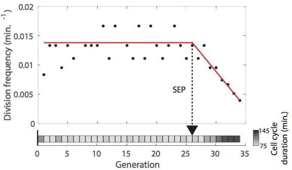
DetecDiv, a generalist deep-learning platform for automated cell division tracking and survival analysis
Figures

DetecDiv workflow Left: Sketch of the analysis pipeline used to track divisions at the single-cell level.
Left: A microfluidic device, featuring 16 independent channels with 2000 individual cell traps in each (depicted with a zoom on the trap array (scale bar: 20 µm) and zoom on one trap containing a budding yeast (scale bar: 5 µm)), is imaged using time-lapse microscopy. Middle-left: Typical temporal sequence of brightfield field of views obtained with the setup (scale bar: 60 µm). Regions Of Interest (ROI) representing the traps are automatically detected using XY cross-correlation processing, and the temporal sequence of each ROI (trap) is extracted and saved. Top-right: Sketch of the training and validation pipeline of DetecDiv classifiers. A set of ROIs is picked from one (or several) experiments and annotated to form a groundtruth dataset. It is then split into a training set, used to train the corresponding classifier, and a test set used to validate the trained classifier. Bottom-right: Example of signals extracted from ROIs using DetecDiv classifiers. An image classifier can be used to extract oscillations of classes describing the size of the bud, from dividing cells, and thus the occurrence of new cell cycles (more details in Figure 2). A sequence classifier can be used to detect changes in cell-cycle frequency, such as a cell-cycle slowdown (Senescence Entry Point, SEP; more details in Figure 4). A pixel classifier can be used to segment the mother cell from other cells, and from the background (more details in Figure 5). Using these classifiers on the same ROIs allows extracting quantitative metrics from dividing cells, at the single-cell and population level.
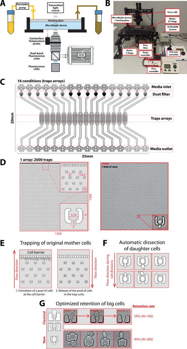
Experimental setup and microfluidic device.
(A) Schematics of the custom imaging setup built for DetecDiv (see Methods for details). (B) Picture of the imaging setup. (C) Design of the microfluidic device with 16 independent channels. Each channel has one inlet, a dust filter, and one outlet. (D) Left: Schematics of the array of cell traps. Inset represents close-ups on indicated areas. Dimensions are in µm. Right: Brightfield image of a typical field of view and close-up on one trap (scale bar: 60 µm and 5 µm). (E) Principle of the cell barrier used to prevent the cells from moving towards the inlet when loading the cells from the outlet, since any cell upstream of the cell array may lead to the formation of colonies hence clog the device over time. (F) Principle of the automated dissection of daughter cells: the mother is retained within the trap but their successive daughters are flushed away due to constant medium flow. Daughters may either exit the trap from the top of the bottom opening. (G) Unlike previous cell trap geometries (‘classical’), the current design (‘new’) features shallow PDMS walls that can be deformed by large cells, hence ensuring the long-term retention of the cells. Two small claws on each side of the trap entrance further enhance retention. The retention, measured as the number of cells staying inside the trap before their death (or more than 5000 min, i.e. the duration of the experiment), is displayed for both type of traps.
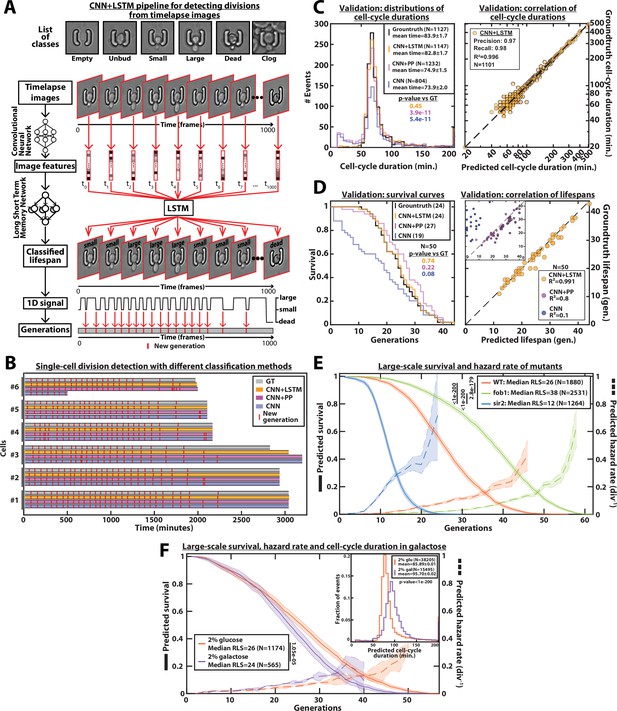
DetecDiv cell-cycle duration predictions and RLS reconstruction pipeline.
(A) Principles of the DetecDiv division tracking and lifespan reconstruction pipeline; Brightfield images are processed by a convolutional neural network (CNN) to extract representative image features. The sequence of image features is then processed by a long short-term memory network (LSTM) that assigns one of the 6 predefined classes (‘unbud’, ‘small’, ‘large’, ‘dead’, ‘clog’, ‘empty’), taking into account the time dependencies. Temporal oscillations between ‘large’ and ‘small’ or ‘large’ and ‘unbudded’ indicate the beginning of a new generation (i.e. cell-cycle). The appearance of the ‘dead’ class marks the end of the lifespan. For scale reference, each image is 19.5µm wide. (B) Comparison of the different methods used for six sample cells. The gray bars represent the groundtruth data made from manually annotated image sequences. Colored lines indicate the corresponding predictions made by CNN+LSTM (orange), the CNN+post-processing (magenta), and the CNN (blue) networks (see Methods and supplementary text for details). The red segments indicate the position of new generation events. (C) Left: histogram of cell-cycle durations representing groundtruth data and predictions using different processing pipelines. The p-value indicates the results of a rank-sum test comparing the predictions to the groundtruth for the different pipeline variants. The total number of generations annotated in the groundtruth or detected by the networks is indicated in the legend. Right: Scatter plot in log scale representing the correlation between groundtruth-calculated cell-cycle durations and those predicted by the CNN+LSTM network. R2 represents the coefficient of correlation between the two datasets. Precision and recall are defined in the Methods section. (D) Left: cumulative distribution showing the survival of cells as a function of the number of generations (N=50 cells). The numbers in the legend indicate the median replicative lifespans. The p-value indicates the results from a statistical log-rank test. Right: Scatter plot representing the correlation of the replicative lifespans of 50 individual cells obtained from the groundtruth with that predicted by the CNN+LSTM architecture. Inset: same as the main plot, but for the CNN and CNN+Post-Processing pipelines. R2 indicates the coefficient of correlation between the two datasets. (E) Replicative lifespans obtained using the CNN+LSTM network for longevity mutants (solid colored lines, genotype indicated). The shading represents the 95% confidence interval calculated using the Greenwood method (Pokhrel et al., 2008). The median RLS and the number of cells analyzed are indicated in the legend. The dashed lines with shading represent the hazard rate (i.e. the instantaneous rate of cell mortality in the population of cells at a given replicative age) and its standard deviation estimated with a bootstrap test (N=100). Results from log-rank tests (comparing WT and mutant distributions) are indicated on the left of the legend. (F) Same as E but for WT cells grown in 2% glucose or 2% galactose (colored lines). Inset: Same as C - Left but with the same conditions as the main panel.
-
Figure 2—source data 1
Parameter values used for training the CNN+LSTM classifier.
- https://cdn.elifesciences.org/articles/79519/elife-79519-fig2-data1-v3.xlsx
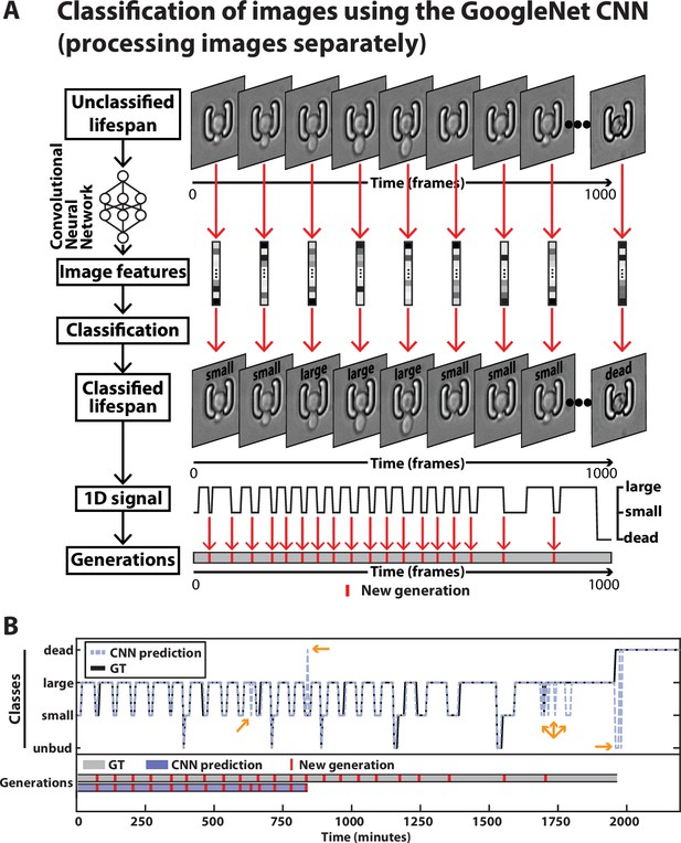
Principles of division tracking and lifespan reconstruction using a CNN-based image classification.
(A) In this framework, the sequence of images is processed by a GoogleNet CNN that processes each image separately. The CNN extracts image features that are used to assign a label to each image among six possible classes (see supplementary methods for details). As with the CNN+LSTM architecture described in Figure 2, the sequence of labels is used to assign new generation events and the occurrence of cell death. For scale reference, each image is 19.5µm wide. (B) Typical sequence of label (Top) and the associated generations extracted from it (Bottom), from the image sequence of a ROI. The groundtruth is depicted in black and gray and the output of the CNN-based image classification is shown in purple. The yellow arrows indicate prediction errors. A large-to-small error leads to a false positive new generation, while a false death leads to a precocious shortening the sequence of generations.
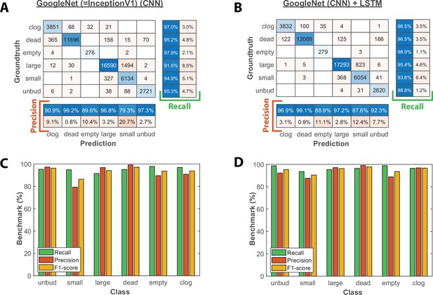
Image classification benchmarks obtained with the CNN and the CNN+LSTM architecture.
(A) Confusion matrix obtained with a test dataset (50 trapped cells followed over 1000 frames) using the CNN image classifier. Each number in the matrix represents the number of detected events. (B) Same as A, but for the combined CNN+LSTM architecture (C) Bar plot showing the recall, precision, and F1-score metrics obtained on each class for the CNN image classifier on the test dataset. (D) Same as C, but for the combined CNN+LSTM architecture.
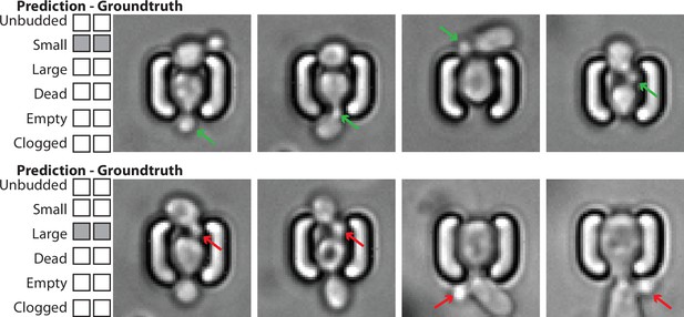
Example of image classification correctly labeling the state of the mother cell, despite the presence of surrounding cells with potentially different states.
Top: Four images of a mother cell in contact with another cell, annotated (groundtruth) as ‘Small’, and classified as such. The presence of this cell does not affect the classification of the budding state of the mother cell. The green arrows indicate the actual small bud from the mother cell. Bottom: Four images of a mother cell in contact with another cell, annotated (groundtruth) as ‘Large’, and classified as such. The presence of this cell does not affect the classification of the budding state of the mother cell. The red arrows indicate a small bud from the neighbor cell that could have misled the classifier. For scale reference, each image is 19.5µm wide.
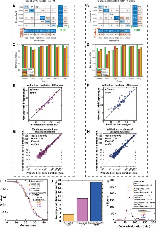
Image classification benchmarks, cell-cycle duration and RLS prediction using different CNNs.
(A) Confusion matrix obtained with a test dataset (50 trapped cells followed over 1000 frames) using a InceptionV3 CNN combined with an LSTM. Each number in the matrix represents the number of detected events. (B) Same as A, but using an InceptionResnetV2 combined with an LSTM. (C) Bar plot showing the recall, precision, and F1-score metrics obtained on each class using a InceptionV3 CNN combined with an LSTM on the test dataset. (D) Same as C, but using an InceptionResnetV2 combined with an LSTM. (E) Scatter plot representing the correlation of the replicative lifespans of 50 individual cells obtained from the groundtruth with that predicted using a InceptionV3 CNN combined with an LSTM. (F) Same as E, but using an InceptionResnetV2 combined with an LSTM. (G) Scatter plot in log-scale representing the correlation between groundtruth-calculated cell-cycle durations and those predicted using a InceptionV3 CNN combined with an LSTM. R2 represents the coefficient of correlation between the two datasets. Precision and recall are defined in the Methods section. (H) Same as G, but using an InceptionResnetV2 combined with an LSTM (I) Cumulative distribution showing the survival of cells as a function of the number of generations (N=50 cells) as determined manually or as predicted by different CNNs combined with an LSTM. The numbers in the legend indicate the median replicative lifespans. The p-value indicates the results from a statistical log-rank test. (J) Average classification time of an image sequence from a ROI (1000 frames) using three different CNNs combined with an LSTM. N=1000 image sequences. (K) Histogram of cell-cycle durations representing groundtruth data and predictions by different CNNs combined with an LSTM. The p-value indicates the results of a rank-sum test comparing the predictions to the groundtruth for the different networks. The total number of generations annotated in the groundtruth or detected by the networks is indicated in the legend.
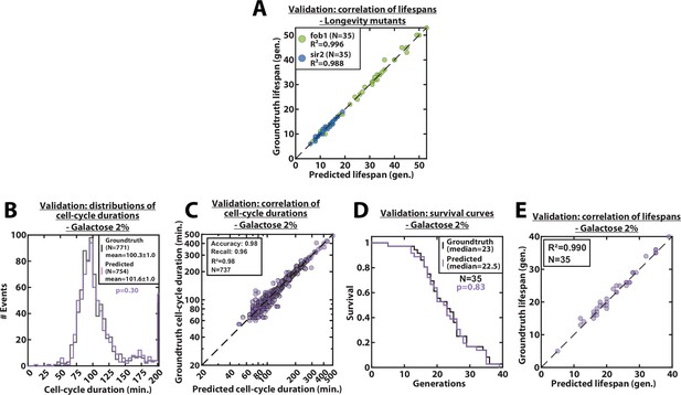
Validation of RLS and cell-cycle durations predictions, for mutants and galactose conditions.
(A) Scatter plot representing the correlation of the replicative lifespans of individual cells from sir2Δ or fob1Δ longevity mutants obtained from the groundtruth with that predicted by the CNN+LSTM architecture (N=35). (B) Histogram of cell-cycle durations representing groundtruth data and predictions, for cells growing in 2% galacose media. The p-value indicates the results of a rank-sum test comparing the predictions to the groundtruth. The total number of generations annotated in the groundtruth or detected by the networks is indicated in the legend. (C) Scatter plot in log scale representing the correlation between groundtruth-calculated cell-cycle durations and those predicted by the CNN+LSTM network, for cells growing in 2% galacose media. R2 represents the coefficient of correlation between the two datasets. Precision and recall are defined in the supplementary text. (D) Cumulative distribution showing the survival of cells growing in 2% galacose media as a function of the number of generations (N=35 cells). The numbers in the legend indicate the median replicative lifespans. The p-value indicates the results from a statistical log-rank test. (E) Scatter plot representing the correlation of the replicative lifespans of individual cells growing in 2% galacose media, obtained from the groundtruth with that predicted by the CNN+LSTM architecture (N=35). R2 indicates the coefficient of correlation between the two datasets.
Comparison of the groundtruth with the CNN+LSTM classifier predictions for the cellular state.
The left column represents the class predictions made by the CNN+LSTM classifier, while the right column represents the groundtruth (determined by manual annotation). The two numbers represent the number of buds generated by the cells according to the classifier predictions and manual annotation, respectively. For scale reference, each image is 19.5µm wide.
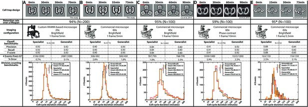
Classification benchmarks and performances of the divison detection of a CNN+LSTM image classifier, trained on time-lapses images from different microfluidic devices and imaging setups.
A specialist classifier was trained independently for each source, while a generalist classifier was trained on a mixed dataset generated from all the sources. (A) Cell trap and imaging setup developed in this study, with a framerate of 1 frame/5 min. (B) Cell trap developed in this study imaged with a ×60 objective mounted on a commercial imaging system with a framerate of 1 frame/5 min. (C) Cell trap from the Acar lab (Liu et al., 2015) imaged with a ×40 objective mounted on a commercial imaging system with a framerate of 1 frame/10 min. (D) Cup-shaped trap similar to Jo et al., 2015, imaged with a ×60 phase-constrast objective mounted on a commercial imaging system with a framerate of 1 frame/10 min. (E) Cell trap from the Swain lab (Crane et al., 2014; Granados et al., 2018) imaged with a ×60 objective mounted on a commercial imaging system with a framerate of 1 frame/2.5 min. Scale bars: 5µm.
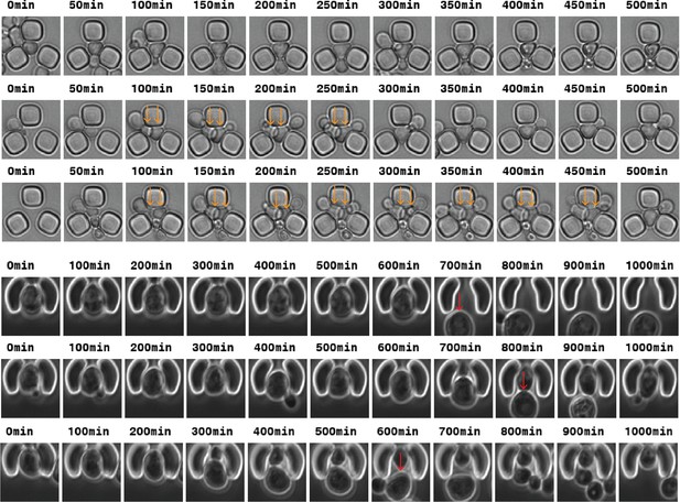
Top: Time-lapse images of traps from the Acar lab (Liu et al., 2015) from which the automated division detection can be impaired due to multiple cells in the trap (orange arrows).
Bottom: Time-lapse images of cup-shaped traps (Jo et al., 2015) from which the automated RLS analysis can be impaired due to mother/daughter replacement (red arrows).
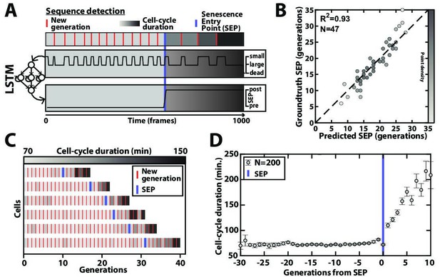
Deep learning-based measurement of the dynamics of entry into senescence.
(A) Sketch depicting the detection of the Senescence Entry Point (SEP). The temporal sequence of classes probabilities (i.e. unbud, small, large, dead) is fed into an LSTM network that predicts the SEP by assigning one of the two predefined classes pre-SEP or post-SEP to each frame. (B) Correlogram showing the correlation between the SEP predicted by the LSTM network and the groundtruth data, obtained as previously described (Fehrmann et al., 2013). The gray level coded data points indicate the local density of the points using arbitrary units as indicated by the gray level bar. (C) Sample trajectories indicating the successive generations of individual cells (red lines) along with the cell-cycle duration (color-coded as indicated). (D) Average cell-cycle duration versus generation index after aligning all individual trajectories from the SEP (Fehrmann et al., 2013). Each point represents an average over up to 200 cell trajectories. The error bar represents the standard error-on-mean.
-
Figure 4—source data 1
Parameter values used for training the SEP detection classifier.
- https://cdn.elifesciences.org/articles/79519/elife-79519-fig4-data1-v3.xlsx
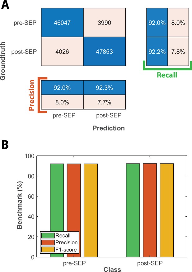
Classification benchmarks for the detection of the onset of Senescence Entry using an LSTM sequence-to-sequence classification.
(A) Confusion matrix obtained with a test dataset (50 time-series based on the cellular state probabilities output by the CNN+LSTM classifier) using a trained LSTM classifier. Each number in the matrix represents the number of detected events. (B) Bar plot showing the precision, recall, and F1-score metrics obtained on each class for the LSTM classifier on the test dataset.
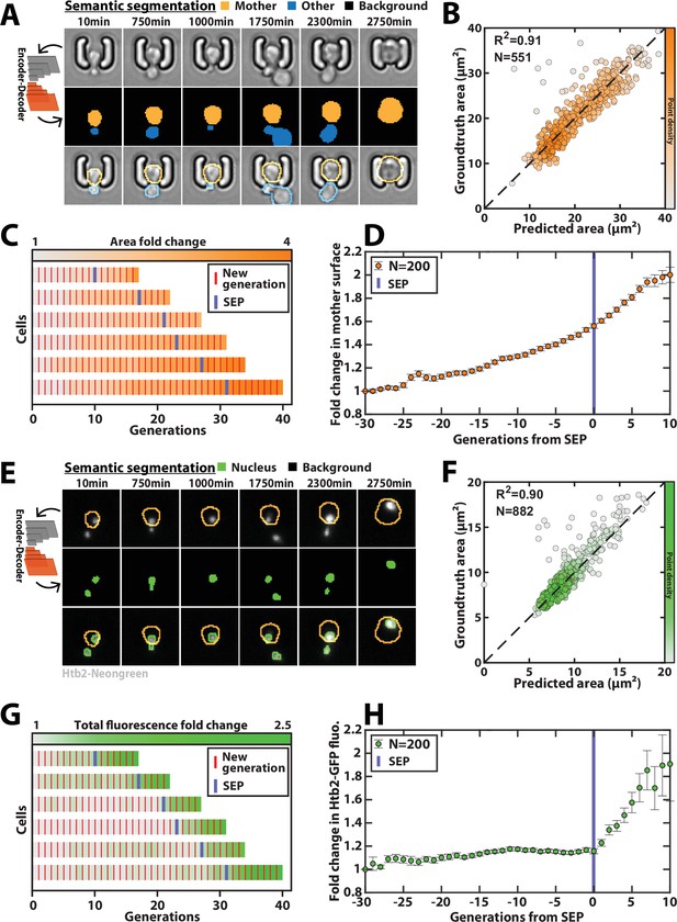
Deep learning-based semantic segmentation of cells and nuclei.
(A) Principles of semantic cell contours segmentation based on brightfield images; Top and middle row: Individual brightfield images were processed by the DeeplabV3+ network that was trained to perform pixel classification using three predefined classes representing the background (black), the mother cell of interest (orange), or any other cell in the image (blue). Bottom row: overlay of brightfield images with segmented cellular contours. For scale reference, each image is 19.5µm wide. (B) Correlogram showing the correlation between individual cell area predicted by the segmentation pipeline and the groundtruth data, obtained by manual annotation of the images. The color code indicates the local density of the points using arbitrary units. (C) Sample trajectories indicating the successive generations of individual cells (red lines) along with the cell surface area (color-coded as indicated). (D) Average mother cell surface area versus generation index after aligning all individual trajectories from the SEP (Fehrmann et al., 2013). Each point represents an average of up to 200 cell trajectories. The error bar represents the standard error-on-mean. (E) Principles of semantic cell nuclei segmentation based on fluorescent images of cells expressing a histone-Neongreen fusion. The semantic segmentation network was trained to classify pixels between two predefined classes (‘background’ in black, ‘nucleus’ in green). For scale reference, each image is 19.5µm wide. (F) Same as B but for nuclear surface area. (G) Same as C but for total nuclear fluorescence (H) Same as in D but for total nuclear fluorescence.
-
Figure 5—source data 1
Parameter values used for training the classifier dedicated to cell segmentation.
- https://cdn.elifesciences.org/articles/79519/elife-79519-fig5-data1-v3.xlsx
-
Figure 5—source data 2
Parameter values used for training the classifier dedicated to nucleus segmentation.
- https://cdn.elifesciences.org/articles/79519/elife-79519-fig5-data2-v3.xlsx
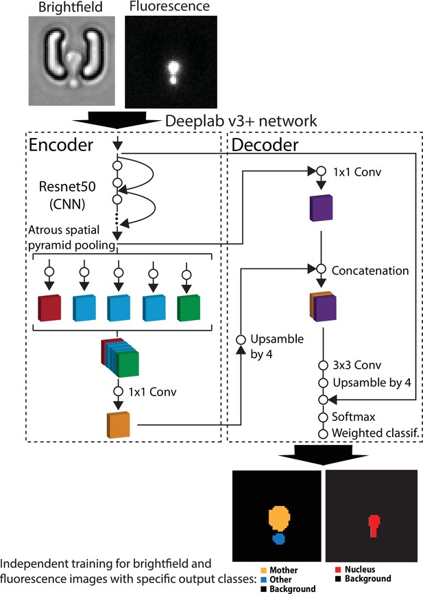
Principles of the pipeline used for semantic segmentation with DeepLabV3+.
Brightfield or fluorescence images are separately processed by the DeepLabV3+ encoder/decoder network (Chen et al., 2018) that has been modified to classify image pixels according to user-defined classes (mother/other/background and nucleus/background for brightfield and fluorescence images, respectively). For scale reference, each image is 19.5µm wide. A weighted classification layer is used to deal with class imbalance.
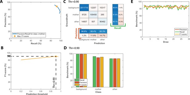
Benchmarks for the semantic segmentation of brightfield images.
(A) Precision/Recall tradeoff plot obtained by varying the output prediction threshold for the class “mother” using a test dataset that contains 50 image sequences with 1000 frames. The yellow dot indicates the point that maximizes the F1-score. (B) Evolution of F1-score as a function of the output prediction threshold computed on the [0.2 : 0.95] interval. A threshold value of 0.9 maximizes the F1-score (90%). (C) Confusion matrix obtained with the test dataset using a 0.9 prediction threshold. (D) Bar plot showing the recall, precision, and F1-score metrics obtained on each class for the pixel classifier on the test dataset. (E) Cross-validation of the classification model used for semantic segmentation; Class-averaged recall, precision, and F1-score plotted as a function of the index of the draws performed, as indicated on the legend (200 ROIs and 50 ROIs are randomly selected for training and testing upon each draw, respectively).
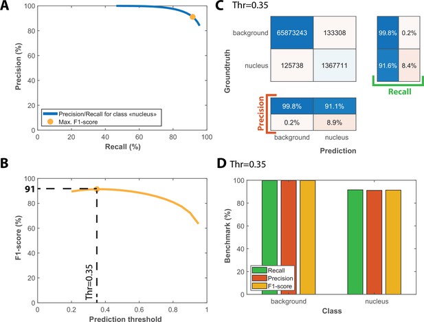
Benchmarks for the semantic segmentation of fluorescence images.
(A) Precision/Recall tradeoff plot obtained by varying the output prediction threshold for the class “nucleus” using a test dataset that contains 25 image sequences with 1000 frames. The orange dot indicates the point that maximizes the F1-score. (B) Evolution of F1-score as a function of the output prediction threshold computed on the [0.2 : 0.95] interval. A threshold value of 0.35 maximizes the F1-score (91%). (C) Confusion matrix obtained with the test dataset using a 0.35 prediction threshold. (D) Bar plot showing the recall, precision and F1-score metrics obtained on each class for the pixel classifier on the test dataset.
Sample movies of individual cells following cellular state classification, cell, and nuclear contour segmentation.
The left column represents the cellular state according to the prediction made by the CNN+LSTM classifier. The middle column shows the brightfield image along with mother cell contours obtained by a semantic segmentation classifier. The right column displays the Htb2-NeonGreen fluorescence channel, along with cells contours and nuclear contours obtained by a semantic segmentation classifier. For scale reference, each image is 19.5µm wide.
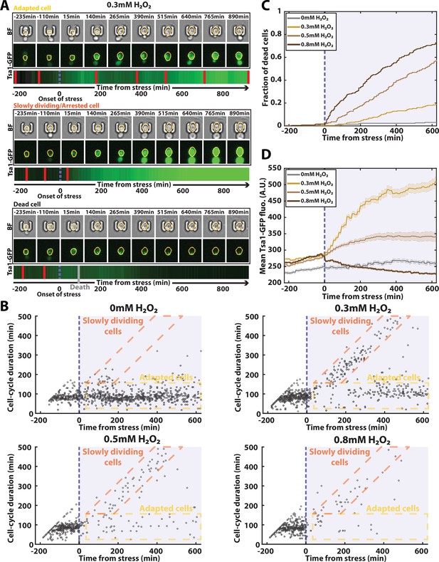
Automated analysis of the stress response to H2O2 using DetecDiv.
(A) Successive brightfield and Tsa1-GFP images of three representative cells submitted to 0.3 mM of H2O2 and corresponding to a different fate. The orange contour of the cell is determined using the segmentation described in Figure 5, and the total GFP fluorescence inside it is depicted as a function of time, where red bars indicates a new generation and the purple dotted bar indicated the onset of H2O2. For scale reference, each image is 19.5µm wide. (B) Scatter plot of automatically detected cell-cycle durations versus time of 500 cells submitted to different doses of H2O2. The purple area indicates the presence of the indicated dose of H2O2. (C) Fraction of dead cells versus time as automatically detected by the CNN+LSTM classifier, under different H2O2 doses. The purple area indicates the presence of the indicated dose of H2O2. N=500. (D) Mean Tsa1-GFP fluorescence from cells submitted to different doses of H2O2. The purple area indicates the presence of the indicated dose of H2O2. N=500.
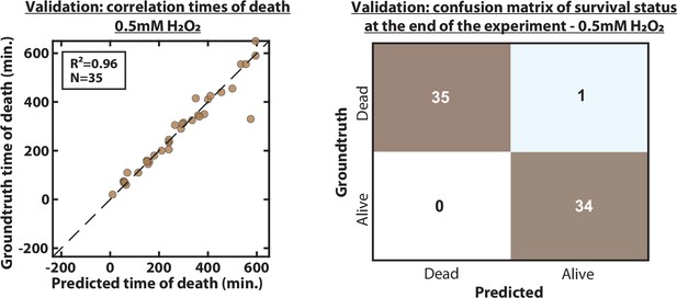
Validation of predicted time of death and death status at the end of the experiment.
(A) Scatter plot representing the correlation of the time of death of 35 individual cells exposed to a 0.05 mM H2O2 stress, between the groundtruth and the prediction by the CNN+LSTM architecture. R2 indicates the coefficient of correlation between the two datasets. (B) Confusion matrix between the survival status (‘Dead’ or ‘Alive’) of cells at the end of the experiment between the groundtruth and the prediction by the CNN+LSTM. Each number in the matrix represents the number of cells.
Additional files
-
MDAR checklist
- https://cdn.elifesciences.org/articles/79519/elife-79519-mdarchecklist1-v3.docx
-
Supplementary file 1
Strain list.
- https://cdn.elifesciences.org/articles/79519/elife-79519-supp1-v3.xlsx
-
Supplementary file 2
List of classification models.
- https://cdn.elifesciences.org/articles/79519/elife-79519-supp2-v3.xlsx


