Evolutionary shaping of human brain dynamics
Figures
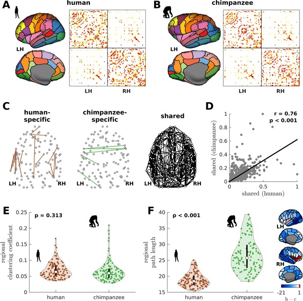
Human and chimpanzee connectome properties.
(A, B) Parcellation and connectome. The surface plots show the 114-region atlas (Supplementary file 1) on inflated cortical surfaces. The matrices represent the group-averaged structural connectivity between brain regions. (C) Structural connections that are human-specific, chimpanzee-specific, and shared between humans and chimpanzees. (D) Association of the weights of the connections shared between humans and chimpanzees. The solid line represents a linear fit with Pearson’s correlation coefficient (r) and p value (p). (E) Violin plot of the distribution of regional clustering coefficients. Each violin shows the first to third quartile range (black line), median (white circle), raw data (dots), and kernel density estimate (outline). p is the p value of the difference in the mean of the distribution between the species (two-sample t-test). (F) Violin plot of the distribution of regional path lengths. Violin plot details are similar to those in E. The surface plots show the spatial organization of the difference in path length between the species (i.e., human – chimpanzee) visualized on inflated human cortical surfaces. The negative–zero–positive values are colored as blue–white–red.
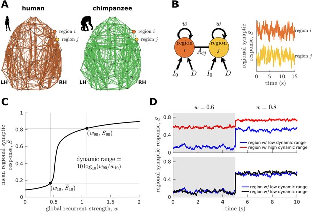
Brain network modeling.
(A) Group-averaged human and chimpanzee networks visualized on the same brain template. Top 20% of connections by strength are shown. (B) Schematic diagram of the model. Each brain region is recurrently connected with strength and driven by an excitatory input and white noise with standard deviation . The connection between regions and is weighted by based on the connectomic data. The regional neural dynamics are represented by the synaptic response variable ; high translates to high neural activity. (C) Method for calculating the dynamic range of each brain region from its mean synaptic response versus global recurrent strength curve. Note that , with being the corresponding global recurrent strength at and . (D) Example time series of regions with different (top panel) and similar (bottom panel) dynamic ranges at = 0.6 and 0.8. The time series in the top panel have correlation values (Pearson’s r) of 0.06 and 0.08 at = 0.6 and = 0.8, respectively. The time series in the bottom panel have correlations of 0.40 and 0.14 at = 0.6 and = 0.8, respectively.
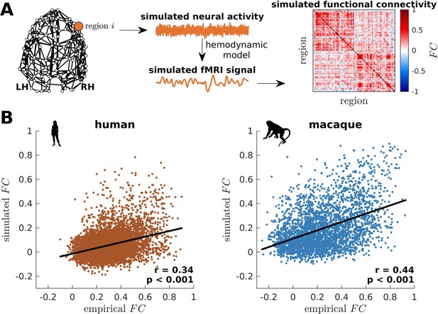
Validation of simulated dynamics on empirical functional neuroimaging data.
(A) From the connectome, neural activity is simulated using the model presented in Figure 2B. This activity is fed into a hemodynamic model to obtain a simulated fMRI signal for each brain region. Finally, functional connectivity () is calculated by taking pairwise Pearson correlations of the simulated fMRI signals across all regions. (B) Association between simulated and empirical FC for humans and macaques. The simulated FC is calculated using model parameters that optimize model-data fitting. Each dot represents the pairwise . The solid line represents a linear fit with Pearson’s correlation coefficient (r) and p value (p).
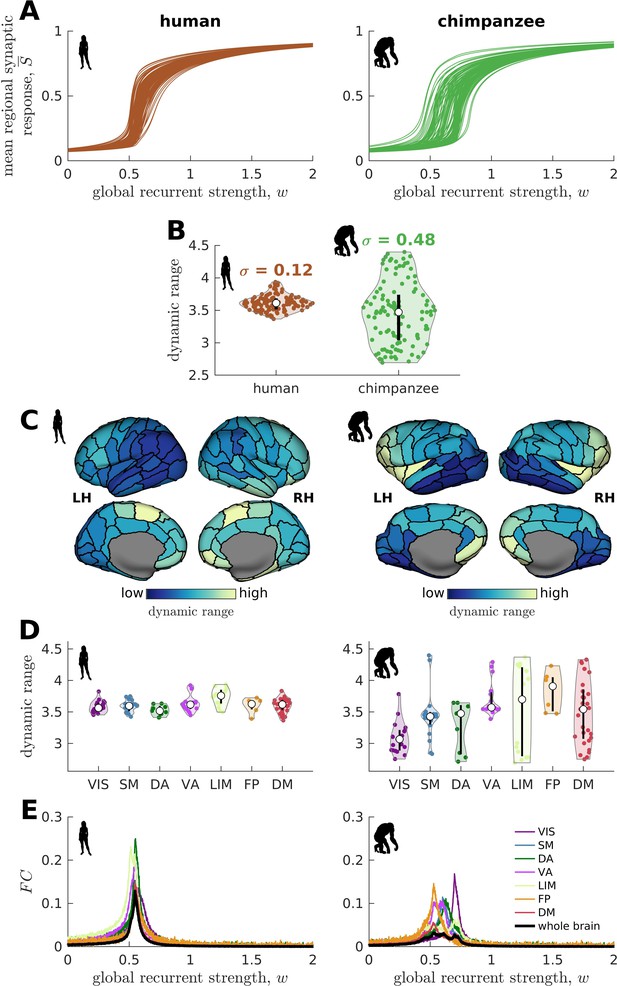
Human and chimpanzee neural dynamics.
(A) Regional neural dynamics as a function of global recurrent strength (). (B) Violin plot of the distribution of dynamic ranges across brain regions. Each violin shows the first to third quartile range (black line), median (white circle), raw data (dots), and kernel density estimate (outline). is the standard deviation of the distribution. (C) Spatial organization of dynamic ranges. Data are visualized on inflated cortical surfaces. Light color represents high dynamic range and dark color represents low dynamic range. (D) Violin plot of the distribution of dynamic ranges in seven canonical brain networks. Violin plot details are similar to those in B. (E) Simulated average functional connectivity () within the networks in D as a function of . The black line represents the average across the whole brain.
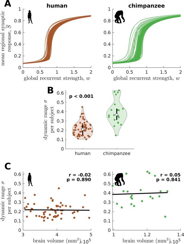
Confirmatory analysis on individual-specific connectomes and accounting for total brain volume.
(A) Regional neural dynamics as a function of global recurrent strength () for exemplar human and chimpanzee participants. (B) Violin plot of the standard deviation () of the distribution of dynamic ranges across brain regions for each participant. Each violin shows the first to third quartile range (black line), median (white circle), raw data (dots), and kernel density estimate (outline). p is the p value of the difference in the mean of the distribution between the species (two-sample t-test). (C) Dynamic range standard deviation () for each participant as a function of total brain volume. The solid line represents a linear fit with Pearson’s correlation coefficient (r) and p value (p).
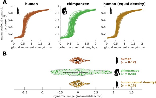
Confirmatory analysis on human and chimpanzee connectomes of equal connection density.
(A) Regional neural dynamics as a function of global recurrent strength () for the original human connectome, original chimpanzee connectome, and human connectome pruned to have an equal density as the original chimpanzee connectome. (B) Violin plot of the distribution of dynamic ranges across brain regions. Each violin shows the first to third quartile range (black line), median (white circle), raw data (dots), and kernel density estimate (outline). The data are mean-subtracted for visual purposes. is the standard deviation of the distribution.
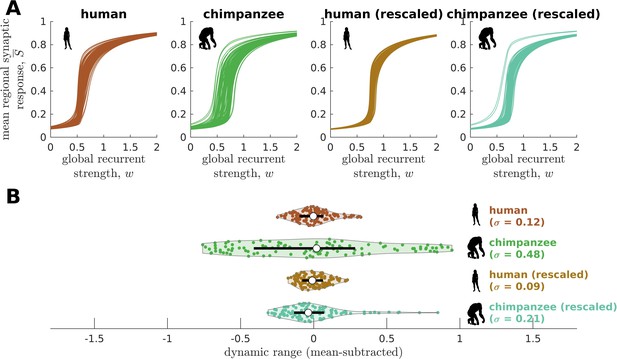
Confirmatory analysis accounting for inter-individual variability of connectomic data.
(A) Regional neural dynamics as a function of global recurrent strength () for the original human connectome, original chimpanzee connectome, and human connectome rescaled to match the inter-individual variability of the original chimpanzee connectome, and chimpanzee connectome rescaled to match the inter-individual variability of the original human connectome. (B) Violin plot of the distribution of dynamic ranges across brain regions. Each violin shows the first to third quartile range (black line), median (white circle), raw data (dots), and kernel density estimate (outline). The data are mean-subtracted for visual purposes. is the standard deviation of the distribution.
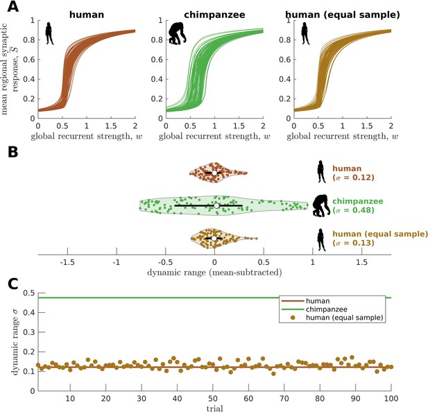
Confirmatory analysis on matched sample size.
(A) Regional neural dynamics as a function of global recurrent strength () for the original human connectome, original chimpanzee connectome, and an exemplar human connectome averaged from a sample of random human participants of the same size as the chimpanzee group (N=22). (B) Violin plot of the distribution of dynamic ranges across brain regions. Each violin shows the first to third quartile range (black line), median (white circle), raw data (dots), and kernel density estimate (outline). The data are mean-subtracted for visual purposes. is the standard deviation of the distribution. (C) Dynamic range standard deviation () for multiple random sampling trials of human participants. The solid lines represent the results for the original human and chimpanzee connectomes.
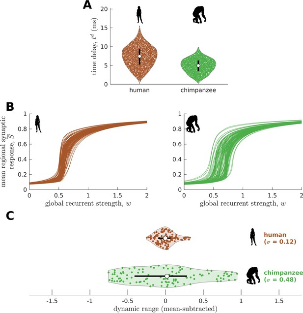
Confirmatory analysis accounting for activity propagation delays between brain regions.
(A) Violin plot of the distribution of propagation time delays () across all connections for a representative human and chimpanzee. Each violin shows the first to third quartile range (black line), median (white circle), raw data (dots), and kernel density estimate (outline). (B) Regional neural dynamics as a function of global recurrent strength (). (C) Violin plot of the distribution of dynamic ranges across brain regions. Each violin shows the first to third quartile range (black line), median (white circle), raw data (dots), and kernel density estimate (outline). The data are mean-subtracted for visual purposes. is the standard deviation of the distribution.
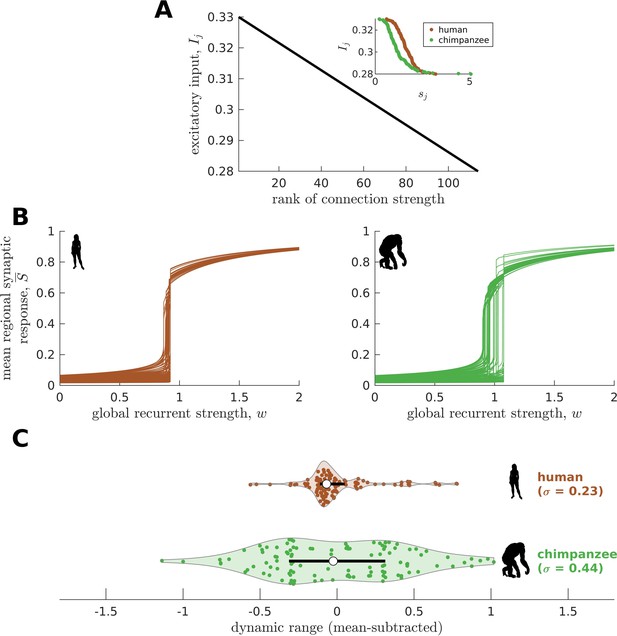
Confirmatory analysis accounting for heterogeneous excitatory input across brain regions.
(A) The excitatory input in each brain region is inversely proportional to the rank of its total connection strength (). The inset shows the actual relationship between and . (B) Regional neural dynamics as a function of global recurrent strength (). (C) Violin plot of the distribution of dynamic ranges across brain regions. Each violin shows the first to third quartile range (black line), median (white circle), raw data (dots), and kernel density estimate (outline). The data are mean-subtracted for visual purposes. is the standard deviation of the distribution.
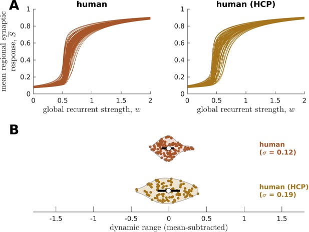
Replication of human neural dynamics on an independent dataset.
(A) Regional neural dynamics as a function of global recurrent strength () for the original human connectome and human connectome obtained from the Human Connectome Project (HCP). (B) Violin plot of the distribution of dynamic ranges across brain regions. Each violin shows the first to third quartile range (black line), median (white circle), raw data (dots), and kernel density estimate (outline). The data are mean-subtracted for visual purposes. is the standard deviation of the distribution.
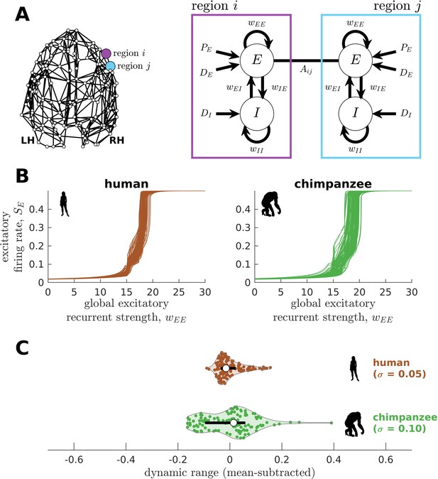
Replication of human and chimpanzee neural dynamics using a different biophysical model (the Wilson-Cowan model).
(A) Exemplar connectome and schematic diagram of the Wilson-Cowan model. In this biophysical model, each brain region comprises interacting populations of excitatory () and inhibitory () neurons. Connections within and between populations are represented by the parameters; for example, represents the excitatory recurrent connection strength. The excitatory neural population is driven by a constant excitatory input and white noise with standard deviation , while the inhibitory population is only driven by white noise with standard deviation . Regions and are connected with weight based on the connectomic data. (B) Regional neural dynamics (mean excitatory firing rate ) as a function of global excitatory recurrent strength (). (C) Violin plot of the distribution of dynamic ranges across brain regions. Each violin shows the first to third quartile range (black line), median (white circle), raw data (dots), and kernel density estimate (outline). The data are mean-subtracted for visual purposes. is the standard deviation of the distribution.
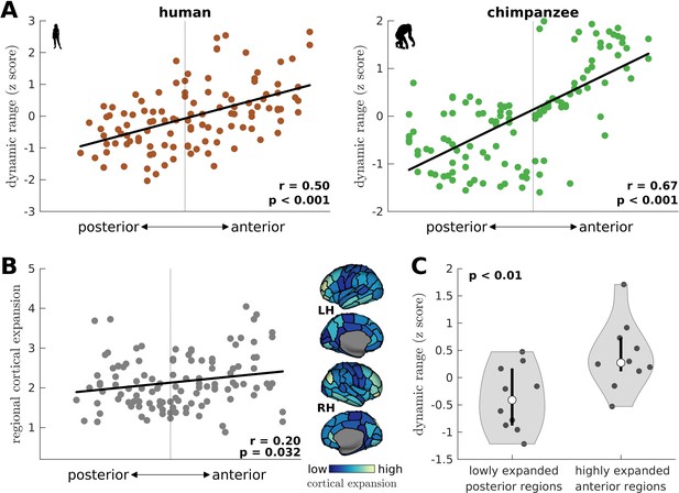
Gradient of dynamic ranges and regional chimpanzee-to-human cortical expansion along the anterior-posterior axis.
(A) Relationship between a brain region’s dynamic range and its anterior-posterior location. The dynamic range values are transformed to z scores. The solid line represents a linear fit with Pearson’s correlation coefficient (r) and p value (p). (B) Relationship between a brain region’s cortical expansion and its anterior-posterior location. The expansion is defined as the human:chimpanzee surface area ratio of each region, following Wei et al., 2019. The solid line represents a linear fit with Pearson’s correlation coefficient (r) and p value (p). The level of expansion is visualized on inflated human cortical surfaces. Light color represents a highly expanded region in humans compared to chimpanzees, while dark color represents a lowly expanded region. (C) Violin plot of the distribution of dynamic ranges of highly expanded anterior regions (top 10 regions) and lowly expanded posterior regions (bottom 10 regions) in the human brain. Each violin shows the first to third quartile range (black line), median (white circle), raw data (dots), and kernel density estimate (outline). p is the p value of the difference in the mean of the distributions (two-sample t-test).
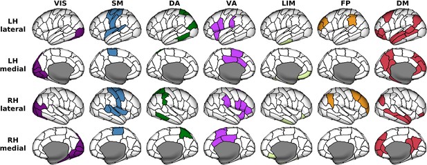
Anatomical locations of regions clustered according to seven canonical brain networks.
VIS = Visual; SM = Somatomotor; DA = Dorsal Attention; VA = Ventral Attention; LIM = Limbic; FP = Frontoparietal; DM = Default Mode. These functional networks are mapped onto the 114-region atlas in Supplementary file 1. The networks are visualized on inflated human cortical surfaces.
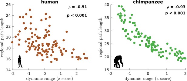
Association of the human and chimpanzee connectomes’ path length and dynamic range.
Average regional path length as a function of z-score-transformed dynamic ranges. is the Spearman rank correlation and p is the p value.
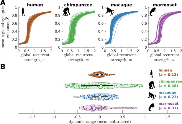
Neural dynamics of human and non-human primates.
(A) Regional neural dynamics as a function of global recurrent strength () for human, chimpanzee, macaque, and marmoset. (B) Violin plot of the distribution of dynamic ranges across brain regions. Each violin shows the first to third quartile range (black line), median (white circle), raw data (dots), and kernel density estimate (outline). The data are mean-subtracted for visual purposes. is the standard deviation of the distribution.
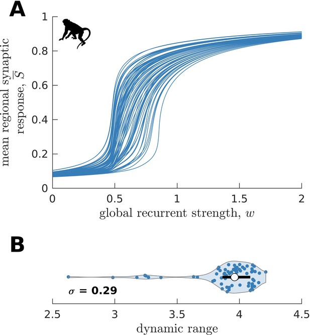
Replication of macaque neural dynamics on an independent dataset (CoCoMac).
(A) Regional neural dynamics as a function of global recurrent strength (). (B) Violin plot of the distribution of dynamic ranges across brain regions. The violin shows the first to third quartile range (black line), median (white circle), raw data (dots), and kernel density estimate (outline). is the standard deviation of the distribution.
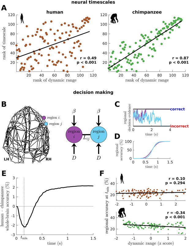
Human and chimpanzee neural timescales and connectome decision-making capacity.
(A) Ranked neural timescales as a function of ranked dynamic ranges. The solid line represents a linear fit with Pearson’s correlation coefficient (r) and p value (p). (B) Exemplar connectome and schematic diagram of the drift-diffusion model. In the model, each brain region accumulates decision evidence via a diffusion (Brownian) process with drift rate and driving white noise with standard deviation . Regions and are connected with Laplacian weight based on the connectomic data. (C) Example time series of regional decision evidence across time for regions and , demonstrating how each region reaches a correct or incorrect decision. (D) Regional accuracy curves obtained by simulating the model for an ensemble of trials and calculating the rate of achieving the correct decision. (E) Difference in whole-brain accuracy across time between humans and chimpanzees. Whole-brain accuracy represents the average of the accuracy of all regions. The dashed line shows the time () at which the difference in accuracy between humans and chimpanzees is most negative (i.e., chimpanzee accuracy>human accuracy). (F) Regional accuracy at (found in E) as a function of z-score-transformed dynamic ranges. The solid line represents a linear fit with Pearson’s correlation coefficient (r) and p value (p).
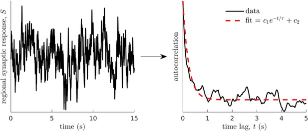
Method for calculating neural timescales.
(Left) Sample regional neural activity. (Right) Autocorrelation of the data (neural activity) as a function of time lag (solid line) and corresponding exponential fit (dashed line) from which the timescale is estimated. Note that and are fitting constants.
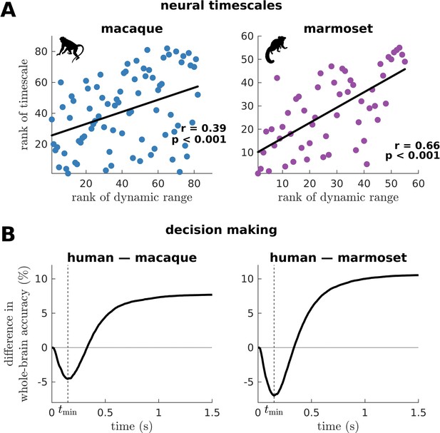
Macaque and marmoset neural timescales and their connectome’s decision-making capacity.
(A) Ranked neural timescales as a function of ranked dynamic ranges (similar to Figure 6A). The solid line represents a linear fit with Pearson’s correlation coefficient (r) and p value (p). (B) Human-macaque and human-marmoset difference in whole-brain accuracy across time (similar to Figure 6E). The dashed line shows the time () at which the difference in accuracy is most negative (i.e., macaque accuracy>human accuracy and marmoset accuracy>human accuracy).
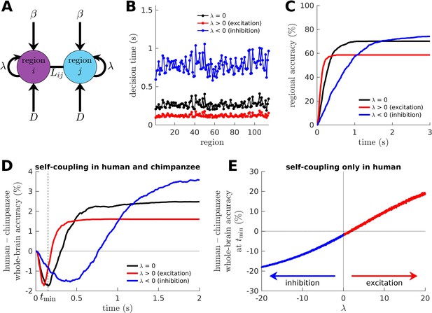
Effects of excitation and inhibition on decision-making capacity of the human and chimpanzee connectomes.
(A) Extended drift-diffusion model, which includes a parameter that scales the self-coupling term. corresponds to our original drift-diffusion model, corresponds to increased excitation, and corresponds to increased inhibition. (B) Decision time of each brain region, which is quantified as the time it takes for the region to reach its decision threshold. (C) Decision accuracy across time of a region. (D) Difference in whole-brain accuracy across time between humans and chimpanzees. Note that both humans and chimpanzees have the same level of excitation or inhibition (i.e., their parameters are the same). The dashed line shows the time () at which the difference in accuracy between humans and chimpanzees is most negative at (i.e., chimpanzee accuracy>human accuracy). (E) Difference in whole-brain accuracy at (found in D) between humans and chimpanzees, with only the humans having a non-zero self-coupling term. Hence, for humans and for chimpanzees.
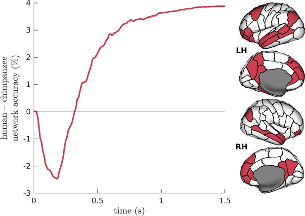
Difference in Default-Mode Network (DMN) accuracy across time between humans and chimpanzees.
The DMN regions are visualized on inflated human cortical surfaces.
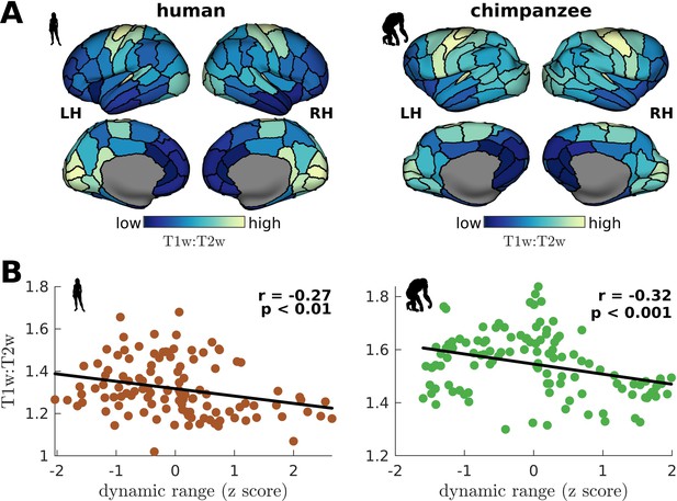
Testing of model predictions on T1w:T2w data.
(A) T1w:T2w maps visualized on inflated cortical surfaces. Light color represents high T1w:T2w value (high myelination) and dark color represents low T1w:T2w value (low myelination). (B) Regional T1w:T2w as a function of z-score-transformed dynamic ranges. The solid line represents a linear fit with Pearson’s correlation coefficient (r) and p value (p).
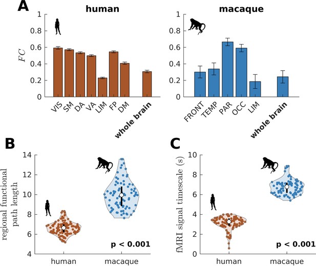
Testing of model predictions on functional neuroimaging data.
(A) Functional connectivity () within large-scale networks and across the whole brain of humans and macaques. The human large-scale networks are similar to those defined in Figure 3D. The macaque large-scale networks are: FRONT = Frontal; TEMP = Temporal; PAR = Parietal; OCC = Occipital; LIM = Limbic. The error bars are standard errors of the mean across participants (100 humans and 8 macaques). (B) Violin plot of the distribution of regional functional path length across brain regions calculated from group-averaged FC matrices. Each violin shows the first to third quartile range (black line), median (white circle), raw data (dots), and kernel density estimate (outline). (C) Violin plot of the distribution of fMRI signal timescales. Violin plot details are similar to those in B. For B, C, p is the p value of the difference in the mean of the distribution between the species (two-sample t-test).
Additional files
-
MDAR checklist
- https://cdn.elifesciences.org/articles/80627/elife-80627-mdarchecklist1-v2.docx
-
Supplementary file 1
Table listing the names of 57 cortical regions in each hemisphere.
- https://cdn.elifesciences.org/articles/80627/elife-80627-supp1-v2.docx


