Phylodynamics of SARS-CoV-2 in France, Europe, and the world in 2020
Figures
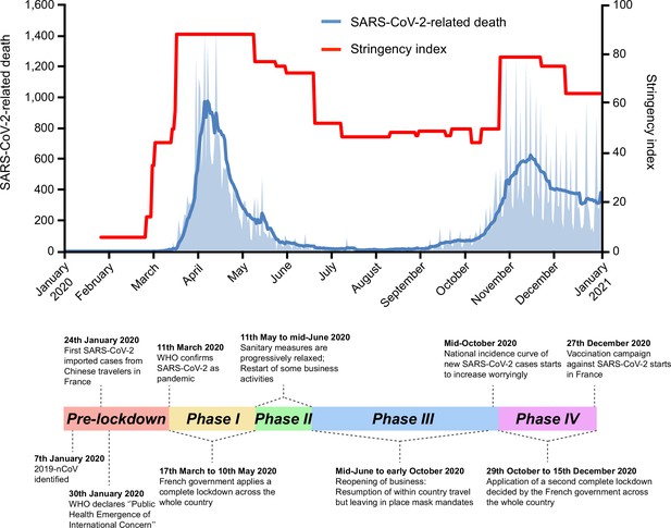
Timeline of severe acute respiratory syndrome coronavirus 2 (SARS-CoV-2)-related deaths and stringency index in France, 2020.
Key events are indicated on the timeline. Official lockdowns included stay home orders and closure of schools and daycares. Based on SARS-CoV-2-related deaths, the two first French epidemic waves are, respectively, dated from March to July 2020, and September to December 2020. SARS-CoV-2-related deaths are displayed as the daily number of deaths (light blue area) and as the weekly average of daily number of deaths (dark blue curve). The stringency (Oxford) index is a composite measure based on different response indicators including school and workplace closures and travel bans, rescaled to a value from 0 to 100 (100 = strictest) (Hale et al., 2021).
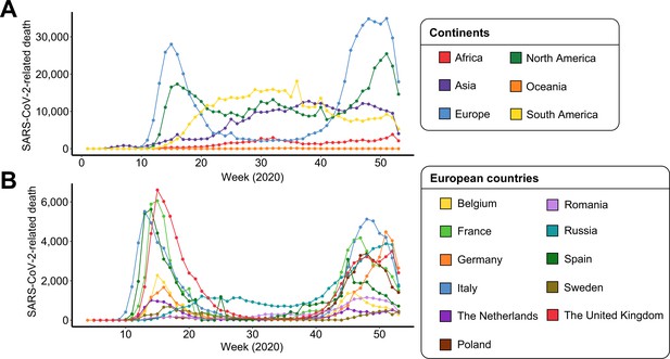
Severe acute respiratory syndrome coronavirus 2 (SARS-CoV-2)-related deaths per week of 2020 for each (A) continent and (B) European country.
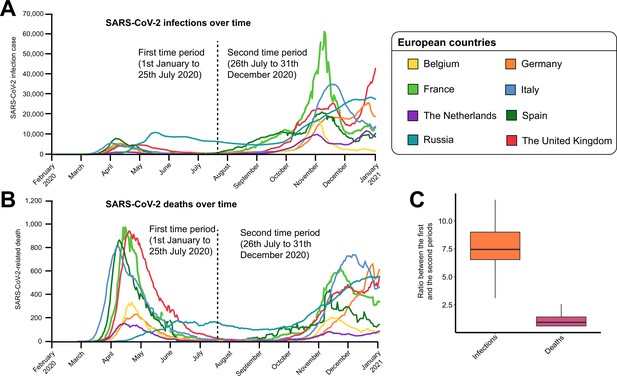
Difference in the count of severe acute respiratory syndrome coronavirus 2 (SARS-CoV-2)-positive cases and SARS-CoV-2-related deaths over time.
Evolution of (A) SARS-CoV-2-positive infections and (B) SARS-CoV-2-related deaths over time for eight European countries. The dashed line indicates the limit between the two time periods (January 1 to July 25, 2020 and July 26 to December 31, 2020) investigated in this study. (C) Ratio of SARS-CoV-2-positive cases and SARS-CoV-2-related deaths between the two time periods.
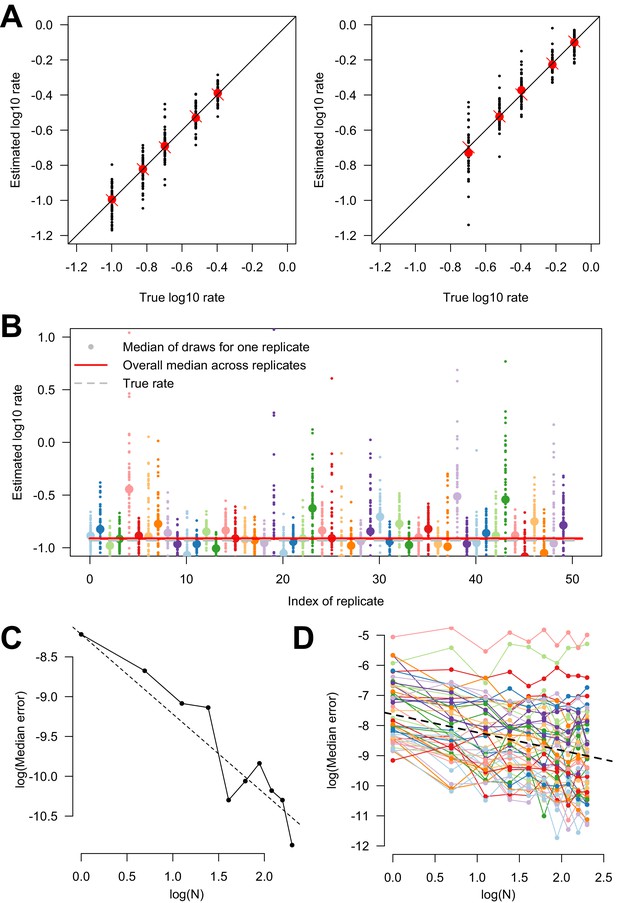
Estimating variability in transition rates using simulations.
(A) Estimated versus true parameters in the simulation study of the two-states model. The two panels show the two transition rates. For each set of parameters, 50 replicates were conducted. The large red dot is the median of the replicates. The red cross is the true parameter value, on the bisector. (B) Estimated rate of transition in subsampled trees. For each replicate (n = 50), one point is the result of one subsampled smaller phylogenetic tree (from a large phylogenetic tree). The big dot shows the median for each replicate. The horizontal red line is the overall median (of the medians), across replicates. The horizontal dashed gray line is the true rate. Only one of the two rate parameters is shown. (C) Log-median error in parameter estimation as a function of the log number of replicates, when inference is conducted on truly independent replicate evolutionary histories, on a tree of 1000 leaves. The points are the data, the dashed line shows the line of slope ‘−1’ which is the expectation as the replicates are truly independent. (D) Log-median error as a function of log number of subsamples used for the inference done on subsampled phylogenetic trees. The colored points and lines show the inference done on 50 distinct realizations of the evolutionary process on the whole tree. The dashed line is the overall regression line with a slope of −0.7. We tested between 1 and 10 subsampled trees (x-axis).
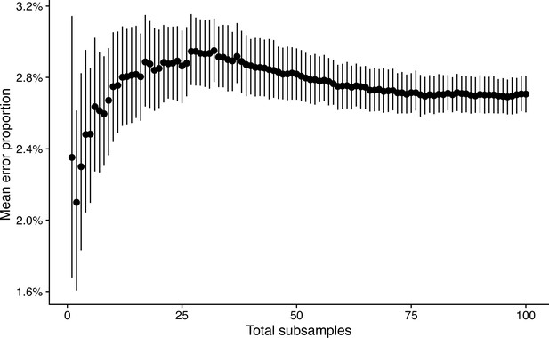
Mean error proportion of discrete trait transitions when subsampling a bigger tree.
The mean error proportion is plotted as a black dot on the y-axis. The error bars correspond to a 95% confidence interval obtained by 1000 bootstraps. The x-axis represents the total number of subsamples used to obtained the mean and non-parametric confidence interval.
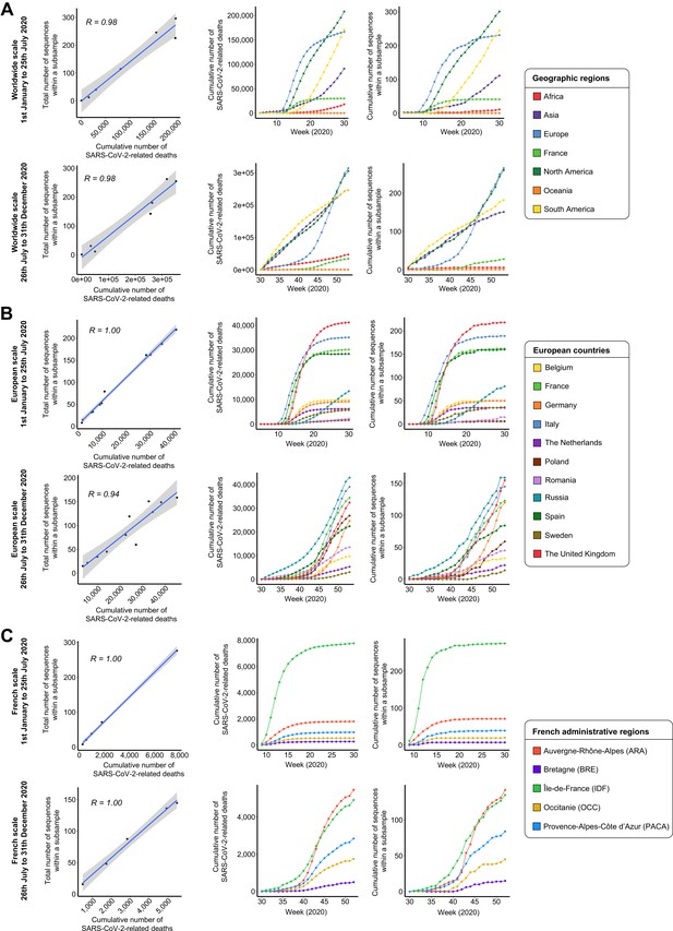
Positive correlation between the number of severe acute respiratory syndrome coronavirus 2 (SARS-CoV-2)-related deaths and the number of sequences included within a subsample on (A) worldwide, (B) European, and (C) French scales.
For each item, the first row of plots corresponds to the data from January 1 to July 25, 2020, and the second one consists of the data from July 26 to December 31, 2020. The left plots show the positive correlation between the total number of sequences per territory and the number of SARS-CoV-2-related deaths during the period investigated. The coefficient of correlation R is indicated inside the plots. The central and right plots show the cumulative number of SARS-CoV-2-related deaths and sequences within a subsample over time.
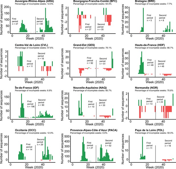
Differential profiles of severe acute respiratory syndrome coronavirus 2 (SARS-CoV-2) sequences wanted and available for each French administrative region.
In this analysis, we aimed to obtain 500 SARS-CoV-2 for each time period (January 1 to July 25, 2020 and July 26 to December 31, 2020) to generate a subsample covering the different French administrative regions. We calculated the differential between the number of sequences available and the number of sequences that are required to properly represent the number of SARS-CoV-2 infections per week. Green and red colors correspond to an excess and a lack of sequences for a week, respectively. For each region, we also calculated the percentage of weeks where a lack of sequences was observed. For each time period, the number of sequences wanted is indicated.
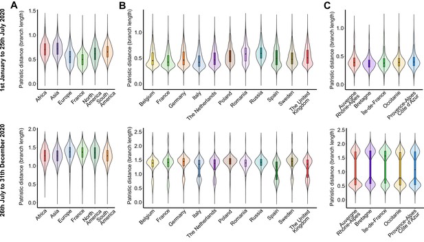
Within-territory pairwise patristic distance across the subsamples for each period on (A) worldwide, (B) European, and (C) French administrative region scales.
The first row of plots corresponds to the data from January 1 to July 25, 2020, and the second one consists of the data from July 26 to December 31, 2020. Distances were calculated from the dated trees using the distTips function of the adephylo R package.
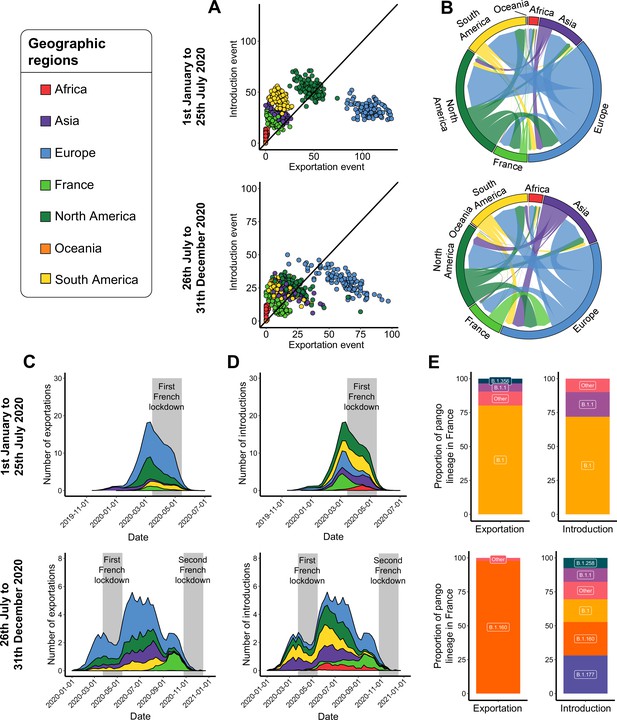
Severe acute respiratory syndrome coronavirus 2 (SARS-CoV-2) exchange worldwide.
Exchange events were inferred with 100 subsampled phylogenies between January 1 and July 25, 2020, and between July 26 and December 31, 2020. (A) Number of introduction and exportation events for each subsample and for each continent and France. (B) SARS-CoV-2 exchange flows between continents and France during the two time periods investigated. In these plots, migration flow out of a particular location starts close to the outer ring and ends with an arrowhead at the destination location. Arrow width is proportional to the exchange strength. (C) Number of exportation and (D) introduction events per territory over time. The mean number of exchanges over the subsamples and for each week was calculated. Gray bars indicate the dates of the complete lockdowns in France. (E) Proportion of pango lineages exported from France and introduced into France. Lineages with a proportion <3% were grouped into the ‘other’ clade.
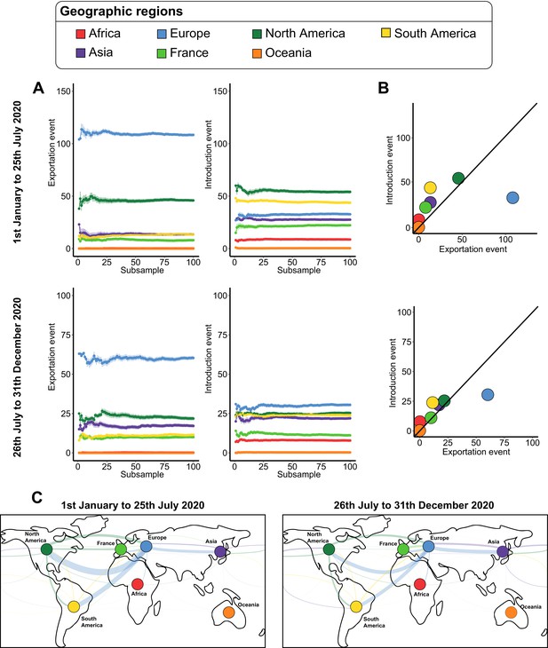
Severe acute respiratory syndrome coronavirus 2 (SARS-CoV-2) exchanges at the worldwide scale across subsamples.
(A) Variations of exportation and introduction events across the 100 subsamples. The upper plots show the variation of the events on the data covering January 1 to July 25, 2020, while the lower plots display the variation of the data between July 26 and December 31, 2020. The standard deviation corresponds to the sum of the previous subsamples. (B) Mean number of introduction and exportation events for each continent and France. The upper and lower plots show the event averages between January 1 and July 25, 2020, and between July 26 and December 31, 2020. (C) Worldwide maps of continental and France exchanges. The width of the links is proportional to the number of exchange events. The color, specific to each territory, indicates the flow direction. The points that serve to anchor the territories were randomly placed.
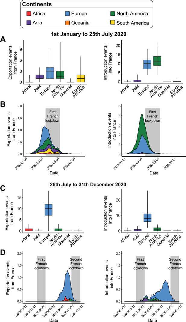
Introduction and exportation events from the perspective of France at the worldwide scale.
(A) Number of exportation and introduction events involving France between January 1 and July 25, 2020. The left and right boxplots indicate the number of severe acute respiratory syndrome coronavirus 2 (SARS-CoV-2) exportations from France to other continents, and the number of SARS-CoV-2 introductions into France from the different continents, respectively. (B) Evolution of these exportation and introduction events over time. Values correspond to the weekly mean across the subsamples. The gray area corresponds to the containment period in France. (C) and (D) are the sample plots based on the events observed between July 26 and December 31, 2020.
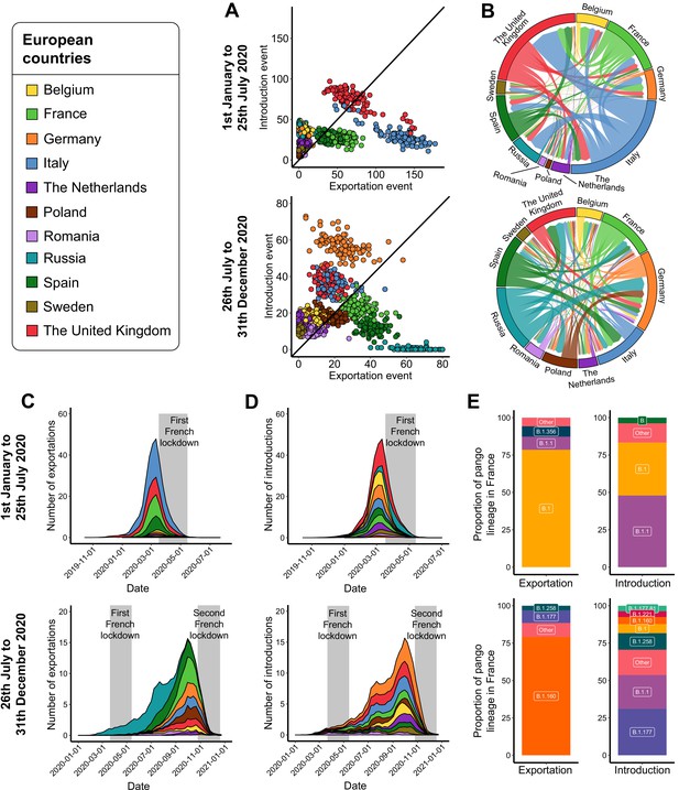
Severe acute respiratory syndrome coronavirus 2 (SARS-CoV-2) exchanges on the European scale.
Transmission events were calculated by averaging the results from 100 subsampled phylogenies between January 1 and July 25, 2020, and between July 26 and December 31, 2020. (A) Number of introduction and exportation events for each subsample and for each European country. (B) SARS-CoV-2 exchange flows between European countries during the two time periods investigated. In these plots, migration flow out of a particular location starts close to the outer ring and ends with an arrowhead at destination location. Arrow width is proportional to the exchange strength. (C) Number of exportation and (D) introduction events per territory over time. The mean number of exchanges over subsamples and for each week was calculated. Gray bars indicate the dates of the complete lockdowns in France. (E) Proportion of pango lineages exported from France and introduced into France. Lineages with a proportion <3% were grouped into the ‘other’ clade.
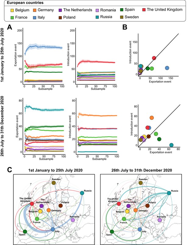
Severe acute respiratory syndrome coronavirus 2 (SARS-CoV-2) exchanges on the European scale across subsamples.
(A) Variations of exportation and introduction events across the 100 subsamples. The upper plots show the variation of the events on the data covering January 1 to July 25, 2020, while the lower plots display the variation of the data between July 26 and December 31, 2020. The standard deviation corresponds to the sum of the previous subsamples. (B) Mean number of introduction and exportation events for each European country. The upper and lower plots show the event averages between January 1 and July 25, 2020, and between July 26 and December 31, 2020. (C) Maps of European SARS-CoV-2 exchanges. The width of the links is proportional to the number of exchange events. The color, specific to each European country, indicates the flow direction. The points that serve to anchor the territories were randomly placed.
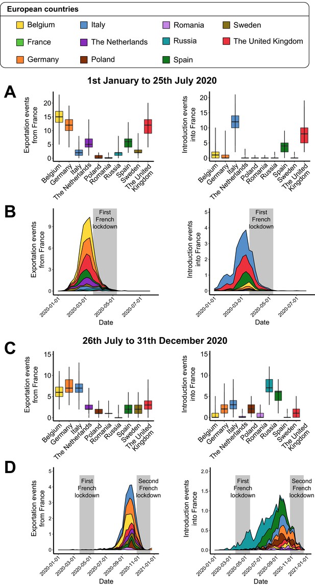
Introduction and exportation events from the perspective of France on the European scale.
(A) Number of exportation and introduction events involving France between January 1 and July 25, 2020. The left and right boxplots indicate the number of severe acute respiratory syndrome coronavirus 2 (SARS-CoV-2) exportations from France to other European countries, and the number of SARS-CoV-2 introductions into France from the different countries, respectively. (B) Evolution of these exportation and introduction events over time. Values correspond to the weekly mean across the subsamples. The gray area corresponds to the containment period in France. (C) and (D) are the sample plots based on the events observed between July 26 and December 31, 2020.
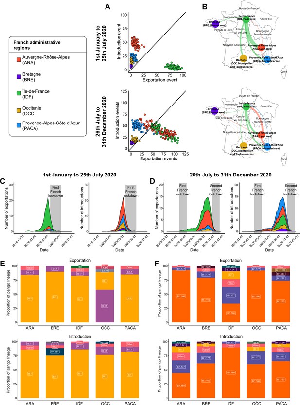
Severe acute respiratory syndrome coronavirus 2 (SARS-CoV-2) exchanges in France.
Exchange events were calculated through 100 subsampled phylogenies between January 1 and July 25, 2020, and between July 26 and December 31, 2020. (A) Number of introduction and exportation events for each subsample and for each French administrative region. (B) SARS-CoV-2 exchange flows between French administrative regions during the two time periods investigated. Migration flow out correspond to the mean of the French sets of sequences. The number of exportation and introduction events per French region over time are detailed (C) between January 1 and July 25, 2020, and (D) between July 26 and December 31, 2020. The proportion of pango lineages exported or introduced are given for each French region during (E) the first and (F) the second time period investigated. Lineages with a proportion <3% were grouped into the ‘other’ clade.
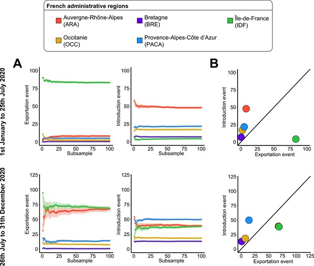
Severe acute respiratory syndrome coronavirus 2 (SARS-CoV-2) exchanges on the French scale across subsamples.
(A) Variations of exportation and introduction events across the 100 subsamples. The upper plots show the variation of the events on the data covering January 1 to July 25, 2020, while the lower plots display the variation of the data between July 26 and December 31, 2020. The standard deviation corresponds to the sum of the previous subsamples. (B) Mean number of introduction and exportation events for each French administrative region. The upper and lower plots show the event averages between January 1 and July 25, 2020, and between July 26 and December 31, 2020.
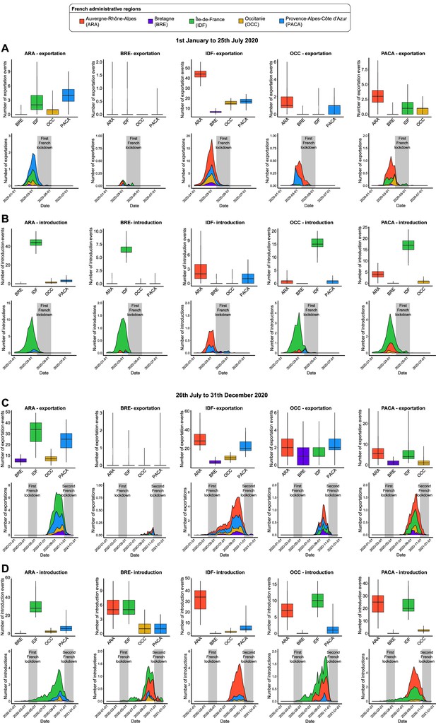
Introduction and exportation events from the perspective of each French administrative region.
(A) Number of exportation and (B) introduction events for each French administrative region between January 1 and July 25, 2020. The first row of plots indicates the number of events, according to each region, across the subsamples. The second row of plots shows the distribution of the weekly events over time. Values were weekly averaged across the subsamples. The gray area corresponds to the containment period in France. (C) and (D) are the sample plots based on the events observed between July 26 and December 31, 2020.
Tables
Number of severe acute respiratory syndrome coronavirus 2 (SARS-CoV-2) sequences investigated for each dataset.
| Dataset | Geographies | Period investigated | Average number of sequences sampled in a subsample | Total number of sequences |
|---|---|---|---|---|
| World | Africa, Asia, Europe, France, North America, Oceania, South America | January 1 to July 25, 2020 | 846 | 39,288 |
| July 26 to December 31, 2020 | 777 | 39,755 | ||
| Europe | Belgium, France, Germany, Italy, The Netherlands, Poland, Romania, Russia, Spain, Sweden, United Kingdom | January 1 to July 25, 2020 | 904 | 26,757 |
| July 26 to December 31, 2020 | 872 | 27,658 | ||
| France | Auvergne-Rhône-Alpes (ARA), Bretagne (BRE), Île-de-France (IDF), Occitanie (OCC), Provence-Alpes-Côte d’Azur (PACA) | January 1 to July 25, 2020 | 416 | 2543 |
| July 26 to December 31, 2020 | 433 | 3124 |


