Model discovery to link neural activity to behavioral tasks
- Department of Neuroscience, The Ohio State University College of Medicine, United States
- Interdisciplinary Biophysics Graduate Program, United States
Figures
Figure 1 with 1 supplement
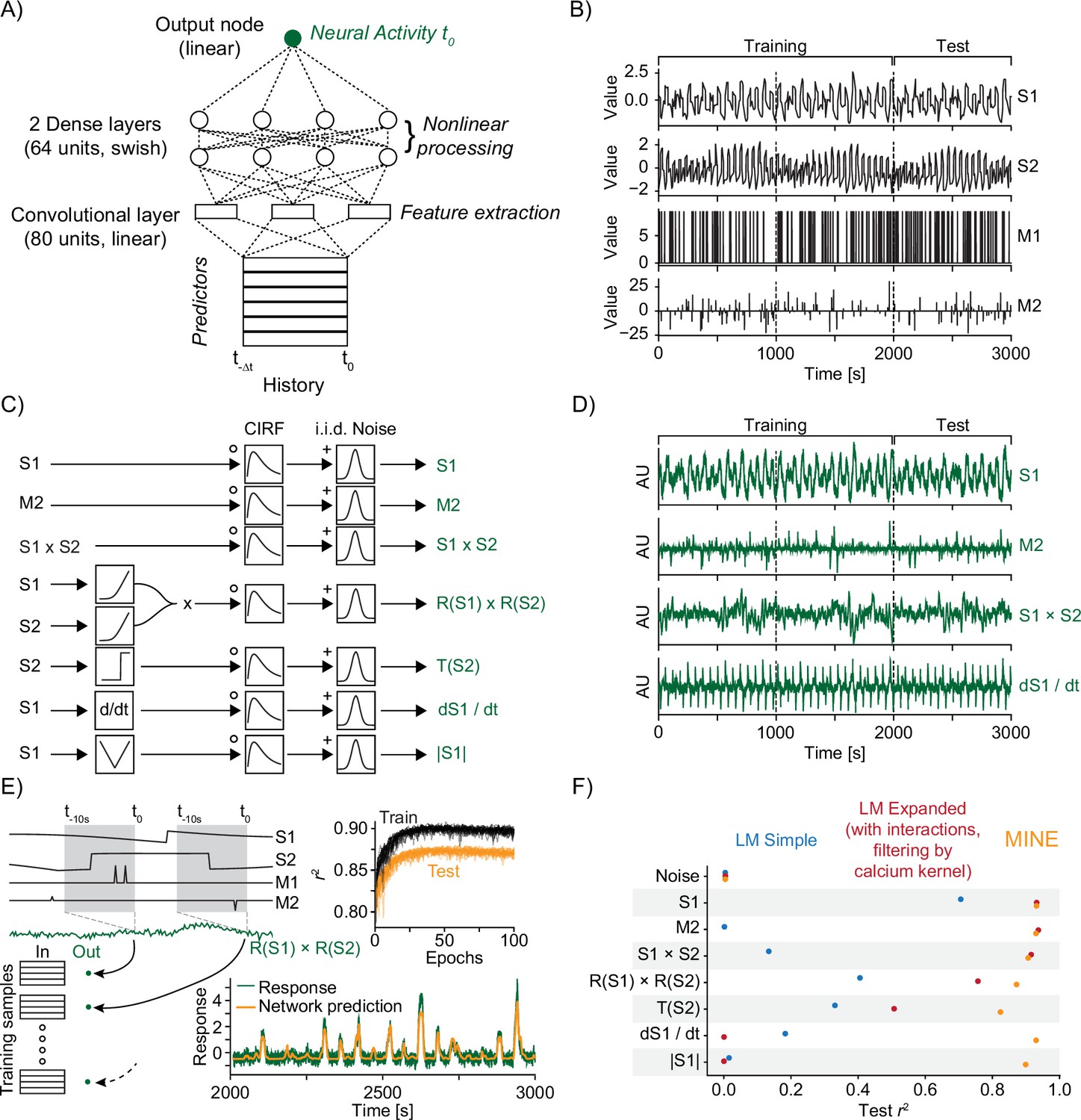
Model identification of neural encoding (MINE) accommodates a large set of predictor–activity relationships.
(A) Schematic of the convolutional neural network (CNN) used. (B) The predictors that make up the ground-truth dataset. S1 and S2 are continuously variable predictors akin to sensory variables while M1 and M2 are discrete in time, akin to motor or decision variables. Dashed lines indicate a third each of the data with the first two-thirds used for training of models and the last third used for testing. (C) Schematic representation of ground-truth response generation. (D) Example responses in the ground-truth dataset. Labels on the right refer to the response types shown in (C). (E) The model predicts activity at time using predictors across time to as inputs. The schematic shows how this is related to the generation of training and test data. Top inset shows development of training and test error across training epochs for 20 models trained on the R(S1) × R(S2) response type. Bottom inset shows example prediction (orange) overlaid on response (dark green). (F) Squared correlation to test data for a simple linear regression model (blue), a linear regression model including first-order interaction terms and calcium kernel convolution (red), as well as the CNN fit by MINE (orange). Each dot represents the average across 20 models. While the standard deviation is represented by a dash, it is smaller than the dot size in all cases and therefore not visible in the graph.
Figure 1—figure supplement 1
Model identification of neural encoding (MINE) accommodates a large set of predictor–activity relationships.
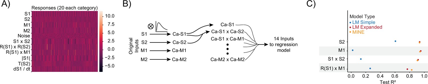
(A) Heatmap of all generated responses in the ground-truth dataset 220 total across 11 groups including pure noise responses. (B) Schematic of the expanded linear model that includes all first-order interaction terms and convolution with the true ‘calcium kernel’ used in the ground-truth dataset. We note, however, that since multiplication is a nonlinear operation, the generation of the interaction terms after convolution is not exactly the same as the generation of the interaction terms in the ground-truth dataset (where convolution occurs after the multiplication). (C) For data not shown in Figure 1F, squared correlation with test data for a simple linear regression model (blue), a linear regression model including first-order interaction terms and calcium kernel convolution (red), as well as the convolutional neural network (CNN) model fit by MINE (orange). Each dot represents the average across 20 models. While the standard deviation is represented by a dash, it is smaller than the dot size in all cases and therefore not visible in the graph.
Figure 2 with 1 supplement
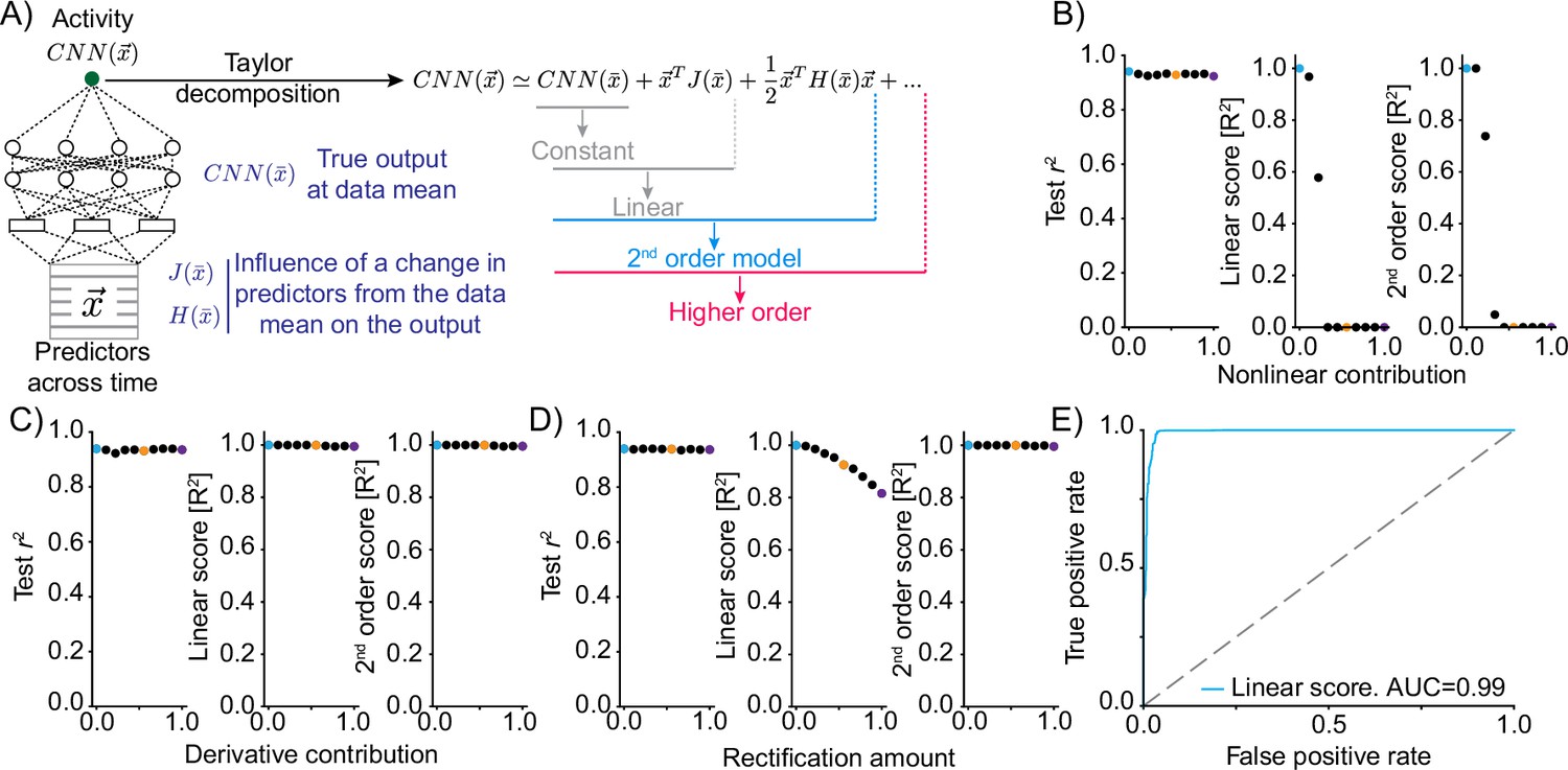
Truncations of the Taylor expansion assign computational complexity.
(A) Schematic of the approach. At the data mean, the output of the network is differentiated with respect to the inputs. The first-order derivative (gradient J) and the second-order derivatives (Hessian H) are computed at this point. Comparing the output of truncations of the Taylor expansion can be used to assess the computational complexity of the function implemented by the convolutional neural network (CNN).For example, if the function is linear, it would be expected that a truncation after the linear term explains the vast majority of the variance in the true network output. (B) Mixing varying degrees of a nonlinear response function with a linear response (‘Nonlinear contribution’) and its effect on network performance (left, squared correlation to test data), the variance explained by truncation of the Taylor series after the linear term (middle) and the variance explained for a truncation after the second-order term (right). Colored dots relate to the plots of linear correlations in Figure 2—figure supplement 1. (C) As in (B) but mixing a linear function of a predictor with a linear transformation of the predictor, namely the first-order derivative. (D) As in (B) but mixing a linear function of a predictor with a rectified (nonlinear) version. (E) ROC plot, revealing the performance of a classifier of nonlinearity that is based on the variance explained by the truncation of the Taylor series after the linear term across 500 independent generations of linear/nonlinear mixing.
Figure 2—figure supplement 1
Truncations of the Taylor expansion assign computational complexity.
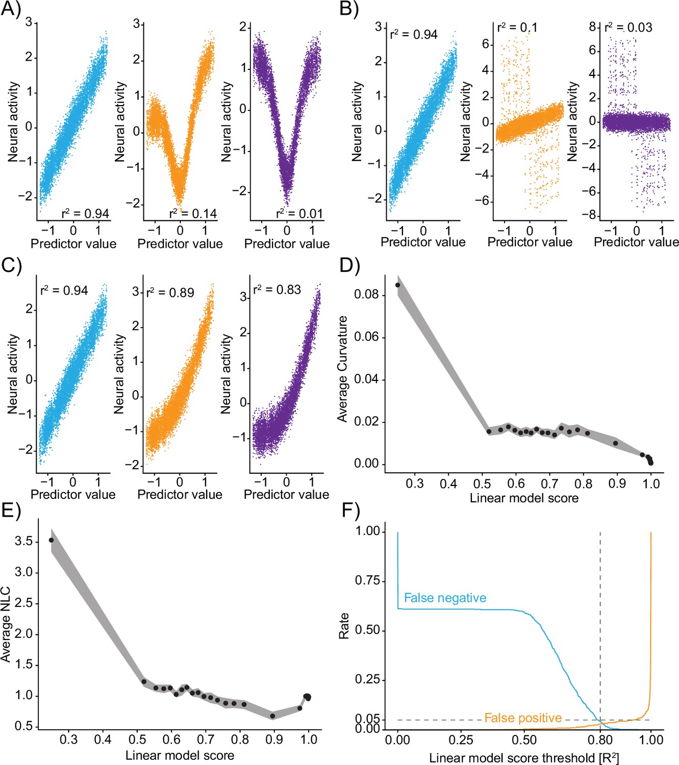
(A–C) Linear correlations between input predictors and ground-truth data ‘neural activity’ for different mixtures. Colors of correlation plots correspond to colored examples in Figure 2. (A) Mixing of a nonlinear and linear transformation of the predictor. (B) Mixing of a predictor and its derivative. (C) Mixing of a predictor and a rectified version of the predictor. (D) Relationship of the linear model score (coefficient of determination of the linear truncation of the Taylor series) and the average curvature of the function implemented by the convolutional neural network (CNN) (see ‘Methods’). Data divided into 50 even-sized quantiles based on the linear model score. Band is bootstrap standard error across all data points within the quantile (N=10 datapoints in each quantile). (E) Same as (D) but relationship to the nonlinearity coefficient. (F) For different thresholds of the linear model score, the fraction of false negative (blue) and false positive (orange) identifications of nonlinearity on the ground-truth data (N=500 independent simulations). Note: outputs are recentered to 0 mean and 1 standard deviation before being passed to the CNN and before being plotted here.
Figure 3 with 1 supplement
Model identification of neural encoding (MINE) characterizes linear and nonlinear receptive fields.
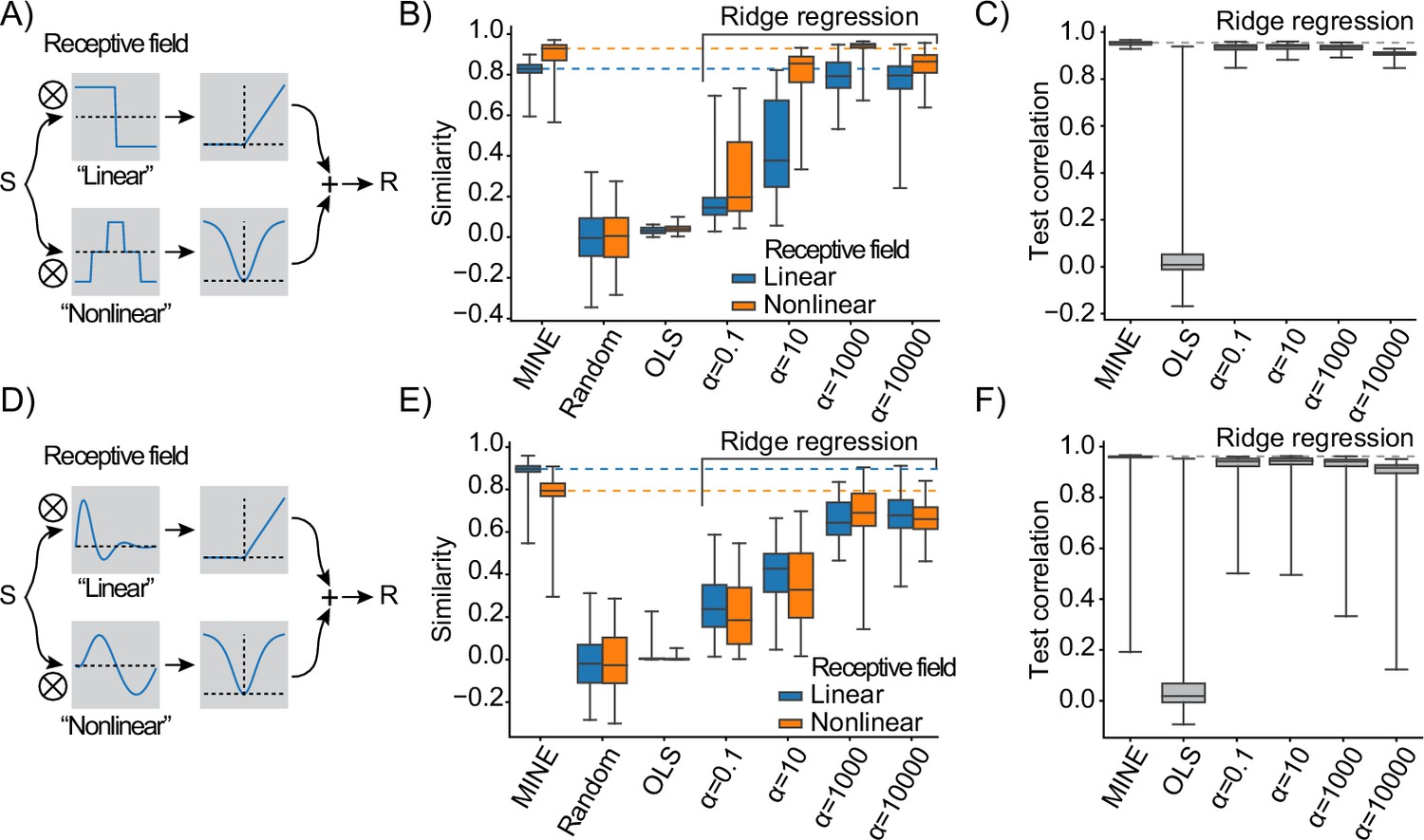
(A) Schematic of the test response generation. Inputs S (either white-noise or slow fluctuating) are convolved in parallel with two receptive fields acting as filters. The result of one convolution is transformed by an asymmetric nonlinearity (top), the other through a symmetric one (bottom). The results of these transformations are summed to create the response R that is a stand-in for a neural response that depends on one linear and one nonlinear receptive field. (B) When presenting a slowly varying stimulus, the quality of receptive fields extracted by MINE (expressed as the cosine similarity between the true receptive fields and the respective receptive fields obtained by the analysis), as well as direct fitting of first- and second-order Volterra kernels through linear regression (OLS) as well as Ridge regression. Listed indicates the strength of the Ridge penalty term. Linear receptive field blue, nonlinear orange. Dashed lines indicate median cosine similarity of the receptive fields extracted using MINE. (C) Correlation to validation data presented to the fit models as a means to assess generalization. Dashed lines indicate correlation to test data of the MINE model. (D–F) Same as (A–C) but with smoothly varying receptive fields. All data is across 100 indepedent simulations.
Figure 3—figure supplement 1
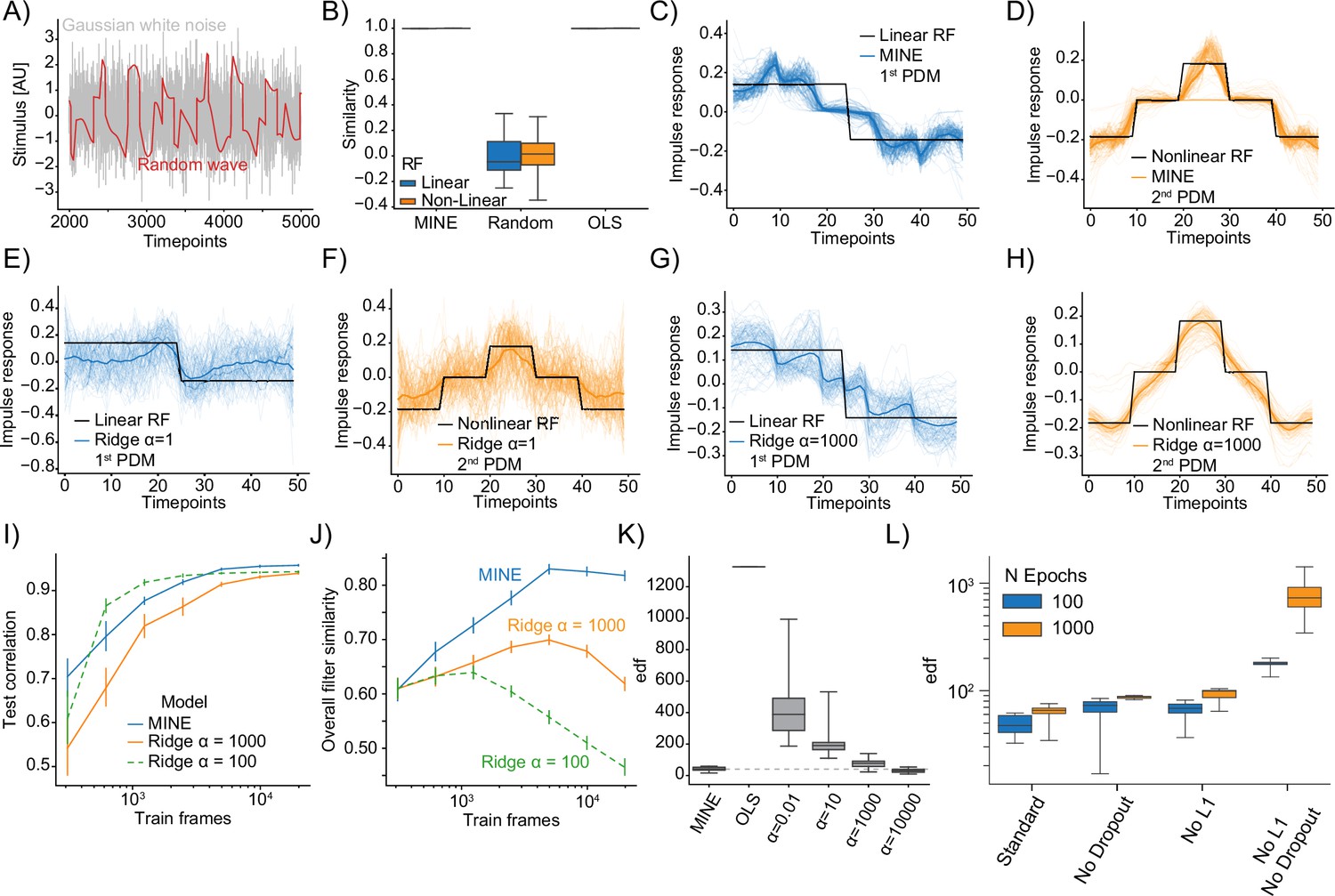
Model identification of neural encoding (MINE) characterizes linear and nonlinear receptive fields.
(A) Comparison of example Gaussian white noise (gray) and random wave stimulus (red). (B) When presenting a Gaussian white noise stimulus, the quality of receptive fields extracted by MINE (expressed as the cosine similarity between the true receptive fields and the respective receptive fields obtained by the analysis), as well as direct fitting of first- and second-order Volterra kernels through linear regression (OLS). Linear receptive field blue, nonlinear orange. Note that for both MINE and OLS the receptive fields have near perfect similarity and boxes therefore collapse onto the median (black lines). N=10 independent simulations. (C–H) For MINE (C–D) and two Ridge regression models with indicated penalties () visual comparison between the true receptive fields used in the simulation (black) and the extracted linear (blue lines) and nonlinear (orange lines) receptive fields. Thin lines are individual simulations, thick lines represent the average. N=100 independent simulations. (I) For MINE and two Ridge regression models with indicated penalties (), the dependence of the predictive power (correlation of the prediction to true data on a validation set) on the number of training frames included in fitting the models. Error bars are bootstrap standard error across 50 independent simulations. (J) Same as (I) but instead of the predictive power, the dependence of the overall filter similarity (linear and nonlinear RF) on the number of training frames. Error bars are bootstrap standard error across 50 independent simulations. (K) Estimated effective degrees of freedom (see ‘Methods’) for the different models with again indicating the penalty of the Ridge regression models. (L) For MINE, how the effective degrees of freedom are determined by the number of training epochs (blue vs. orange) and the presence/absence of Dropout and the L1 weight constraint.
Figure 4 with 1 supplement
Taylor decomposition reveals contributing single factors and interactions.
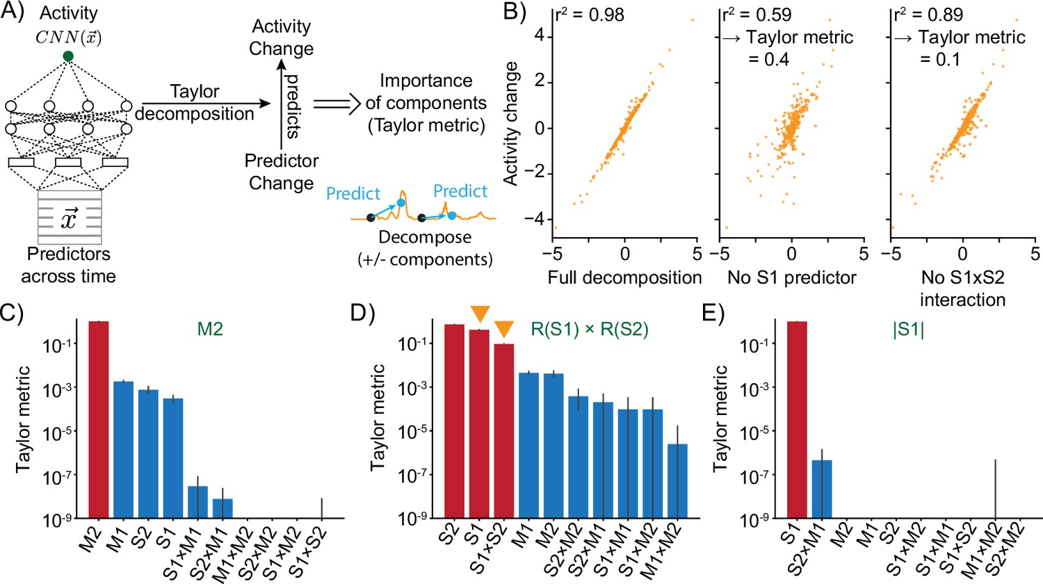
(A) The neural model translates predictors into neural activity. By Taylor decomposition, the function implemented by the convolutional neural network (CNN) can be linearized locally. Relating changes in predictors to changes in activity for full and partial linearizations reveals those predictors and interactions that contribute to neural activity. (B) Example of Taylor metric computation. Left: relationship between the CNN output and the full Taylor approximation. Middle: after removal of the term that contains the S1 predictor. Right: after removal of the term that describes the interaction between S1 and S2. (C–E) Three example responses and associated Taylor metrics. Red bars indicate predictors that are expected to contribute, blue bars those that should not contribute. Error bars are 95% bootstrap confidence intervals across N=20 independent simulations. (C) M2 response type. (D) R(S1) × R(S2) response type. Arrowheads indicate the metrics that are shown in the example (right and middle) of (B). (E) Response type encoding the absolute value of S1.
Figure 4—figure supplement 1
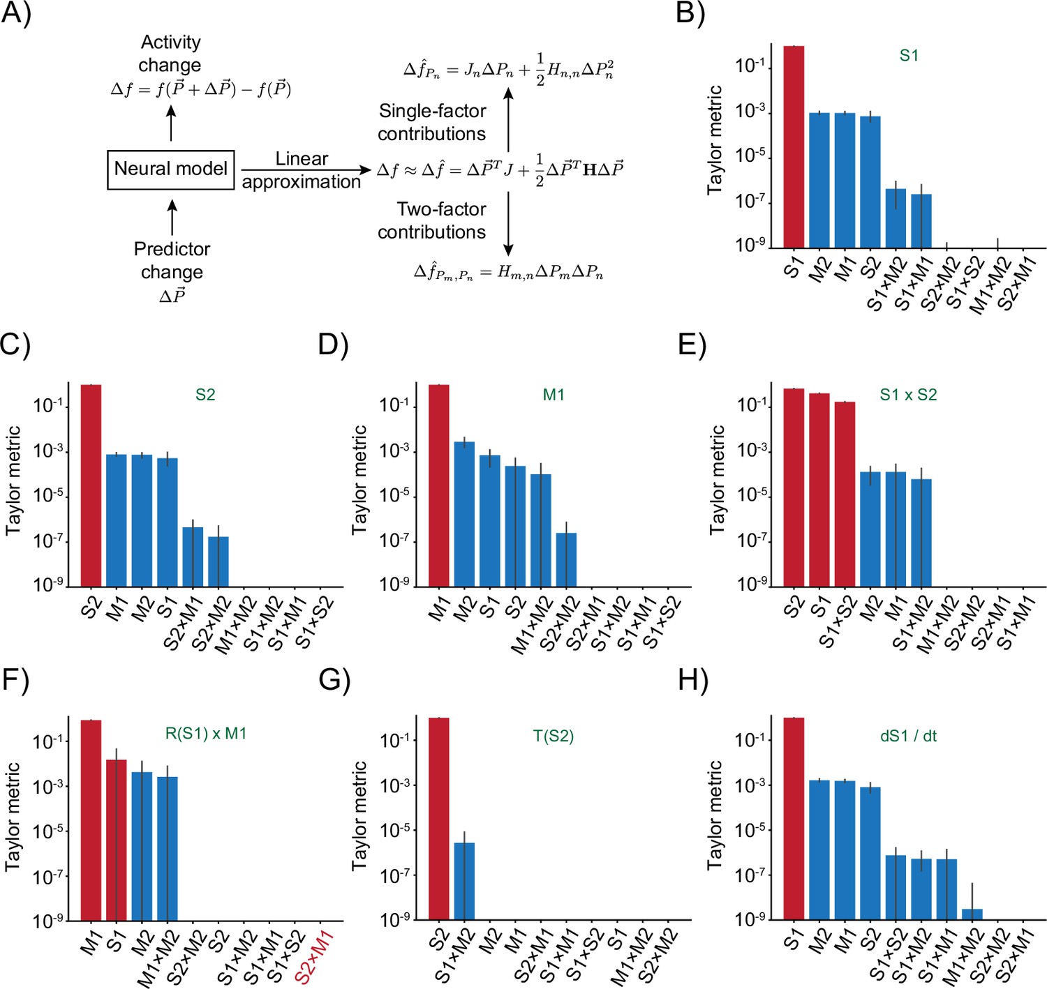
Taylor decomposition reveals contributing single factors and interactions.
(A) Schematic highlighting key parts of the decomposition that isolates individual factors. (B–H) Remaining responses and associated Taylor metrics. Red bars indicate predictors that are expected to contribute, blue bars those that should not contribute. Error bars are 95% bootstrap confidence intervals across N=20 independent simulations. (B) Response type only depending on S1 predictor. (C) Response type only depending on S2 predictor. (D) Response type only depending on M1 predictor. (E) Response to multiplicative interaction of S1 and S2 predictors. (F) Response to multiplicative interaction of rectified S1 and original M1 predictor. Note that the S2 × M1 term that should contribute has the lowest metric. (G) Response thresholding S2 predictor. (H) Response to the derivative of S1.
Figure 5 with 1 supplement
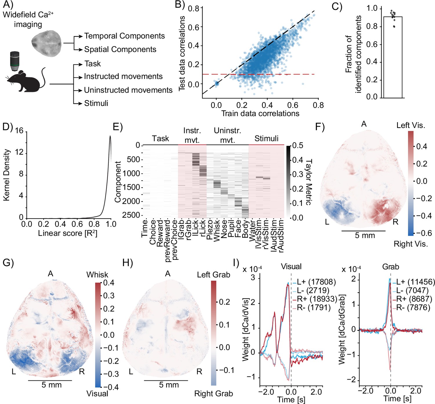
Model identification of neural encoding (MINE) identifies cortical features of sensorimotor processing during a learned task.
(A) Simplified schematic of the widefield imaging experiment conducted in Musall et al., 2019a. (B) MINE test data vs. training data correlations on 200 temporal components from 13 sessions across 13 mice. Black dashed line is identity, red dashed line is the test correlation threshold to decide that a component had been identified by MINE. (C) In each of the 13 sessions, the fraction of identified components (dots) as well as the average (bar). (D) Across 200 components each in the 13 sessions, the distribution of the linear score computed by MINE (coefficient of variation for the truncation of the Taylor expansion after the linear term as in Figure 2). (E) Across all components from all 13 sessions that have been identified by MINE, the Taylor metrics that were significantly larger than 0. Components (rows) have been sorted according to the predictor with the maximal Taylor metric. (F) Per-pixel Taylor metric scores for the right visual stimulus (‘rVisStim’) subtracted from those of the left visual stimulus (‘lVisStim’). A, anterior; L, left; R, right. (G) As in (F) but the sum of the visual stimulus Taylor metrics (‘lVisStim+rVisStim’) has been subtracted from the Taylor metric of the whisking predictor (‘Whisk’). (H) As in (F) but the Taylor metric for the right grab predictor (“rGrab”) has been subtracted from the Taylor metric of the left grab predictor (‘lGrab’). (I) Clustering of per-pixel receptive fields, separating excitatory (bold lines) from inhibitory responses (pale lines). Pixels were selected to only include the top 10% Taylor metrics for visual (left plot) and grab (right plot) predictors; left blue, right red. Numbers in parentheses indicate cluster size. The gray dashed line indicates time 0, that is, the time at which calcium activity is measured. Note that the sensory receptive field (visual) is exclusively in the past (future stimuli do not drive the neurons) while the motor receptive fields (grab) slightly overlap with the future, indicating that neurons ramp up activity before the behavioral action.
Figure 5—figure supplement 1
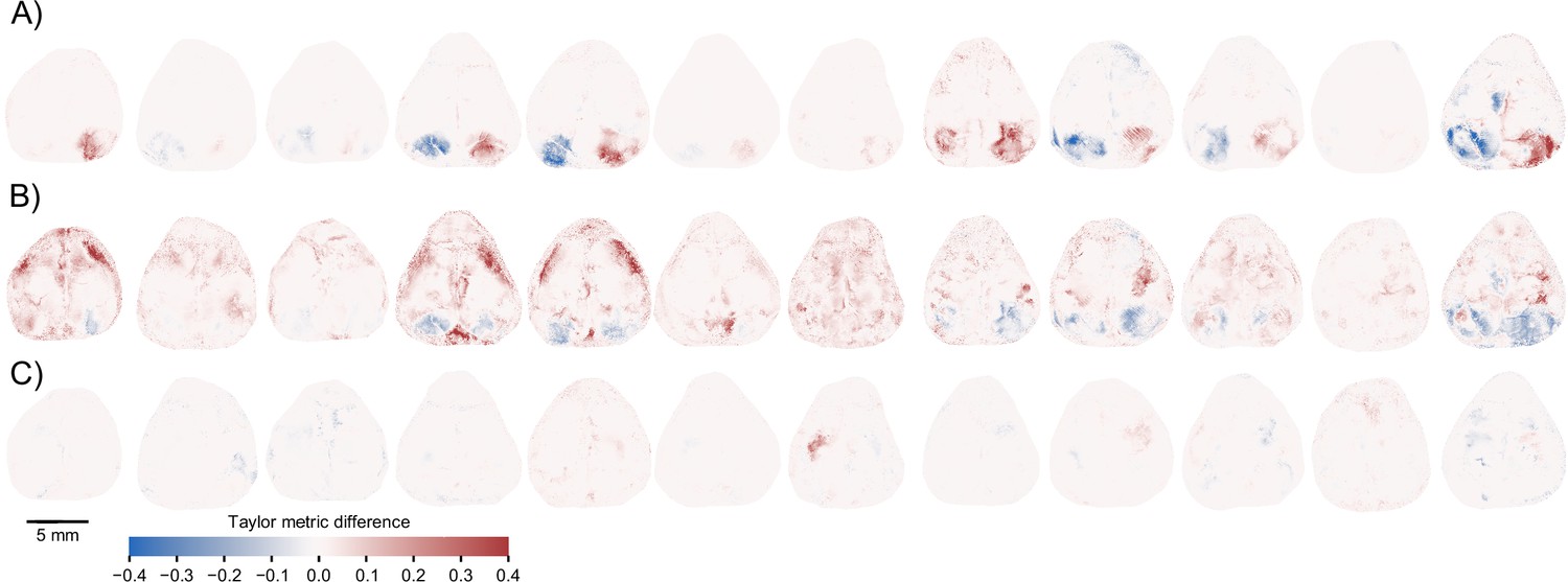
Model identification of neural encoding (MINE) identifies cortical features of sensorimotor processing during a learned task.
(A) Per-pixel Taylor metric scores for the right visual stimulus (‘rVisStim’) subtracted from those of the left visual stimulus (‘lVisStim’) for the 12 mice not shown in Figure 5F. (B) As (A) but the sum of the visual stimulus Taylor metrics subtracted from the Taylor metrics of the whisking predictor for the same 12 mice. (C) As (A) but the Taylor metric for the right grab predictor has been subtracted from the Taylor metric of the left grab predictor.
Figure 6 with 1 supplement

Using model identification of neural encoding (MINE) to probe larval zebrafish thermoregulatory circuits.
(A) Experimental design. Larval zebrafish expressing nuclear GCaMP6s in all neurons and mCherry in glutamatergic neurons are imaged under a two-photon microscope while random heat stimuli are provided with a laser and behavior is inferred through tail motion, middle (inset shows a sum projection through the example trial depipcted on left and right and in (B) - edge-length = 400 microns). Left: example temperature trajectory during one trial. Right: behavioral responses recorded during the same trial. (B) Deconvolved calcium traces of all neurons identified in the plane imaged during the same trial as in (A) (heatmap), sorted by the test correlation achieved by the convolutional neural network (CNN) (plot on the left). Orange arrowheads mark the same timepoints as in (A) and (B). Orange dashed line indicates the fit cutoff used for deciding that a neuron was identified by MINE, blue line marks Pearson correlation of 0. (C) Illustration comparing MINE to the linear regression model. (D) Venn diagram illustrating fractions of CaImAn extracted neurons identified by MINE, the comparison LM model or both. (E) Plot of functional classes identified by Taylor analysis across 25 fish. Barplot at the top indicates total number of neurons in each class on a logarithmic scale. Dotplot marks the significant Taylor components identified in each functional class. Classes are sorted by size in descending order. Horizontal barplot on the right indicates the total number of neurons with activity depending on a given predictor. Orange filled bars mark classes only driven by the stimulus, green open bars those only driven by behavioral predictors while blue bars mark classes of mixed sensorimotor selectivity. Gray numbers in the row labeled ‘N-fish’ indicate the number of fish in which a given type was identified. The red arrowhead marks the functional type that is analyzed further in Figure 7D. (F) Classification of neurons labeled by reticulospinal backfills (inset shows example labeling) across six fish. Orange filled bars mark classes only driven by the stimulus, green open bars those only driven by behavioral predictors while blue bars mark classes of mixed sensorimotor selectivity. (G) For different functional neuron classes identified by MINE, the fraction also identified by the linear comparison model. Error-bars are bootstrap standard errors across N=25 zebrafish larvae. (H) Anatomical clustering of stimulus driven (left), behavior driven (middle), and mixed-selectivity (right) neurons. Neurons were clustered based on spatial proximity, and clusters with fewer than 10 neurons were not plotted (see ‘Methods’). Asymmetric patterns for lower abundance classes likely do not point to asymmetry in brain function but rather reveal noise in the anatomical clustering approach.
Figure 6—figure supplement 1
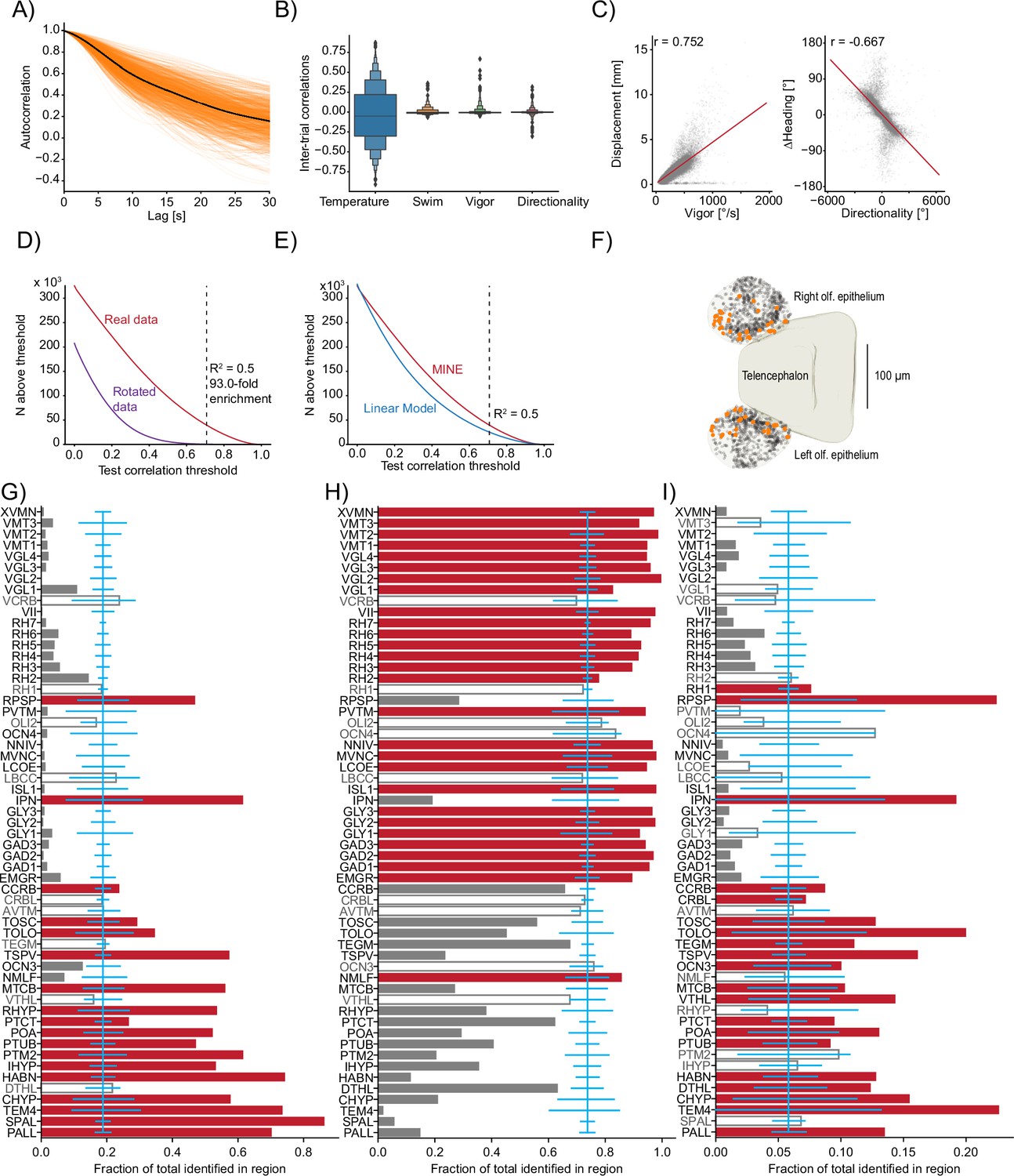
Using model identification of neural encoding (MINE) to probe larval zebrafish thermoregulatory circuits.
(A) Across all imaged planes of all fish (orange lines), the autocorrelation of the provided stimulus. Black line is the average across all planes (). (B) Boxenplot of the inter-trial correlations for the temperature stimulus and the three behavioral metrics. Note that we use the term ‘trial’ here to denote equal thirds of the imaging period in one plane that allows us to use two ‘trials’ for training and one for testing the fit artificial neural networks (ANNs) and linear models. Since there is no repetitive structure, the term trial is used loosely here. (C) Scatterplot and correlations on free-swimming data between the vigor (left) and directionality (right) tail metrics and free-swimming actual displacements (left) and actual heading-angle changes (right). (D) For different test-correlation thresholds (x-axis), the number of units for which the convolutional neural network (CNN) has above-threshold test correlations (considered identified by the CNN). Red curve, real data; purple curve, rotated data where the calcium activity has been rotated by one trial with respect to the stimulus and behavior predictors. Black dashed line indicates the threshold used in the article and lists the ratio of identified units in the real versus rotated data. (E) Same as (D) but comparing the CNN (replot from D) with above threshold correlations for the linear model. Dashed line again indicates the threshold used in the article. (F) Identified temperature encoding units in the olfactory epithelium. Orange dots are units that according to Taylor metric encode the stimulus while black dots represent units within the epithelium that were not identified by the CNN to highlight medial enrichment of temperature encoding neurons. (G–I) For each analyzed Z-Brain region, the units encoding the stimulus (G), behavior (H), or both (I) as a fraction of the sum across these three groups. Red bars highlight the regions with significant enrichment. Open bars and gray text highlight those regions that are neither significantly enriched nor significantly depleted of the given type while gray bars highlight the regions with significant depletion. Blue line is the expected (average) fraction of the given type. Error bars mark a boot-strapped 95% confidence interval around the average of possible observed fractions if the region would in fact contain the expected fraction of units. Bars for which the top is above this confidence interval are therefore significantly enriched, and bars for which the top is below are significantly depleted. Note that the regions in which <50 neurons total across the listed categories have been identified have not been analyzed for enrichment. Region abbreviations are listed in Supplementary file 1.
Figure 7 with 1 supplement
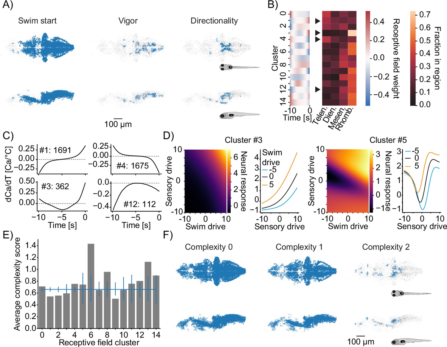
Functional subdivisions of thermoregulatory circuits.
(A) Anatomical clustering of neurons encoding swim starts (left), swim vigor (middle), and swim direction (right). Neurons were clustered based on spatial proximity, and clusters with fewer than 10 neurons were not plotted (see ‘Methods’). Asymmetric patterns for lower abundance classes likely do not point to asymmetry in brain function but rather reveal noise in the anatomical clustering approach. (B) Subclustering of stimulus-selective neurons according to their temporal receptive field (left heatmap). Right: heatmap visualizes for each cluster what fraction of that cluster is present in the major four subdivisions of the zebrafish brain (Telen., telencephalon; Dien., diencephalon; Mesen., mesencephalon; Rhomb., rhombencephalon). Arrowheads indicate differentially distributed example clusters highlighted in (C). (C) Temporal receptive fields of example clusters. Each plot shows the influence of a change in temperature at the indicated timepoint on the activity (as measured by calcium) of a neuron within the cluster. Numbers reflect the number of neurons present in each given cluster. Dashed lines indicate 0 where the number of 0-crossings of each receptive field indicate if the neuron responds to absolute temperature value (no crossings, cluster 12), to the first derivative (velocity of temperature, increasing, cluster 1; decreasing cluster 4) or to the second derivative (acceleration of temperature, cluster 3). (D) Exemplars of two clusters (full set in Figure 7—figure supplement 1E) of nonlinear mixed-selectivity neurons that integrate thermosensory information with information about swim start. Heatmaps show predicted neural calcium response for varying levels of swim- and sensory drive (see ‘Methods’). Line plots show predicted calcium responses (Y-axis) to different sensory drives (X-axis) at different levels of swim drive (blue bar -5, black bar 0, orange bar +5). (E) Average complexity of each receptive field cluster shown in (B) (gray bars). Blue horizontal line reveals the total average complexity, and vertical blue lines indicate bootstrapped 95% confidence intervals around the average complexity based on the number of neurons contained within the cluster. If the gray bar is above or below that interval, the complexity within that cluster deviates significantly from the data average complexity. (F) As in (A) but clustering of neurons of complexity 0 (left), complexity 1 (middle), and complexity 2 (right).
Figure 7—figure supplement 1
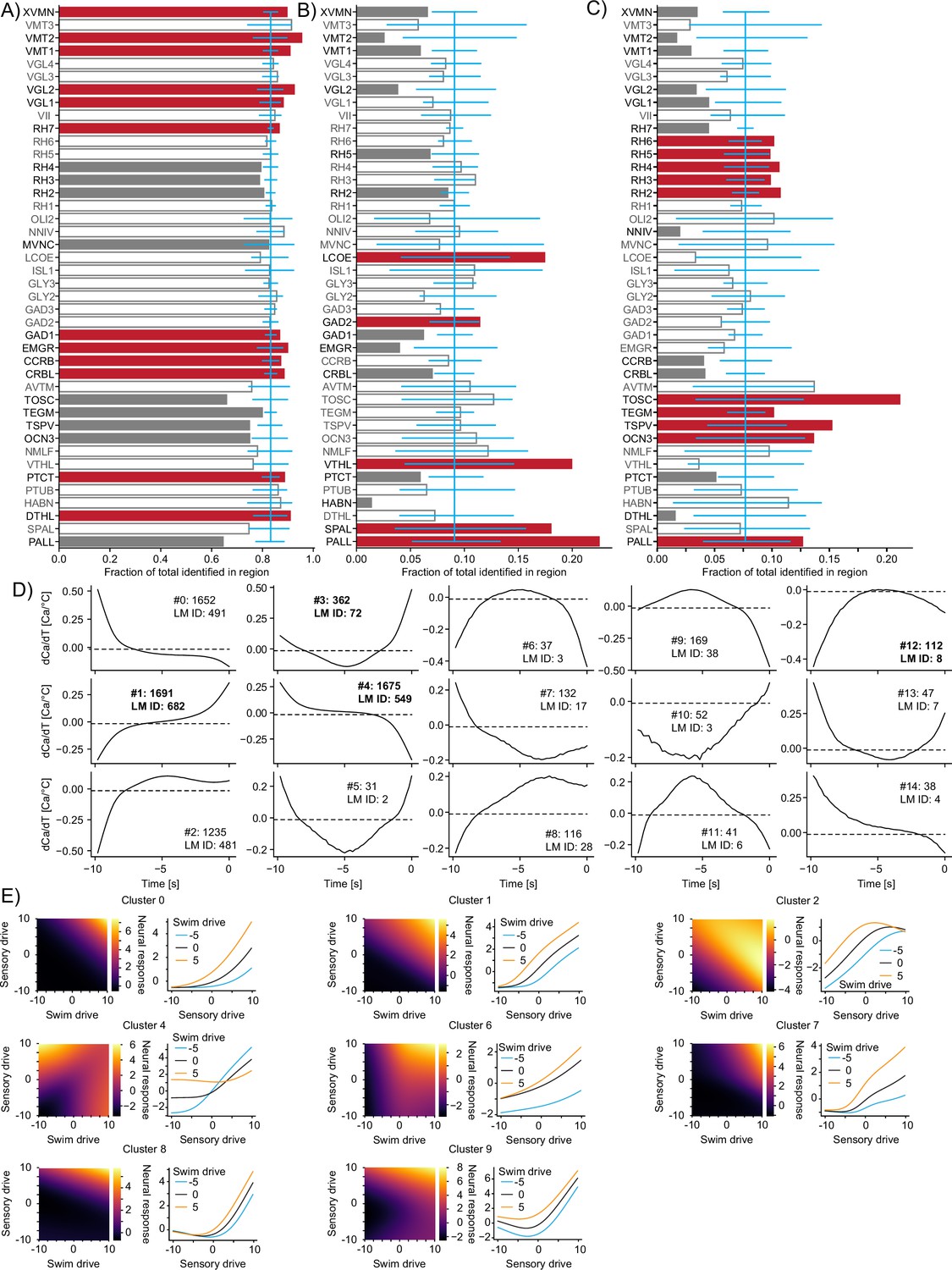
Functional subdivisions of thermoregulatory circuits.
(A–C) For each analyzed Z-Brain region, the units encoding swim starts (A), vigor (B), or directionality (C) as a fraction of the sum across these three groups. Red bars highlight the regions with significant enrichment. Open bars and gray text highlight those regions that are neither significantly enriched nor significantly depleted of the given type while gray bars highlight the regions with significant depletion. Blue line is the expected (average) fraction of the given type. Error bars mark a boot-strapped 95% confidence interval around the average of possible observed fractions if the region would in fact contain the expected fraction of units. Bars for which the top is above this confidence interval are therefore significantly enriched, and bars for which the top is below are significantly depleted. Note that the regions in which <50 neurons total across the listed categories have been identified have not been analyzed for enrichment. Region abbreviations are listed in Supplementary file 1. (D) Temporal receptive fields of all clusters. Each plot shows the influence of a change in temperature on the activity (as measured by calcium) of a neuron within the cluster. Numbers after the colon reflect the number of neurons present in each given cluster. Numbers after LM ID indicate how many neurons within the cluster have also been identified by the linear model. Note, however, that the clusters themselves would not have been identified based on the linear model data. Clusters in bold are also shown in Figure 7. (E) Exemplars of clusters not shown in Figure 7 of nonlinear mixed-selectivity neurons that integrate thermosensory information with information about swim start. Heatmaps show predicted neural calcium response for varying levels of swim- and sensory drive (see ‘Methods’). Line plots show predicted calcium responses (Y-axis) to different sensory drives (X-axis) at different levels of swim drive (blue bar -5, black bar 0, orange bar +5).
Tables
Table 1
The programmatic interface to model identification of neural encoding (MINE).
Details and example usage of the programmatic interface to MINE.
| class MineData | class Mine |
|---|---|
| correlations_trained (n_neurons x 1) | train_fraction (float) |
| Correlation of CNN prediction and activity on training portion of data | Which fraction of the data is used for training with remainder used for testing |
| correlations_test (n_neurons x 1) | model_history (integer) |
| Correlation of CNN prediction and activity on test portion of data | Number of timepoints the model receives as input |
| taylor_scores (n_neurons x n_components x 2) | corr_cut (float) |
| Taylor metric for each component (predictor and first -order interaction terms). The first entry along the last dimension is the mean score, the second entry is the bootstrap standard error. | If test correlation is less than this value for a neuron, it is considered ‘not fit.’ |
| model_lin_approx_scores (n_neurons x 1) | compute_taylor (bool) |
| Goodness of fit of linear Taylor model around the data mean to determine nonlinearity. | If true, compute Taylor metrics and complexity analysis (linear and second-order approximations). |
| mean_exp_scores (n_neurons x 1) | return_jacobians (bool) |
| Goodness of fit of second-order Taylor model around the data mean to derive complexity. | If true, return linear receptive fields. |
| jacobians (n_fit_neurons x (n_timepoints x n_predictors)) | taylor_look_ahead (integer) |
| For each fit neuron, the receptive field of each predictor across time. | The number of timepoints to predict ahead when calculating Taylor metrics. |
| hessians (n_fit_neurons x (n_timepoints x n_predictors) x (n_timepoints x n_predictors)) | taylor_pred_every (integer) |
| For each fit neuron, the matrix of second-order partial derivatives. Useful to extract second-order receptive fields. | Every how many frames a Taylor expansion should be performed to calculate Taylor metrics. |
| Additional settable properties: | |
| return_hessians (bool, default False) If true, return matrices of second-order derivatives model_weight_store (hdf5 file or group, default None) If set, trained model weights for all models will be organized and stored in the file/group n_epochs (integer, default 100) The number of training epochs. | |
| save_to_hdf5(file_object, overwrite = False) | analyze_data(pred_data: List, response_data: Matrix) ->MineData |
| Saves the result data to an hdf5 file or group | Takes a list of n_timepoints long predictors and a matrix of n_neurons x n_timepoints size and applies MINE iteratively to fit and characterize CNN relating all predictors to each individual neuron. |
| Example usage: | |
| predictors = [Stimulus, Behavior, State] | |
| responses = ca_data | |
| # NOTE: If predictors and response are not z-scored, | |
| # (mean = 0; standard deviation = 1) Mine will print | |
| # a warning | |
| miner = Mine (2/3, 50, 0.71, True, True, 25, 5) | |
| miner.model_weight_store = h5py.File(“m_weights.h5”, ‘a’) | |
| result_data = miner.analyze_data (predictors, responses) | |
| all_fit = result_data.correlations_test >= 0.71 | |
| is_nonlinear = result_data.model_lin_approx_scores <0.8 | |
| is_stim_driven = (result_data.taylor_scores[:, 0, 0] – 3 x result_data.taylor_scores[:, 0, 1]) >0 |
Additional files
-
Supplementary file 1
Z-Brain region abbreviations.
- https://cdn.elifesciences.org/articles/83289/elife-83289-supp1-v2.docx
-
MDAR checklist
- https://cdn.elifesciences.org/articles/83289/elife-83289-mdarchecklist1-v2.docx
Download links
A two-part list of links to download the article, or parts of the article, in various formats.
Downloads (link to download the article as PDF)
Open citations (links to open the citations from this article in various online reference manager services)
Cite this article (links to download the citations from this article in formats compatible with various reference manager tools)
Model discovery to link neural activity to behavioral tasks
eLife 12:e83289.
https://doi.org/10.7554/eLife.83289


