Conjunction of factors triggering waves of seasonal influenza
- University of Chicago, United States
- Microsoft Research, United States
- Columbia University, United States
Figures
Figure 1 with 6 supplements
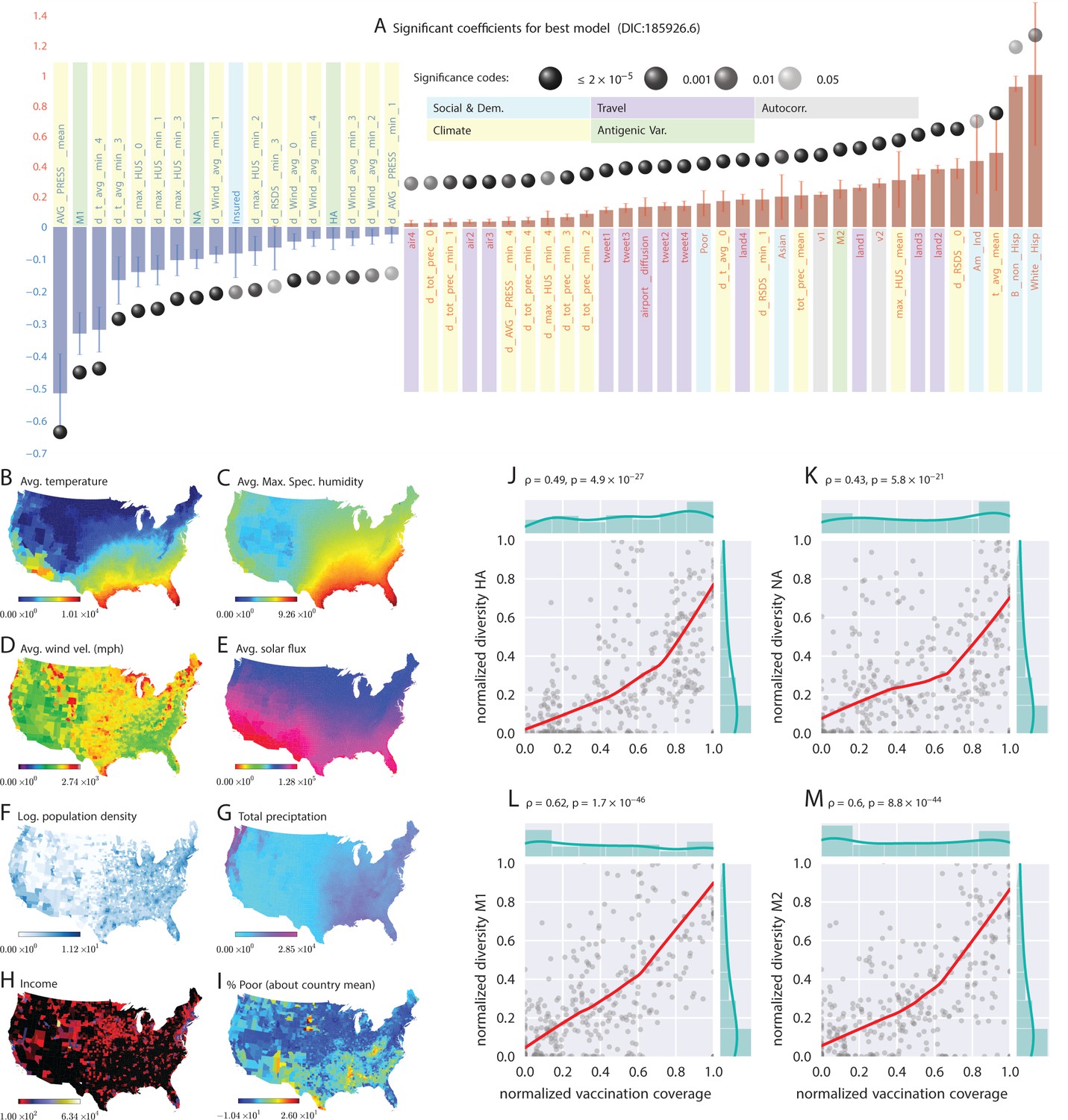
Putative determinants of seasonal influenza onset in the continental US and Poisson mixed-effect regression analysis (Approach 2).
Plate A shows the significant variables along with their computed influence coefficients from the mixed-effect Poisson regression analysis (the best model chosen from different regression equations with different variable combinations). The statistically significant estimates of fixed effects are grouped into several classes: climate variables, economic and demographic variables, auto-regression variables, variables related to travel, and those related to antigenic diversity (see the last entry in Table 5 for the detailed regression equation used. The complete list of all models considered is given in Table S-D7). The fixed-effect regression coefficients plotted in Plate A are shown on a logarithmic scale, meaning that the absolute magnitude of predictor-specific effect is obtained by exponentiating the parameter value. A negative coefficient for a predictor variable suggests that the influenza rate falls as this factor increases, while a positive coefficient predicts a growing rate of infection as the parameter value grows. The integrated influence of individual predictors, under this model, is additive with respect to the county-specific rate of infection. For example, a coefficient of for parameter AVG_PRESS_mean tells us that the average atmospheric pressure has a negative association with the influenza rate. As the mean atmospheric pressure for the county grows, the probability that the county would participate in an infection initiation wave falls. As , the rate of infection drops by when atmospheric pressure increases by one unit of zero-centered and standard-deviation-normalized atmospheric pressure. Similarly, an increase in the share of a white Hispanic population predicts an increase in influenza rate: A coefficient of 1.3 translates into a rate increase, possibly, because of the higher social network connectivity associated with this segment of population. Plates B - I enumerate the average spatial distribution of a few key significant factors considered in Poisson regression: (B) average temperature; (C) average maximum specific humidity; (D) average wind velocity in miles per hour; (E) average solar flux; (F) logarithm of population density (people per square mile); (G) total precipitation; (H) income, and; (I) percent of poor as deviations about the country average. Plates J-M show the strong dependence between our estimated antigenic diversity (normalized, see Definition in text) corresponding to the HA, NA, M1, and M2 viral proteins, and the cumulative fraction of the inoculated population (normalized between 0 and 1), where both sets of variables are geo-spatially and temporally stratified. Pearson’s correlation tests shown in Plates J-M were performed under null hypothesis that there the two quantities (plotted along axes X and Y) are statistically independent ().
Figure 1—figure supplement 1
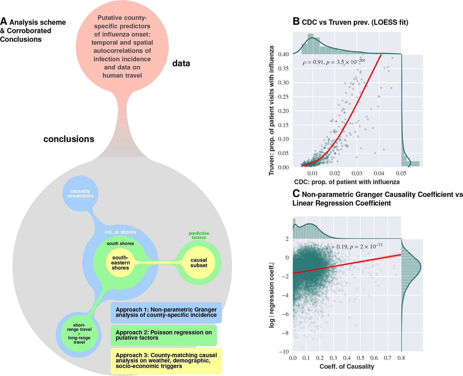
Logical flow and cross-corroboration of conclusions.
Plate A: Diverse data sets processed via multiple techniques to reach convergent, and reinforcing, conclusions. Approach 1 (the Granger-causality analysis) shows that the epidemic tends to begin near water bodies, and that short-range travel is more influential compared to air travel for propagation. Approach 2 (Poisson regression) identifies significant predictive factors, suggesting that the epidemic begins near the southern shores of the US, and corroborates the result on short- vs. long-range travel. Approach 3 (county-matching) points to south eastern shores of the continental US as where the epidemic initiates, and identifies a validated subset of predictive factors. Plate B shows that influenza prevalence as reported by Truven dataset positively correlates with CDC reports. Plate C illustrates that our conclusions regarding a putatively causal influence between neighboring counties, inferred using different techniques (mixed-effect regression vs. non-parametric Granger-causality), match up positively. Pearson’s correlation tests shown in Plates B and C are performed under null hypothesis that there the two types of quantities (plotted along axes X and Y) are statistically independent ().
Figure 1—figure supplement 2
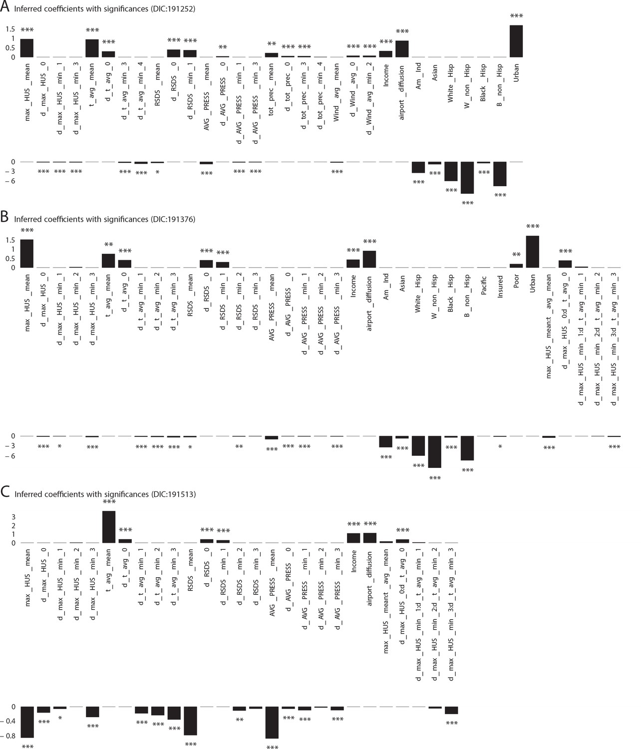
Significant influencing variables obtained with mixed effect regression with different models as tabulated in Table 1 of main text (three more models with DIC larger than that of the best model shown in Figure 1 plate A).
https://doi.org/10.7554/eLife.30756.005
Figure 1—figure supplement 3
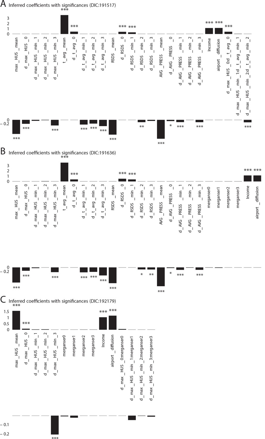
Additional Cases: Significant influencing variables obtained with mixed effect regression with different models as tabulated in Table 1 of main text (three more models with DIC larger than that of the best model shown in Figure 1 plate A).
https://doi.org/10.7554/eLife.30756.006
Figure 1—figure supplement 4

Violin plots for the coefficients inferred for variables that turn out to be significant in the best model, computed considering the complete set of models we investigated.
We note that with the exception of the antigenic variation of the surface protein hemagglutinin (HA), and some derivatives of maximum absolute humidity, significant mass of the individual violin plots fall either entirely on the positive or entirely on the negative half-plane; implying that the significant factors rarely flip sign. Thus, while the coefficients inferred change as we explore different models, the direction of influence remains mostly unchanged.
Figure 1—figure supplement 5

Spatial variation in the probability of patient visits corresponding to any ICD9-CM code (plate on left), and for diagnoses corresponding to influenza-like diseases (plate on right).
https://doi.org/10.7554/eLife.30756.008
Figure 1—figure supplement 6
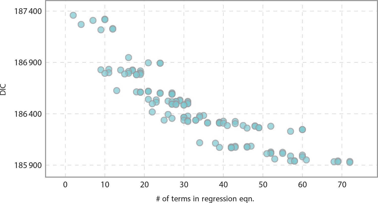
Informativeness of model vs model complexity as related to the number of terms in the regression equation.
As expected, we yielded more informative models as we increased complexity.
Figure 2 with 1 supplement
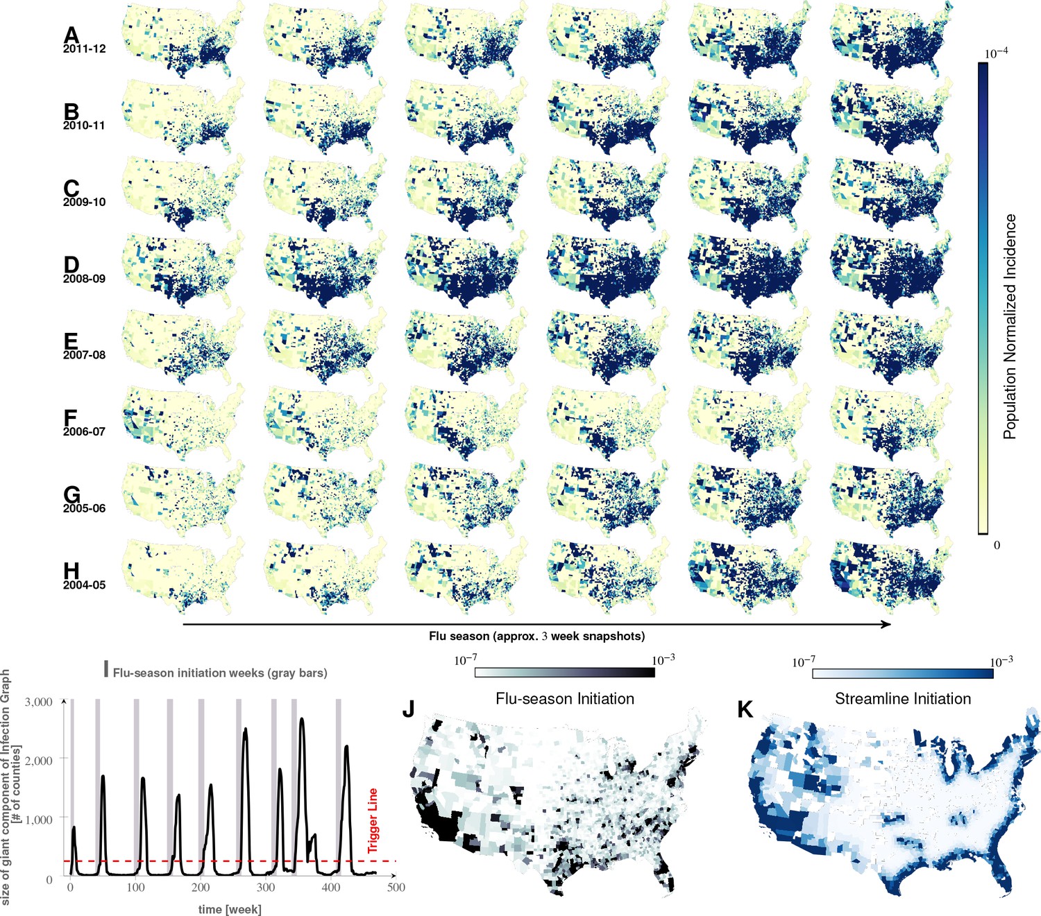
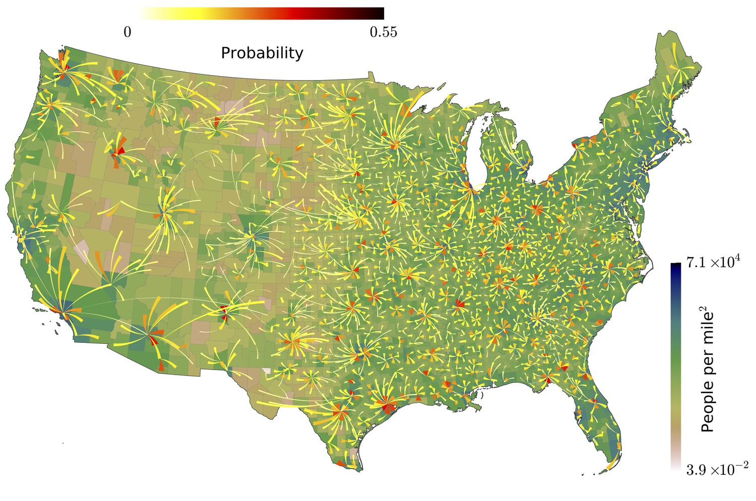
Characteristics of seasonal influenza in the continental US An analysis of county-specific, weekly reports on the number of influenza cases for a period of weeks spanning January 2003 to December 2013 (Plates A-H) for recurrent patterns of disease propagation.
In particular, the weeks leading up to that in which an epidemic season peaks (determined by significant infection reports from the maximum number of counties for that season) demonstrate an apparent flow of disease from south to north, which cannot be explained by population density alone (also see movie in Supplement). Plate I illustrates the near-perfect time table for a seasonal epidemic. Plates J and K compare the county-specific initiation probabilities of an influenza season, and the causality streamlines.
Figure 2—video 1
Movement of seasonal influenza waves across USA.
Each frame of the movie corresponds to 1-week snapshot.
Figure 3
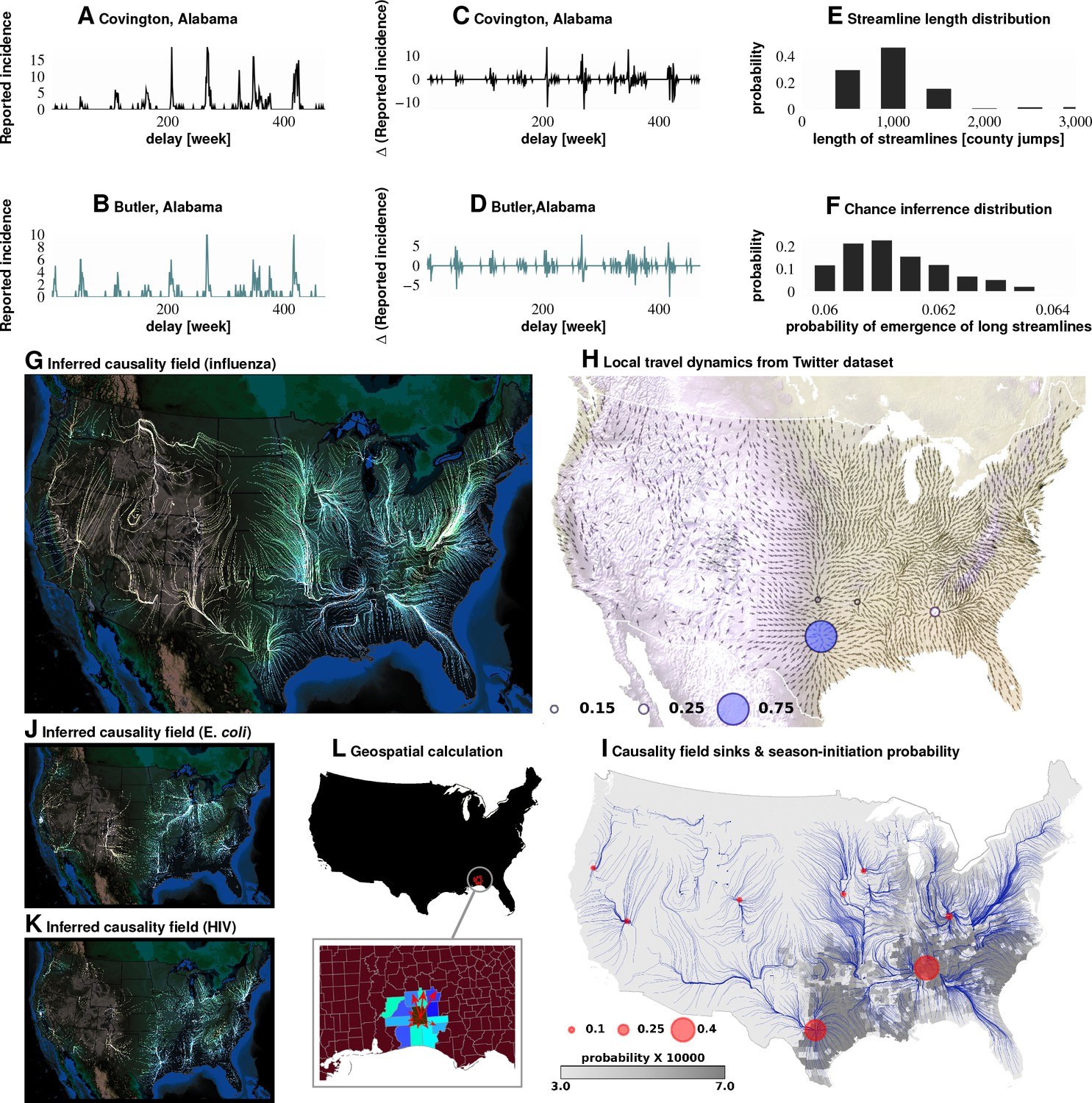
Computation of causality field, Approach 1 Plates A and B: Incidence data from neighboring counties in Alabama, US.
Plates C and D: Transformation to difference-series, , change in the number of reported cases between weeks. We imposed a binary quantization, with positive changes mapping to ‘1,’ and negative changes mapping to ‘0.’ From a pair of such symbol streams, we computed the direction-specific coefficients of Granger causality (see Supplement). For each county, we obtained a coefficient for each of its neighbors, which captured the degree of influence flowing outward to its respective neighbors (Plate L). We computed the expected outgoing influence by considering these coefficients as representative of the vector lengths from the centroid of the originating county to centroids of its neighbors. Viewed across the continental US, we then observed the emergence of clearly discernible paths outlining the ‘causality field’ (Plate G). The long streamlines shown are highly significant, with the probability of chance occurrence due to accidental alignment of component stitched vectors less than ; while each individual relationship has a chance occurrence probability of (Plates E and F). Plate H: Spatially-averaged travel patterns (see text in Materials and methods) and the sink distribution between expected travel patterns. These patterns (Plate H), along with the inferred causality field (Plate I), match up closely, with sinks showing up largely in the Southern US, explaining the central role played there. In Plate H, the size of the blue circles indicate the percentage of movement streamlines (computed by interpreting the locally averaged movement directions as a vector field) that sink to those locations. In Plate I, the size of the red circles indicate the percentage of causality streamlines that sink to the indicated locations. We note that of the movement streamlines sink in counties belonging to the Southern states, which matches up well with the sinks of the causality streamlines. In Plates J and K show spatial analysis results for two different infections (HIV and E. coli, respectively) and which exhibit very different causality fields, negating the possibility of boundary effects.
Figure 4 with 1 supplement
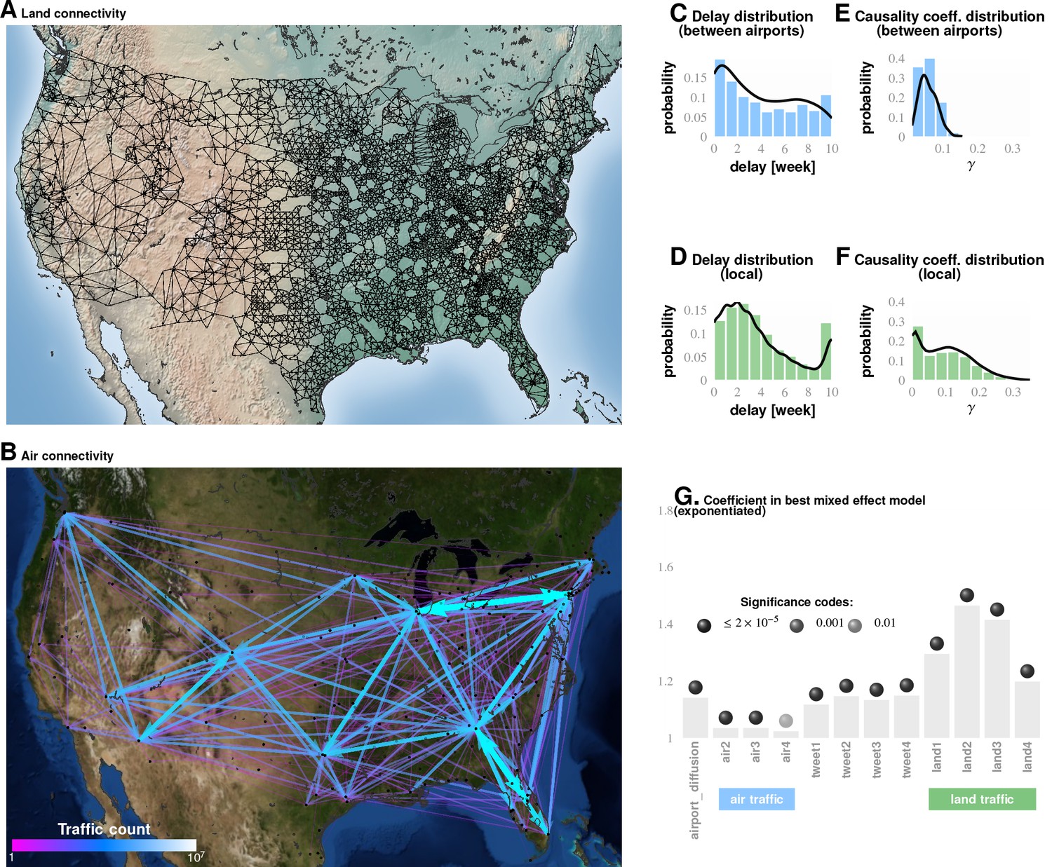
Comparing influence of short- and long-distance travel on infection propagation Plate A shows land connectivity visualized as a graph with edges between neighboring counties.
Plate B shows air connectivity as links between airports, with edge thickness proportional to traffic volume. Plate C shows the delay in weeks for the propagation of Granger-causal influence between counties in which major airports are located, and Plate E shows the distribution of the inferred causality coefficient between those same counties. Plates D and F show the delay and the causality coefficient distribution respectively, which we computed by considering spatially neighboring counties. The results show that local connectivity is more important. We reached a similar conclusion using mixed-effect Poisson regression, as shown in Plate G: The inferred coefficients for land connectivity are significantly larger than those for air connectivity, tweet-based connectivity, or exponential diffusion from the top largest airports. The coefficients shown in Plate G are exponentiated, allowing us to visualize probability magnitudes (see ‘Model Definition’).
Figure 4—figure supplement 1
Our analysis of the Twitter movement matrix indicates that people most frequently travel between neighboring counties, preferentially towards higher-population-density areas, which shows that the maximum-probability movement patterns follow the local gradient of increasing population density.
https://doi.org/10.7554/eLife.30756.017
Figure 5
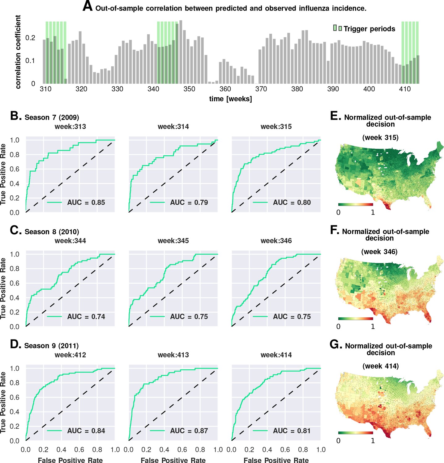
Prediction performance with training data from the first six seasons and validation on the last three.
Plate A shows the correlation between the observed incidence and the model-predicted response. We show significant positive correlation, particularly within the trigger periods, between the model predictions and the actual held-out data. This gives us confidence to construct ROC curves for each week. Plates B-D show the ROC curves for the last three weeks of each of the three seasons in the out-of-sample period (potentially, these computations can be repeated for all possible partitions of study weeks into training and test samples). Plates E-G illustrate that the normalized decision variable, which is the normalized response from the model, identifies the South and Southeastern counties as the trigger zones.
Figure 6
Results for our analysis involving county-matching (Approach 3).
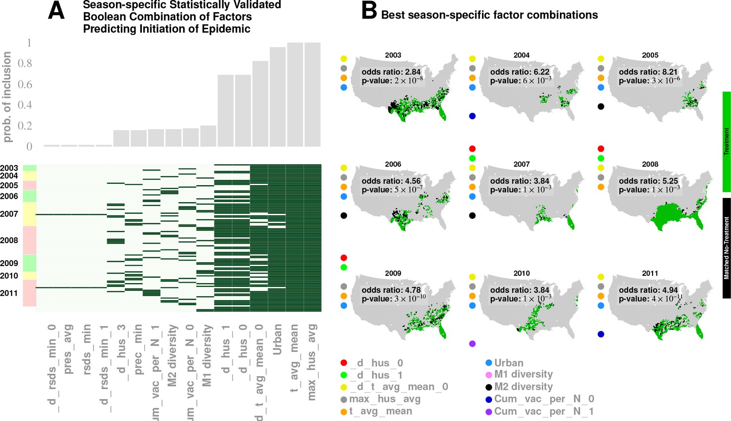
Plate A illustrates the factor combinations that turn out to be significant over the nine seasons. Notably, for each season, we have multiple, distinct factor sets that turn out to be significant () and yield a greater-than-unity odd ratio. Plotting the probability with which different factors are selected when we look at season-specific county matchings (the top panel in Plate A), we see a corroboration of the conclusions drawn in Approach 2. We find that specific humidity and average temperature, along with their variations, are almost always included. We do see some new factors that fail to be significant in the regression analysis, , degree of urbanity and vaccination coverage. While vaccination coverage is indeed included as a factor in our best performing model, in Approach two it failed to achieve significance, perhaps due to its strong dependence on antigenic variation (see Figure 1J–M). Degree of urbanity is indeed significant for some of the regression models we considered (see Supplementary Information), but was not significant for the model with the smallest DIC. Note that ‘Treatment’ here is defined as a logical combination of weather factors. A treatment is typically a conjunction of several weather variables. For example, the treatment shown in top left panel of Plate B involves a conjunction of: (1) a drop in average temperature during the week of infection; (2) a drop in temperature during the week of infection; (3) a higher-than-average specific humidity; (4) a higher-than-average temperature, and; (5) a high degree of urbanity. With respect to the ‘treatment,’ we can divide counties into three groups: (1) ‘treated counties,’ shown in green; (2) at least one matching county for each of the treated counties (matching counties are very close to the treated counties in all aspects but in treatment, which we called ‘control’ counties), shown in black, and; (3) other counties, shown in grey. The counties in the ‘treatment’ and ‘control’ groups are further subdivided into those counties that initiated an influenza wave and those that have not, resulting in four counts arranged into a two-by-two contingency table. We then used the Fisher exact test to test for association between treatment and influenza onset. Panels in Plate B show both the treated and control sets for the seasons for a subset of chosen factors. The results are significant, as shown in Tables 2 and 3. The variable definitions are given in Table 4. Notably, some of the variables found significant in the regression analysis are not included above, and some which are not found to be significant in the best regression model show up here. This is not to imply that they are not predictive or lack causal influence. The matched treatment approach, as described above, is not very effective if we use more than factors simultaneously to define the treated set (for the amount of data we have); this results in a contingency table populated with zero entries.
Appendix 1—figure 1
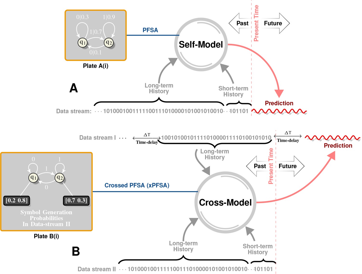
Intuitive Description of Self and Cross Models.
Plate A illustrates the notion of self-models. Historical data is first represented as a symbol sequence (denoted as ‘Data stream’ in Plate A) using space-time discretization and magnitude quantization. For example, we may use a spatial discretization of in both latitudes and longitudes, a temporal discretization of week, and a binary magnitude quantization that maps all magnitudes below to symbol , and all higher magnitudes to symbol . This symbol stream then represents a sample path from a hidden, quantized stochastic process. A self-model is a generative model of this data stream, which captures symbol patterns that causally determine (in a probabilistic sense) future symbols. Specifically, our inferred self-model (see Plate A(i) for an example) is a probabilistic, finite state automata (PFSA). Plate B illustrates the notion of cross-models. Instead of inferring a model from a given stream to predict future symbols in the same stream, we now have two symbol streams (Data Stream I and Data Stream II), and the cross-model is essentially a generative model that attempts to predict symbols in one stream by reading historical data in another. Notably, as shown in Plate B(i), the cross-model is syntactically not exactly a PFSA (arcs have no probabilities in the cross-model, but each state has an output distribution). We call such models ”crossed probabilistic finite state automata,’ or XPFSA. Once these models are inferred, they may be used to predict the future evolution of the data streams. Thus, the self-model in Plate A may be initialized with its unique stationary distribution, after which a relatively short observed history would dictate the current distribution on the model states. This, in turn, would yield a distribution over the symbol alphabet in the next time step. For a cross-model, we would be able to obtain future symbol distribution in the second stream, given a short history in the first stream. Note that the cross-model from I II is not necessarily the same as the cross-model in the other direction.
Tables
Table 1
Social connectivity: The US Southern region appears to have an unusually high level of social connectivity.
(In GSS survey results, the number of close friends, close friends who are neighbors, and number of friends who all or mostly know each other is higher in the South, especially in the East/South/Central census region, than in the country at large.)
| WSC (TX, OK, AR, LA) | ESC (MS, AL, TN, KY) | SA (FL, GA, SC, NC, VA, WV, MD, DC) | Country-at-large | WNC (ND, SD, NE, KS, MO, IA, MN) (not in South/Southeast) this is the second most social region following ESC (MS, AL, TN, KY) | |
|---|---|---|---|---|---|
| Close friends | 7.22 | 12.76 | 8.20 | 7.57 | 10.56 |
| Close friends who are neighbors | 1.02 | 3.40 | 1.32 | 1.45 | 3.15 |
| % of friends who all or mostly know each other | All:20% Mostly: 43% | All:18% Mostly: 58% | All: 11% Mostly: 52% | All: 12 Mostly: 50% | All: 16% Mostly: 58% |
| How often visit closest friends* | 107 | 151 | 126 | 122 | 129 |
-
*Survey options are: lives in household, daily, several times a week, once a week, once a month, several times a year, and less often. These are converted to approximate number of visits per year (see Supplement for more information about the GSS analysis).
Table 2
Fisher’s exact test results on matched treatment combinations
https://doi.org/10.7554/eLife.30756.012| YR | dh | dh | dt | h | t | u | M1 | M2 | V | V | a | p-value | Odds ratio | Lower 99% cnf. bnds. | Upper 99% cnf. bnds. |
|---|---|---|---|---|---|---|---|---|---|---|---|---|---|---|---|
| 2003 | X | X | Y | Y | Y | Y | X | X | X | X | X | 2.83 | 1.73 | 4.66 | |
| 2004 | X | X | Y | Y | Y | Y | X | X | Y | X | X | 6.22 | 1.08 | 132.03 | |
| 2005 | X | X | Y | Y | Y | Y | X | Y | X | X | X | 8.31 | 2.16 | 54.93 | |
| 2006 | X | X | Y | Y | Y | Y | X | Y | X | X | X | 4.56 | 1.96 | 12.0 | |
| 2007 | Y | Y | X | Y | Y | Y | X | Y | X | X | X | 3.85 | 0.82 | 28.16 | |
| 2008 | Y | Y | Y | Y | Y | X | X | X | X | X | X | 5.26 | 1.23 | 50.2 | |
| 2009 | Y | Y | X | Y | Y | Y | X | X | X | X | X | 4.78 | 2.38 | 10.34 | |
| 2010 | X | X | Y | Y | Y | Y | X | X | X | Y | X | 3.64 | 0.93 | 24.27 | |
| 2011 | X | X | Y | Y | Y | Y | X | X | Y | X | X | 4.91 | 2.51 | 10.05 | |
| All Years | Y | Y | Y | Y | Y | Y | Y | Y | Y | Y | X | 3.88 | 2.10 | 7.89 | |
| All Years | Y | Y | Y | Y | Y | Y | Y | Y | Y | Y | Y | 1.0 | 0.48 | 2.15 |
Table 3
Fisher’s exact test results on matched treatment combinations
https://doi.org/10.7554/eLife.30756.013| (a) | ||
|---|---|---|
| YR p | -value 99% | Conf. Bnd. |
| max hus avg | ||
| 2003 | 0.003603 | 1.0, 4.21 |
| 2004 | 0.6919 | 0.16, 17.63 |
| 2005 0. | 1948 | 0.61, 7.89 |
| 2006 0. | 6525 0.28, 3.06 | |
| 2007 0. | 3574 0.49, 18.85 | |
| 2008 0. | 103 | 0.55, 1.23 |
| 2009 0 | .1067 | 0.68, 8.77 |
| 2010 | 0.5318 | 0.27, 41.03 |
| 2011 | 0.09054 | 0.74, 5.17 |
| ALL YRS | 1[1]10-4 | 1.12, 1.88 |
| t avg mean | ||
| 2003 | 0.06439 | 0.81, 3.65 |
| 2004 | 1 | 0.27, 10.62 |
| 2005 | 0.003339 | 1.17, 123.0 |
| 2006 | 0.8172 | 0.29, 4.0 |
| 2007 | 0.537 | 0.47, 7.42 |
| 2008 | 0.05985 | 0.59, Inf |
| 2009 | 0.0006337 | 1.37, 51.68 |
| 2010 | 0.2853 | 0.50, 9.28 |
| 2011 | 0.05729 | 0.85, 3.49 |
| ALL YRS 5.87 | [1]10-9 | 1.36, 2.23 |
| d hus 0 | ||
| 2003 | 0.5374 | 0.55, 3.41 |
| 2004 | 1 | 0.27, 11.01 |
| 2005 | 0.04401 | 0.81, 7.13 |
| 2006 | 0.001708 | 1.31, Inf |
| 2007 | 0.009199 | 1.0, 37.34 |
| 2008 | 0.3051 | 0.60, 5.92 |
| 2009 | 0.02726 | 0.82, 90.16 |
| 2010 | 1 | 0.41, 2.78 |
| 2011 | 0.577 | 0.57, 2.77 |
| ALL YRS | 1.48[1]10-5 | 1.12, 1.64 |
| d t avg mean 0 | ||
| 2003 | 0.004956 | 1.0, 24.12 |
| 2004 | 0.445 | 0.14, 6.0 |
| 2005 | 0.001164 | 1.23, 12.03 |
| 2006 | 0.01198 | 0.97, 11.08 |
| 2007 | 0.01147 | 0.96, 11.05 |
| 2008 | 0.08552 | 0.74, 11.18 |
| 2009 | 0.06847 | 0.73, 17.69 |
| 2010 | 0.08251 | 0.15, 1.63 |
| 2011 | 0.6031 | 0.47, 3.55 |
| ALL | YRS 4.98[1]10-11 | 1.35, 2.06 |
| (b) | ||
|---|---|---|
| YR p- | value | 99% Conf. Bnd. |
| hus 1 | ||
| 2003 | 0.1652 | 0.10, 2.43 |
| 2004 | 1 | 0.22, 24.42 |
| 2005 | 0.002004 | 0.09, 0.87 |
| 2006 | 1 | 0.32, 7.65 |
| 2007 | 0.389 | 0.33, 1.90 |
| 2008 | 0.02142 | 0.9, 8.48 |
| 2009 | 0.1822 | 0.67, 6.06 |
| 2010 | 0.6005 | 0.23, 4.22 |
| 2011 | 0.9166 | 0.6, 1.88 |
| ALL YRS | 0.07 | 0.72, 1.06 |
| d hus 2 | ||
| 2003 | 0.0083 | 1.01, 5.77 |
| 2004 | 0.79 | 0.36, 13.33 |
| 2005 | 0.275 | 0.71, 2.54 |
| 2006 | 0.24 | 0.66, 4.36 |
| 2007 | 0.19 | 0.62, 9.33 |
| 2008 | 0.18 | 0.65, 7.52 |
| 2009 | 0.53 | 0.44, 6.25 |
| 2010 | 0.08 | 0.21, 1.51 |
| 2011 | 0.59 | 0.69, 1.87 |
| ALL YRS | 0.13 | 0.78, 1.07 |
| urbanity | ||
| 2003 | 0.0083 | 1.01, 5.77 |
| 2004 | 0.79 | 0.36, 13.33 |
| 2005 | 0.275 | 0.71, 2.54 |
| 2006 | 0.24 | 0.66, 4.36 |
| 2007 | 0.19 | 0.62, 9.33 |
| 2008 | 0.18 | 0.65, 7.52 |
| 2009 | 0.53 | 0.44, 6.25 |
| 2010 | 0.08 | 0.21, 1.51 |
| 2011 | 0.59 | 0.69, 1.87 |
| ALL YRS | 2.2_10-16 | 3.67, 5.06 |
| airport proximity | ||
| 2003 | 0.004956 | 1.0, 24.12 |
| 2004 | 0.445 | 0.14, 6.0 |
| 2005 | 0.001164 | 1.23, 12.03 |
| 2006 | 0.01198 | 0.97, 11.08 |
| 2007 | 0.01147 | 0.96, 11.05 |
| 2008 | 0.08552 | 0.74, 11.18 |
| 2009 | 0.06847 | 0.73, 17.69 |
| 2010 | 0.08251 | 0.15, 1.63 |
| 2011 | 0.6031 | 0.47, 3.55 |
| ALL YRS | 1_10-16 | 1.73, 2.93 |
Table 4
Variables in mixed-effect Poisson regression analysis (Approach 2)
https://doi.org/10.7554/eLife.30756.020| Variable name | physical effect |
|---|---|
| N | Total number of patient visits given week and county (the offset) |
| max_HUS_mean | Mean county-specific maximum specific humidity over nine years |
| d_max_HUS_i | Normalized and zero-centered deviations of maximum humidity, i = 0–4 weeks before |
| t_avg_mean | Mean county-specific temperature over nine years |
| d_t_avg_i | Normalized and zero-centered deviations of mean temperature, i = 0–4 weeks before |
| RSDS_mean | Mean county-specific solar insolation over nine years |
| d_RSDS_i | Normalized and zero-centered deviations of mean solar insolation, i = 0–4 weeks before |
| AVG_PRESS mean | Mean county-specific solar insolation over nine years |
| d_AVG_PRESS_i | Normalized and zero-centered deviations of mean surface pressure, i = 0–4 weeks before |
| tot_prec_mean | Mean county-specific total precipitation over nine years |
| d_tot_prec_i | Normalized and zero-centered deviations of mean total precipitation, i = 0–4 weeks before |
| Wind_avg_mean | Mean county-specific average wind speed over nine years |
| d_Wind_avg_i | Normalized and zero-centered deviations of average wind speed, i = 0–4 weeks before |
| Income | County-specific mean income |
| airport_diffusion | Influence from proximity to airports, modeled as human traffic-weighted exponential diffusion from the 30 largest US airports |
| Am_Ind | % of American Indians in the county |
| Asian | % of Asians |
| White_Hisp | % of Caucasian/Hispanics |
| W_non_Hisp | % of Caucasian/Non-Hispanics |
| Black_Hisp | % of Black/Hispanics |
| B_non_Hisp | % of Black/Non-Hispanics |
| Pacific | % of Pacific Islanders |
| Insured | % of county population insured |
| Poor | % of county population under poverty line |
| Urban | % of county population classified as urban |
| land_i | influenza velocity change in the land neighbors of the county weeks before the current week |
| tweet_i | influenza velocity change in the Twitter neighbors of the county weeks before the current week |
| air_i | influenza velocity change in airport neighbors of the county weeks before the current week |
| v_i | change in rate of infection in the county itself weeks from the current |
| M1 | Diversity in M1 protein primary structure |
| M2 | Diversity in M2 protein primary structure |
| NA | Diversity in NA protein primary structure |
| HA | Diversity in HA protein primary structure |
| Cum_vac_per_N_i | vaccination coverage in the county cumulated over past 20 weeks weeks from the current |
-
(a) Definition of variables
Table 5
Different Models Considered and DIC Ranking
https://doi.org/10.7554/eLife.30756.021| Equation used in Poisson regression | DIC |
|---|---|
| flu LOGN + 1 + max_HUS_mean + d_max_HUS_0 + d_max_HUS_min_1 + d_max_HUS_min_2 + d_max_HUS_min_3 + t_avg_mean + d_t_avg_0 + d_t_avg_min_1 + d_t_avg_min_2 + d_t_avg_min_3 + max_HUS_mean * t_avg_mean + d_max_HUS_0 * d_t_avg_0 + d_max_HUS_min_1 * d_t_avg_min_1 + d_max_HUS_min_2 * d_t_avg_min_2 + d_max_HUS_min_3 * d_t_avg_min_3 + RSDS_mean + d_RSDS_0 + d_RSDS_min_1 + d_RSDS_min_2 + d_RSDS_min_3 + AVG_PRESS_mean + d_AVG_PRESS_0 + d_AVG_PRESS_min_1 + d_AVG_PRESS_min_2 + d_AVG_PRESS_min_3 + Income + airport_diffusion + Am_Ind + Asian + White_Hisp + W_non_Hisp + Black_Hisp + B_non_Hisp + Pacific + Insured+Poor + Urban+v1+v2+land1+land2+land3+land4+tweet1+tweet2+tweet3+tweet4+air1+air2+air3+air4+HA + M1+M2+NA. | 185942 |
| flu LOGN + 1 + max_HUS_mean + d_max_HUS_0 + d_max_HUS_min_1 + d_max_HUS_min_2 + d_max_HUS_min_3 + d_max_HUS_min_4 + t_avg_mean + d_t_avg_0 + d_t_avg_min_1 + d_t_avg_min_2 + d_t_avg_min_3 + d_t_avg_min_4 + RSDS_mean + d_RSDS_0 + d_RSDS_min_1 + d_RSDS_min_2 + d_RSDS_min_3 + d_RSDS_min_4 + AVG_PRESS_mean + d_AVG_PRESS_0 + d_AVG_PRESS_min_1 + d_AVG_PRESS_min_2 + d_AVG_PRESS_min_3 + d_AVG_PRESS_min_4 + tot_prec_mean + d_tot_prec_0 + d_tot_prec_min_1 + d_tot_prec_min_2 + d_tot_prec_min_3 + d_tot_prec_min_4 + Wind_avg_mean + d_Wind_avg_0 + d_Wind_avg_min_1 + d_Wind_avg_min_2 + d_Wind_avg_min_3 + d_Wind_avg_min_4 + Income + airport_diffusion + Am_Ind + Asian + White_Hisp + W_non_Hisp + Black_Hisp + B_non_Hisp + Pacific + Insured+Poor + Urban+v1+v2+land1+land2+land3+land4+tweet1+tweet2+tweet3+tweet4+air1+air2+air3+air4+HA + M1+M2+NA.+HA * NA. | 185940.6 |
| flu LOGN + 1 + max_HUS_mean + d_max_HUS_0 + d_max_HUS_min_1 + d_max_HUS_min_2 + d_max_HUS_min_3 + t_avg_mean + d_t_avg_0 + d_t_avg_min_1 + d_t_avg_min_2 + d_t_avg_min_3 + max_HUS_mean * t_avg_mean + d_max_HUS_0 * d_t_avg_0 + d_max_HUS_min_1 * d_t_avg_min_1 + d_max_HUS_min_2 * d_t_avg_min_2 + d_max_HUS_min_3 * d_t_avg_min_3 + RSDS_mean + d_RSDS_0 + d_RSDS_min_1 + d_RSDS_min_2 + d_RSDS_min_3 + AVG_PRESS_mean + d_AVG_PRESS_0 + d_AVG_PRESS_min_1 + d_AVG_PRESS_min_2 + d_AVG_PRESS_min_3 + Income + airport_diffusion + Am_Ind + Asian + White_Hisp + W_non_Hisp + Black_Hisp + B_non_Hisp + Pacific + Insured+Poor + Urban+v1+v2+land1+land2+land3+land4+tweet1+tweet2+tweet3+tweet4air1+air2+air3+air4+HA + M1+M2+NA.+Cum_vac_per_N_0 | 185938.1 |
| flu LOGN + 1 + max_HUS_mean + d_max_HUS_0 + d_max_HUS_min_1 + d_max_HUS_min_2 + d_max_HUS_min_3 + d_max_HUS_min_4 + t_avg_mean + d_t_avg_0 + d_t_avg_min_1 + d_t_avg_min_2 + d_t_avg_min_3 + d_t_avg_min_4 + RSDS_mean + d_RSDS_0 + d_RSDS_min_1 + d_RSDS_min_2 + d_RSDS_min_3 + d_RSDS_min_4 + AVG_PRESS_mean + d_AVG_PRESS_0 + d_AVG_PRESS_min_1 + d_AVG_PRESS_min_2 + d_AVG_PRESS_min_3 + d_AVG_PRESS_min_4 + tot_prec_mean + d_tot_prec_0 + d_tot_prec_min_1 + d_tot_prec_min_2 + d_tot_prec_min_3 + d_tot_prec_min_4 + Wind_avg_mean + d_Wind_avg_0 + d_Wind_avg_min_1 + d_Wind_avg_min_2 + d_Wind_avg_min_3 + d_Wind_avg_min_4 + Income + airport_diffusion + Am_Ind + Asian + White_Hisp + W_non_Hisp + Black_Hisp + B_non_Hisp + Pacific + Insured+Poor + Urban+v1+v2+land1+land2+land3+land4+tweet1+tweet2+tweet3+tweet4+air1+air2+air3+air4+HA + M1+M2+NA.+Cum_vac_per_N_diff_1 + Cum_vac_per_N_diff_2 + Cum_vac_per_N_diff_3 + Cum_vac_per_N_diff_4 | 185935.9 |
| flu LOGN + 1 + max_HUS_mean + d_max_HUS_0 + d_max_HUS_min_1 + d_max_HUS_min_2 + d_max_HUS_min_3 + d_max_HUS_min_4 + t_avg_mean + d_t_avg_0 + d_t_avg_min_1 + d_t_avg_min_2 + d_t_avg_min_3 + d_t_avg_min_4 + RSDS_mean + d_RSDS_0 + d_RSDS_min_1 + d_RSDS_min_2 + d_RSDS_min_3 + d_RSDS_min_4 + AVG_PRESS_mean + d_AVG_PRESS_0 + d_AVG_PRESS_min_1 + d_AVG_PRESS_min_2 + d_AVG_PRESS_min_3 + d_AVG_PRESS_min_4 + tot_prec_mean + d_tot_prec_0 + d_tot_prec_min_1 + d_tot_prec_min_2 + d_tot_prec_min_3 + d_tot_prec_min_4 + Wind_avg_mean + d_Wind_avg_0 + d_Wind_avg_min_1 + d_Wind_avg_min_2 + d_Wind_avg_min_3 + d_Wind_avg_min_4 + Income + airport_diffusion + Am_Ind + Asian + White_Hisp + W_non_Hisp + Black_Hisp + B_non_Hisp + Pacific + Insured+Poor + Urban+v1+v2+land1+land2+land3+land4+tweet1+tweet2+tweet3+tweet4+air1+air2+air3+air4+HA + M1+M2+NA. | 185933.7 |
| flu LOGN + 1 + max_HUS_mean + d_max_HUS_0 + d_max_HUS_min_1 + d_max_HUS_min_2 + d_max_HUS_min_3 + d_max_HUS_min_4 + t_avg_mean + d_t_avg_0 + d_t_avg_min_1 + d_t_avg_min_2 + d_t_avg_min_3 + d_t_avg_min_4 + RSDS_mean + d_RSDS_0 + d_RSDS_min_1 + d_RSDS_min_2 + d_RSDS_min_3 + d_RSDS_min_4 + AVG_PRESS_mean + d_AVG_PRESS_0 + d_AVG_PRESS_min_1 + d_AVG_PRESS_min_2 + d_AVG_PRESS_min_3 + d_AVG_PRESS_min_4 + tot_prec_mean + d_tot_prec_0 + d_tot_prec_min_1 + d_tot_prec_min_2 + d_tot_prec_min_3 + d_tot_prec_min_4 + Wind_avg_mean + d_Wind_avg_0 + d_Wind_avg_min_1 + d_Wind_avg_min_2 + d_Wind_avg_min_3 + d_Wind_avg_min_4 + Income + airport_diffusion + Am_Ind + Asian + White_Hisp + W_non_Hisp + Black_Hisp + B_non_Hisp + Pacific + Insured+Poor + Urban+v1+v2+land1+land2+land3+land4+tweet1+tweet2+tweet3+tweet4+air1+air2+air3+air4+HA + M1+M2+NA.+Cum_vac_per_N_0 | 185932.3 |
| flu LOGN + 1 + max_HUS_mean + d_max_HUS_0 + d_max_HUS_min_1 + d_max_HUS_min_2 + d_max_HUS_min_3 + d_max_HUS_min_4 + t_avg_mean + d_t_avg_0 + d_t_avg_min_1 + d_t_avg_min_2 + d_t_avg_min_3 + d_t_avg_min_4 + RSDS_mean + d_RSDS_0 + d_RSDS_min_1 + d_RSDS_min_2 + d_RSDS_min_3 + d_RSDS_min_4 + AVG_PRESS_mean + d_AVG_PRESS_0 + d_AVG_PRESS_min_1 + d_AVG_PRESS_min_2 + d_AVG_PRESS_min_3 + d_AVG_PRESS_min_4 + tot_prec_mean + d_tot_prec_0 + d_tot_prec_min_1 + d_tot_prec_min_2 + d_tot_prec_min_3 + d_tot_prec_min_4 + Wind_avg_mean + d_Wind_avg_0 + d_Wind_avg_min_1 + d_Wind_avg_min_2 + d_Wind_avg_min_3 + d_Wind_avg_min_4 + Income + airport_diffusion + Am_Ind + Asian + White_Hisp + W_non_Hisp + Black_Hisp + B_non_Hisp + Pacific + Insured+Poor + Urban+v1+v2+land1+land2+land3+land4+tweet1+tweet2+tweet3+tweet4+air1+air2+air3+air4+HA + M1+M2+NA.+Cum_vac_per_N_0 + Cum_vac_per_N_1 + Cum_vac_per_N_2 + Cum_vac_per_N_3 | 185926.6 |
Additional files
-
Source code 1
R code for analyses in Approach 2: mcmc_flu.r
Raw outputs of the regression experiments in Approach 2: R Output Logs: models computed using only weeks associated with initiation of influenza wave.
- https://doi.org/10.7554/eLife.30756.022
-
Source code 2
County-matching code for Approach 3: counterfactual.cc
- https://doi.org/10.7554/eLife.30756.023
-
Source data 1
Streamline raw data for Figure 4G: streamline_data.zip
Each streamline is a a series of physical coordinates (latitude and longitude in degrees), with a linebreak after each streamline.
- https://doi.org/10.7554/eLife.30756.024
-
Source data 2
Analysis of 50% of all weeks in study with mixed-effect Poisson regression: flu-50-percent-weeks.txt
- https://doi.org/10.7554/eLife.30756.025
-
Source data 3
Raw outputs of all mixed-effect regression analyses in this study.
- https://doi.org/10.7554/eLife.30756.026
-
Supplementary file 1
Summarized Algorithms for Non-parametric Granger Causal Inference:
SI2.docx
- https://doi.org/10.7554/eLife.30756.027
-
Supplementary file 2
Back to School Effect Analysis.
- https://doi.org/10.7554/eLife.30756.028
-
Supplementary file 3
Regression Equations and Corresponding DIC values.
- https://doi.org/10.7554/eLife.30756.029
-
Supplementary file 4
Regression Equations for all models tested in our regression analysis along with corresponding DIC values.
Balancing Precision and Sensitivity when Identifying Influenza-like Illnesses from Electronic Medical Records.
- https://doi.org/10.7554/eLife.30756.030
-
Transparent reporting form
- https://doi.org/10.7554/eLife.30756.031
Download links
A two-part list of links to download the article, or parts of the article, in various formats.
Downloads (link to download the article as PDF)
Open citations (links to open the citations from this article in various online reference manager services)
Cite this article (links to download the citations from this article in formats compatible with various reference manager tools)
Conjunction of factors triggering waves of seasonal influenza
eLife 7:e30756.
https://doi.org/10.7554/eLife.30756


