Differences in topological progression profile among neurodegenerative diseases from imaging data
- University College London, United Kingdom
- Université Côte d’Azur, Inria, Epione Research Project, France
- Erasmus Medical Center, Netherlands
- Erasmus MC, Netherlands
- VUmc, Netherlands
Figures
Figure 1
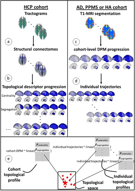
Overview of topological profile estimation.
(a) We construct the average structural connectome from Human Connectome Project (HCP) tractograms; (b) we compute topological descriptors on the structural connectome and the progression pattern that corresponds to each; (c) we estimate the long-term atrophy progression pattern and its variability within each condition, using GP Disease Progression Model on regional volumes from T1-weighted MRI; (d) we estimate rates of progression for each individual from the cohort-level GP progression model; (e) we estimate each topological profile (both cohort-level and individual) as the linear combination of topological descriptors, with weights , that best matches the observed progression rates. Those profiles are then visualized in a low-dimensional projection of the space of topological descriptors.
Figure 2 with 4 supplements

Temporal evolution of brain loss in AD, PPMS and HA confirm known atrophy progression patterns, and the progression patterns corresponding to the topological profiles for the three cohorts match the progression of atrophy better than the single best fitting topological descriptor.
Top row: 4D representation of the GP disease progression model for AD (left), PPMS (middle) and HA (right). Second row: 4D representation of the progression pattern corresponding to the topological profile for AD (left) - a combination of centrality measures and network-based proximity; PPMS (middle) – a combination of centrality, segregation and cortical proximity measures; and HA (right) - a combination of centrality, cortical proximity, and constant progression. Third row: 4D representation of the progression pattern corresponding the single best fitting topological descriptor for AD (left) - network proximity; PPMS (middle) - segregation; and HA (right) - cortical proximity. Each region’s color opacity is proportional to the cumulative abnormality of each region (strong blue means strongly atrophied), and time increases from left to right. AIC is the Aikake Information Criterion for the fit to the observed disease progression (lower is better).
Figure 2—figure supplement 1
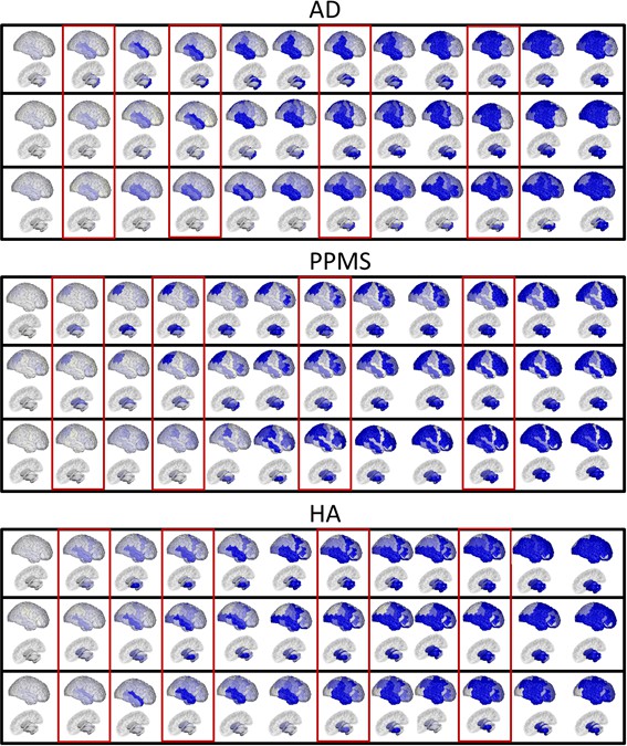
Fine-grained representation of Figure 2, with 12 stages.
Top row, for each panel: 4D representation of the disease progression model for AD (top panel), PPMS (middle panel) and HA (bottom panel). Middle row, for each panel: 4D representation of the progression corresponding to the topological profiles for AD (top panel), combination centrality and network proximity; PPMS (middle panel), combination of segregation, centrality and cortical proximity; and HA (bottom panel), combination of centrality and cortical proximity spread. Bottom row, for each panel: 4D representation of the progression corresponding to the single best fitting descriptors for AD (top panel), network proximity to epicenter; PPMS (middle panel), segregation - inverse clustering specifically; HA (bottom panel), cortical proximity. Each region’s color is proportional to the cumulative abnormality of each region, and time reads from left to right. In red rectangles, the regions selected for Figure 2, main text.
Figure 2—figure supplement 2
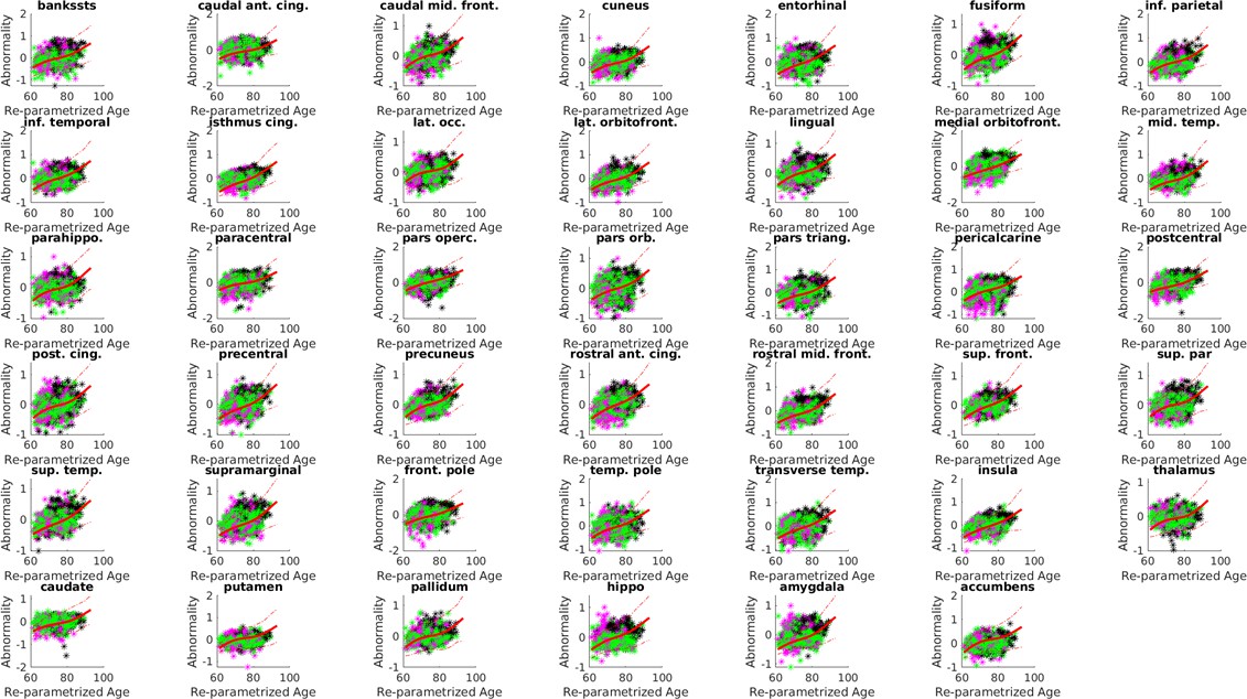
Biomarker trajectories, with standard deviations and measurements for the AD cohort.
Here in full red, the estimated trajectories and in dashed red the standard deviations (1-sigma confidence band). Each colored dot is a individual, and is colored according to the baseline diagnosis (magenta = HC, green = MCI, black = AD). The model estimates a time-shift (‘Re-parameterized age’) that shuffles the individuals disaggregating the diagnosis (i.e. HC individual are earlier in the progression, followed by MCI, and then AD).
Figure 2—figure supplement 3
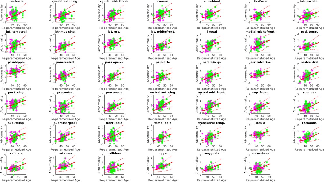
Individual trajectories, with standard deviations and measurements, for the PPMS cohort.
Estimated trajectories in full red and in dashed red the standard deviations (1-sigma confidence band). Each colored dot is a individual, and is colored according to the baseline diagnosis (magenta = HC, green = PPMS). The model estimates a time-shift (‘Re-parameterized age’) that shuffles the individuals disaggregating the diagnosis (i.e. HC individual are earlier in the progression, followed by PPMS).
Figure 2—figure supplement 4

Individual trajectories, with standard deviations and measurements, for the HA cohort.
Estimated trajectories in full red and in dashed red the standard deviations (1-sigma confidence band). Each colored dot is a individual, and is colored according to the baseline age: magenta < mean std (Young’ cohort); mean-std < green < mean+std; black > mean+std (”Old’ cohort).
Figure 3 with 1 supplement
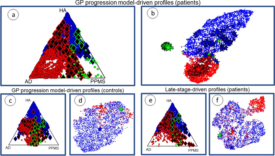
Individual profiles are specific for each neurological condition.
Red indicates AD individuals, blue indicates HA and green is PPMS. Panel (a) shows ternary plot of the individual profiles, obtained via the GP Progression Model, for AD+MCI-diagnosed individuals, PPMS-diagnosed individuals, and HA individuals plotted according to the distance from the cohort-level profile; corners are cohort-level profiles. Outliers of each cohort are highlighted (identified with diamonds); (b) shows a 2D representation of the topological profiles in (a), using tSNE; big stars represent the cohort profiles and small ones the bootstrapped cohort-profiles; (c) ternary plot using GP Progression Model -driven profiles for only healthy control individuals in the AD and PPMS cohorts, and HA individuals; (d) tSNE plot of data in (c); (e) ternary plot of the individual profiles for AD+MCI-diagnosed, PPMS-diagnosed, and HA individuals, estimated from only late-stage data; (f) tSNE plot for the topological profiles of data in (e).
Figure 3—figure supplement 1
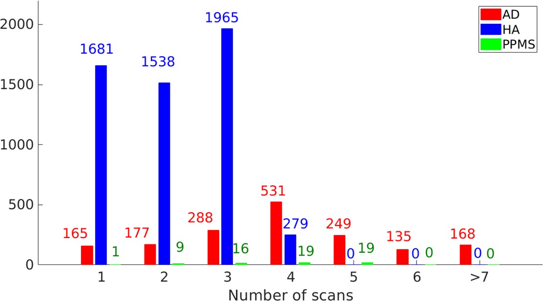
Longitudinal information for the study cohort (AD: 1713 individuals, HA 5463 individuals, PPMS 64 individuals).
The overall time-points are 6670 for AD, 11627 for HA and 244 for PPMS; the average follow-up (years) are 2.4 for AD, 5.3 for HA and 4.0 for PPMS; the standard deviation of follow-up (years) is 1.8 for AD, 1.1 for HA and 1.5 for PPMS; the range of follow-up (years) is 0.5–10 for AD, 0.7–10.5 for HA and 0–6 for PPMS.
Figure 4
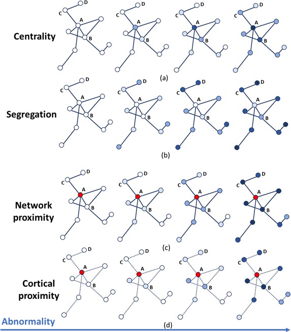
Temporal progression patterns (left-to-right) of different descriptors.
For each descriptor (row), abnormality increases in a descriptor-specific pattern. The magnitude of cumulative abnormality at a node is proportional to the color intensity. Red nodes are epicenters. (a) Centrality: node A is affected first due to having the highest centrality, followed by node B, then C and D. (b) Segregation: node D is affected first due to having the highest segregation, followed by C, then B and A. (c) Network proximity: nodes B and C are affected before D, because they are closer to the epicenter A (along the connectivity network). (d) Cortical proximity: node B is affected first because of its spatial proximity to the epicenter A, then C and finally D. Here edges are dashed as no information is needed from connectivity.
Figure 5

A schematic representation of the mathematical modeling of the topological profiling with GP Progression Model.
In the example here we have three biomarkers/regions (represented in red (), green () and blue ()), and two topological descriptors ( and ). (a) The GP Progression Model estimates temporal trajectories of biomarkers progression, along the disease time . The unique maximum points of the derivatives of the trajectories correspond to their maximal rate of change . (b) Two topological descriptors are computed for each region from anatomical connectomes. They combine, column-wise, in the matrix . (c) For each subject , the GP Progression Model estimates a time-reparametrization which shifts individual measurements to the disease time. For each biomarker, the speed of progression of subject with respect to the cohort progression is the value of the derivative of the biomarker progression at , which represents the shift of the average age of the subject. (d) Topological profiles are estimated via a linear model relating and (for the cohort-level topological profile) or (for the individual profiles).
Tables
Table 1
Weights of the topological profiles of the three cohorts.
The table reports the weights for each network metric, grouped per topological descriptor. Credible intervals for the weights are given in parentheses. Bootstrapping variation is shown in square brackets. Bonferroni-corrected p-values and effect size for the permutation testing of the null hypothesis are shown in braces. In bold, the weights that have been used to compute the topological profiles.
| Topological descriptor | Network metrics | AD | PPMS | HA |
|---|---|---|---|---|
| Betweenness centrality | 0.21 (0.17) [0.22 (0.18)] {0.01 (2.85)} | 0.10 (0.08) [0.11 (0.08)] {0.01 (2.72)} | 0.09 (0.06) [0.07 (0.05)] {0.01 (3.16)} | |
| Centrality | Closeness centrality | 0.01 (0.02) [0.04 (0.04)] {0.01 (2.90)} | 0.11 (0.11) [0.12 (0.12))] {0.01 (2.34)} | 0.03 (0.05) [0.04 (0.04)] {0.01 (1.79)} |
| Weighted degree | 0.03 (0.03) [0.02 (0.02)] {0.01 (3.10)} | 0.07 (0.05) [0.07 (0.05)] {0.01 (2.96)} | 0.13 (0.09) [0.11 (0.07)] {0.01 (2.78)} | |
| Clustering coefficient | 0.19 (0.11) [0.21 (0.12)] {0.01 (3.32)} | 0.14 (0.05) [0.14 (0.06)] {0.01 (4.52)} | 0.10 (0.07) [0.08 (0.06)] {0.01 (2.97)} | |
| Segregation | Inverse degree | 0.05 (0.06) [0.05 (0.05)] {0.05 (0.26)} | 0.17 (0.12) [0.16 (0.11)] {0.01 (3.43)} | 0.01 (0.01) [0.01 (0.01)] {0.01 (5.31)} |
| Inverse clustering | 0.01 (0.03) [0.05 (0.04)] {0.01 (1.90)} | 0.32 (0.22) [0.36 (0.24)] {0.01 (2.82)} | 0.01 (0.01) [0.01 (0.02)] {0.01 (2.01)} | |
| Network proximity | Shortest path | 0.65 (0.39) [0.54 (0.35)] {0.01 (3.62)} | 0.06 (0.06) [0.07 (0.06)] {0.01 (2.48)} | 0.01 (0.04) [0.01 (0.02)] {0.01 (1.48)} |
| Cortical proximity | Spatial distance | 0.06 (0.08) [0.10 (0.06)] {0.01 (2.14)} | 0.22 (0.14) [0.21 (0.18)] {0.01 (3.22)} | 0.64 (0.38) [0.54 (0.32)] {0.01 (3.46)} |
| Constant progression | Constant term | 0.07 (0.02) [0.12 (0.03)] {0.01 (4.01)} | 0.08 (0.04) [0.10 (0.05)] {0.01 (3.56)} | 0.19 (0.09) [0.18 (0.12)] {0.01 (3.58)} |
Table 2
Weights of the topological profiles of the three cohorts when using only late-stage atrophy data are more uncertain and overlap more.
The table reports the weights for each network metric, grouped per topological descriptor.
| Topological descriptors | Network metrics | AD | PPMS | HA |
|---|---|---|---|---|
| Betweenness centrality | 0.15 (0.11) | 0.11 (0.09) | 0.05 (0.02) | |
| Centrality | Closeness centrality | 0.01 (0.03) | 0.06 (0.07) | 0.01 (0.02) |
| Weighted degree | 0.03 (0.04) | 0.11 (0.08) | 0.09 (0.05) | |
| Clustering coefficient | 0.07 (0.10) | 0.11 (0.15) | 0.03 (0.02) | |
| Segregation | Inverse degree | 0.06 (0.06) | 0.12 (0.09) | 0.06 (0.06) |
| Inverse clustering | 0.09 (0.08) | 0.25 (0.22) | 0.01 (0.04) | |
| Network proximity | Shortest path | 0.30 (0.22) | 0.05 (0.05) | 0.02 (0.04) |
| Cortical proximity | Spatial distance | 0.12 (0.09) | 0.15 (0.09) | 0.15 (0.09) |
| Constant progression | Constant term | 0.04 (0.05) | 0.10 (0.07) | 0.33 (0.21) |
Table 3
Confusion matrix of classification rates for individuals’ assignment to each cohort by matching individual topological profiles to cohort-level topological profiles.
Without parentheses: results using full GP Progression Model -driven topological profiles. Within parentheses: results using topological profiles estimated from only late-stage data. Higher numbers are better in diagonal entries (correct assignment), and lower numbers are better in off-diagonal entries (incorrect assignment).
| AD | PPMS | HA | |
|---|---|---|---|
| AD | 84% (57%) | 4% (9%) | 12% (34%) |
| PPMS | 2% (16%) | 68% (45%) | 29% (38%) |
| HA | 7% (14%) | 2% (12%) | 91% (74%) |
Additional files
-
Supplementary file 1
Supplementary information.
- https://cdn.elifesciences.org/articles/49298/elife-49298-supp1-v3.docx
-
Transparent reporting form
- https://cdn.elifesciences.org/articles/49298/elife-49298-transrepform-v3.pdf
Download links
A two-part list of links to download the article, or parts of the article, in various formats.
Downloads (link to download the article as PDF)
Open citations (links to open the citations from this article in various online reference manager services)
Cite this article (links to download the citations from this article in formats compatible with various reference manager tools)
Differences in topological progression profile among neurodegenerative diseases from imaging data
eLife 8:e49298.
https://doi.org/10.7554/eLife.49298


