Trading mental effort for confidence in the metacognitive control of value-based decision-making
Figures
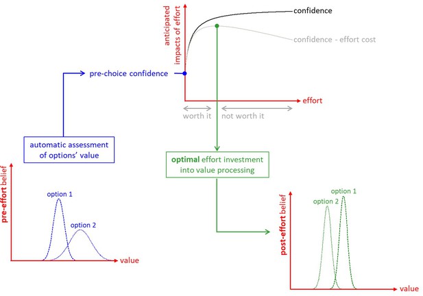
The metacognitive control of decisions.
First, automatic processes provide a ‘pre-effort’ belief about option values. This belief is probabilistic, in the sense that it captures an uncertain prediction regarding the to-be-experienced value of a given option. This pre-effort belief serves to identify the anticipated impact of investing costly cognitive resources (i.e., effort) in the decision. In particular, investing effort is expected to increase decision confidence beyond its pre-effort level. But how much effort it should be worth investing depends upon the balance between expected confidence gain and effort costs. The system then allocates resources into value-relevant information processing up until the optimal effort investment is reached. At this point, a decision is triggered based on the current post-effort belief about option values (in this example, the system has changed its mind, i.e., its preference has reversed). Note: we refer to the ensuing increase in the value difference between chosen and unchosen items as the ‘spreading of alternatives’ (cf. Materials and methods section).
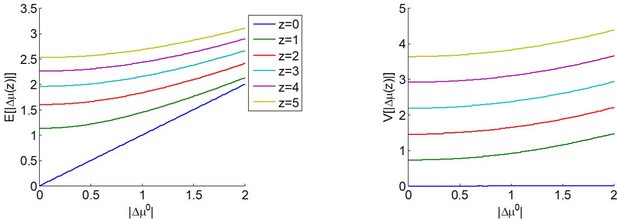
The expected impact of allocated resources onto value representations.
Left panel: the expected absolute mean difference (y-axis) is plotted as a function of the absolute prior mean difference (x-axis) for different amounts of allocated resources (color code), having set type #2 effort efficacy to unity (i.e. ). Right panel: Variance of the absolute mean difference; same format.

Experimental design.
Left: pre-choice item rating session: participants are asked to rate how much they like each food item and how certain they are about it (value certainty rating). Center: choice session: participants are asked to choose between two food items, to rate how confident they are about their choice, and to report the feeling of effort associated with the decision. Right: post-choice item rating session (same as pre-choice item rating session).
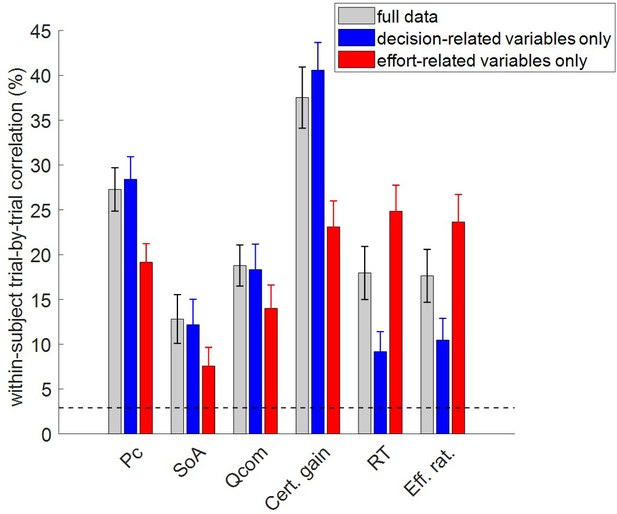
Accuracy of model postdictions and out-of-sample predictions.
The mean within-subject (across-trial) correlation between observed and predicted/postdicted data (y-axis) is plotted for each variable (x-axis, from left to right: choice confidence, spreading of alternatives, change of mind, certainty gain, RT and subjective effort ratings), and each fitting procedure (gray: full data fit, blue: decision-related variables only, and red: effort-related variables only). Error bars depict standard error of the mean, and the horizontal dashed black line shows chance-level prediction accuracy.
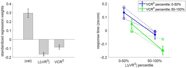
Three-way relationship between RT, value, and value certainty.
Left panel: Mean standardized regression weights for |ΔVR0| and VCR0 on log-RT (cst is the constant term); error bars represent s.e.m. Right panel: Mean z-scored log-RT (y-axis) is shown as a function of |ΔVR0| (x-axis) and VCR0 (color code: blue = 0–50% lower quantile, green = 50–100% upper quantile); solid lines indicate empirical data (error bars represent s.e.m.), star-dotted lines show out-of-sample predictions and diamond-dashed lines represent model postdictions.
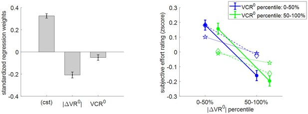
Three-way relationship between subjective effort rating, value, and value certainty.
Same format as Figure 5.
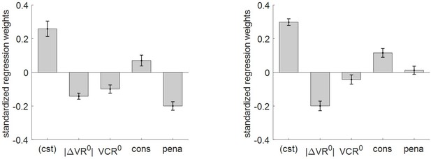
Impact of consequential and penalized conditions on effort-related variables.
Left panel: log-RT: mean standardized regression weights (same format as Figure 4 – left panel, cons = ‘consequential’ condition, pena = ‘penalized’ condition). Right panel: subjective effort ratings: same format as left panel.
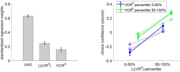
Three-way relationship between choice confidence, value, and value certainty.
Same format as Figure 5.
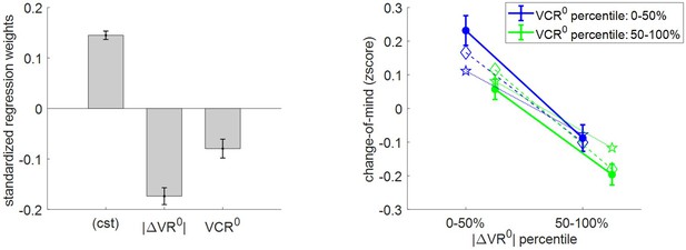
Three-way relationship between change of mind, value, and value certainty.
Same format as Figure 5.
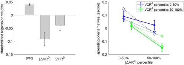
Three-way relationship between spreading of alternatives, value, and value certainty.
Same format as Figure 5.
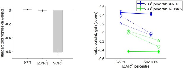
Three-way relationship between value certainty gain, value, and value certainty.
Same format as Figure 5.
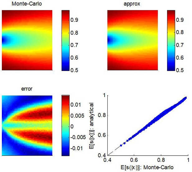
Quality of the analytical approximation to .
Upper left panel: the Monte-Carlo estimate of (color-coded) is shown as a function of both the mean (y-axis) and the variance (x-axis) of the parent process . Upper right panel: analytic approximation to as given by Equation A3 (same format). Lower left panel: the error, that is, the difference between the Monte-Carlo and the analytic approximation (same format). Lower right panel: the analytic approximation (y-axis) is plotted as a function of the Monte-Carlo estimate (x-axis) for each pair of moments of the parent distribution.
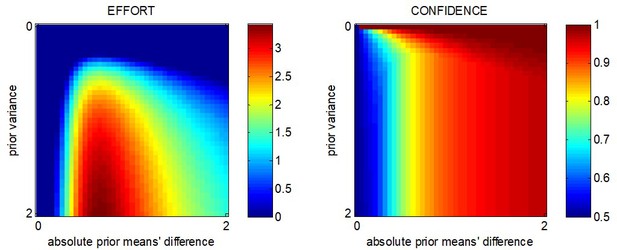
The β-effect: MCD-optimal effort and confidence when effort has no impact on the value difference.
MCD-optimal effort (left) and confidence (right) are shown as a function of the absolute prior mean difference (x-axis) and prior variance (y-axis).
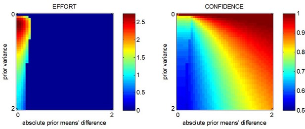
The γ-effect: MCD-optimal effort and confidence when effort has no impact on value precision.
Same format as Appendix 1—figure 2.
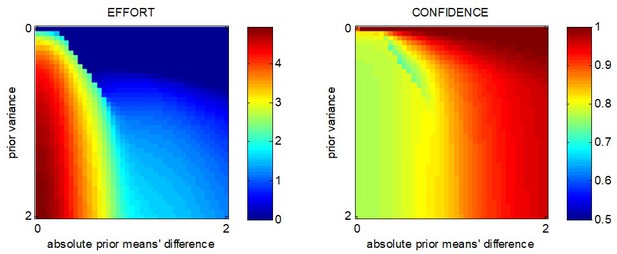
MCD-optimal effort and confidence when both types of effort efficacy are operant.
Same format as Appendix 1—figure 2.
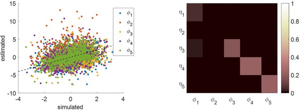
Comparison of simulated and estimated MCD parameters.
Left panel: estimated parameters (y-axis) are plotted against simulated parameters (x-axis). Each dot is a Monte-Carlo simulation and different colors indicate distinct parameters (blue: efficacy type #1, red: efficacy type #2, yellow: unknown weight of consequential choices on decision importance, violet: intrinsic cost of effort, green: unknown weight of penalized choices on effort cost). The black dotted line indicates the identity line (perfect estimation). Right panel: Parameter recovery matrix: each line shows the squared partial correlation coefficient between a given estimated parameter and each simulated parameter (across 1000 Monte-Carlo simulations). Diagonal elements of the recovery matrix measure ‘correct estimation variability’, i.e. variations in the estimated parameters that are due to variations in the corresponding simulated parameter. In contrast, non-diagonal elements of the recovery matrix measure ‘incorrect estimation variability’, that is, variations in the estimated parameters that are due to variations in other parameters. Perfect recovery would thus exhibit a diagonal structure, where variations in each estimated parameter are only due to variations in the corresponding simulated parameter. In contrast, strong non-diagonal elements in recovery matrices signal pairwise non-identifiability issues.
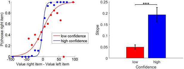
Relationship between choices, pre-choice value ratings, and choice confidence.
Left panel: the probability of choosing the item on the right (y-axis) is shown as a function of the pre-choice value difference (x-axis), for high- (blue) versus low- (red) confidence trials. The plain lines show the logistic prediction that would follow from group-averages of the corresponding slope estimates. Right panel: the corresponding logistic regression slope (y-axis) is shown for both high- (blue) and low- (red) confidence trials (group means ± s.e.m.).
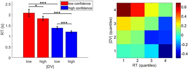
Relationship between pre-choice value ratings, choice confidence, and response times.
Left panel: response times (y-axis) are plotted as a function of low- and high- |ΔVR0| (x-axis) for both low- (red) and high- (blue) confidence trials. Error bars represent s.e.m. Right panel: A heatmap of mean z-scored confidence is shown as a function of both response time (x-axis) and |ΔVR0| (y-axis).
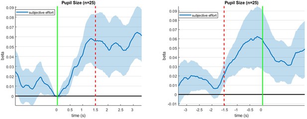
Correlation between pupil size and subjective effort ratings during decision time.
Left panel: Mean (± s.e.m.) correlation between pupil size and subjective effort (y-axis) is plotted as a function of peristimulus time (x-axis). Here, epochs are co-registered w.r.t. stimulus onset (the green line indicates stimulus onset and the red dotted line indicates the average choice response). Right panel: Same, but for epochs co-registered w.r.t. choice response (the green line indicates choice response and the red dotted line indicates the average stimulus onset).
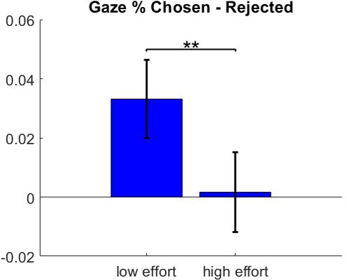
Gaze bias for low- and high-effort trials.
Mean (± s.e.m.) gaze bias is plotted for both low- (left) and high- (right) effort trials.
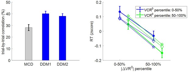
Accuracy of RT postdictions.
Left panel: The mean within-subject (across-trial) correlation between observed and postdicted RT data (y-axis) is plotted for each model (gray: MCD, blue: DDM1 and DDM2); error bars depict s.e.m. Right panel: Mean z-scored log-RT (y-axis) is shown as a function of |ΔVR0| (x-axis) and VCR0 (color code: blue = 0–50% lower quantile, green = 50–100% upper quantile); solid lines indicate empirical data (error bars represent s.e.m.), diamond-dashed lines represent DDM1 postdictions and star-dotted lines show DDM2 postdictions.
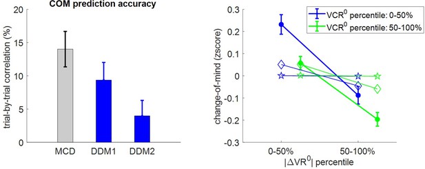
Accuracy of out-of-sample change of mind postdictions.
Same format as Appendix 1—figure 10.
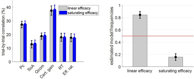
Comparisons of MCD model with linear and saturating γ-effects.
Left panel: The mean within-subject (across-trial) correlation between observed and postdicted data (y-axis) is plotted for dependent variable (x-axis, from left to right: choice confidence, spreading of alternatives, change of mind, certainty gain, RT and subjective effort ratings) and each model (gray: MCD with linear efficacy, blue: MCD with saturating efficacy); error bars depict s.e.m. Right panel: Estimated model frequencies from the random-effect group-level Bayesian model comparison; error bars depict posterior standard deviations.
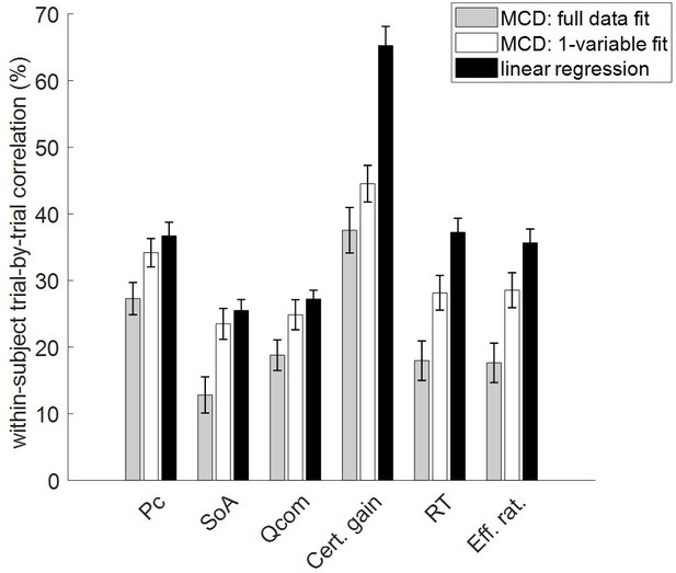
Comparisons of MCD and model-free postdiction accuracies.
The mean within-subject (across-trial) correlation between observed and postdicted data (y-axis) is plotted for each variable (x-axis, from left to right: choice confidence, spreading of alternatives, change of mind, certainty gain, RT, and subjective effort ratings), and each fitting procedure (gray: MCD full data fit, white: MCD 1-variable fit, and black: linear regression). Error bars depict standard error of the mean.
Additional files
-
Source data 1
Behavioral data.
- https://cdn.elifesciences.org/articles/63282/elife-63282-data1-v2.mat
-
Source code 1
Analysis code.
- https://cdn.elifesciences.org/articles/63282/elife-63282-code1-v2.zip
-
Transparent reporting form
- https://cdn.elifesciences.org/articles/63282/elife-63282-transrepform-v2.docx


