Mechanistic theory predicts the effects of temperature and humidity on inactivation of SARS-CoV-2 and other enveloped viruses
Figures
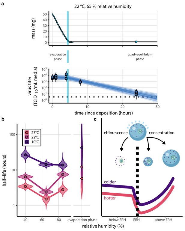
Inactivation kinetics and estimated half-life of SARS-CoV-2 on an inert surface as a function of temperature and relative humidity (RH).
(a) Example of medium evaporation and virus inactivation as a function of time since deposition; experiments at 22°C and 65% RH shown. Inactivation proceeds in two phases: an evaporation phase during which water mass is lost from the sample to evaporation and a quasi-equilibrium phase once the sample mass has plateaued. Light blue vertical line shows posterior median estimated time that quasi-equilibrium was reached. Top plot: medium evaporation. Dots show measured masses. Square shows measured final (quasi-equilibrium) mass; plotted at 24 hr for readability. Lines are 10 random draws from the posterior for the evaporation rate; horizontal section of line reflects the reaching of quasi-equilibrium (measured final mass). See figure supplements for all conditions. Bottom plot: virus inactivation. Points show posterior median estimated titers in log10 TCID50/mL for each sample; lines show 95% credible intervals. Black dotted line shows the approximate single-replicate limit of detection (LOD) of the assay: 100.5TCID50/mL media. Three samples collected at each time-point. Lines are 10 random draws per measurement from the posterior distribution for the inactivation rates, estimated by a simple regression model (see Materials and methods). (b) Measured virus half-lives. Violin plots show posterior distribution of estimated half-lives, plotted on a logarithmic scale. Dots show posterior median value. Color indicates temperature. Measurements at 40%, 65%, and 85% RH reflect decay kinetics once the deposited solution has reached quasi-equilibrium with the ambient air. Estimated half-lives for the evaporation phase that occurs prior to quasi-equilibrium are plotted to the right, since conditions during this phase are mainly dilute, and thus analogous to high RH quasi-equilibrium conditions. See figure supplements for plots showing the fit of the regression used to estimate half-lives to the titer data. (c) Schematic of hypothesized effects of temperature and relative humidity on duration of virus viability. Virus half-lives are longer at lower temperatures, regardless of humidity, because inactivation reaction kinetics proceed more slowly. Relative humidity affects virus half-life by determining quasi-equilibrium solute concentration in the droplet containing the virus. Above the efflorescence relative humidity (ERH), solutes are concentrated by evaporation. The lower the ambient humidity, the more water evaporates, the more concentration occurs, and the faster inactivation reactions proceed. Below the ERH, solutes effloresce, forming crystals. Half-lives are thus not particularly sensitive to changes in sub-ERH relative humidity, and half-lives even slightly below the ERH may be substantially longer than half-lives slightly above it.
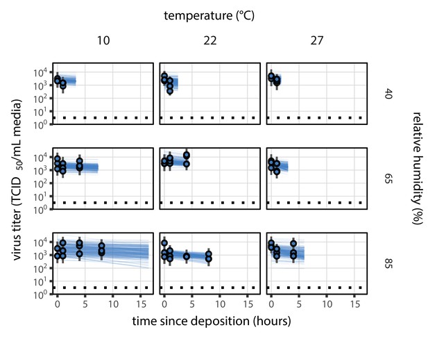
Fit of the regression model used to estimate the half-lives in b to evaporation phase (pre-drying) SARS-CoV-2 titer data.
Fit of the regression model used to estimate half-lives to evaporation phase (pre-drying) SARS-CoV-2 titer data, according to method described in Empirical virus decay estimation (see Equation 44). We model evaporation phase decay of infectious virus at temperature as exponential at a rate ; this decay rate can therefore be estimated by fitting a line to the time series of estimated log10 virus titers. Points show posterior median estimated titers in log10 TCID50/mL for each sample; lines show 95% credible intervals. Black dotted line shows the approximate single-replicate limit of detection (LOD) of the assay: 100.5 TCID50/mL media. Three samples collected at each time-point. x-axis shows time since sample deposition. Lines are truncated at the estimated time quasi-equilibrium was reached. Lines are random draws (10 per sample) from the joint posterior distribution of the initial sample virus concentration and the estimated decay rate; the distribution of lines gives an estimate of the uncertainty in the decay rate and the variability of the initial titer for each experiment.
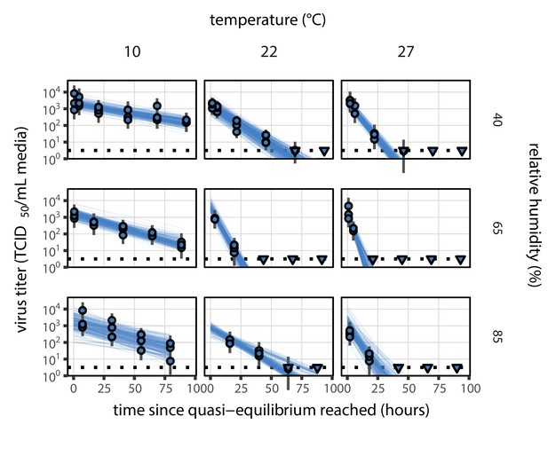
Fit of the regression model used to estimate the half-lives in b to quasi-equilibrium (post-drying) SARS-CoV-2 titer data.
Fit of the regression model used to estimate half-lives to quasi-equilibrium (post-drying) SARS-CoV-2 titer data, according to method described in Empirical virus decay estimation (see Equation 44). We model quasi-equilibrium decay of infectious virus in environmental condition as exponential at a rate ; this decay rate can therefore be estimated by fitting a line to the time series of estimated log10 virus titers. Points show posterior median estimated titers in log10 TCID50/mL for each sample; lines show 95% credible intervals. Time-points with no positive wells for any replicate are plotted as triangles at the approximate single-replicate limit of detection (LOD) of the assay—denoted by a black dotted line at 100.5 TCID50/mL media—to indicate that a range of sub-LOD values are plausible. Three samples collected at each time-point. x-axis shows time since quasi-equilibrium was reached, as measured in evaporation experiments. Lines are random draws (10 per sample) from the joint posterior distribution of the initial sample virus concentration and the estimated decay rate; the distribution of lines gives an estimate of the uncertainty in the decay rate and the variability of the initial titer for each experiment.
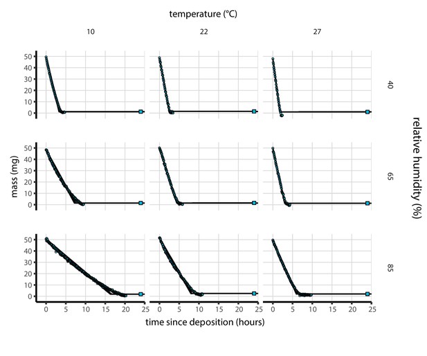
Results of medium evaporation experiments.
Evaporation of supplemented Dulbecco’s Modified Eagle Medium (DMEM) as a function of temperature and humidity. Dots show measured masses. Square shows measured final (quasi-equilibrium) mass; actual measurement times for final masses were upon removal of sample from chamber, but for readability they are plotted at 24 hr for all experiments. Lines are 100 random draws from the posterior distribution for the evaporation rate; horizontal section of line reflects the reaching of quasi-equilibrium (measured final mass). Transition point between evaporation phase and quasi-equilibrium phase inferred from data (see Modeling of medium evaporation and Evaporation model fitting). Note that final mass measurement is more accurate than time series measurements (see Materials and methods, Evaporation experiment).
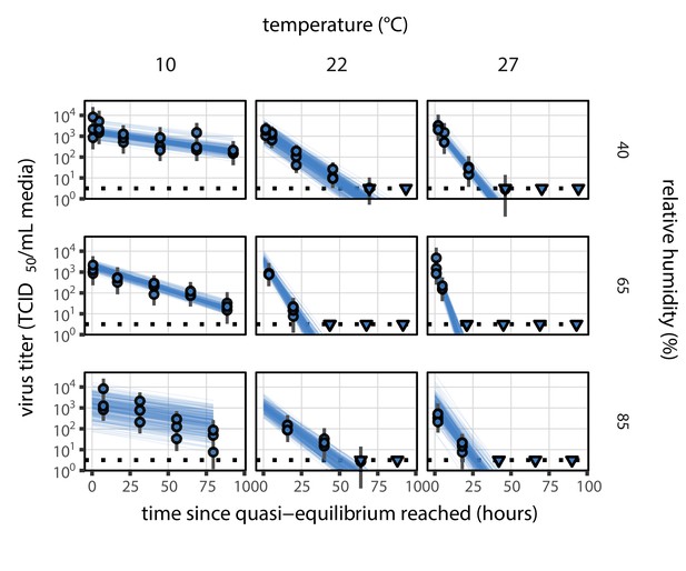
Estimated titers and main mechanistic model fit for SARS-CoV-2 stability on polypropylene at quasi-equilibrium.
Points show posterior median estimated titers in log10 TCID50/mL for each sample; lines show 95% credible intervals. Time-points with no positive wells for any replicate are plotted as triangles at the approximate single-replicate limit of detection (LOD) of the assay—denoted by a black dotted line at 100.5TCID50/mL media—to indicate that a range of sub-LOD values are plausible. Three samples collected at each time-point. x-axis shows time since quasi-equilibrium was reached, as measured in evaporation experiments. Lines are random draws (10 per sample) from the joint posterior distribution of the initial sample virus concentration and the mechanistic model predicted decay rate; the distribution of lines gives an estimate of the uncertainty in the decay rate and the variability of the initial titer for each experiment. See Figure 2—figure supplement 4 for a visualization of the mechanistic model fit using directly-measured concentration, rather with a curve estimating the humidity/concentration relationship.
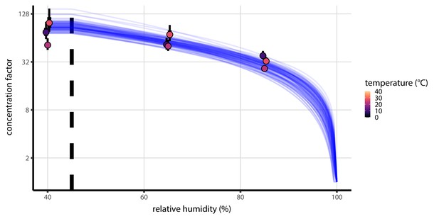
Fitted curve estimating the relationship between humidity and quasi-equilibrium concentration factor.
Fitted curve estimating concentration factor at quasi-equilibrium a function of relative humidity. Points show estimates for quasi-equilibrium concentration factor based on empirically measured masses from the evaporation experiments (Figure 1—figure supplement 3) and the estimated initial solute mass fraction. Estimates shown for each temperature (point color) and ambient RH (x-axis value). Vertical lines around the points show a 68% (thick) and 95% (thin) credible interval. Blue curves show model predictions for concentration factor given parameters , (see Solute concentration factor, Equation 12), and the initial solute mass fraction, all estimated jointly alongside mechanistic model parameters and evaporation rates. Each curve is an independent draw from the joint posterior distribution of the parameters, thus giving a sense of the distribution of possible curves; 100 curves plotted. Vertical dashed line shows the efflorescence relative humidity, 45%.
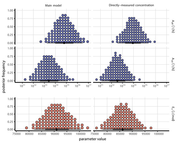
Mechanistic model parameter estimates, both with and without a fitted curve relating RH to concentration.
Posterior distributions for key mechanistic model parameters. Main model fit (with fitted curve relating RH to concentration factor) shown at left, directly-measured concentration factor model fit shown at right. Distributions are visualized as quantile dotplots (Kale et al., 2020); 100 representative dots are shown for each parameter. Black circle below shows posterior median, bars show 68% (thick) and 95% (thin) credible intervals. For and , parameter values are plotted on a logarithmic scale. See Appendix 1—table 1 and Appendix 1—table 2 for posterior medians and 95% credible intervals; see Code and data availability for code to reproduce full set of posterior samples.
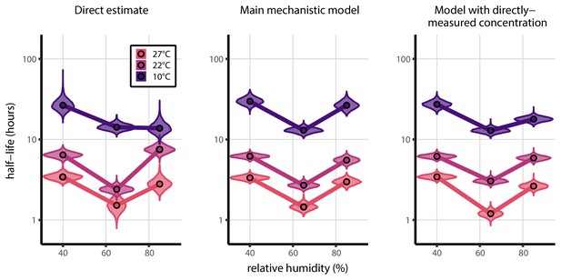
Comparison of directly-measured half-lives with those predicted by the mechanistic model, both with and without a fitted curve relating RH to concentration.
Comparison of directly-measured half-lives (left) with those predicted by the mechanistic model, either with a fitted curve relating RH to concentration (center), as in the main text, or using directly-measured concentration factors (right). Violin plots show posterior distribution of estimated half-lives, plotted on a logarithmic scale. Dots show posterior median value. Color indicates temperature. Measurements at 40%, 65%, and 85% RH reflect decay kinetics once the deposited solution has reached quasi-equilibrium with the ambient air.
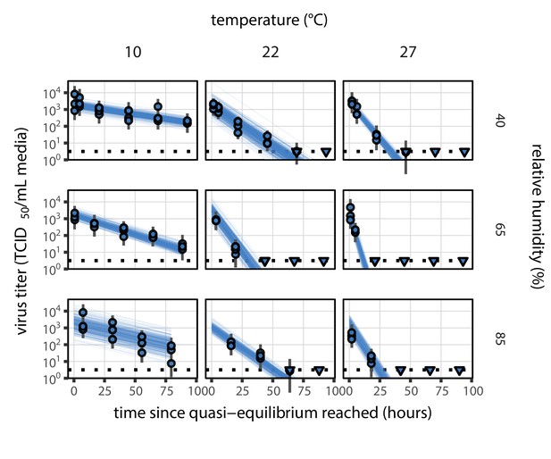
Equivalent quasi-equilibrium phase figure, but using directly-measured concentration factors rather than a fitted curve that relates RH to concentration.
Estimated titers and fit of the directly-measured concentration mechanistic model for SARS-CoV-2 stability on polypropylene at quasi-equilibrium (concentration factor taken from evaporation experiments, rather than from a fitted curve that relates RH to concentration). Points show posterior median estimated titers in log10 TCID50/mL for each sample; lines show 95% credible intervals. Time-points with no positive wells for any replicate are plotted as triangles at the approximate single-replicate limit of detection (LOD) of the assay—denoted by a black dotted line at 100.5 TCID50/mL media—to indicate that a range of sub-LOD values are plausible. Three samples collected at each time-point. x-axis shows time since quasi-equilibrium was reached, as measured in evaporation experiments. Lines are random draws (10 per sample) from the joint posterior distribution of the initial sample virus concentration and the mechanistic model predicted decay rate; the distribution of lines gives an estimate of the uncertainty in the decay rate and the variability of the initial titer for each experiment.
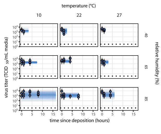
Equivalent main mechanistic model fit figure for the evaporation phase.
Estimated titers and main mechanistic model fit for SARS-CoV-2 stability on polypropylene during the evaporation phase. Points show posterior median estimated titers in log10 TCID50/mL for each sample; lines show 95% credible intervals. Black dotted line shows the approximate single-replicate limit of detection (LOD) of the assay: 100.5 TCID50/mL media. Three samples collected at each time-point. x-axis shows time since sample deposition. Lines are truncated at the estimated time quasi-equilibrium was reached. Lines are random draws (10 per sample) from the joint posterior distribution of the initial sample virus concentration and the mechanistic model predicted decay rate; the distribution of lines gives an estimate of the uncertainty in the decay rate and the variability of the initial titer for each experiment.
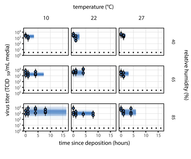
Evaporation phase figure, but using directly-measured concentration factors rather than a fitted curve that relates RH to concentration.
Estimated titers and fit of the directly-measured concentration mechanistic model for SARS-CoV-2 stability on polypropylene during the evaporation phase (concentration factor taken from evaporation experiments, rather than from a fitted curve that relates RH to concentration). Points show posterior median estimated titers in log10 TCID50/mL for each sample; lines show 95% credible intervals. Black dotted line shows the approximate single-replicate limit of detection (LOD) of the assay: 100.5 TCID50/mL media. Three samples collected at each time-point. x-axis shows time since sample deposition. Lines are truncated at the estimated time quasi-equilibrium was reached. Lines are random draws (10 per sample) from the joint posterior distribution of the initial sample virus concentration and the mechanistic model predicted decay rate; the distribution of lines gives an estimate of the uncertainty in the decay rate and the variability of the initial titer for each experiment.
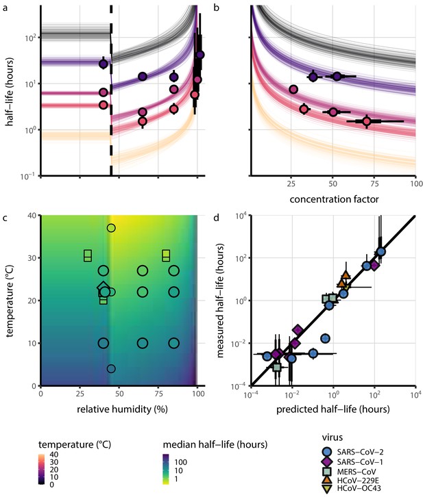
Extrapolation of human coronavirus half-life from the mechanistic model to unobserved temperatures and humidities and prediction of data from the literature.
(a) Predicted half-life as a function of relative humidity. Points show posterior median for measured half-lives, estimated without the mechanistic model (simple regression estimate for each temperature/humidity combination), lines show a 68% (thick) and 95% (thin) credible interval. Dashed line shows the ERH. Estimated evaporation phase half-lives are plotted at the right. Colored lines show predicted half-lives as a function of humidity at five temperatures: 0°C, 10°C, 22°C, 27°C, and 40°C. One hundred100 random draws from the posterior distribution are shown at each temperature to visualize uncertainty. Line and point colors indicate temperature. (b) Predicted half-life above the ERH as a function of quasi-equilibrium concentration factor. Points and lines as in a, but only solution (above ERH) conditions are shown. (c) Heatmap showing posterior median predicted half-lives as a function of temperature and relative humidity. Posterior median estimated half-lives for human coronaviruses from our study and from the literature plotted on top using the same color map (see also Appendix 1—table 3 and Figure 3—figure supplement 1). Shape indicates virus; measurements from our own group are shown slightly larger with a slightly thicker outline. Points of identical temperature and humidity are nudged slightly to avoid direct overplotting. (d) Relative within-study mechanistic model predictions (x-axis, see Appendix, Relative predictions) compared to simple regression measurements (y-axis) for human coronavirus half-lives. Points show posterior median for measured (horizontal) or predicted (vertical) half-lives and lines show a 68% (thick) and 95% (thin) credible interval. Shape indicates virus; datapoints come from studies in the literature for which there were measurements at at least two temperature and/or humidity conditions for the same virus and experimental material (e.g. plastic, steel, bulk medium).
-
Figure 3—source data 1
Predicted and measured half-lives (posterior medians and credible intervals) for within-study relative predictions shown in d.
- https://cdn.elifesciences.org/articles/65902/elife-65902-fig3-data1-v2.zip
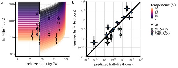
Absolute mechanistic model predictions compared simple regression estimates of half-lives, as in c, but plotted as in a and d.
Mechanistic model predictions compared to half-lives estimated directly from data via simple regression. All inactivation studies in which both temperature and relative humidity were reported are included. (a) Half-life as a function of relative humidity at different temperatures. Colored lines show predicted half-life as a function of relative humidity (x-axis value) and temperature (color) according to the main model fit. 100 random draws from the posterior distribution are plotted for each of 20 evenly spaced temperatures between 0 and 40°C. Gray line shows the efflorescence relative humidity (ERH) assumed in the model, 45%. Points show posterior median for measured half-lives for human coronaviruses. Measurements included come from this study (Table 1), from our meta-analysis of the literature (Appendix 1—table 3), and from SARS-CoV-1 and MERS-CoV data collected by our group (Appendix 1—table 4). (b) Half-lives predicted from the mechanistic model (x-axis) compared to independent estimates (y-axis), for the same observations plotted in a. In both panels, half-life estimates are simple regression estimates (i.e. no mechanistic model; fitting of independent exponential decay rates to each condition). Shape indicates virus; in a, measurements from our own group are shown slightly larger. Black lines show a 68% (thick) and 95% (thin) credible interval for posterior estimates. Note that three SARS-CoV-2 points from a particular study (Harbourt et al., 2020) show consistently longer-than-predicted half-lives, and all MERS-CoV points show shorter-than-predicted half-lives. In both instances, our mechanistic model makes accurate relative predictions for these data once calibrated to a reference half-life within the same study (Figure 3d). Taken together, this indicates that there can be experiment- and/or virus- specific effects on absolute half-lives while the general mechanism remains: hotter, more concentrated solutions produce faster virus inactivation.
-
Figure 3—figure supplement 1—source data 1
Predicted and measured half-lives (posterior medians and credible intervals) for absolute predictions shown in c and in Figure 3—figure supplement 1.
- https://cdn.elifesciences.org/articles/65902/elife-65902-fig3-figsupp1-data1-v2.zip
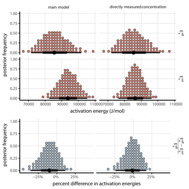
Posterior distributions for activation energies below () and above () the ERH, and the percentage difference between them , 4-parameter model version.
Main model fit shown at left, model fit with directly-measured concentration shown at right. Distributions are visualized as quantile dotplots (Kale et al., 2020); 100 representative dots are shown for each parameter. Black circle below shows posterior median, bars show 68% (thick) and 95% (thin) credible intervals.
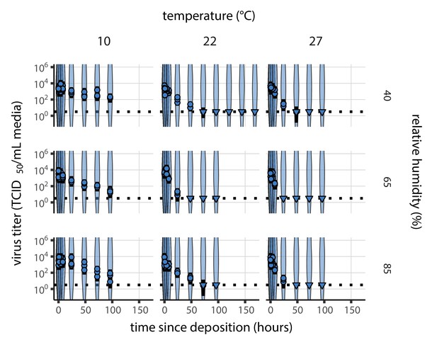
Prior predictive check for SARS-CoV-2 titer inference.
Violin plots show distribution of simulated titers sampled from the prior predictive distribution. Points show posterior median estimated titers in log10 TCID50/mL for each sample; lines show 95% credible intervals. Time-points with no positive wells for any replicate are plotted as triangles at the approximate single-replicate limit of detection (LOD) of the assay—denoted by a black dotted line at 100.5 TCID50/mL media—to indicate that a range of sub-LOD values are plausible. Three samples collected at each time-point. x-axis shows time since sample deposition. Wide coverage of violins relative to datapoints shows that priors are agnostic over the titer values of interest.
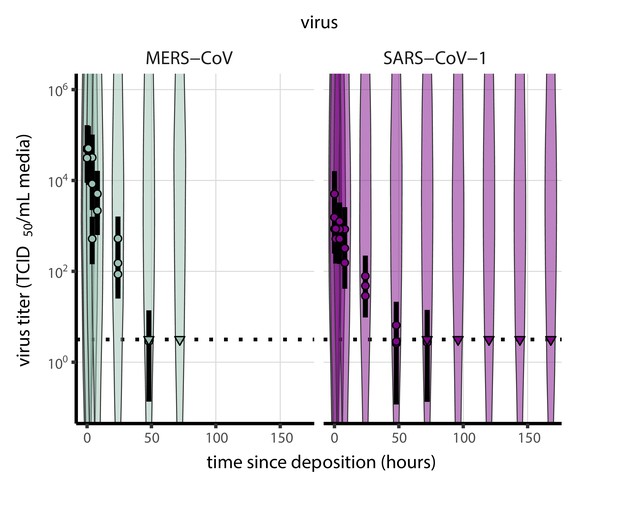
Prior predictive check for titer inference for SARS-CoV-1 and MERS-CoV.
Violin plots show distribution of simulated titers sampled from the prior predictive distribution. Points show posterior median estimated titers in log10 TCID50/mL for each sample; lines show 95% credible intervals. Time-points with no positive wells for any replicate are plotted as triangles at the approximate single-replicate limit of detection (LOD) of the assay—denoted by a black dotted line at 100.5 TCID50/mL media—to indicate that a range of sub-LOD values are plausible. Three samples collected at each time-point. x-axis shows time since sample deposition. Wide coverage of violins relative to datapoints shows that priors are agnostic over the titer values of interest.
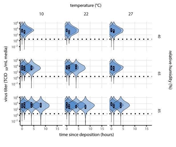
Prior predictive check for empirical virus decay during the evaporation phase for SARS-CoV-2.
Violin plots show distribution of simulated titers sampled from the prior predictive distribution. Points show posterior median estimated titers in log10 TCID50/mL for each sample; lines show 95% credible intervals. x-axis shows time since sample deposition. Black dotted line shows the single-replicate limit of detection of the assay: 100.5 TCID50/mL media. Wide coverage of violins relative to datapoints show that priors are agnostic over the titer values of interest, and that the priors regard both fast and slow decay rates as possible.
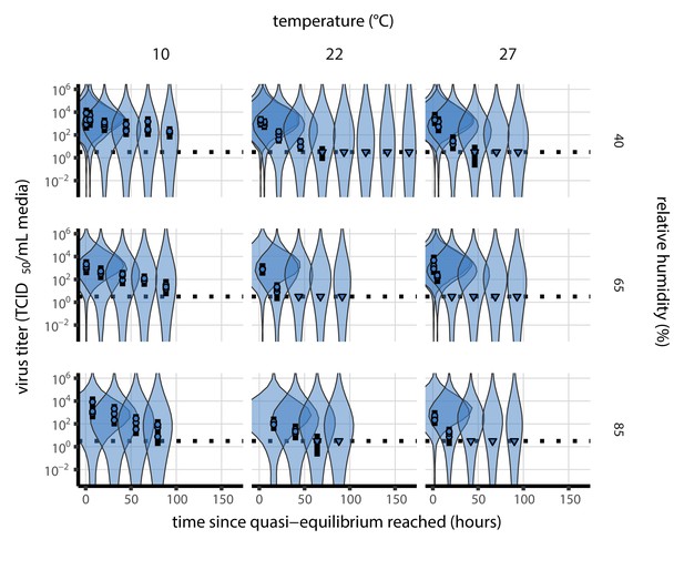
Prior predictive check for empirical virus decay at quasi-equilibrium for SARS-CoV-2.
Violin plots show distribution of simulated titers sampled from the prior predictive distribution. Points show posterior median estimated titers in log10 TCID50/mL for each sample; lines show 95% credible intervals. Time-points with no positive wells for any replicate are plotted as triangles at the approximate single-replicate limit of detection (LOD) of the assay—denoted by a black dotted line at 100.5 TCID50/mL media—to indicate that a range of sub-LOD values are plausible. Three samples collected at each time-point. x-axis shows time since quasi-equilibrium was reached, as measured in evaporation experiments. Wide coverage of violins relative to datapoints shows that priors are agnostic over the titer values of interest, and that the priors regard both fast and slow decay rates as possible.
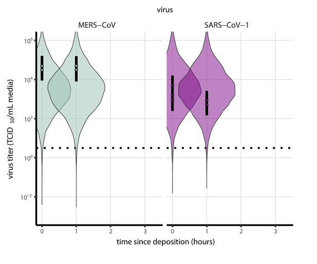
Prior predictive check for empirical virus decay during the evaporation phase for SARS-CoV-1 and MERS-CoV at 22°C and 40% relative humidity.
Violin plots show distribution of simulated titers sampled from the prior predictive distribution. Points show posterior median estimated titers in log10 TCID50/mL for each sample; lines show 95% credible intervals. Black dotted line shows the approximate single-replicate limit of detection (LOD) of the assay: 100.5 TCID50/mL media. Three samples collected at each time-point. x-axis shows time since sample deposition. Wide coverage of violins relative to datapoints shows that priors are agnostic over the titer values of interest, and that the priors regard both fast and slow decay rates as possible.
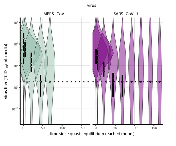
Prior predictive check for empirical virus decay at quasi-equilibrium for SARS-CoV-1 and MERS-CoV at 22°C and 40% relative humidity.
Violin plots show distribution of simulated titers sampled from the prior predictive distribution. Points show posterior median estimated titers in log10 TCID50/mL for each sample; lines show 95% credible intervals. Time-points with no positive wells for any replicate are plotted as triangles at the approximate single-replicate limit of detection (LOD) of the assay—denoted by a black dotted line at 100.5 TCID50/mL media—to indicate that a range of sub-LOD values are plausible. Three samples collected at each time-point. x-axis shows time since quasi-equilibrium was reached, as measured in evaporation experiments. Wide coverage of violins relative to datapoints shows that priors are agnostic over the titer values of interest, and that the priors regard both fast and slow decay rates as possible.
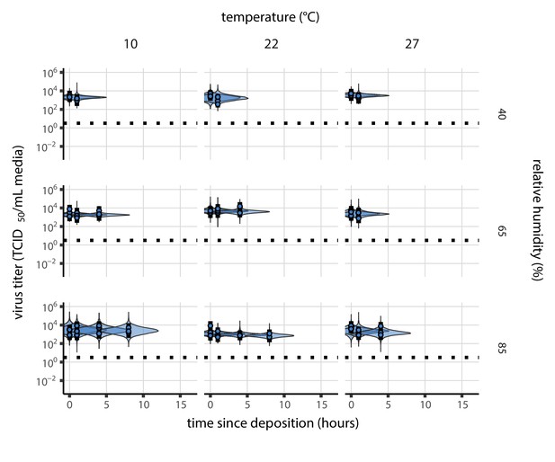
Posterior predictive check for empirical virus decay during the evaporation phase for SARS-CoV-2.
Violin plots show distribution of simulated titers sampled from the posterior predictive distribution. Points show posterior median estimated titers in log10 TCID50/mL for each sample; lines show 95% credible intervals. Black dotted line shows the approximate single-replicate limit of detection (LOD) of the assay: 100.5 TCID50/mL media. Three samples collected at each time-point. x-axis shows time since sample deposition. Tight correspondence between distribution of posterior simulated titers and independently estimated titers suggests the model fits the data well.
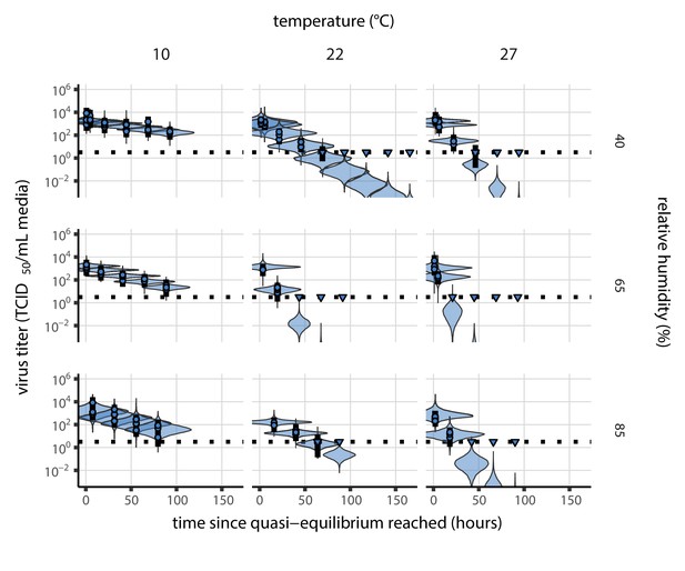
Posterior predictive check for empirical virus decay at quasi-equilibrium for SARS-CoV-2.
Violin plots show distribution of simulated titers sampled from the posterior predictive distribution. Points show posterior median estimated titers in log10 TCID50/mL for each sample; lines show 95% credible intervals. Time-points with no positive wells for any replicate are plotted as triangles at the approximate single-replicate limit of detection (LOD) of the assay—denoted by a black dotted line at 100.5 TCID50/mL media—to indicate that a range of sub-LOD values are plausible. Three samples collected at each time-point. x-axis shows time since quasi-equilibrium was reached, as measured in evaporation experiments. Tight correspondence between distribution of posterior simulated titers and independently estimated titers suggests the model fits the data well.
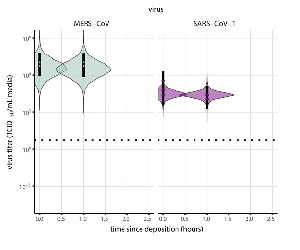
Posterior predictive check for empirical virus decay during the evaporation phase for SARS-CoV-1 and MERS-CoV at 22°C and 40% relative humidity.
Violin plots show distribution of simulated titers sampled from the posterior predictive distribution. Points show posterior median estimated titers in log10 TCID50/mL for each sample; lines show 95% credible intervals. Black dotted line shows the approximate single-replicate limit of detection (LOD) of the assay: 100.5 TCID50/mL media. Three samples collected at each time-point. x-axis shows time since sample deposition. Tight correspondence between distribution of posterior simulated titers and independently estimated titers suggests the model fits the data well.
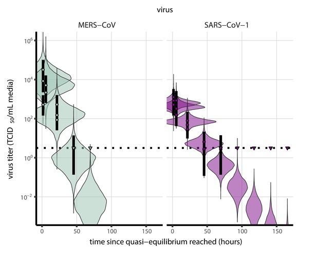
Posterior predictive check for empirical virus decay at quasi-equilibrium for SARS-CoV-1 and MERS-CoV at 22°C and 40% relative humidity.
Violin plots show distribution of simulated titers sampled from the posterior predictive distribution. Points show posterior median estimated titers in log10 TCID50/mL for each sample; lines show 95% credible intervals. Time-points with no positive wells for any replicate are plotted as triangles at the approximate single-replicate limit of detection (LOD) of the assay—denoted by a black dotted line at 100.5 TCID50/mL media—to indicate that a range of sub-LOD values are plausible. Three samples collected at each time-point. x-axis shows time since quasi-equilibrium was reached, as measured in evaporation experiments. Tight correspondence between distribution of posterior simulated titers and independently estimated titers suggests the model fits the data well.

Prior predictive check for main model fit during the evaporation phase.
Violin plots show distribution of simulated titers sampled from the prior predictive distribution. Points show posterior median estimated titers in log10 TCID50/mL for each sample; lines show 95% credible intervals. Black dotted line shows the approximate single-replicate limit of detection (LOD) of the assay: 100.5 TCID50/mL media. Three samples collected at each time-point. x-axis shows time since sample deposition. Wide coverage of violins relative to datapoints shows that priors are agnostic over the titer values of interest, and that the priors regard both fast and slow decay rates as possible.
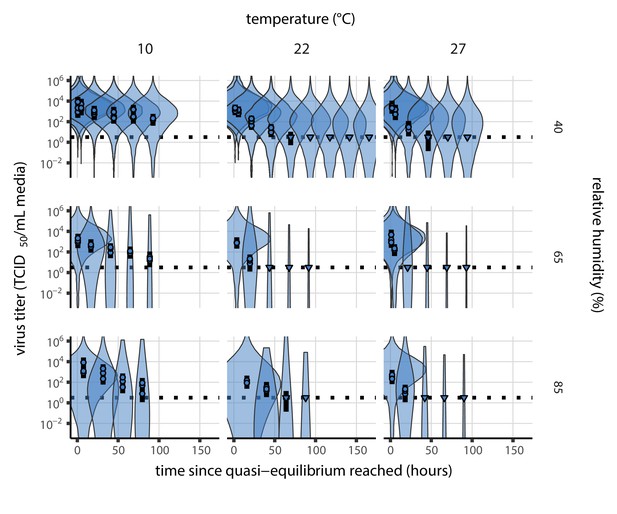
Prior predictive check for main model fit at quasi-equilibrium.
Violin plots show distribution of simulated titers sampled from the prior predictive distribution. Points show posterior median estimated titers in log10 TCID50/mL for each sample; lines show 95% credible intervals. Time-points with no positive wells for any replicate are plotted as triangles at the approximate single-replicate limit of detection (LOD) of the assay—denoted by a black dotted line at 100.5 TCID50/mL media—to indicate that a range of sub-LOD values are plausible. Three samples collected at each time-point. x-axis shows time since quasi-equilibrium was reached, as measured in evaporation experiments. Wide coverage of violins relative to datapoints shows that priors are agnostic over the titer values of interest, and that the priors regard both fast and slow decay rates as possible.
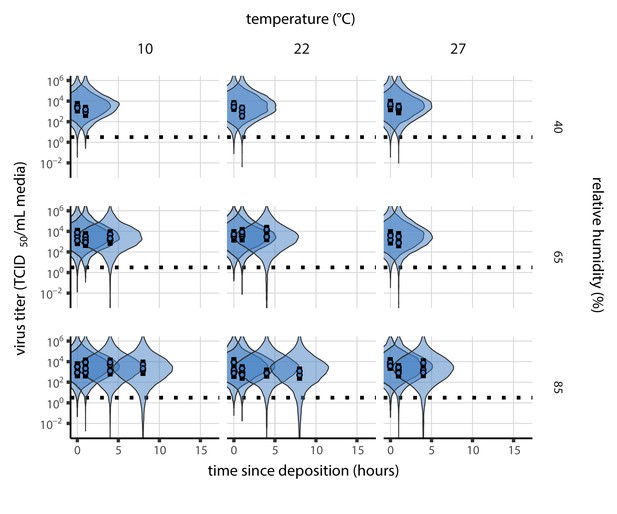
Prior predictive check for model fit using directly-measured concentration during the evaporation phase.
Violin plots show distribution of simulated titers sampled from the prior predictive distribution. Points show posterior median estimated titers in log10 TCID50/mL for each sample; lines show 95% credible intervals. Black dotted line shows the approximate single-replicate limit of detection (LOD) of the assay: 100.5 TCID50/mL media. Three samples collected at each time-point. x-axis shows time since sample deposition. Wide coverage of violins relative to datapoints shows that priors are agnostic over the titer values of interest, and that the priors regard both fast and slow decay rates as possible.
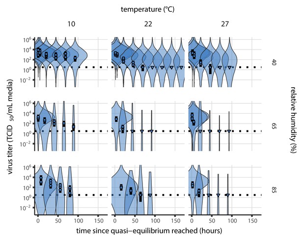
Prior predictive check for model fit using directly-measured concentration at quasi-equilibrium.
Violin plots show distribution of simulated titers sampled from the prior predictive distribution. Points show posterior median estimated titers in log10 TCID50/mL for each sample; lines show 95% credible intervals. Time-points with no positive wells for any replicate are plotted as triangles at the approximate single-replicate limit of detection (LOD) of the assay—denoted by a black dotted line at 100.5 TCID50/mL media—to indicate that a range of sub-LOD values are plausible. Three samples collected at each time-point. x-axis shows time since quasi-equilibrium was reached, as measured in evaporation experiments. Wide coverage of violins relative to datapoints shows that priors are agnostic over the titer values of interest, and that the priors regard both fast and slow decay rates as possible.
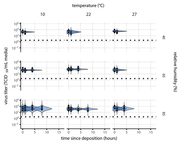
Posterior predictive check for main model fit during the evaporation phase.
Violin plots show distribution of simulated titers sampled from the posterior predictive distribution. Points show posterior median estimated titers in log10 TCID50/mL for each sample; lines show 95% credible intervals. Black dotted line shows the approximate single-replicate limit of detection (LOD) of the assay: 100.5 TCID50/mL media. Three samples collected at each time-point. x-axis shows time since sample deposition. Tight correspondence between distribution of posterior simulated titers and independently estimated titers suggests the model fits the data well.
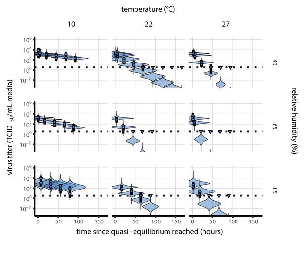
Posterior predictive check for main model fit at quasi-equilibrium.
Violin plots show distribution of simulated titers sampled from the posterior predictive distribution. Points show posterior median estimated titers in log10 TCID50/mL for each sample; lines show 95% credible intervals. Time-points with no positive wells for any replicate are plotted as triangles at the approximate single-replicate limit of detection (LOD) of the assay—denoted by a black dotted line at 100.5 TCID50/mL media—to indicate that a range of sub-LOD values are plausible. Three samples collected at each time-point. x-axis shows time since quasi-equilibrium was reached, as measured in evaporation experiments. Tight correspondence between distribution of posterior simulated titers and independently estimated titers suggests the model fits the data well.
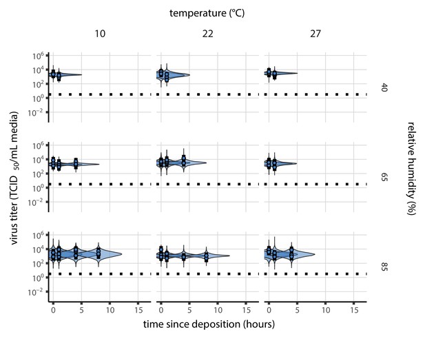
Posterior predictive check for model fit using directly-measured concentration during the evaporation phase.
Violin plots show distribution of simulated titers sampled from the posterior predictive distribution. Points show posterior median estimated titers in log10 TCID50/mL for each sample; lines show 95% credible intervals. Black dotted line shows the approximate single-replicate limit of detection (LOD) of the assay: 100.5 TCID50/mL media. Three samples collected at each time-point. x-axis shows time since sample deposition. Tight correspondence between distribution of posterior simulated titers and independently estimated titers suggests the model fits the data well.
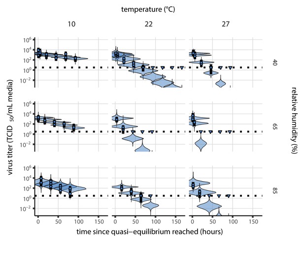
Posterior predictive check for model fit using directly-measured concentration at quasi-equilibrium.
Violin plots show distribution of simulated titers sampled from the posterior predictive distribution. Points show posterior median estimated titers in log10 TCID50/mL for each sample; lines show 95% credible intervals. Time-points with no positive wells for any replicate are plotted as triangles at the approximate single-replicate limit of detection (LOD) of the assay—denoted by a black dotted line at 100.5 TCID50/mL media—to indicate that a range of sub-LOD values are plausible. Three samples collected at each time-point. x-axis shows time since quasi-equilibrium was reached, as measured in evaporation experiments. Tight correspondence between distribution of posterior simulated titers and independently estimated titers suggests the model fits the data well.
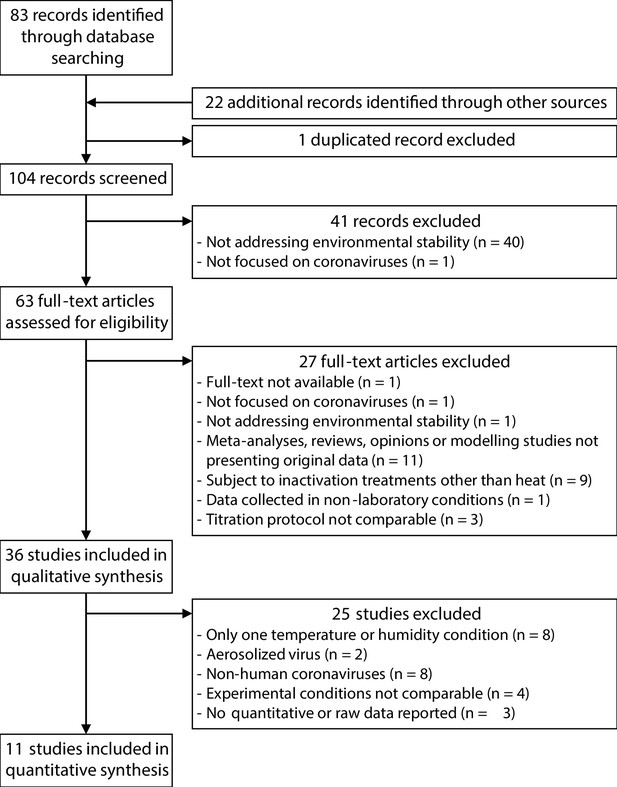
Selection process of the studies included in the meta-analysis of the effect of temperature and humidity on human coronaviruses.
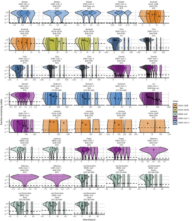
Prior predictive check for empirical coronavirus decay from literature data.
Violin plots show distribution of simulated fractions of virus remaining viable sampled from the prior predictive distribution. Points show estimated fraction remaining viable for each collected sample based on data extracted from the literature. Shape and color indicates virus. x-axis shows time since first available measure. Study author, virus, and experimental conditions—material, temperature, and relative humidity (RH)—indicated at the top of each panel. Black dotted line shows LOD for each experiment. Wide coverage of violins relative to datapoints shows that priors are agnostic over the values of interest, and that the priors regard both fast and slow decay rates as possible.
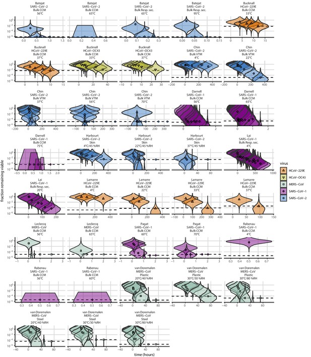
Posterior predictive check for empirical coronavirus decay from literature data.
Violin plots show distribution of simulated fractions of virus remaining viable sampled from the posterior predictive distribution. Points show estimated fraction remaining viable for each collected sample based on data extracted from the literature. Shape and color indicates virus. x-axis shows time since first available measure. Study author, virus, and experimental conditions—material, temperature, and relative humidity (RH)—indicated at the top of each panel. Black dotted line shows LOD for each experiment. Tight correspondence between distribution of posterior simulated titers and independently estimated titers suggests the model fits the data well.
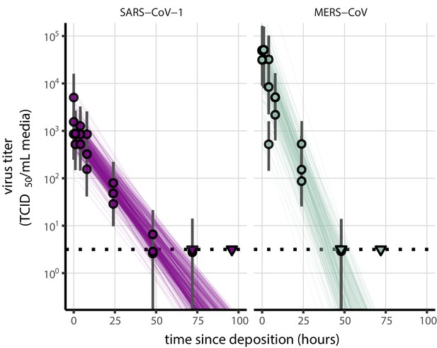
Fit of simple regression model to SARS-CoV-1 and MERS-CoV data.
Points show posterior median estimated titers in log10 TCID50/mL for each sample; lines show 95% credible intervals. Time-points with no positive wells for any replicate are plotted as triangles at the approximate single-replicate limit of detection (LOD) of the assay—denoted by a black dotted line at 100.5 TCID50/mL media—to indicate that a range of sub-LOD values are plausible. Three samples collected at each time-point. x-axis shows time since sample deposition. Lines are random draws (10 per sample) from the joint posterior distribution of the initial sample virus concentration and the estimated decay rate; the distribution of lines gives an estimate of the uncertainty in the decay rate and the variability of the initial titer for each experiment.
Tables
Estimated half-lives in hours of SARS-CoV-2 on polypropylene as a function of temperature (T) and relative humidity (RH).
Estimated half-lives are reported as posterior median and the middle 95% credible interval.
| T (°C) | RH (%) | Median half-life (h) | 2.5 % | 97.5 % | |
|---|---|---|---|---|---|
| Quasi-equilibrium phase | 10 | 40 | 26.55 | 20.28 | 38.75 |
| 10 | 65 | 14.22 | 12.17 | 17.16 | |
| 10 | 85 | 13.78 | 10.67 | 19.70 | |
| 22 | 40 | 6.43 | 5.52 | 7.56 | |
| 22 | 65 | 2.41 | 2.03 | 2.88 | |
| 22 | 85 | 7.50 | 6.22 | 9.24 | |
| 27 | 40 | 3.43 | 2.91 | 4.12 | |
| 27 | 65 | 1.52 | 1.05 | 2.14 | |
| 27 | 85 | 2.79 | 2.12 | 3.78 | |
| Evaporation phase | 10 | 42.08 | 10.97 | 334.34 | |
| 22 | 12.18 | 4.47 | 163.58 | ||
| 27 | 5.76 | 2.14 | 125.85 |
Parameter estimates for the mechanistic model of SARS-CoV-2 inactivation as a function of temperature and humidity, using a fitted curve relating RH to concentration factor, as in the main text.
Estimates are reported as posterior median and the middle 95% credible interval.
| Parameter | Median | 2.5 % | 97.5 % | Unit |
|---|---|---|---|---|
| 6.15 × 10¹⁴ | 1.64 × 10¹³ | 3.02 × 10¹⁶ | ||
| 2.51 × 10¹³ | 6.31 × 10¹¹ | 1.34 × 10¹⁵ | ||
| 9.10 × 10⁴ | 8.21 × 10⁴ | 1.01 × 10⁵ |
Parameter estimates for the mechanistic model of SARS-CoV-2 inactivation as a function of temperature and humidity, using concentration factors directly-measured in evaporation experiments.
Estimates are reported as posterior median and the middle 95% credible interval.
| Parameter | Median | 2.5 % | 97.5 % | Unit |
|---|---|---|---|---|
| 8.70 × 10¹³ | 3.48 × 10¹² | 2.31 × 10¹⁵ | ||
| 3.43 × 10¹² | 1.27 × 10¹¹ | 9.64 × 10¹³ | ||
| 8.62 × 10⁴ | 7.82 × 10⁴ | 9.42 × 10⁴ |
Estimated half-lives in hours for data from the literature, as a function of material, temperature (T), and relative humidity (RH).
Estimated half-lives are reported as posterior median and the middle 95% credible interval. CCM: cell culture medium; VTM: virus transport medium; Resp. sec.: respiratory secretions.
| Study | Virus | Material | T (°C) | RH (%) | Median half-life (h) | 2.5 % | 97.5 % |
|---|---|---|---|---|---|---|---|
| Harbourt et al., 2020 | SARS-CoV-2 | Skin | 4 | 45 | 4.18 × 101 | 2.59 × 101 | 1.42 × 10² |
| Lamarre and Talbot, 1989 | HCoV-229E | Bulk CCM | 4 | 1.87 × 10² | 4.96 × 101 | 8.55 × 10³ | |
| Rabenau et al., 2005 | SARS-CoV-1 | Bulk CCM | 4 | 1.15 | 1.10 × 10⁻¹ | 8.63 × 10² | |
| Lai et al., 2005 | SARS-CoV-1 | Bulk Resp. sec. | 4 | 4.42 × 101 | 3.63 × 101 | 5.74 × 101 | |
| Chin et al., 2020 | SARS-CoV-2 | Bulk VTM | 4 | 1.96 × 10² | 5.46 × 101 | 1.06 × 10⁴ | |
| van Doremalen et al., 2013 | MERS-CoV | Plastic | 20 | 40 | 1.55 | 1.08 | 2.44 |
| van Doremalen et al., 2013 | MERS-CoV | Steel | 20 | 40 | 3.16 | 2.29 | 4.77 |
| Lai et al., 2005 | SARS-CoV-1 | Bulk Resp. sec. | 20 | 1.10 × 101 | 8.38 | 1.61 × 101 | |
| Harbourt et al., 2020 | SARS-CoV-2 | Skin | 22 | 45 | 3.75 | 2.07 | 8.06 |
| Lamarre and Talbot, 1989 | HCoV-229E | Bulk CCM | 22 | 1.52 × 101 | 8.83 | 2.57 × 101 | |
| Chin et al., 2020 | SARS-CoV-2 | Bulk VTM | 22 | 1.84 × 101 | 1.34 × 101 | 2.64 × 101 | |
| van Doremalen et al., 2013 | MERS-CoV | Plastic | 30 | 30 | 1.18 | 6.27 × 10⁻¹ | 2.34 |
| van Doremalen et al., 2013 | MERS-CoV | Steel | 30 | 30 | 1.31 | 7.19 × 10⁻¹ | 2.60 |
| van Doremalen et al., 2013 | MERS-CoV | Plastic | 30 | 80 | 9.66 × 10⁻¹ | 5.56 × 10⁻¹ | 1.78 |
| van Doremalen et al., 2013 | MERS-CoV | Steel | 30 | 80 | 5.74 × 10⁻¹ | 3.99 × 10⁻¹ | 9.69 × 10⁻¹ |
| Bucknall et al., 1972 | HCoV-229E | Bulk CCM | 33 | 1.61 | 1.00 | 3.85 | |
| Bucknall et al., 1972 | HCoV-OC43 | Bulk CCM | 33 | 6.55 | 3.72 | 7.08 × 101 | |
| Lamarre and Talbot, 1989 | HCoV-229E | Bulk CCM | 33 | 1.43 × 101 | 8.55 | 2.29 × 101 | |
| Harbourt et al., 2020 | SARS-CoV-2 | Skin | 37 | 45 | 5.96 × 10⁻¹ | 3.37 × 10⁻¹ | 1.32 |
| Bucknall et al., 1972 | HCoV-229E | Bulk CCM | 37 | 1.04 | 6.60 × 10⁻¹ | 2.19 | |
| Bucknall et al., 1972 | HCoV-OC43 | Bulk CCM | 37 | 4.22 | 2.30 | 6.53 × 101 | |
| Lamarre and Talbot, 1989 | HCoV-229E | Bulk CCM | 37 | 5.73 | 2.89 | 1.11 × 101 | |
| Chin et al., 2020 | SARS-CoV-2 | Bulk VTM | 37 | 2.09 | 1.48 | 3.12 | |
| Batéjat et al., 2021 | SARS-CoV-2 | Bulk CCM | 56 | 2.25 × 10⁻² | 1.65 × 10⁻² | 2.80 × 10⁻² | |
| Darnell et al., 2004 | SARS-CoV-1 | Bulk CCM | 56 | 4.49 × 10⁻² | 3.45 × 10⁻² | 6.34 × 10⁻² | |
| Leclercq et al., 2014 | MERS-CoV | Bulk CCM | 56 | 4.32 × 10⁻³ | 1.27 × 10⁻³ | 1.52 × 10⁻² | |
| Rabenau et al., 2005 | SARS-CoV-1 | Bulk CCM | 56 | 3.08 × 10⁻³ | 1.08 × 10⁻⁵ | 2.63 × 10⁻² | |
| Chin et al., 2020 | SARS-CoV-2 | Bulk VTM | 56 | 1.64 × 10⁻² | 1.07 × 10⁻² | 2.89 × 10⁻² | |
| Pagat et al., 2007 | SARS-CoV-1 | Bulk CCM | 60 | 3.49 × 10⁻² | 2.61 × 10⁻² | 5.06 × 10⁻² | |
| Rabenau et al., 2005 | SARS-CoV-1 | Bulk CCM | 60 | 3.16 × 10⁻³ | 9.01 × 10⁻⁶ | 2.63 × 10⁻² | |
| Batéjat et al., 2021 | SARS-CoV-2 | Bulk CCM | 65 | 1.86 × 10⁻³ | 7.62 × 10⁻⁶ | 1.17 × 10⁻² | |
| Darnell et al., 2004 | SARS-CoV-1 | Bulk CCM | 65 | 4.14 × 10⁻² | 3.08 × 10⁻² | 6.21 × 10⁻² | |
| Leclercq et al., 2014 | MERS-CoV | Bulk CCM | 65 | 7.35 × 10⁻⁴ | 5.15 × 10⁻⁴ | 1.42 × 10⁻³ | |
| Batéjat et al., 2021 | SARS-CoV-2 | Bulk Resp. sec. | 65 | 8.36 × 10⁻³ | 5.95 × 10⁻³ | 1.16 × 10⁻² | |
| Pagat et al., 2007 | SARS-CoV-1 | Bulk CCM | 70 | 9.79 × 10⁻³ | 7.72 × 10⁻³ | 1.38 × 10⁻² | |
| Chin et al., 2020 | SARS-CoV-2 | Bulk VTM | 70 | 3.28 × 10⁻³ | 1.69 × 10⁻³ | 6.10 × 10⁻³ | |
| Darnell et al., 2004 | SARS-CoV-1 | Bulk CCM | 75 | 2.31 × 10⁻³ | 8.88 × 10⁻⁶ | 2.10 × 10⁻² | |
| Batéjat et al., 2021 | SARS-CoV-2 | Bulk Resp. sec. | 95 | 2.41 × 10⁻³ | 1.62 × 10⁻³ | 3.62 × 10⁻³ |
Estimated half-lives in hours of SARS-CoV-1 and MERS-CoV on polypropylene as a function of temperature (T) and relative humidity (RH).
Estimated half-lives are reported as posterior median and the middle 95% credible interval.
| T (°C) | RH (%) | Virus | Median half-life (h) | 2.5 % | 97.5 % | |
|---|---|---|---|---|---|---|
| Quasi-equilibrium phase | 22 | 40 | SARS-CoV-1 | 6.42 | 5.22 | 7.92 |
| 22 | 40 | MERS-CoV | 3.16 | 2.53 | 3.97 | |
| Evaporation phase | 22 | SARS-CoV-1 | 11.55 | 1.43 | 207.68 | |
| 22 | MERS-CoV | 13.18 | 1.09 | 217.34 |


