Early lock-in of structured and specialised information flows during neural development
Figures
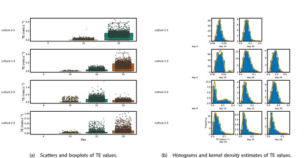
Plots of the distributions of estimated transfer entropy (TE) values in the recordings analysed in this study.
(a) Scatters of the TE values are overlaid on box plots. The box plots show the quartiles and the median (values greater than 10 SDs from the mean have been removed from both the box and scatter plots as outliers). (b) Density estimates of the nonzero (statistically significant) TE distribution on top of a histogram. The densities are estimated using a Gaussian kernel. The histogram bin width and kernel histogram are both 10% of the data range. Recordings with fewer than 10 statistically significant TE values are excluded.
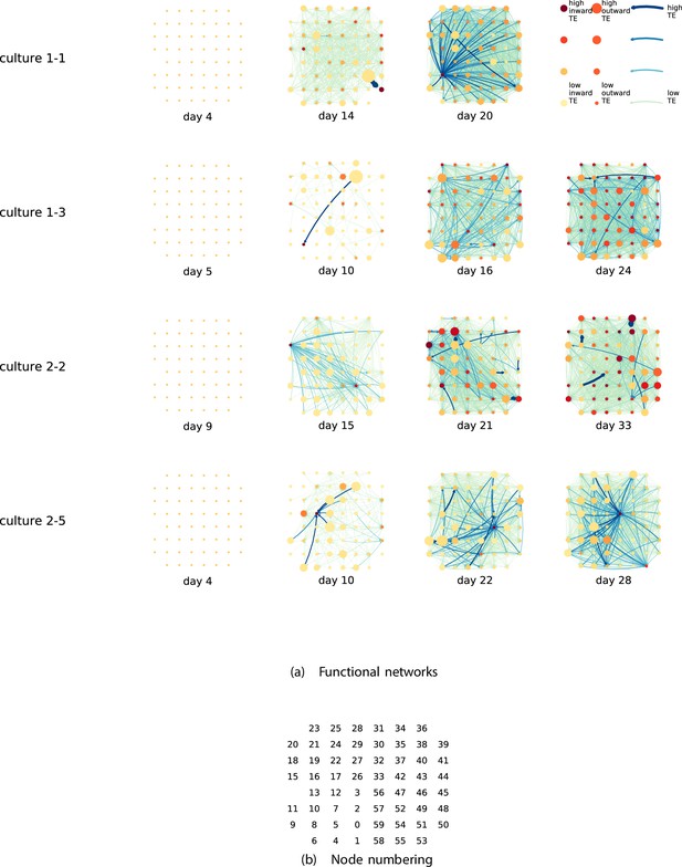
Functional networks overlaid on the spatial layout of the electrodes.
(a) The directed functional networks implied by the estimated transfer entropy (TE) values. Each node represents an electrode in the original experimental setup. The nodes are spatially laid out according to their position in the recording array. An edge is present between nodes if there is a statistically significant information flow between them. The edge weight and colour are indicative of the amount of information flowing between electrodes (see the legend). The scaling of this weight and colour is done relative to the mean and variance of the information flow in each recording separately. The size and colour of the nodes are assigned relative to the total outgoing and incoming information flow on the node, respectively. As with the edge colour and size, this is done relative to the distribution of these values in each recording separately. (b) The spatial layout of the nodes. The numbering is identical to that used in the documentation of the open dataset studied in this work (Wagenaar et al., 2006b; Network, 2021).
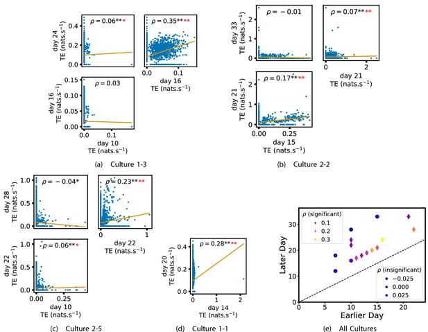
Plots investigating the relationship between the information flow on a given source-target pair over different days of development.
(a–d) show scatter plots between all pairs of days for each culture (excluding days with less than 10 significant transfer entropy [TE] values). Specifically, in each scatter plot, the value of a given point is the TE on the associated edge on an earlier day and the value of that same point is the TE on the same edge but on a later day. The days in question are shown on the bottom and sides of the grids of scatter plots. The orange line shows the ordinary least-squares regression. The Spearman correlation () between the TE values on the two days is displayed in each plot. Values of significant at the 0.05 level are designated with an asterisk and those significant at the 0.01 level are designated with a double asterisk. Red asterisks are used to denote significance after performing a Bonferroni correction for multiple comparisons. (e) shows all recording day pairs for all cultures (where the pairs are always from the same culture) and the associated Spearman correlation between the TE on the edges across this pair of recording days. Diamonds indicate significance at , with Bonferroni correction.
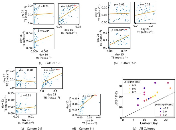
Plots investigating the relationship between the outward information flow from a given node over different days of development.
(a–d) show scatter plots between all pairs of days for each culture (excluding days with less than 10 significant transfer entropy [TE] values). Specifically, in each scatter plot, the value of a given point is the average outgoing TE from the associated node on an earlier day and the value of that same point is the total outgoing TE from the same node but on a later day. The days in question are shown on the bottom and sides of the grids of scatter plots. The orange line shows the ordinary least-squares regression. The Spearman correlation () between the outgoing TE values on the two days is displayed in each plot. Values of significant at the 0.05 level are designated with an asterisk and those significant at the 0.01 level are designated with a double asterisk. Red asterisks are used to denote significance after performing a Bonferroni correction for multiple comparisons. (e) shows all recording day pairs for all cultures (where the pairs are always from the same culture) and the associated Spearman correlation between the outward TEs of nodes across this pair of recording days. Diamonds indicate significance at , with Bonferroni correction.
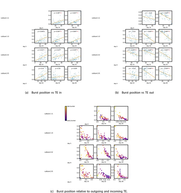
The relationship between the amount of incoming and outgoing local (in burst) transfer entropy (TE) on a given node and its average burst position.
(a) and (b) show the burst position of each node on the axis of each plot, plotted against either the total incoming (a) or outgoing (b) TE on the node. The Spearman correlation () between the mean burst position and the incoming or outgoing TE values is displayed in each plot. Values of significant at the 0.05 level are designated with an asterisk and those significant at the 0.01 level are designated with a double asterisk. Red asterisks are used to denote significance after performing a Bonferroni correction for multiple comparisons. (e) plots the outgoing TE on the axis and the incoming TE on the axis with the points coloured according to the mean burst position of the node: late bursters are coloured yellow and early bursters are purple.
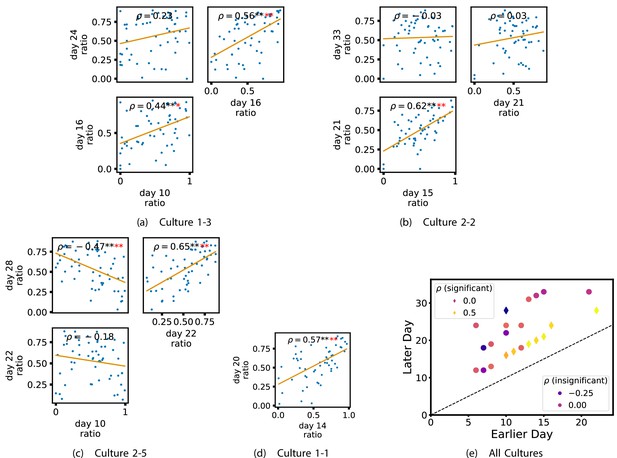
Plots investigating the relationship between the ratio of outward to total burst-local information flow from a given node over different days of development.
(a–d) show scatter plots between all pairs of days for each culture (excluding days with less than 10 significant burst-local transfer entropy [TE] values). Specifically, in each scatter plot, the value of a given point is the ratio of total outgoing burst-local TE on the associated node to the total burst-local TE on the same node on one day and the value of that same point is this same ratio on the same node but on a different day. The days in question are shown on the bottom and sides of the grids of scatter plots. The orange line shows the ordinary least-squares regression. The Spearman correlation () between the TE values on the two days is displayed in each plot. Values of significant at the 0.05 level are designated with an asterisk and those significant at the 0.01 level are designated with a double asterisk. Red asterisks are used to denote significance after performing a Bonferroni correction for multiple comparisons. (e) shows all recording day pairs for all cultures (where the pairs are always from the same culture) and the associated Spearman correlation between the outward TE of the nodes across this pair of recording days. Diamonds indicate significance at , with Bonferroni correction.
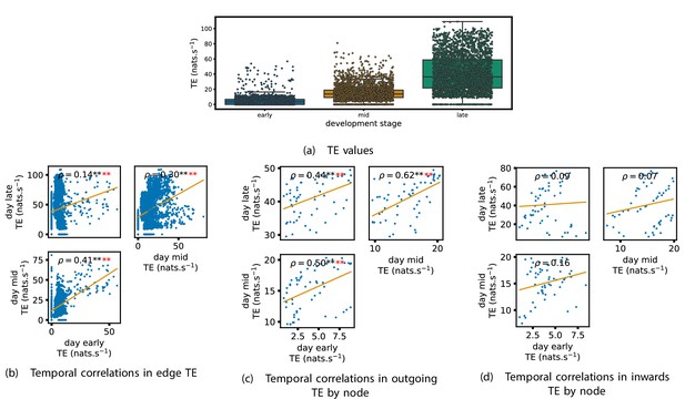
Equivalent plots to those shown in Figures 1, 3 and 4 and Appendix 2—figure 1, but for the simulated spiking network developing under spike-timing-dependent plasticity (STDP).
(a) shows scatters of the transfer entropy (TE) values overlaid on box plots. The box plots show the quartiles and the median (values greater than 10 SDs from the mean have been removed from both the box and scatter plots as outliers). It corresponds to Figure 1. (b –d) show scatter plots investigating the relationship between TE values (or derived summary statistics) over different stages of development. Specifically, in each scatter plot, the value of a given point is a TE value or derived statistic at an earlier simulation stage and the value of that same point is a TE value (or derived statistic) on the corresponding edge or node, but later in the simulation. The orange line shows the ordinary least-squares regression. The Spearman correlation () between the TE values on the two days is displayed in each plot. Values of significant at the 0.05 level are designated with an asterisk and those significant at the 0.01 level are designated with a double asterisk. Red asterisks are used to denote significance after performing a Bonferroni correction for multiple comparisons. (b) corresponds to the scatter plots in Figure 3, (c) corresponds to the scatter plots in Figure 4, and (d) corresponds to the scatter plots in Appendix 2—figure 1.
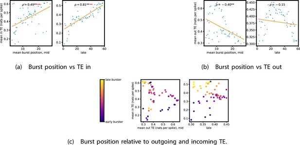
Equivalent plots to those shown in Figure 5, but for the simulated spiking network developing under spike-timing-dependent plasticity (STDP).
Plots show the relationship between the amount of incoming and outgoing local (in burst) transfer entropy (TE) on a given node and its average burst position. (a) and (b) show the burst position of each node on the axis of each plot, plotted against either (a) the total incoming or (b) outgoing TE on the node. The Spearman correlation () between the mean burst position and the incoming or outgoing TE values is displayed in each plot. Values of significant at the 0.05 level are designated with an asterisk and those significant at the 0.01 level are designated with a double asterisk. Red asterisks are used to denote significance after performing a Bonferroni correction for multiple comparisons. (c) plots the outgoing TE on the axis and the incoming TE on the axis with the points coloured according to the mean burst position of the node: late bursters are coloured yellow and early bursters are purple.
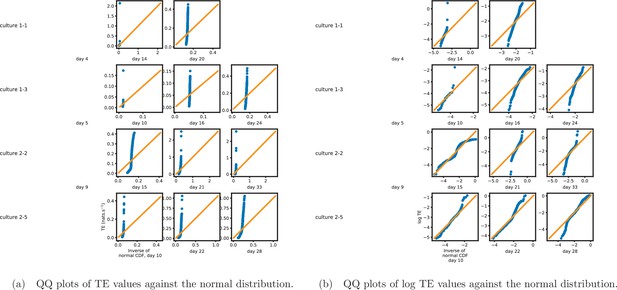
Quantile-quantile (QQ) plots (Gibbons and Chakraborti, 2020) of the nonzero estimated transfer entropy (TE) values against normal (a) and log-normal (b) distributions, respectively.
The axis shows estimated TE values (or their logarithm), whereas the axis shows the value of the normal distribution at the same quantile. The solid orange line shows the line . If the data is drawn from the distribution against which it is being plotted, then the blue marks will sit along this line. We observe that the distributions of TE values deviate substantially from both normal and log-normal distributions in all recordings analysed.
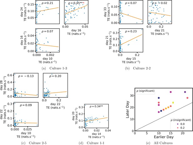
Plots investigating the relationship between the inward information flow from a given node over different days of development.
(a–d) show scatter plots between all pairs of days for each culture (excluding days with zero significant transfer entropy [TE] values). Specifically, in each scatter plot, the value of a given point is the average inward TE from the associated node on an earlier day and the value of that same point is the total outgoing TE from the same node but on a later day. The days in question are shown on the bottom and sides of the grids of scatter plots. The orange line shows the ordinary least squares regression. The Spearman correlation () between the outgoing TE values on the two days is displayed in each plot. Values of significant at the 0.05 level are designated with an asterisk and those significant at the 0.01 level are designated with a double asterisk. A Bonferroni correction for multiple comparisons was used. (e) shows all recording day pairs for all cultures (where the pairs are always from the same culture) and the associated Spearman correlation between the outward TEs of nodes across this pair of recording days. Diamonds indicate significance at , with Bonferroni correction.
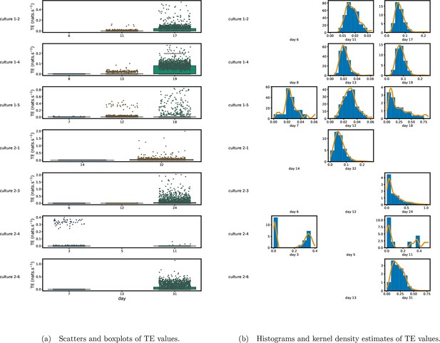
Identical plots to those shown in Figure 1, but showing the cultures left out of that plot for space considerations.
(a) Scatters of the TE values are overlaid on box plots. The box plots show the quartiles and the median (values greater than 10 standard deviationSDs from the mean have been removed from both the box and scatter plots as outliers). (b) Density estimates of the nonzero (statistically significant) TE distribution on top of a histogram. The densities are estimated using a Gaussian kernel. The histogram bin width and kernel histogram are both 10% of the data range. Recordings with fewer than 10 statistically significant TE values are excluded.
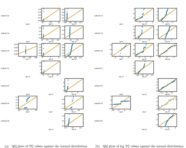
Identical plots to those shown in Appendix 2—figure 1, but for the additional cultures.
The axis shows estimated TE values (or their logarithm), whereas the axis shows the value of the normal distribution at the same quantile. The solid orange line shows the line . If the data is drawn from the distribution against which it is being plotted, then the blue marks will sit along this line. We observe that the distributions of TE values deviate substantially from both normal and log-normal distributions in all recordings analysed.
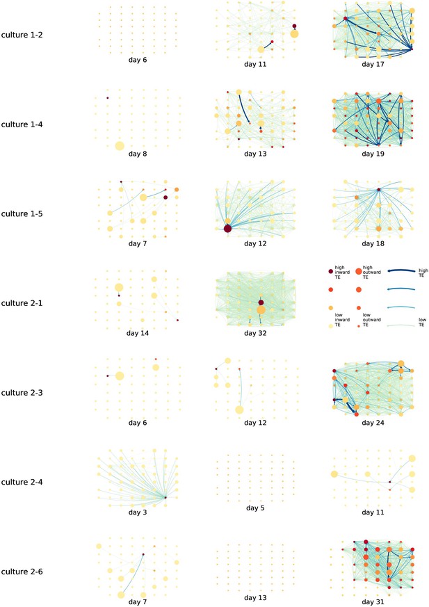
Identical plots to those in Figure 2, but for the additional cultures.
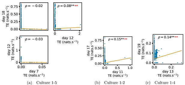
Identical plots to those in Figure 3, but for the additional cultures.
(a) Contains plots for culture 1-5, (b) contains plots for culture 1-2 and (c) contains plots for culture 1-4.
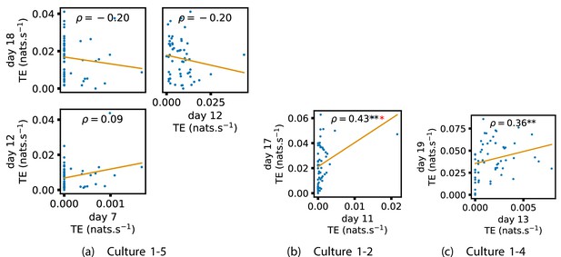
Identical plots to those in Figure 4, but for the additional cultures.
(a) Contains plots for culture 1-5, (b) contains plots for culture 1-2 and (c) contains plots for culture 1-4.
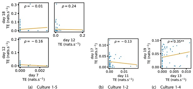
Identical plots to those in Appendix 2—figure 1, but for the additional cultures.
(a) Contains plots for culture 1-5. (b) Contains plots for culture 1-2. (c) Contains plots for culture 1-4.
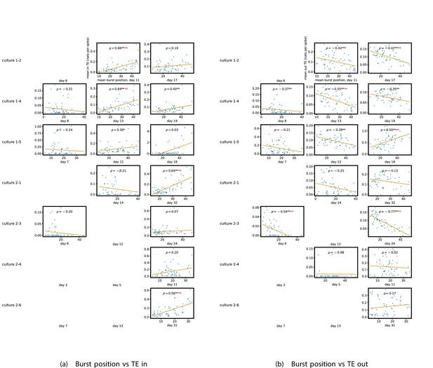
Identical plots to those in Figure 5a and b, but for the additional cultures.
(a) Plots the mean burst position against the total incoming TE. (b) Plots the mean burst position against the total outgoing TE.
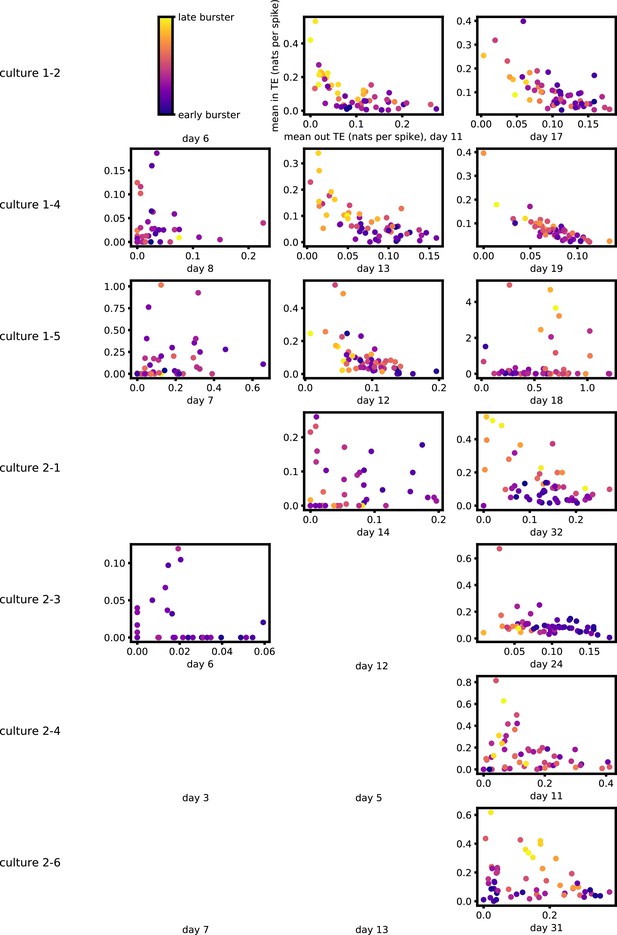
Identical plots to those in Figure 5c, but for the additional cultures.
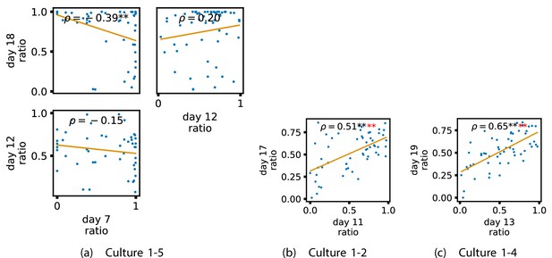
Identical plots to those in Figure 6, but for the additional cultures.
(a) Contains plots for culture 1-5. (b) Contains plots for culture 1-2. (c) Contains plots for culture 1-4.
Tables
Mean transfer entropy (TE) in nats per second between every source-target pair for each recording studied.
| Culture 1-1 | Day 4 | Day 14 | Day 20 | |
| 0 | 0.060 | 0.097 | ||
| Culture 1-3 | Day 5 | Day 10 | Day 16 | Day 24 |
| 0 | 2×10⁻⁴ | 0.017 | 0.098 | |
| Culture 2-2 | Day 9 | Day 15 | Day 21 | Day 33 |
| 0 | 0.015 | 0.11 | 0.057 | |
| Culture 2-5 | Day 4 | Day 10 | Day 22 | Day 28 |
| 0 | 2×10⁻³ | 0.037 | 0.082 |
The number of source-target pairs of electrodes with a statistically significant transfer entropy (TE) value between them for each recording studied.
This corresponds to the number of possible edges in the functional networks shown in Figure 2. As the electrode arrays used to record the data had 59 electrodes, the total number of unique ordered pairs of electrodes (and, therefore, the number of possible edges) is 3422.
| Culture 1-1 | Day 4 | Day 14 | Day 20 | |
| 0 | 607 | 2166 | ||
| Culture 1-3 | Day 5 | Day 10 | Day 16 | Day 24 |
| 0 | 44 | 999 | 1902 | |
| Culture 2-2 | Day 9 | Day 15 | Day 21 | Day 33 |
| 0 | 371 | 1409 | 1386 | |
| Culture 2-5 | Day 4 | Day 10 | Day 22 | Day 28 |
| 0 | 185 | 975 | 1263 |
Summary of significance values for the lock-in results.
Each table cell shows the number of relationships that were found to be significant at the level, out of the total number of relationships tested. Note that relationships were only tested in cases where both recordings in the pair had at least 10 significant transfer entropy (TE) values. A hypothesis test is conducted against the null hypothesis that the original p-values that produced these results were uniformly distributed between 0 and 1 (giving a 0.05 chance of a significant result). * indicates that this probability is less than 0.05. ** indicates that the probability of the observed number of significant results has probability less than 0.001 under this null hypothesis, with a Bonferroni correction for multiple comparisons. The first row summarises the significance values for the value of the TE on the edges, shown in Figure 3 and Appendix 3—figure 4. The second and third rows summarise the significance values for the mean outward and inward TE on each node, shown in Figure 4 and Appendix 3—figure 5 as well as Appendix 2—figure 1 and Appendix 3—figure 6, respectively. The final row summarises the significance values for the ratio of inward to outward burst-local TE, shown in Figure 6 and Appendix 3—figure 9. The columns which restrict the analysis to bursting recordings exclude the final recording of culture 1-5, as this culture ceased bursting, after having previously been bursty (Wagenaar et al., 2006b).
| All cultures, final pair | All cultures, final pair or post day 15 | Bursting, final pair | Bursting, final pair or post day 15 | |
|---|---|---|---|---|
| Edge | 7/7** | 8/9** | 6/6** | 7/8** |
| Out | 5/7** | 6/9** | 5/6** | 6/8** |
| In | 3/7* | 3/9* | 3/6* | 3/8* |
| Burst-local ratios | 5/7** | 6/9** | 5/6** | 6/8** |
Summary of significance values for the results relating to computational roles.
Each table cell shows the number of relationships that were found to be significant at the level, out of the total number of relationships tested. A hypothesis test is conducted against the null hypothesis that the original p-values that produced these results were uniformly distributed between 0 and 1 (giving a 0.05 chance of a significant result). ** indicates that the probability of the observed number of significant results has probability less than 0.001 under this null hypothesis, with a Bonferroni correction for multiple comparisons. The first row summarises the significance values for the relationships between inward burst-local TE and burst position, as shown in Figure 5 and Appendix 3—figure 7. The second row summarises the significance values for the relationships between outward burst-local TE and burst position, as shown in Figure 5 and Appendix 3—figure 7.
| All cultures, final day | All cultures post day 15 | Bursting, final day | Bursting, post day 15 | |
|---|---|---|---|---|
| In | 7/11** | 10/15** | 7/10** | 10/14** |
| Out | 7/11** | 11/15** | 7/10** | 11/14** |
File numbers used for each culture on each day.
These correspond to the file numbering used in the freely available dataset used in this study, provided by Wagenaar et al., 2006b; Network, 2021.
| Culture 1-1 | Day 4 | Day 14 | Day 20 | |
| 2 | 2 | 2 | ||
| Culture 1-2 | Day 6 | Day 11 | Day 17 | |
| 2 | 2 | 2 | ||
| Culture 1-3 | Day 5 | Day 10 | Day 16 | Day 24 |
| 2 | 2 | 2 | 2 | |
| Culture 1-4 | Day 8 | Day 13 | Day 19 | |
| 2 | 2 | 2 | ||
| Culture 1-5 | Day 7 | Day 12 | Day 18 | |
| 2 | 2 | 2 | ||
| Culture 2-1 | Day 14 | Day 32 | ||
| 2 | 2 | |||
| Culture 2-2 | Day 9 | Day 15 | Day 21 | Day 33 |
| 2 | 2 | 2 | 2 | |
| Culture 2-3 | Day 6 | Day 12 | Day 24 | |
| 2 | 2 | 2 | ||
| Culture 2-4 | Day 3 | Day 5 | Day 11 | |
| 1 | 1 | 1 | ||
| Culture 2-5 | Day 4 | Day 10 | Day 22 | Day 28 |
| 1 | 1 | 2 | 1 | |
| Culture 2-6 | Day 7 | Day 13 | Day 31 | |
| 1 | 1 | 1 |
The parameter values used in the continuous-time transfer entropy (TE) estimator.
A complete description of these parameters, along with analysis and discussion of their effects, can be found in Shorten et al., 2021.
| Parameter | Description | Value |
|---|---|---|
| Number of spikes in the target spike train | Varied (see text) | |
| Number of interspike intervals in target history embeddings | 4 | |
| Number of interspike intervals in source history embeddings | 2 | |
| Number of nearest neighbours to find in the initial search | 10 | |
| Number of nearest neighbours to consider during surrogate generation | 10 | |
| Number of random samples of histories at non-spiking points in time | ||
| Number of random samples of histories at non-spiking points in time used for surrogate generation | ||
| Number of surrogates to generate for each node pair | 100 |
Summary statistics for the active information storage (AIS) values estimated at different target embedding lengths .
These were estimated across all electrodes of a representative recording (day 23 of culture 1-3). The p-values shown in the fourth column are associated with the null hypothesis that the mean AIS at the given is equal to the mean AIS at .
| Mean AIS | SD | p-Value | |
|---|---|---|---|
| 1 | 7.73 | 4.71 | – |
| 2 | 8.27 | 4.97 | 3.0×10⁻¹⁹ |
| 3 | 8.41 | 5.08 | 5.8×10⁻⁸ |
| 4 | 8.44 | 5.11 | 2.7×10⁻⁴ |
| 5 | 8.43 | 5.12 | 0.85 |
Summary statistics for the transfer entropy (TE) values estimated at different source embedding lengths .
These were estimated between all electrodes of a representative recording (day 23 of culture 1–-3). The p-values shown in the fourth column are associated with the null hypothesis that the mean TE at the given is equal to the mean TE at .
| Mean TE | SD | p-Value | |
|---|---|---|---|
| 1 | 0.031 | 0.043 | – |
| 2 | 0.058 | 0.056 | 0.0 |
| 3 | 0.057 | 0.069 | 0.84 |
p-Values for the Shapiro–Wilk test (Shapiro and Wilk, 1965) of normality for the distribution of transfer entropy (TE) values estimated in each recording.
Only the statistically significant TE values are included in these tests. Recordings for which there were no statistically significant values estimated are left blank. These p-values represent the probability that the associated test statistic is more extreme than that calculated on the estimated TE values, under the null hypothesis that these values are normally distributed. For any reasonable choice of p cutoff value, the null hypothesis is rejected in all recordings.
| Culture 1-1 | Day 4 | Day 14 | Day 20 | |
| – | 9.8×10–45 | 4.2×10⁻³⁵ | ||
| Culture 1-3 | Day 5 | Day 10 | Day 16 | Day 24 |
| 4.4×10⁻¹³ | 4.7×10⁻²⁴ | 2.7×10–36 | 1.0×10–36 | |
| Culture 2-2 | Day 9 | Day 15 | Day 21 | Day 33 |
| 7.9×10⁻⁶ | 1.6×10⁻²⁸ | 2.6×10⁻³⁵ | 9.5×10–38 | |
| Culture 2-5 | Day 4 | Day 10 | Day 22 | Day 28 |
| – | 7.5×10⁻¹⁰ | 2.4×10⁻²⁸ | 3.7×10⁻²⁹ |
p-Values for the Shapiro–Wilk test (Shapiro and Wilk, 1965) of normality for the distribution of transfer entropy (TE) values estimated in each recording.
Only the statistically significant TE values are included in these tests. Recordings for which there were no statistically significant values estimated are left blank. These p-values represent the probability that the associated test statistic is more extreme than that calculated on the estimated TE values, under the null hypothesis that these values are normally distributed. For any reasonable choice of p cutoff value, the null hypothesis is rejected in all recordings.
| Culture 1-1 | Day 4 | Day 14 | Day 20 | |
| – | 0 | 3.3×10⁻³³ | ||
| Culture 1-2 | Day 6 | Day 11 | Day 17 | |
| – | 2.3×10⁻²¹ | 3.8×10–43 | ||
| Culture 1-3 | Day 5 | Day 10 | Day 16 | Day 24 |
| – | 6.4×10⁻¹³ | 3.3×10⁻¹⁴ | 5.3×10⁻¹⁴ | |
| Culture 1-4 | Day 8 | Day 13 | Day 19 | |
| – | 2.5×10⁻²⁸ | 2.1×10⁻³¹ | ||
| Culture 1-5 | Day 7 | Day 12 | Day 18 | |
| 8.4×10⁻² | 1×10–35 | 1.5×10⁻¹² | ||
| Culture 2-1 | Day 14 | Day 32 | ||
| 2.8×10⁻¹ | 0 | |||
| Culture 2-2 | Day 9 | Day 15 | Day 21 | Day 33 |
| – | 1.4×10⁻¹⁹ | 7.1×10–44 | 0 | |
| Culture 2-3 | Day 6 | Day 12 | Day 24 | |
| – | 2.6×10⁻¹ | 1.4×10–45 | ||
| Culture 2-4 | Day 3 | Day 5 | Day 11 | |
| 3.5×10⁻¹² | – | 1.0×10⁻² | ||
| Culture 2-5 | Day 4 | Day 10 | Day 22 | Day 28 |
| – | 1.2×10⁻²¹ | 3.5×10–40 | 1.2×10–37 | |
| Culture 2-6 | Day 7 | Day 13 | Day 31 | |
| 1.0×10⁻¹ | – | 1.9×10⁻¹⁹ | – |
p-Values for the Shapiro–Wilk test (Shapiro and Wilk, 1965) of log-normality for the distribution of transfer entropy (TE) values estimated in each recording.
Only the statistically significant TE values are included in these tests. Recordings for which there were no statistically significant values estimated are left blank. These p-values represent the probability that the associated test statistic is more extreme than that calculated on the logarithms of the estimated TE values, under the null hypothesis that these values are normally distributed. For any reasonable choice of p cutoff value, the null hypothesis is rejected in all recordings (apart from those with very few significant TE values). It is interesting to note that the p-values are often smaller on later days, despite the Q-Q plots in Appendix 1—figure 1, suggesting the distribution is closer to log-normal. This is probably due to there being many more statistically significant TE values on these later days (see Table 2).
| Culture 1-1 | Day 4 | Day 14 | Day 20 | |
| – | 3.1×10⁻²¹ | 2.9×10⁻¹⁰ | ||
| Culture 1-2 | Day 6 | Day 11 | Day 17 | |
| – | 3.2×10⁻¹⁴ | 1.6×10⁻²² | ||
| Culture 1-3 | Day 5 | Day 10 | Day 16 | Day 24 |
| – | 1.3×10⁻⁴ | 3.0×10⁻¹³ | 1.3×10⁻²² | |
| Culture 1-4 | Day 8 | Day 13 | Day 19 | |
| – | 3.0×10⁻¹⁵ | 2.4×10⁻⁷ | ||
| Culture 1-5 | Day 7 | Day 12 | Day 18 | |
| 3.3×10⁻² | 7.8×10⁻²⁴ | 2.0×10⁻⁴ | ||
| Culture 2-1 | Day 14 | Day 32 | ||
| 9.7×10⁻¹ | 3.6×10⁻²² | |||
| Culture 2-2 | Day 9 | Day 15 | Day 21 | Day 33 |
| – | 1.8×10⁻¹² | 3.6×10⁻¹⁴ | 5.8×10⁻²⁹ | |
| Culture 2-3 | Day 6 | Day 12 | Day 24 | |
| – | 6.1×10⁻² | 1.78×10⁻⁷ | ||
| Culture 2-4 | Day 3 | Day 5 | Day 11 | |
| 9.8×10⁻¹³ | – | 5.1×10⁻² | ||
| Culture 2-5 | day 4 | day 10 | Day 22 | Day 28 |
| - | 1.2×10⁻³ | 1.1×10⁻¹⁶ | 2.4×10⁻¹⁴ | |
| Culture 2-6 | day 7 | day 13 | Day 31 | |
| 7.4×10⁻¹ | - | 1.9×10⁻¹⁴ | – |
Mean transfer entropy (TE) in nats per second between every source-target pair for the additional cultures.
| Culture 1-2 | Day 6 | Day 11 | Day 17 |
| 0 | 6.6×10⁻⁴ | 0.023 | |
| Culture 1-4 | Day 8 | Day 13 | Day 19 |
| 0 | 0.017 | 0.040 | |
| Culture 1-5 | Day 7 | Day 12 | Day 18 |
| 5.6×10⁻⁵ | 6.6×10⁻³ | 0.016 | |
| Culture 2-1 | Day 14 | Day 32 | |
| 2.9×10⁻⁶ | 0.028 | ||
| Culture 2-3 | Day 6 | Day 12 | Day 24 |
| 0 | 2.0×10⁻⁵ | 0.075 | |
| Culture 2-4 | Day 3 | Day 5 | Day 11 |
| 6.4×10⁻³ | 0 | 5.3×10⁻⁵ | |
| Culture 2-6 | Day 7 | Day 13 | Day 31 |
| 0 | 0 | 0.061 |
Displays the same information as Figure 2, but for the additional cultures.
| Culture 1-2 | Day 6 | Day 11 | Day 17 |
| 0 | 105 | 860 | |
| Culture 1-4 | Day 8 | Day 13 | Day 19 |
| 1 | 214 | 1457 | |
| Culture 1-5 | Day 7 | Day 12 | Day 18 |
| 21 | 375 | 195 | |
| Culture 2-1 | Day 14 | Day 32 | |
| 5 | 1165 | ||
| Culture 2-3 | Day 6 | Day 12 | Day 24 |
| 2 | 9 | 1000 | |
| Culture 2-4 | Day 3 | Day 5 | Day 11 |
| 97 | 0 | 11 | |
| Culture 2-6 | Day 7 | Day 13 | Day 31 |
| 9 | 0 | 873 |


