Controlling periodic long-range signalling to drive a morphogenetic transition
- Laboratory for Molecular Cell Biology and Department of Cell and Developmental Biology, University College London, United Kingdom
- Department of Mathematics, University College London, United Kingdom
- Faculty of Mathematics, University of Vienna, Austria
Figures
Figure 1 with 6 supplements
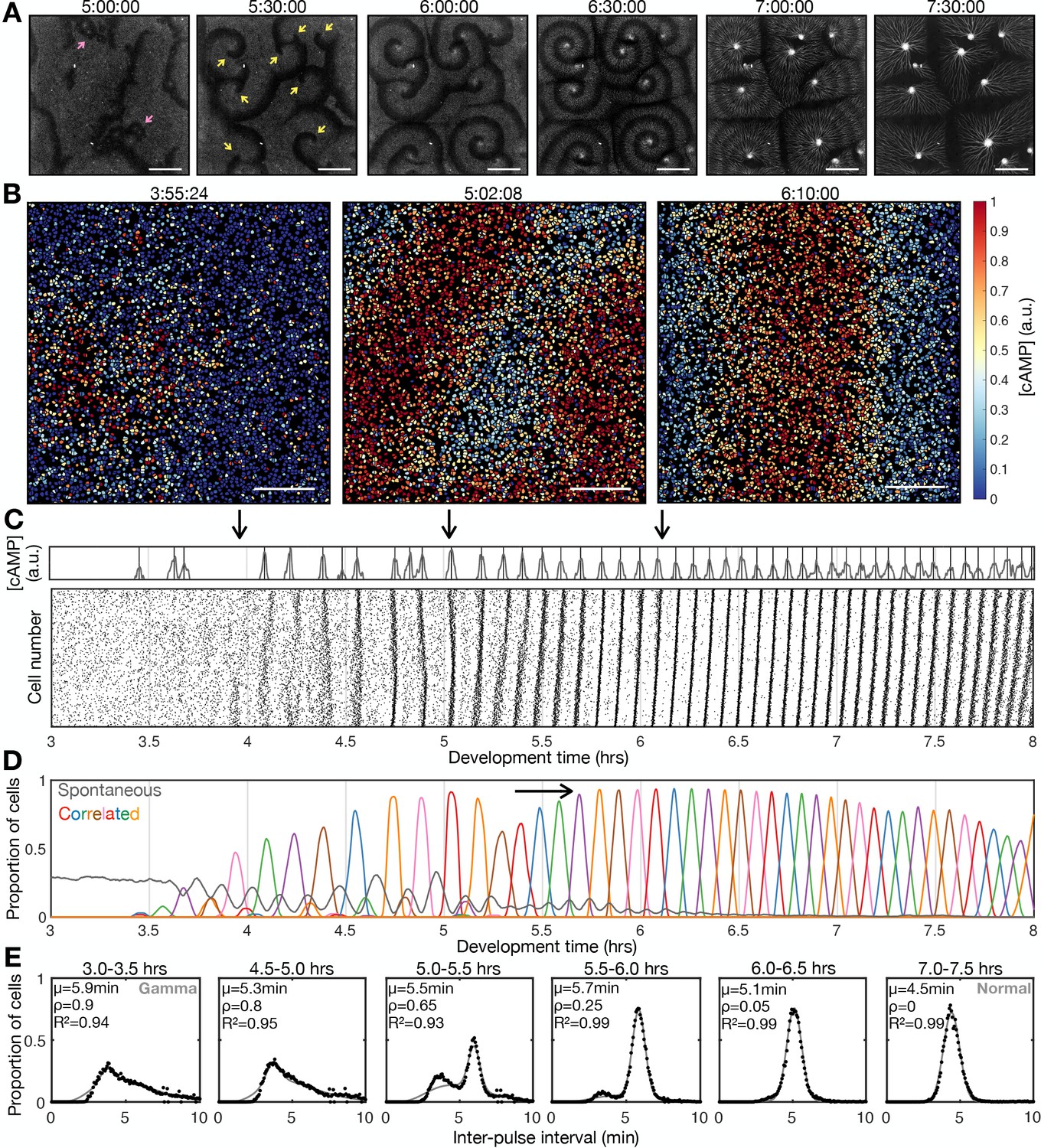
Transition to collective cell signalling.
(A) cAMP waves (dark bands) imaged using the Flamindo2 reporter following starvation (for a representative movie see Figure 1—video 1). Arrows indicate circular waves (pink) and spiral waves (yellow). Scale bar: 2 mm. (B) The distribution of cells and internal [cAMP] (colour) following starvation. Scale bar: 200 µm. (C) Representative time series of the internal [cAMP] within an individual cell (top) and a plot of signal peaks for 1000 cells (bottom). (D) Changing proportions of correlated (coloured) and spontaneous (grey) activation events following starvation; each colour represents a single cAMP wave. Arrow: onset of spiral formation. (E) The distribution of inter-pulse intervals over different 30 min time intervals after starvation onset with the mean of each shown by parameter µ, together with a fitted sum of the gamma (weighted by value ρ) and normal (weighted by value 1-ρ) distribution. For the gamma distribution, the shape and rate parameter were 6.6 and 1.25 min respectively, and the mean of the normal distribution varied (from 6 to 4.5 min).
Figure 1—figure supplement 1
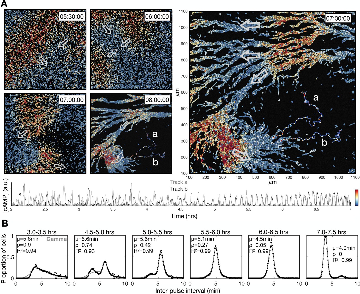
Transition to collective cell signalling.
These data are derived from a different experiment to that presented in Figure 1. (A) The distribution of cells and internal [cAMP] (colour) shown at 30 min intervals following 5.5 hr from starvation, with arrows labelling the direction of wave motion. Also shown at the 7.5 and 8 hr time point are two cell tracks, labelled a and b, whose internal [cAMP] (a.u.) are depicted in the plot below. (B) Same as Figure 1E, but from a different experiment. The distribution of inter-pulse intervals over different 30 min time intervals after starvation onset (black) with the mean of each shown by parameter µ, together with a fitted sum of the gamma (weighted by value ρ) and normal (weighted by value 1-ρ) distribution.
Figure 1—figure supplement 2
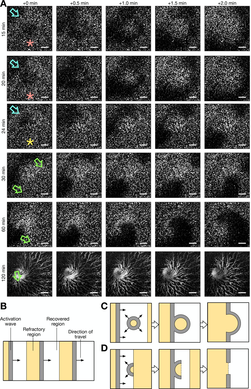
Formation of spiral waves via photoactivation (see Figure 1—video 3 for additional clarity).
(A) A series of raw images (over 2 min intervals starting from the times labelled at the left of column 1) showing activation waves that travel from the top right to bottom left corner of the field of view (blue arrow), are circular and result from photoactivation (red stars) and are broken/partially circular (yellow star) and rotate. Rows 1 and 2 show a photoactivated circular wave that collides with the oncoming periodic wave. Row 3 shows a photoactivated semi-circular wave (broken) that travels towards, and collides with, the oncoming periodic wave, resulting in a broken wave. Row 4 shows the rotation of both the ends of the broken wave, resulting in two spiral waves. Row 5 shows the dominance of one spiral wave. Row 6 shows the aggregate that formed from the dominant spiral wave. Time starts from 5 hr following starvation. Scale bars: 200 µm. (B) Cartoon schematic of the spatial structure of cell activation states for periodic travelling waves. (C) Same as B, except an activation wave is triggered in the recovered region, resulting in the fusion of the resultant circular wave and periodic travelling wave. This is representative of row 1 and 2 of A. (D) Same as C and B, except that an activation wave is triggered at the border of the recovered and refractory region, resulting in a broken wave shaped as a semi-circle, that collides with the oncoming periodic travelling wave, resulting in a broken wave. This is representative of row 3 of A, which resulted in the formation of a spiral wave (rows 4, 5, and 6).
Figure 1—figure supplement 3
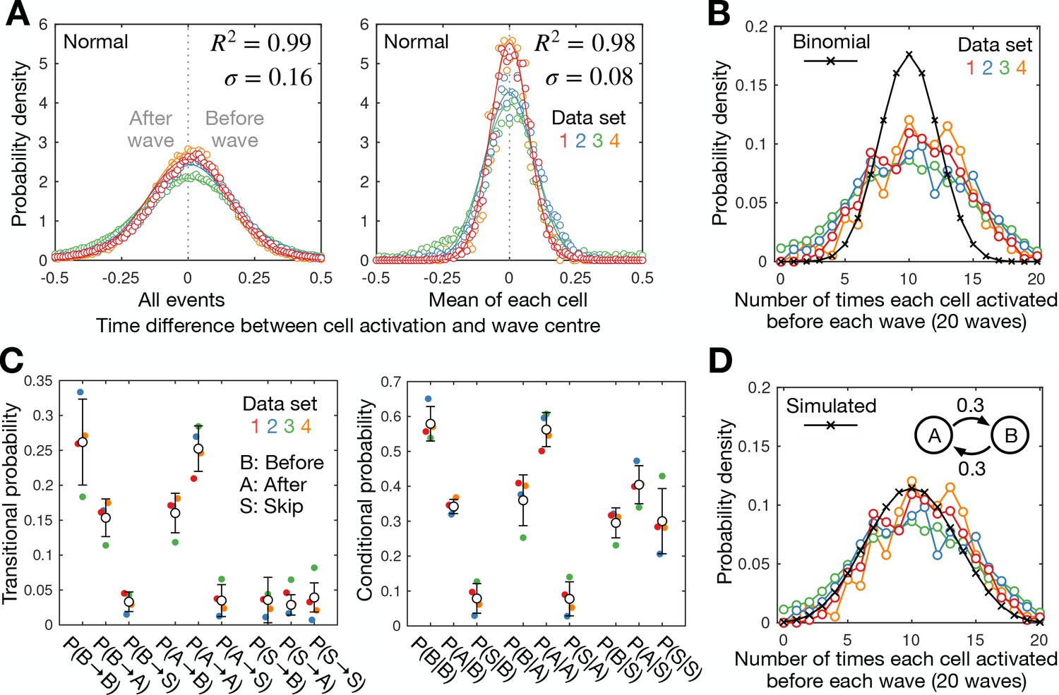
Cell-cell variability in activation times.
A) Distribution of the time difference between the peak of cell activation and the wave peak for all cell activation events (left) and the mean for each cell (right; circles) with fitted normal distributions (mean of 0; line). Also shown is the mean R² value and SD of the fitted normal distribution fit for each dataset (colours). The mean for each cell provides a normal distribution with an SD that is around half of the distribution for all activation events, suggesting the timing of cell activation is not random. (B) The distribution of the number of times each cell activated before a set of 20 waves for each dataset (colours) compared to the binomial distribution (black crosses). The measured distribution displays a higher spread, indicating cells can be biased to activate before or after waves, suggesting cells are intrinsically heterogeneous, or cell activation is history dependent. (C) Switching between early- and late-firing states. The transitional probability P(X→Y) (left) and the conditional probability P(X|Y) (right) between states X and Y where X,Y=B,A,S; B, A, and S represent the states where a cell activates before a wave, after a wave, or skips a wave, respectively. Shown are the mean (black dots) and SD (error bars) from the same four datasets shown in A and B. Cells activate at the same and opposite side of consecutive waves with probability 0.5–0.6 and 0.3–0.4, respectively, with the probability of wave-skipping being 0–0.1. In other words, cells that activate before the wave are slightly more likely to activate again before the next wave, indicating a history dependence, but that this tendency is short lived. (D) Modelling bias in firing times: a two-state Markov model with experimentally derived transitional probabilities produces a distribution consistent with experimental data. This figure is the same as B except the data is compared to a distribution (black, solid, and crosses) simulated from a two state Markov model (inset)–states A (after wave) and B (before wave)–with transitional probability 0.3 for 20 time steps (waves), generated from 106 simulations.
Figure 1—video 1
Dictyostelium cAMP signalling patterns and aggregation.
cAMP wave patterns (dark bands) imaged using the Flamindo2 reporter following starvation. The cell population was imaged every minute from 2 hr to 8 hr following starvation. Stills of the movie are shown in Figure 1A. Scale bar: 2 mm.
Figure 1—video 2
Quantification of single-cell signalling and motion.
The signalling state (colour: red – high cAMP, blue – low cAMP) and motion (arrow) of individual cells (circles) throughout the transition to collective cell signalling and motion. The data were processed from live images taken every 5 s from 2 hr to 8 hr following starvation. The information gathered from this data is shown in Figures 1 and 2. Scale bar: 100 µm.
Figure 1—video 3
Initiation of spiral waves using optogenetics.
Shown are cells expressing both blue-photoactivable adenylyl cyclase (bPAC) photoactivable adenylyl cyclase and the Flamindo2 cAMP reporter. Cells were photoactivated five times while experiencing natural periodic cAMP waves. Movie starts from 5 hr following starvation. Patches of cells (indicated by square boxes) were photoactivated at 4 min 40 s (box 1 – green), 10 min 5 s (box 2 – orange), 14 min 40 s (box 3 – pink), 19 min 20 s (box 4 – dark blue), and 23 min 20 s (box 5 – light blue), resulting in an operator-induced cAMP wave (dark band). The first four photoactivation events resulted in a circular wave pattern, while the fifth resulted in an asymmetric broken band, causing the breakage of the incoming wave, spiral wave formation, and aggregation. Scale bar: 100 µm. Stills from the movie are shown in Figure 1—figure supplement 2.
Figure 2 with 1 supplement
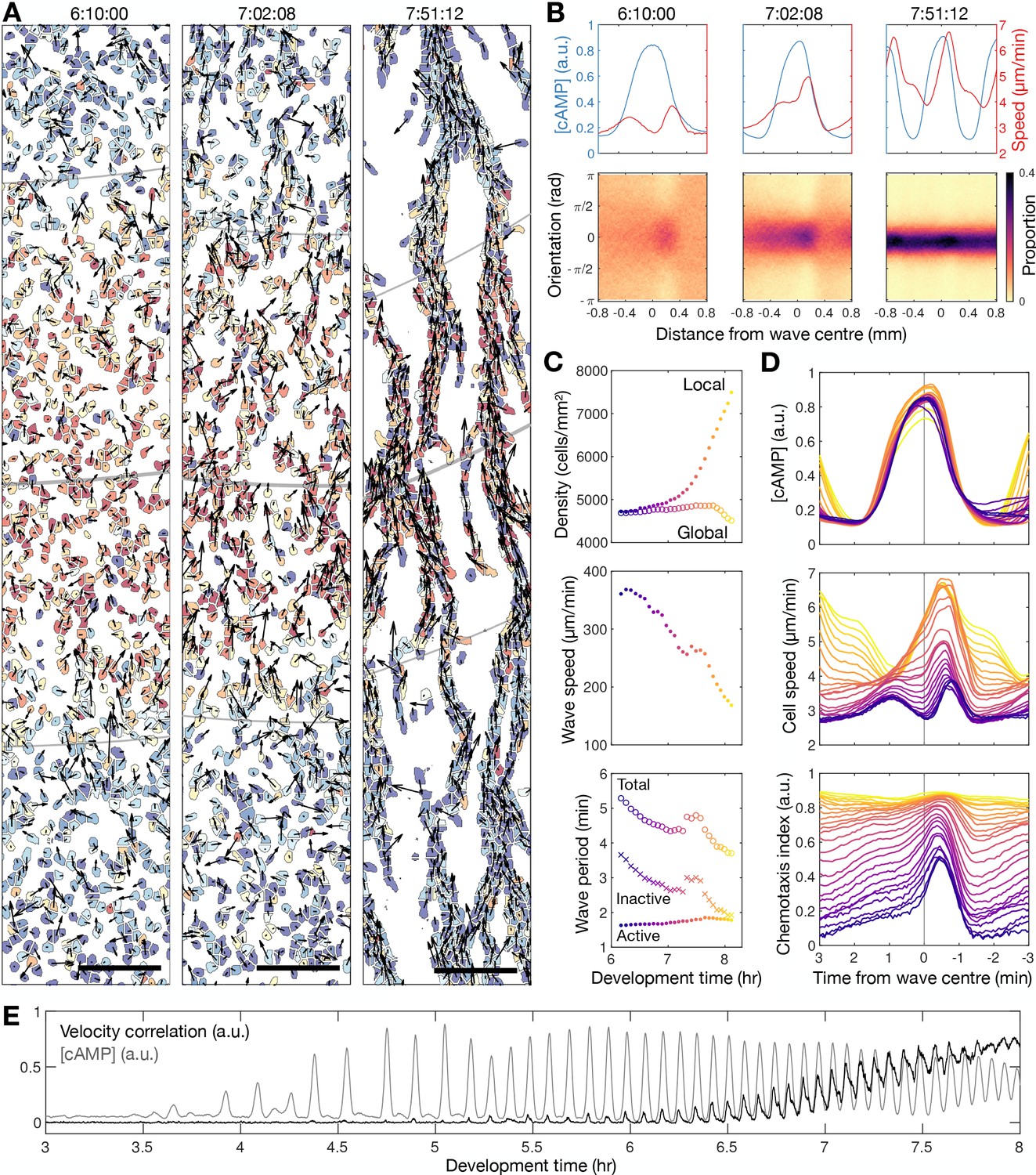
Transition to collective cell motion.
(A) Snapshots of cell velocities (arrows) and signal states (coloured by [cAMP], as in Figure 1B) surrounding a cAMP wave (travelling from top to bottom) at three different time points following spiral wave formation. The inferred wave boundaries and peak are highlighted as grey lines. Scale bar: 100 µm. (B) Top: the mean cell [cAMP] (blue) and speed (red); bottom panels show the orientations of the cells with respect to the direction of wave motion (0 is facing the wave; ± π facing away from the wave), as a function of distance from the wave centre for the three waves shown in A. (C) The local (mean) and global population density (top), wave speed (middle), and wave period (bottom) for each wave during 6–8 hr following starvation. Each data point is coloured by wave number. (D) The mean cell [cAMP] (top), speed (middle), and chemotaxis index (bottom) across each wave, represented as the time to the wave centre (positive values correspond to behind the wave). Each line is coloured by wave number as in C. (E) The mean cell [cAMP] (grey) and local velocity correlation (black) between cells within a 400 µm2 area.
Figure 2—figure supplement 1
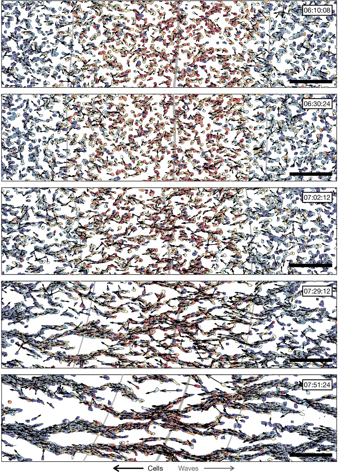
Transition to collective cell motion.
The distribution of cell velocities and signal states surrounding a cAMP wave (travelling from left to right) at approximately 30 min intervals different time points following spiral wave formation. The inferred wave boundaries and peak are highlighted as grey lines. Scale bar: 100 µm. These data are from the same time series as Figure 2A, showing more timepoints.
Figure 3 with 1 supplement
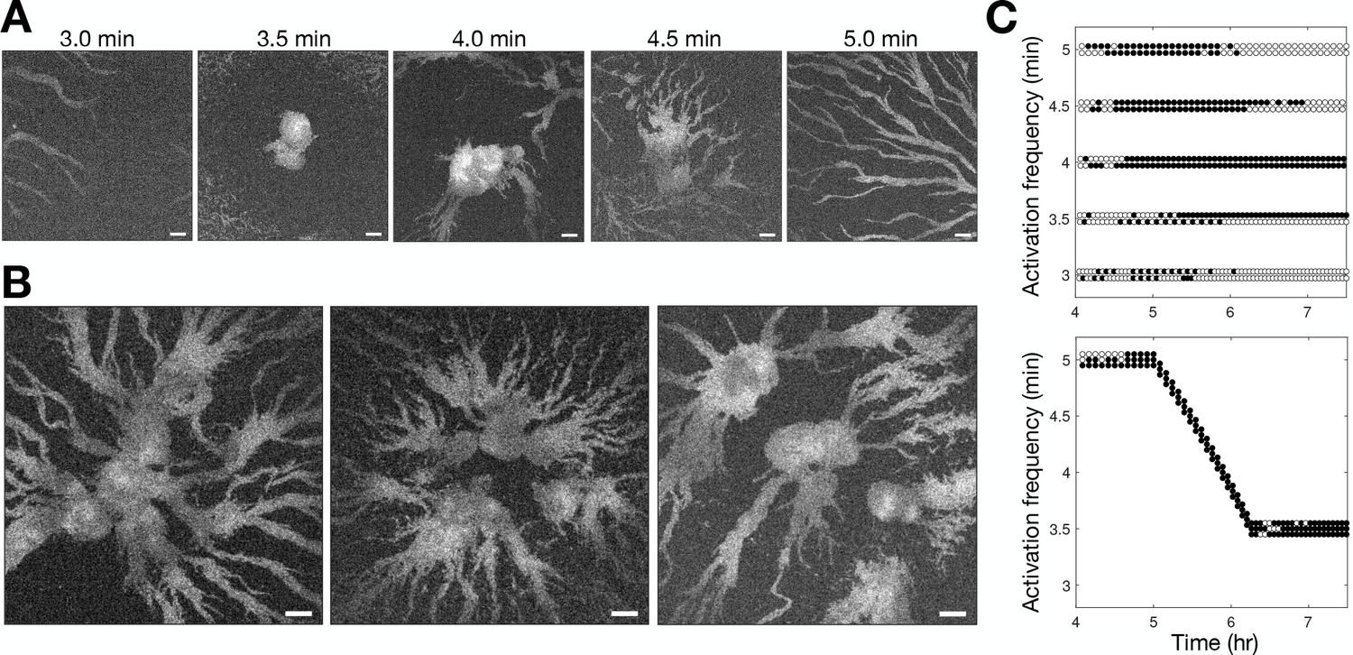
Controlling aggregation by setting the cAMP wave frequency.
See Figure 3—video 1 for live movies. (A) Raw images of cells subjected to 3 hr of periodic activation of the blue-photoactivable adenylyl cyclase (bPAC) (with pulses applied at centre of the field of view) at 3, 3.5, 4, 4.5, and 5 min intervals. Scale bar: 100 µm. (B) Same as A except that the frequency steadily increased from 5 to 3.5 min intervals. Note that the size of the images is larger than those in A. Scale bar: 100 µm. (C) Time series of the periodic photoactivation protocol for the experiments shown in A (top) and B (bottom). The coordinate of each circle represents the time (x-axis) and frequency (y-axis) of photoactivation, and its colour indicates whether it resulted in a relayed circular wave (black) or not (white). Experiments in A are in duplicate, and those in B are in triplicate.
Figure 3—video 1
Inducing aggregation by optogenetic control of cAMP pulsing.
A small area of the population was subjected to 3 hr of periodic activation of the blue-photoactivable adenylyl cyclase (bPAC) . The top two rows show cells pulsed (at centre of the field of view) at 3, 3.5, 4, 4.5, and 5 min intervals. The time of each pulse is shown by the image borders turning red. The movies on the bottom row show an experiment in which the bPAC pulse frequency steadily increased (at 5 s increments, as depicted in Figure 3C) from 5 to 3.5 min intervals. Collective migration occurred with the constant pulse frequencies of 3.5 and 4 min, observed as cell clumping. Cells pulsed at other frequencies were overridden by neighbouring ‘natural’ centres. Cells pulsed at gradually increasing frequencies form large zones of aggregation compared to cells exposed to constant pulse frequencies. Scale bar: 100 µm.
Figure 4 with 4 supplements

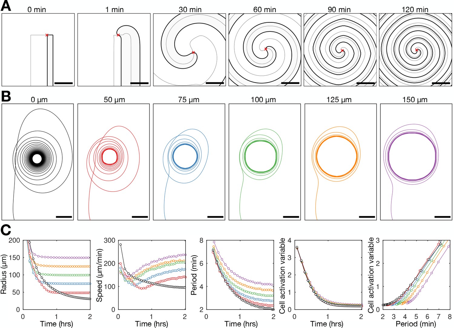
Spiral tip circulation and spiral wave progression.
(A) The fitted spiral curve (thick line) and predicted wave boundary (thin line) with the spatial distribution of: the internal [cAMP] (first panel), the signalling phase (second panel), and maximally activated cells (phase ±π) 2 min apart (0 min – black,+2 min – grey; third panel). Scale bar: 100 µm. (B) 3 min tracks (thick black line) of the spiral tip (star) circulating around the pivotal axis (thick white circle) overlayed with cell positions and signalling phase. Scale bar: 50 µm. (C) Plots of the fitted spiral curve (mean curve per rotation; top) and track of the radius of spiral tip circulation (bottom), coloured by time since spiral wave formation. (D) Time series of the spiral tip circulation rotational period (first panel), rotational radius (second panel), and speed (third panel), in addition to the spiral curve parameter defining the fitted spiral shape in C (fourth panel) for each experiment (red, blue, and green) from the onset of spiral formation. Each circle represents the mean value per rotation and the lines represent the instantaneous values (e.g. rotational period is 2π /). See Figure 4—videos 1–3 for live cell movies.
Figure 4—figure supplement 1
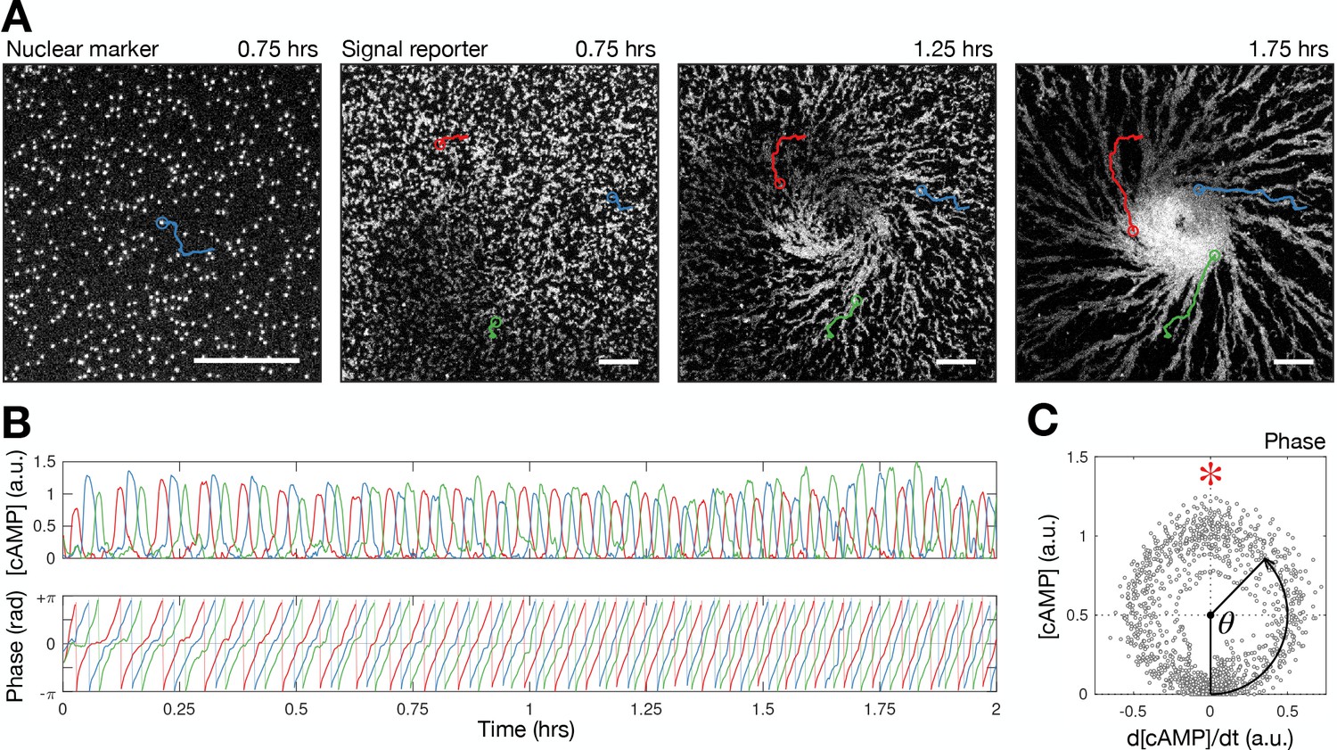
Quantifying single cell signalling around the spiral core.
(A) Raw images of cell nuclei (left) and cell bodies (right three panels) overlayed with cell tracks (red, blue, and green). Scale bar: 100 µm. (B) Time series of the internal [cAMP] (a.u.) signalling phase (rad) of the track shown in A. (C) Phase measurement: the [cAMP] stratified by its change over time.
Figure 4—video 1
Quantifying signalling centre wave circulation and spiral wave structure and dynamics.
Left panels show raw images of the cell population. Middle panels show the quantified signalling state of single cells (red- high cAMP; blue- low cAMP). Right panels show the quantified signalling phase of the cells (white - cells inactive; red - cells activating; black - maximally activated; blue - deactivating). The spiral curve (white line) is fitted from the distribution of maximally activated cells.
Two key points in the curve are highlighted by crosses- the axis of rotation (the curve origin) and the spiral tip (which circulates a distance from the axis). Top and bottom panels show the same data, but the bottom panels are zoomed in versions of the top panels, also including tracks of the spiral tip. Scale bar: 100 µm. The two additional datasets used for the analysis are shown in .
Figure 4—video 2
Quantifying signalling centre wave circulation and spiral wave structure and dynamics.
Repeat experiment of data shown in Figure 4—video 1. Left panels show raw images of the cell population. Middle panels show the quantified signalling state of single cells (red- high cAMP; blue - low cAMP). Right panels show the quantified signalling phase of the cells (white - cells inactive; red - cells activating; black - maximally activated; blue - deactivating). The spiral curve (white line) is fitted from the distribution of maximally activated cells. Two key points in the curve are highlighted by crosses - the axis of rotation (the curve origin) and the spiral tip (which circulates a distance from the axis). Top and bottom panels show the same data, but the bottom panels are zoomed in versions of the top panels, also including tracks of the spiral tip. Scale bar: 100 µm.
Figure 4—video 3
Quantifying signalling centre wave circulation and spiral wave structure and dynamics.
Second repeat experiment of data shown in Figure 4—video 1. Left panels show raw images of the cell population. Middle panels show the quantified signalling state of single cells (red- high cAMP; blue- low cAMP). Right panels show the quantified signalling phase of the cells (white - cells inactive; red - cells activating; black - maximally activated; blue - deactivating). The spiral curve (white line) is fitted from the distribution of maximally activated cells. Two key points in the curve are highlighted by crosses - the axis of rotation (the curve origin) and the spiral tip (which circulates a distance from the axis). Top and bottom panels show the same data, but the bottom panels are zoomed in versions of the top panels, also including tracks of the spiral tip. Scale bar: 100 µm.
Figure 5 with 1 supplement
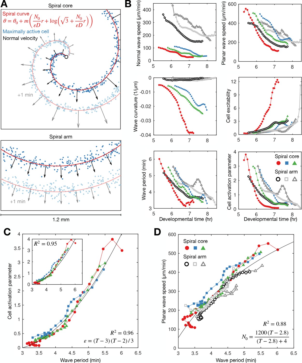
General theory of excitable media – cell excitability is coupled to wave dynamics.
(A) Representative curve fits (red line) to the distribution of maximally activated cells (blue dots) at (top) and away from (bottom) the spiral core. The normal wave speed is shown as black arrows. (B) Time series of wave characteristics derived from A. Coloured lines show data from the spiral core. Greyscale lines show data away from the core. (C) The cell activation parameter (calculated using the eikonal relation) plotted against the wave period at the spiral core. Inset shows the same plot, but with the activation parameter derived from the curvature relation, together with the fitted quadratic function (black line). (D) The dispersion relation at (colours) and away from (greyscale) the spiral core, together with the fitted saturating function. The data shown in dark grey are derived from the same experiment shown in Figure 2. Spiral wave data is from the same experiments shown in Figure 4 (same colours).
Figure 5—figure supplement 1
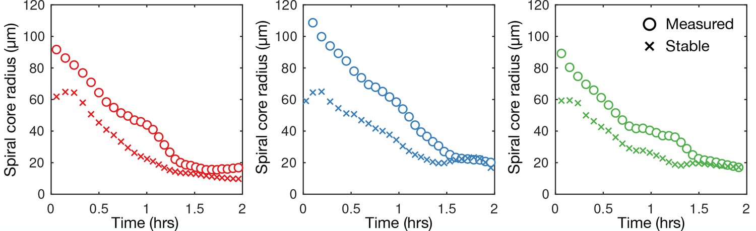
Mechanism of spiral core contraction.
Time series of the measured radius of spiral tip circulation for the data (three different experiments) presented in Figure 5 (same colours; circles) together with the stable radius of circulation predicted using the curvature relation.
Figure 6 with 3 supplements
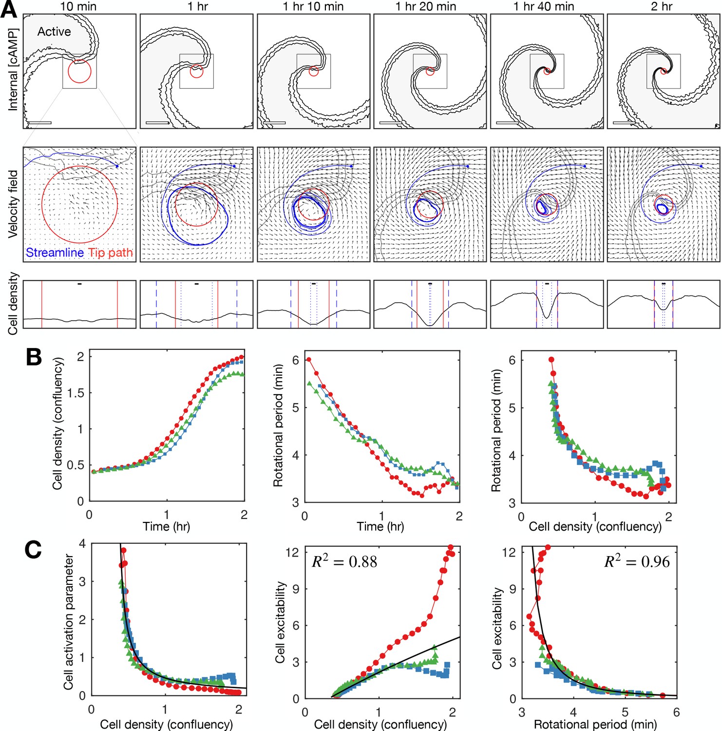
Relationship between cell density and distribution to spiral wave progression.
(A) Top row: the mean internal [cAMP] around the tip with the mean circulation radius of the spiral tip (red). Scale bar: 200 µm. Middle row: mean cell velocity field together with a representative streamline, the mean radius of the path of spiral motion (red), and contoured outline of the spiral (grey). Bottom row: cell density together with the mean radius of the spiral tip motion (red) and the minimum (dotted) and maximum (dashed) distance of the representative streamline from the axis of spiral rotation (blue). Scale bar: 10 µm (≈1 cell diameter). Each plot represents a 5 min average. (B) Time series of the cell density (fraction cell confluency, estimated with cell area of π 52 µm2) around the spiral core (first panel) and spiral tip rotational period (second panel), together with the relationship between the cell density and rotational period (third panel). Shown are the same three datasets (colours) shown in Figures 4 and 5. Data points represent average values per rotation, in contrast to Figure 4D. (C) Relationship between the cell activation parameter (first panel) and cell excitability (inverse of the cell activation; second panel) and the cell density. Relationship between cell excitability and wave period (third panel). The cell activation parameter (inverse of cell density) structured by cell density and period was fitted with a reciprocal curve () and quadratic curve (same as in Figure 5), shown as black lines, with their respective R2 values.
Figure 6—figure supplement 1
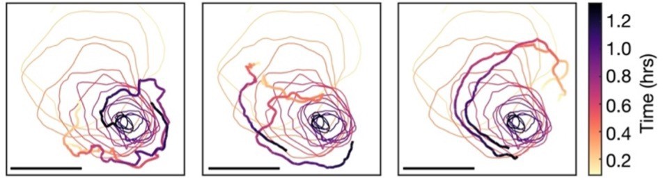
Single-cell tracks around the spiral core.
The path of spiral tip circulation together with single-cell tracks of position, coloured by the time since spiral formation. Scale bar: 100 µm. These tracks are representative of the mean cell velocity fields shown in Figure 6A.
Figure 6—video 1
Quantifying cell velocities at the signalling centre.
Left panel shows quantified signalling state of single cells (red - high cAMP; blue - low cAMP). Right panel shows cell velocities.
Figure 6—video 2
Quantifying the mean cell velocity field.
Left panel shows quantified signalling state of single cells (red- high cAMP; blue- low cAMP) in the rotating reference frame of the spiral. Middle panel is the same data (zoomed in) also showing cell velocities. Right panel shows the mean cell velocities (averaged over 5 min) as a function of the distance from the spiral axis of rotation. Contracting circles show the mean radius of circulation. The data extracted from these movies are shown in Figure 6A.
Figure 7 with 4 supplements
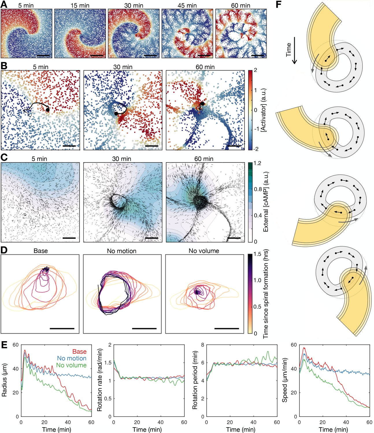
Mathematical model of spiral wave progression (constant cell excitability, variable cell density).
(A) Simulation of the cell population distribution across space and the concentration of the species governing cAMP release (colour). Scale bar: 500 µm. (B) Same as A together with the track (black line) of the spiral tip (black circle). Scale bar: 100 µm. (C) Progression of the external [cAMP] field (colour) with cell velocities (black arrows). Scale bar: 100 µm. (D) Tracks of the spiral tip (coloured by time) for the original simulation (shown in A–C), a simulation without cell motion (second panel) and without cell volume (third panel). Scale bar: 50 µm. (E) Time series of the spiral tip circulation radius, rotation rate, rotation period, and speed for the simulated tracks presented in D. (F) Schematic of the mechanism of spiral tip contraction; as the spiral tip travels around the ring pattern of cells (grey), its external [cAMP] field (yellow) directs cell motion (black arrows) inwards from the ring tangent, resulting in the deformation of the cellular ring.
Figure 7—figure supplement 1
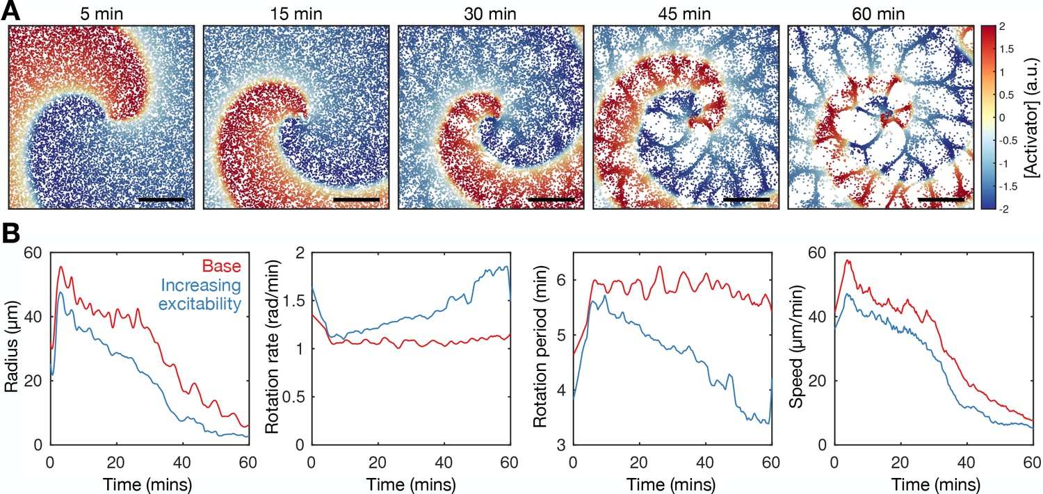
Model extension-increasing cell excitability recapitulates spiral wave progression.
Refer to Figure 7—video 3 for movies of the simulations. The rate of cell activation in the agent-based model (ABM) is specified to be a linearly increasing function of time. (A) Simulation of the cell population distribution across space and the concentration of the species governing cAMP release (colour). Scale bar: 500 µm. (B) Time series of the spiral tip circulation radius, rotation rate, rotation period, and speed for the simulated spiral time for simulation with a constant (red, as in Figure 7) and increasing (blue, as in A) value of cell excitability.
Figure 7—video 1
Inferring the external cAMP field.
The external cAMP field is shown in purple (left panel) and contoured (right panel). The left panel also shows the signalling states of single cells in purple. The right panel shows the cell velocities alongside the external cAMP field. The external cAMP field was predicted using a reaction-diffusion equation with constant decay and point source terms derived from the position and signalling state of each cell.
Figure 7—video 2
Modelling the external cAMP field.
Same representations as Figure 7—video 1, except these data were generated by the agent-based model (ABM) model shown in Figure 7. The ABM reproduces the formation of the cellular ring pattern that contracts over time.
Figure 7—video 3
Modelling the spiral wave with constant (left) and increasing excitability (right).
Agent-based model (ABM)-simulated signalling states of single cells (red - high cAMP; blue - low cAMP). The model shows spiral wave progression requires intrinsic cell excitability increases.
Figure 8 with 3 supplements
Mathematical model of spiral wave progression (constant cell density, variable cell excitability).
(A) Numerical solution depicting the spatial distribution of the external [cAMP] (black contour with shaded interior, ) and the inactivator species (grey contour ). Also shown is the spiral tip location (red cross) estimated by the contour intersections. (B) Path of spiral tip circulation without (black) and with (colours) a physical block of various sizes (radii shown above). Scale bar: 100 µm. (C) Time series of the spiral tip circulation: radius (first panel), speed (second panel), rotation period (third panel), and the cell activation variable (fourth panel). Also shown is the relationship between the cell activation variable and wave period (fifth panel). The colours represent the measures of circulation for the differently sized physical blocks shown in B.
Figure 8—figure supplement 1
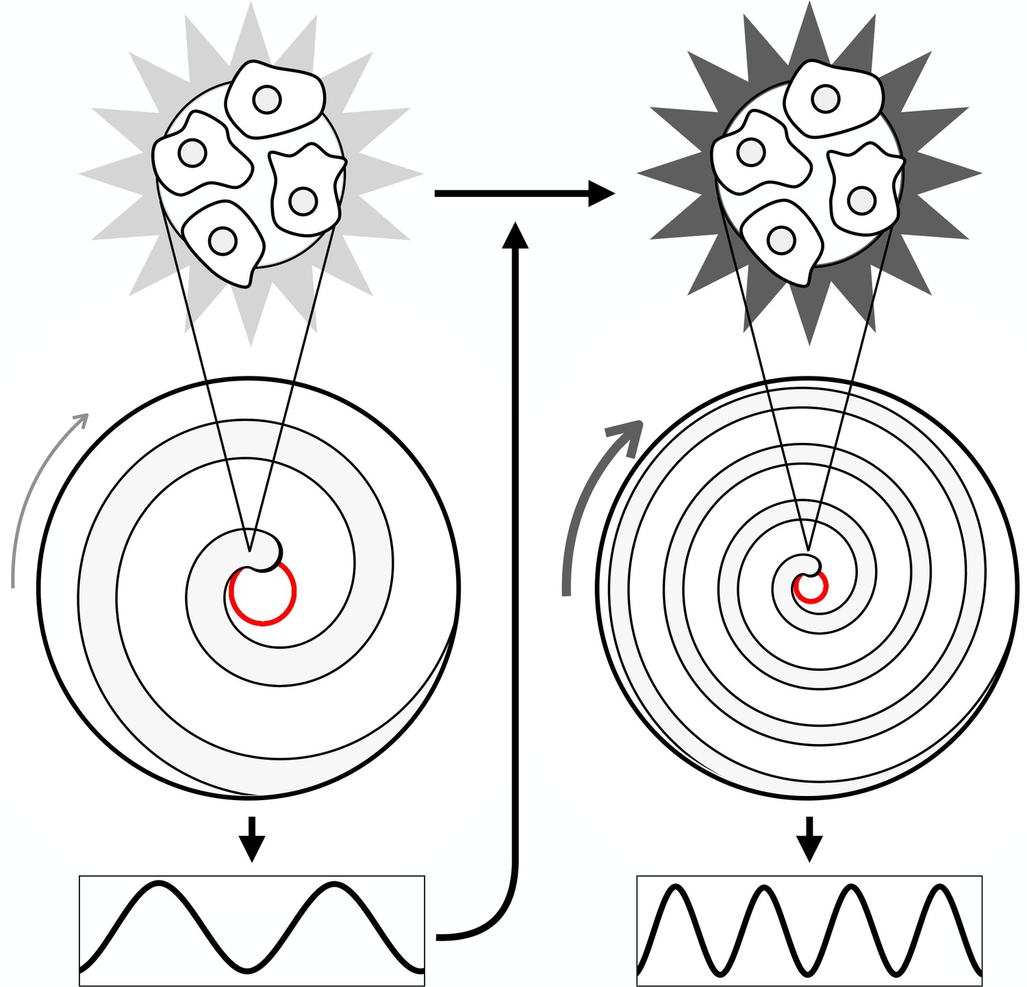
Mechanism of spiral wave progression.
Cartoon schematic illustrating spiral wave progression due to positive feedback between cell excitability and cAMP wave frequency. The excitability of individual cells increases due to an increase in cAMP wave frequency. The wave frequency increases due to an increase in the spiral wave rotation rate. The spiral wave rotation rate increases due to an increase in cell excitability.
Figure 8—video 1
Simulating spiral wave progression.
Simulation of the extended Tyson model in which cell excitability depends on external cAMP dynamics. Cell density is continuous and remains constant. Shown are the contours of the external cAMP field (black lines) and the inactivated species (grey). Also shown is the spiral tip (red circle). The simulated spiral progression shows the main features of observed spiral progression: increase in rotation rate and curvature simultaneously with contraction of the circulation of the spiral tip. These changes produce an increase in the disseminated wave frequency. Figure 8 shows the summary statistics of the simulation.
Figure 8—video 2
Simulating spiral wave progression with a physical block at the signalling centre.
Same representation as Figure 8—video 1, but with a physical barrier (outlined in blue) to prevent contraction of spiral tip circulation. The block does not prevent spiral wave progression (increased rotation rate and curvature). The summary statistics of this treatment are shown in Figure 8.
Figure 9 with 1 supplement

Physical occlusion of spiral core.
See Figure 9—video 1 for live cell movie. (A) Top: raw images of the population distributed around a physical block (dashed circle) with the spiral tip (green dot) and its track (blue line). Bottom: the spatial distribution of the internal [cAMP] with the spiral tip (black) dot and its track (black line). Scale bar: 100 µm. (B) Tracks of the spiral tip position for physical blocks of various sizes (radii shown in titles). The control case (no physical block, black) is from a dataset shown in Figures 3—5. (C) The spiral tip circulation radius (first panel), speed (second panel), and rotation period (third panel) around physical blocks with different average radii (dashed lines). Also shown is the mean (three experiments) of the control data without blocks shown in Figures 3—5 (black). Panel 2 also shows the predicted speed (dashed lines) corresponding to the maximum rotation rate 3.5π/6 around the block radius.
Figure 9—video 1
Spiral wave progression with a physical block at the signalling centre.
Left panel: movie shows raw images of spiral wave progression with contraction of the signalling centre prevented with an agarose block (outlined by the track of the spiral tip). Right panel shows the same movie with the quantified signalling states of single cells (red - high cAMP; blue - low cAMP). Scale bar: 100 µm. Compare to the simulated data in Figure 8—video 2. In both simulated and experimental contexts, spiral waves progress similarly with and without the physical block.
Figure 10 with 3 supplements
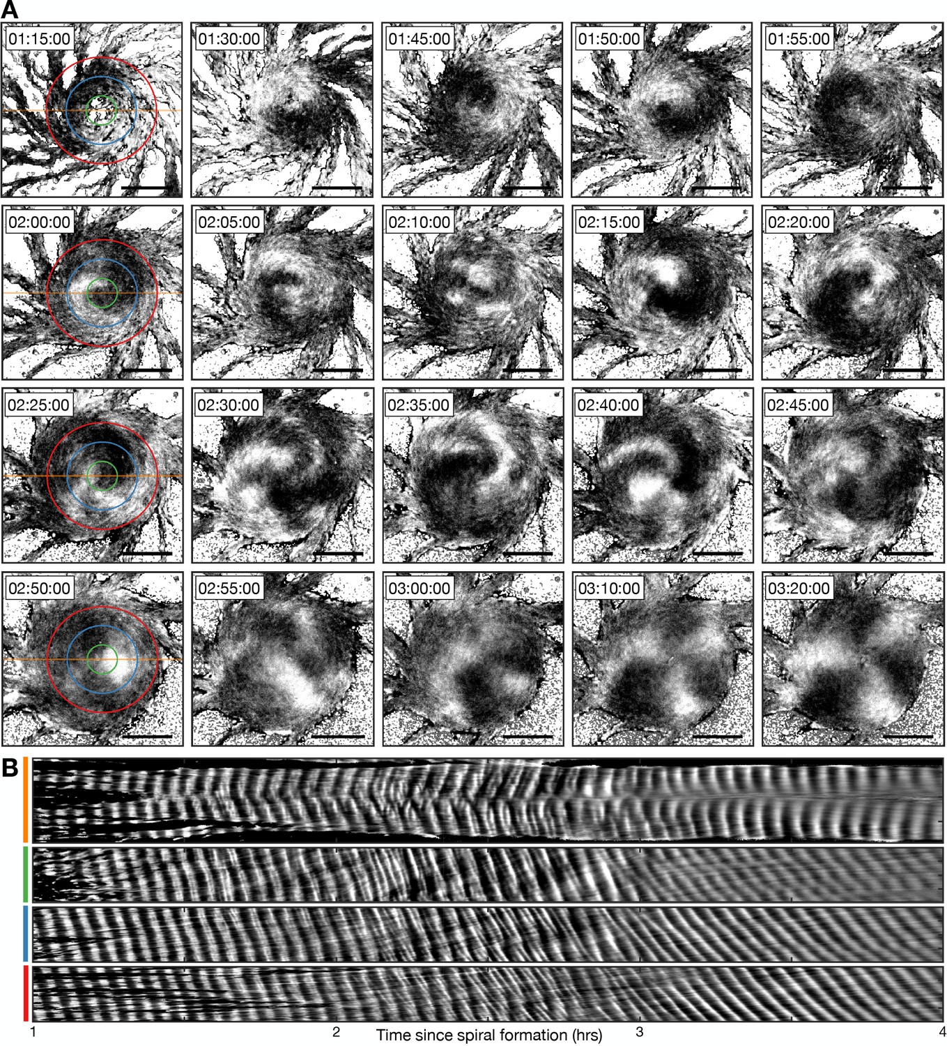
Transition from the single- to multi-armed spiral wave.
(A) Representative intensity-normalised images of the internal [cAMP] (dark - high, light - low) distributed across cellular aggregates at various time points (labelled) following spiral formation. The images in the left column are annotated with the curves from which the kymographs in B are derived. Scale bar: 100 µm. (B) Kymographs of the data presented in A along a cross-section through the aggregate centre (yellow) and circles with radius 30 µm (green), 70 µm (blue), and 110 µm (red).
Figure 10—figure supplement 1
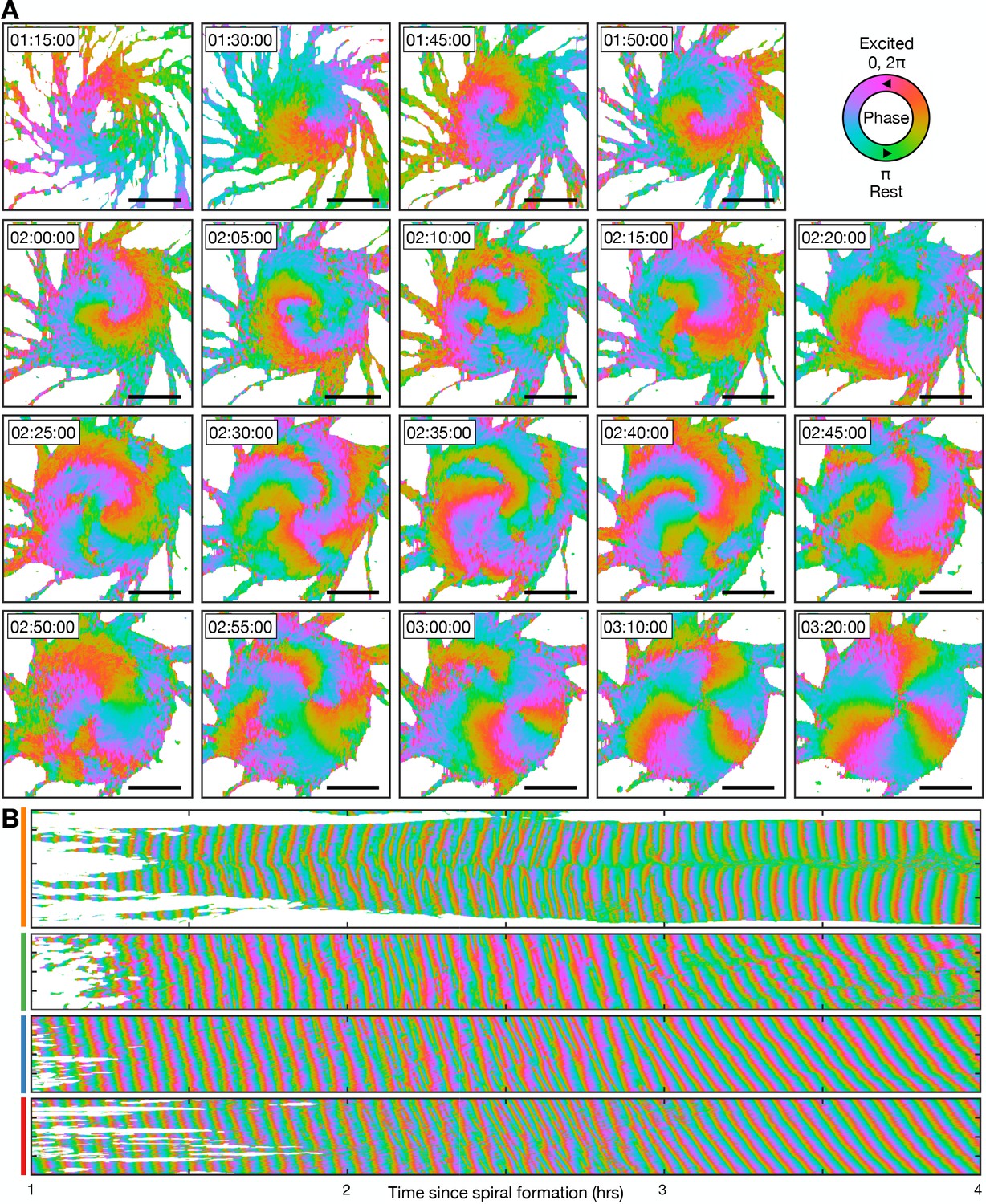
Transition from the single- to multi-armed spiral wave.
These data are from the same experiment as Figure 10, except the cell signalling state is represented as the signalling phase (see Figure 4). (A) Representative images of the signalling phases distributed across the aggregate (red - 0,2π [maximally active] and green - π [rest]). Scale bar: 100 µm. (B) Kymographs of the data presented in A along a cross-section through the aggregate centre (yellow) and circles with radius 30 µm (green), 70 µm (blue), and 110 µm (red), see Figure 10A.
Figure 10—figure supplement 2
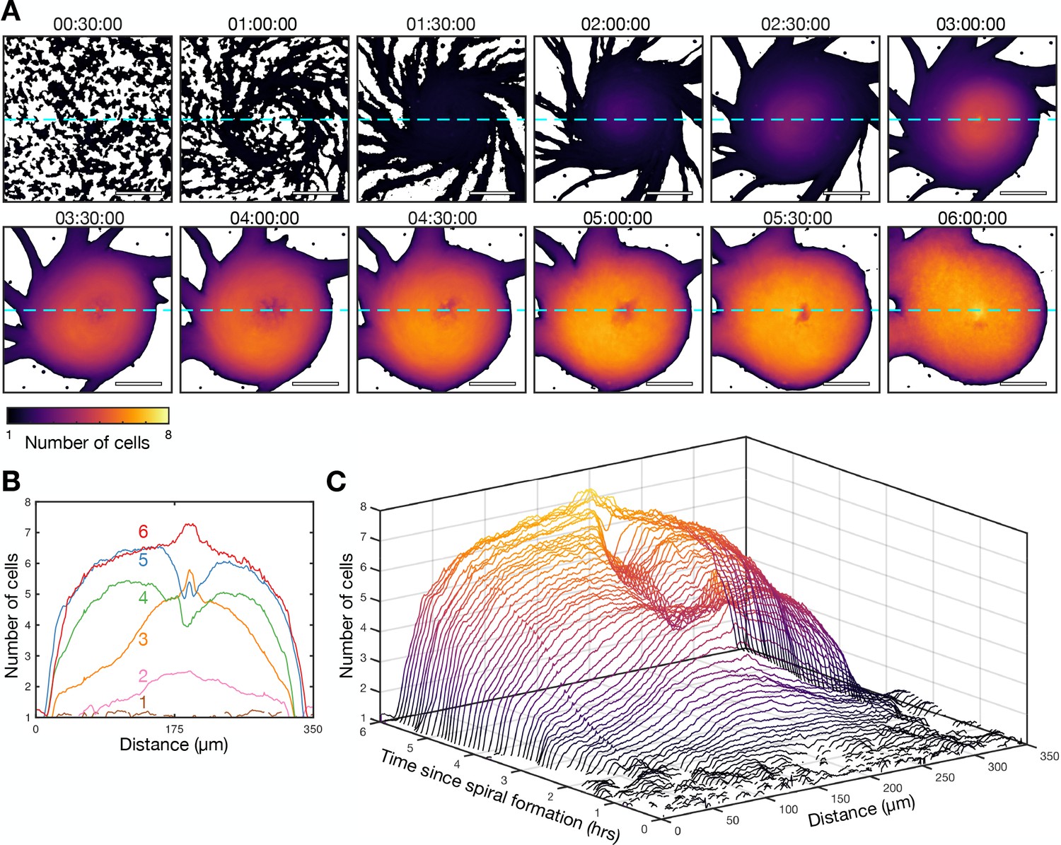
Transition from the single- to multi-armed spiral wave.
These data are from the same experiment as Figure 10. (A) Cell density of the aggregate at 30 min intervals following the onset of spiral formation coloured by the mean intensity of an individual cells. Scale bar: 100 µm. (B) The cell density of the aggregate along a cross-section through the aggregate centre (dashed light blue line in A) at 1 hr intervals (labelled and in different colours) following the onset of spiral formation. (C) Waterfall plot of the intensity of the aggregate along a cross-section through the aggregate centre (dashed light green line in A) at 10 min intervals following the onset of spiral.
Figure 10—video 1
Transition from the single- to multi-armed spiral wave.
Left panel: representative intensity-normalised movie of the internal [cAMP] (dark - high, light - low) distributed across a cell aggregate following spiral formation. Right panel: quantification of the signalling phase of the same movie (red - active; green; inactive; orange - activating; blue - inactivating). Scale bar: 100 µm.
Tables
Table 1
Model parameters.
| Symbol | Meaning | Value/unit | Reference |
|---|---|---|---|
| External [cAMP] | Conc | ||
| Cell position | (mm, mm) | ||
| cAMP activator | a.u. | ||
| cAMP inhibitor | a.u. | ||
| Cell orientation | Radians | ||
| Cell speed | mm min−1 | ||
| Cell sensitivity | a.u., (0, 1) | ||
| Time scale of cAMP dynamics | 0.167 min | Fitted | |
| Activator and inhibitor time scale | 0.1 | Sgro et al., 2015 | |
| ratio | 0.5 | Sgro et al., 2015 | |
| Inhibitor decay rate | 1.2 | Sgro et al., 2015 | |
| Basal inhibitor production cAMP response | 0.058 | Sgro et al., 2015 | |
| magnitude cAMP response threshold | 10–5 conc | Sgro et al., 2015 | |
| External cAMP diffusion constant | 2.4×10⁻² mm2 min–1 | (Höfer et al., 1995) Estimated | |
| External cAMP degradation rate | 5 min–1 | ||
| External cAMP secretion rate | 103 conc mm2 min–1 | ||
| External cAMP secretion length scale | 0.1 mm | ||
| Maximal turning rate | 3×10⁻⁶ mm min–1 conc–1 | Fitted | |
| Speed model parameter 1 | 10–8 mm2 min–2 conc–1 | Fitted | |
| Speed model parameter 2 | 0.6 min–1 | Fitted | |
| Re-sensitisation rate | 150 min–1 | Fitted | |
| De-sensitisation rate | 4×10⁻³ min–1 conc–1 | Fitted | |
| Maximum repulsion strength | 0.1 mm min–1 | Estimated | |
| Cell radius | 5×10⁻³ mm | Measured | |
| Domain length | 4 mm | ||
| Spatial step | 0.02 mm | ||
| Temporal step | 0.05 min |
Additional files
-
MDAR checklist
- https://cdn.elifesciences.org/articles/83796/elife-83796-mdarchecklist1-v2.docx
-
Source code 1
Matlab code for agent-based model of cell aggregation.
- https://cdn.elifesciences.org/articles/83796/elife-83796-code1-v2.zip
Download links
A two-part list of links to download the article, or parts of the article, in various formats.
Downloads (link to download the article as PDF)
Open citations (links to open the citations from this article in various online reference manager services)
Cite this article (links to download the citations from this article in formats compatible with various reference manager tools)
Controlling periodic long-range signalling to drive a morphogenetic transition
eLife 12:e83796.
https://doi.org/10.7554/eLife.83796


